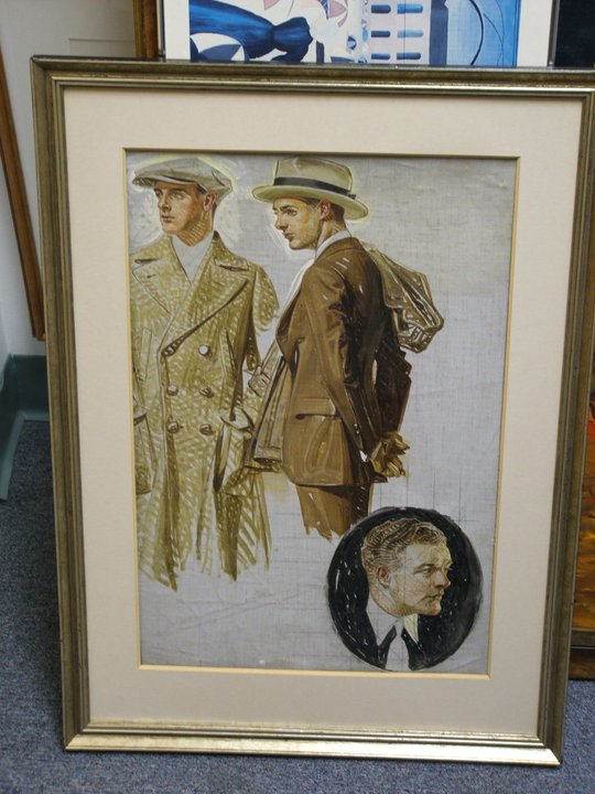
Here
you'll find a variety of samples of my artwork, from illustrations
and posters to set designs and production designs over the years.
You'll also find information on some writing projects, as well
as miscellaneous interviews and any other nonsensical tidbits
of curiosity.
2011
Dec.
29, 2011: Now available on Kindle & Nook...the perfect anti-Christmas
gift!
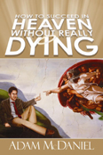
It's
been a long time since I've thought about my first book, How
to Succeed in Heaven Without Really Dying. When
people ask me to describe it, I spell it out in the most basic
way: What if the guardian angel of It's a Wonderful Life was not sent to save George Bailey, but rather
to goad him into actually committing suicide?
Ironically,
this premise wasn't part of my original design when I started
writing the screenplay, from which the book was based. It gradually
evolved into it, as I found myself pulling elements from the
classic holiday film, both in homage and to give it a dark,
satirical spin. This setup is only a small part of the story
-- and takes place about a third of the way in -- but it captures
the gist of the basic premise.
I
just discovered that iUniverse has distributed the book in a
new Kindle
edition and Nook
edition (thanks for the non-notification, iUniverse
customer service!)...so for those of you looking to read something
during your holiday travels, knock yourselves out!
Hardcover:
ISBN 0-595-67154-3 $23.95 Paperback:
ISBN 0-595-34785-1 $13.95 eBook:
ISBN 0-595-79520-X $6.00 Kindle:
ASIN: B006Q93E7U $3.99 Nook:
ISBN 9780595795208 $3.19
Dec.
4, 2011: In tribute to the holiday greeting cards of Edward
Gorey:
Update
12/5: My friend David
Byrd wrote the following message on Facebook in response
to my holiday card. I'd delete it in embarrassment if it wasn't
so damn twisted and hilarious.
Dearest
Boy Your
Xmas Card is positively delicious and a brilliant Homage
to the GREAT (but most unfortunately late) Mr. Gorey of
Elephant House. He would surely kiss you on your Love
Bump in sublime appreciation of your talent and mordant
wit. We send you delectable Solstice Vibrations from our
Tiled Bungalow on the Hill . . .
XXooxxOO
DEB+jolino+Bubbles+Mr.Cooper+AngusMcDoofus
Nov.
24, 2011: Happy Thanksgiving!
15
years ago today I spent my first Thanksgiving away from my family,
inside a tiny studio apartment within a crime infested section
of Los Angeles' mid-Wilshire district. A girl named Mariana
Kalpos, who lived 2 floors beneath me, came over and we feasted
on badly rubbery turkey breast "tenders" I'd laid out on my
artist's drafting desk. This makeshift dining table was at a
slight angle, and our plates would gradually slide from one
end to the other every minute or two. Yet somehow we managed
to juggle keeping all the plates from falling while having a
pleasant dinner conversation.
Whatever
became of Mariana, I don't know; she moved away some months
later, leaving California for good. But I'm happy to report
that my cooking skills, apartment, and dining table have somewhat
improved in the years since. I'd like to think in another 15
years, my fortunes will continue to improve...but perhaps I
shouldn't be too greedy.
Best
wishes to you all, and Happy Thanksgiving!
Nov.
20, 2011: The otherworldly work of Ul de Rico / Atreyu and The
NeverEnding Story
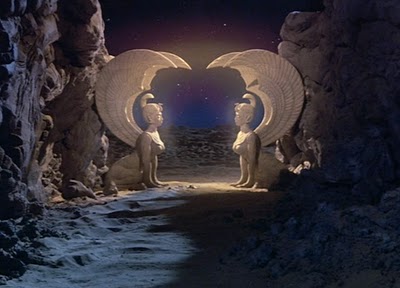
One of my favorite childhood movies was THE
NEVERENDING STORY, an elaborate 1984 fantasy directed
by Wolfgang Petersen, and based on Michael Ende's beloved children's
book (or at least the first half of it, as purists will
admit). I recently watched the film again at a screening in
Los Angeles, and was particularly struck by how unique its fantastic
world looked. Cynics may carp about some of the film's dated
special effects and animatronic work, but for its time it was
quite astonishing, and there's never been another film quite
like it. (Even the film's sequels grossly pale in comparison.)
And in spite of their technical limitations, I personally feel
there's far more magic to be found within those practical effects
crafted with love and care in service to the story, than in
anything glossy, digitized GCI can offer. (After all, who would
seem more believeable to you: Kermit the Frog or Jar Jar Binks?)
Like
H.R. Giger was to Alien, Italian concept artist Ul
de Rico (aka Ulderico Gropplero di Troppenburg) was an instrumental
creative factor in bringing the film's unique, one of a kind
vision to life. When I first saw the movie at 11 years old,
the lush, colorful landscapes seemed oddly familiar, but I couldn't
quite understand why; I'd certainly never seen another movie
that looked that way before.
It
was some years later that I discovered the reason. De Rico was
also the artist and illustrator of The
Rainbow Goblins, a book my mother had given to me
when I was very, very young. This gift was not chosen by coincidence,
for even then, Mom always encouraged my artistic endeavors,
and somehow knew that I'd take an instant liking to the book's
vivid illustrations -- even if I wasn't quite old enough to
read the words. When the book was reprinted in the late 1990's,
I was quick to buy another copy. (Here's to you, Mom.)
Ul
de Rico's website features not only his professional work, but pieces from his
early years and training at the Munich Academy of Fine Arts.
You can also see some of his early concept sketches for The
NeverEnding Story, including landscapes and character designs.
(I've included a few samples here, along with screen captures
from the final film.)
But
let me go back to the subject of the screening by giving a personal
shout out of thanks to actor Noah
Hathaway, who played the lead role of Atreyu. Hathaway
participated in a lively Q&A after the film, where he described
the nightmare behind the production, and several near death
experiences he endured:
Hathaway
went through months of screentests and makeup work, got the
part, then had to retest all over again when the original
director was fired and Wolfgang Petersen stepped in. The casting
process alone took the better part of a year.
Petersen
was a perfectionist, sometimes demanding in excess of 50 takes,
but couldn't speak any English.
Hathaway
survived a broken back (from a horse accident), near drowning
(accidently getting pulled under mud in the swamps of sadness
scene), allergic reactions (to more damn mud), and near-blinding
(a claw from the animatronic Gmork popped an eye out from
its socket)...all by the ripe old age of 12! These accidents
took a severe physical toll, eventually handicapping him from
pursuing a dancing career. If such things happened nowadays
in an American production, no doubt it would make for front
pages headlines and child protective services would be called
in!
Nevertheless,
Hathaway was a real trooper, and showed a good sense of humor
and pride about the film, its enduring cult status, and many
fans. (Count me in as one of 'em.)
I'm
happy to note that Hathaway's making a return to acting, including
a lead role in the upcoming Sushi
Girl opposite Mark Hamill, Tony Todd, Danny Trejo
and Michael Biehn. They showed the trailer right before the
screening...and it looked pretty damn good. Here's wishing him
and the film lots of luck.
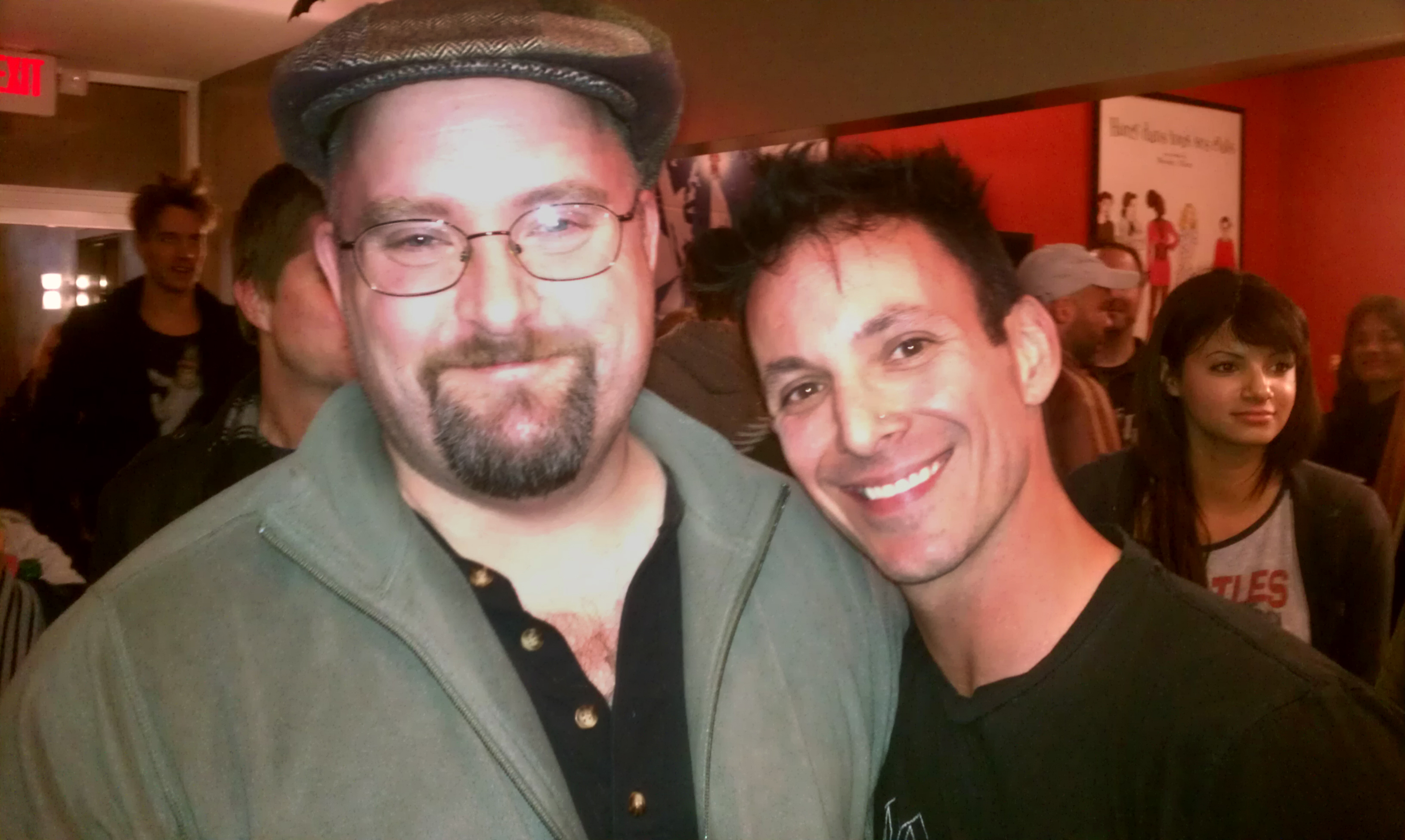
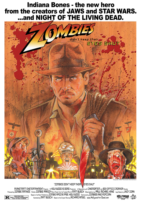
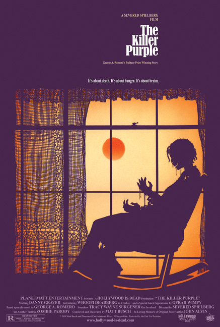
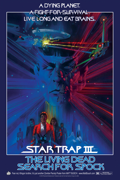
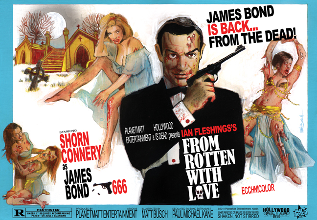
Nov.
2, 2011: Hollywood is DEAD!
I meant to post this Halloween morning, but have either been
too busy at work, or too exhausted from partying. ("Partying"
at my age is hardly hardcore, but still wears me out nonetheless!)
So I'm sorry if this post is a bit late in the game...
For
some years now, artist/illustrator Matt Busch has been creating
some very popular movie poster parodies, reimagining classic
film posters with a zombie twist. They're all darkly humorous
and macabre, of course -- even the reworked titles are funny
-- but I'm particularly struck by the technical level at which
Busch recreates each poster. They're not digital touchups of
existing work (as my spoof posters usually are), but hand drawn and painted, emulating the painting
styles of diverse artists and their respective techniques.
I
grew up on great movies," Busch states, "but the movie
posters themselves are almost more vivid in my memory as iconic
images. So the opportunity to really study the original master
artists like Drew Struzan, John Alvin, Bob Peak, Richard Amsel
and others has been awesome.
Be
sure to check out Busch's HOLLYWOOD
IS DEAD website, which offers oodles of fun even after
the Halloween season.
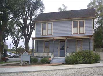
Oct.
29, 2011: HAPPY HALLOWEEN!
It's about time I made a Halloween related post...
Living
in southern California, I get a kick out of visiting South Pasadena
this time of year, as it was the primarly location used in the
original John Carpenter horror film HALLOWEEN.
Truth
be told, I visit the area all the time, as it has a quaint charm
and a lot of nice restaurants. About nine years ago, however,
a friend and I were looking for the "Michael Myers House"
while visiting the area's farmers' market one Thursday afternoon
(a frequent hangout for us). Lo and behold, a video store worker
pointed the house out to us ... directly across the street!
It had been fixed up and repainted, and even though we had passed
that house numerous times, we had not recognized it. Since then,
being the movie geek that I am, I've always paid it a visit
around the creepy holiday...
An
old photo of "The Myers House", taken from this
website. While the house still looks the same, the
area behind it has changed a bit, with mission style condos
now occupying the vacant lot at left. The Gold line train
system also stops directly at the corner.
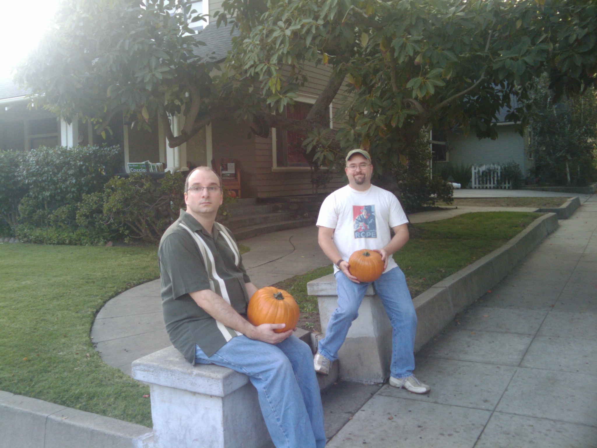
My
friend Brian and I back in October 2009, sitting in front
of the house that was used as Laurie Strode's (Jamie Lee
Curtis) residence in Halloween. The owners are very good
sports about visiting movie fans; year round, they place
pumpkins on their porch, and let you borrow them for photo
ops!
A
lot of the locations are still there, as the area has wisely
maintained its old-time charm, and the neighborhood is filled
with beautiful bungalow and craftsman style homes. The historic
Rialto Theater (featured prominently in Altman's THE PLAYER
and SCREAM 2) is nearby too -- though sadly it closed back in
2008.
Back
in the summer of 2001, I was looking to move out of my Burbank
apartment and had set my sights on a beautiful 2-bedroom above
some shops in an old brick building. The asking price was only
$850 a month -- likely because, at the time, the Gold Line rail
system was just being installed, and the street corner was a
terrific mess of mud and construction noise. I was desperate
to live there, though, but it took the building's owner about
two months to finally get back to me ... and by then, I'd already
moved into a new apartment in Glendale.
Well,
all the pity, because -- unbeknownst to me at the time -- it
was the very same building where the "Halloween" killer
had robbed his legendary mask and kitchen knife!
For
the curious, check out this
website, which details the various locations used in
the movie. A lot of other films and TV shows -- INDIANA
JONES IV, BACK TO THE FUTURE, THE TERMINATOR among them
-- filmed nearby, too.
Oct.
15, 2011:
Oct.
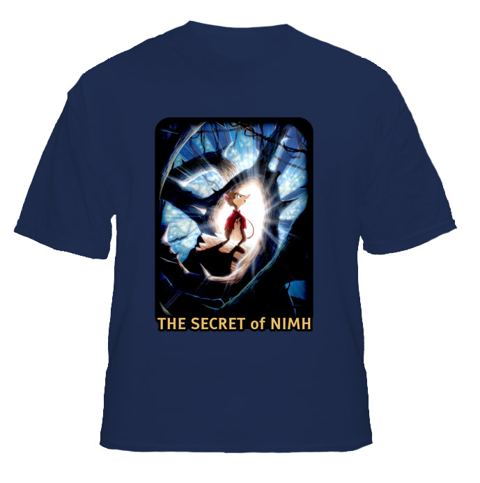
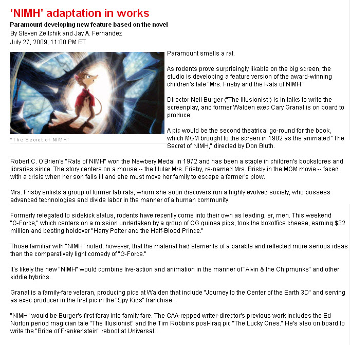
10, 2011: Revisiting NIMH.
I've made no secret of my love for The Secret of NIMH,
Don Bluth's elaborate 1982 fantasy film that, in my mind, ranks
with The Iron Giant as one of the best hand-drawn animated
movies of the last thirty years. (My retrospective article,
"Remembering
NIMH", has long been one of the most visited pages
of my website, so I know there must be more than a few other
fans out there.)
The
other day I came across this astonishing fan art by Mike
Daarken Lim, a frighteningly talented young artist --
eight years my junior -- who simply puts my own work to shame.
Also a huge fan of the film, he did some digital paintings that
gave a more natural, worldly spin on the film's characters:
Lim's
work motivates me to mention the film's release on Blu-Ray,
which, as it was waaaaay back in March, is wildly overdue. I
was thrilled by the news of it's release in the new format,
but alas, it proved to be a disappointing experience. There
were several things I had to take to task: First, while the
DVD presented the film in both it's original full frame aspect
ratio as well as letterboxed widescreen (with matting at the
top and bottom, rather than added horizontal picture information),
the Blu-Ray altogether abandons the full frame version -- a
grievous, unforgivable error. Second, and
equally heartbreaking, is how the film's high-definition remaster
obviously was not nearly as extensive as it should have been.
While the picture is sharp and the colors are gorgeous, the
dust and scratches are accentuated; this is the danger of converting
something to hi-def, when steps aren't taken to clean up the
image properly. Finally, everything about the Blu-Ray indicates
that it was treated as nothing more than a bare-bones release;
the recycled, cutesy packaging and the lack of an interactive
menu and chaptering (the DVD release had wonderful menus) only
leads me to feel like the film has been taken for granted...and
destined to be overlooked all over again.
Last
Spring, co-directing animator and producer Gary Goldman expressed
similar sentiments about the release, both with the remastering
process and the packaging. I can only hope that one day the
film will be properly rediscovered, and enjoyed by a new generation
of animation fans.
Let
me close this little write-up with this video interview with
Bluth and Goldman, held during Canada's International Fantasia
Film Festival last year.
Sept.
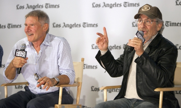
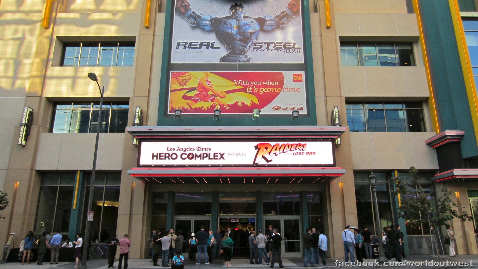
25, 2011: Raiders of the Lost Ark screening with Spielberg
and Ford.
I was one of the lucky few who attended the 7pm Sept. 12th screening
of Raiders of the Lost Ark at the LA Live Theater, with
both Steven Spielberg and Harrison Ford giving a Q&A after
the film. I wanted to wait until a full video was available
online before posting about it, and you can finally find that here.
(Unfortunately embedding was disabled.)
Photo from The Los Angeles
Times.
Ford's
participation was a sorta-kept-secret, but I had heard rumors
from friends prior to the show that he was expected. My most
lasting impressions of the discussion were:
Spielberg's
self-effacing sense of humor, and his surprising frankness
when discussing Indy IV and personal regrets over the
digital enhancements he had made to the re-release of E.T.
Ford's
apparently deliberate delivery of slow, laconic answers to
the questions asked of him; he looked like he knew he was
making the audience laugh, and seemed to have a dry sense
of humor about himself.
Oh
-- and Simon Pegg and Damon Lindelof were hiding in the audience.
As
for the film, the digital print looked gorgeous, and the sound
quality was flawless. Best of all, it still looked like a film
from 1981, with the film's natural grain still in place, but
cleaner and sharper than I'd ever seen it before.
Photo thanks to Jay West. (Adam
wasn't brave enough to bring his own camera.)
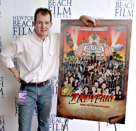
It
was also fun to catch up with some old friends and fellow Indyfans,
namely "The Raiders Guys" Eric Zala and Chris Strompolos,
whose childhood fan film Raiders
of the Lost Ark - The Adaptation has become a little
cinematic legend of its own. We'd been chatting for years, but
this was the first time we all met face to face. I was also
introduced to Charles de Lauzirika, a young film producer whose
documentaries on the making of Blade Runner I long admired.
To
coincide with the film's 30th anniversary (yes, yes, I know
it was actually last June). here are two other articles that
may be of interest:
My
2008 coverage of "crashing" location shooting
on the very last shot done for Indiana Jones and the Kingdom
of the Crystal Skull. This was originally posted in the
forums of TheRaider.net, but it's about time I posted something
here.
Sept.
17, 2011: The Brotherhood and the Shield.
I
just completed a new book cover for Mike Gibney'sThe
Brotherhood and the Shield: The Three Thorns. I was
never quite satisfied with the
original cover, which was done some years ago, and appreciate
Mike allowing me the opportunity to go back and reimagine it.
Check out this page,
which shows the step-by-step process of its creation.
Welcome
to my makeover! I thought that my art
gallery was in need of a little sprucing up, but I also
wanted to keep the previous style and basic layout. I opted
to make the main page a little more "splashy", adding
new graphics, while consolidating some of the pages so that
the overall menu wouldn't be quite as cumbersome. I also thought
that using icons above the banner for my personal links (Facebook,
LinkedIn, guestbook, etc...) helped to separate them from the
art pages, and make navigating a little bit easier. I'm in the
process of making more changes and additions to the site over
the next few weeks, so stay tuned and enjoy!
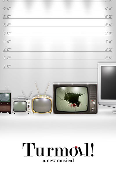
Poster
for Turmoil! A New Musical. I just completed the poster for a theatrical musical (right),
now in workshop. It's a murder mystery/comedy, set in the world
of television soaps.
The
Brotherhood and the Shield: The Three Thorns.
I also just completed a
new book cover for Mike Gibney'sThe Brotherhood and
the Shield: The Three Thorns. I was never quite satisfied
with the
original cover, which was done some years ago, and appreciate
Mike allowing me the opportunity to go back and reimagine it.
I'll be posting more about the cover design -- and the book
series in general -- in the near future.
Sept.
11, 2011
My
thoughts and prayers go to all those we lost on 9/11, their
friends and family, as well as those who are still trying to
find some healing ten years beyond that tragic day.
I
was back on the east coast at the time, visiting my family in
Pennsylvania, and watched everything unfold, as millions did,
live on the television. My mom, sister and I all huddled together,
and dad (thankfully) returned from his New Jersey office and
stayed at home in the days that followed. While I was scared
at the thought of having to fly back to Los Angeles, I realized
how lucky I was to be safe, to have my family safe, and -- luckiest
of all -- to have my friends living and working in New York
safe. (In an extraordinary turn of events, one of my childhood
friends worked in the World Trade Center. When I finally was
able to get through to my home phone's voicemail, I found a
message from him out of the blue, which he had left just the
day before, stating that he was actually on a business trip
in California for the week!)
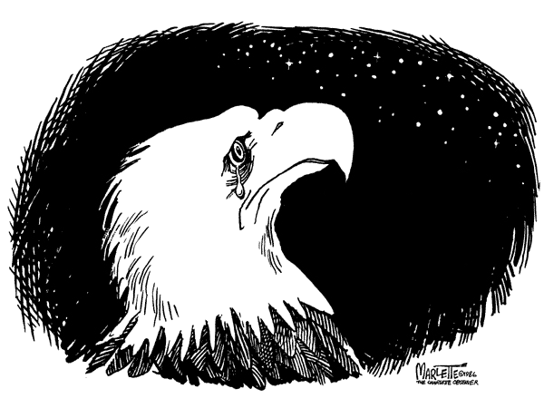
In
2001 this website was in its infancy, and I remember posting
this cartoon image (right) in response to the tragedy. It was
done by legendary cartoonist Doug Marlette in covering the 1986
space shuttle Challenger disaster. The simplicity the image
somehow managed to perfectly express so many feelings -- of
mourning and loss, of patriotism, and of a profound collective
understanding of the human condition.
A
picture can be worth more than a thousand words; it can evoke
a thousand feelings.
In
researching this cartoon for today's post, I was saddened to
learn that Marlette
had died in a traffic accident four years ago. It seems
to be such a trivial, unfitting end to so illustrious a career;
not only had Marlette won the Pulitzer Prize for his cartoons,
but was an award winning author and playwright.
Like
the best of editorial writers, Marlette didn't shy away from
controversial subjects, and in examining them, he not only wanted
people to react, but to make them think. Take,
for example, this story excerpted from The
Cagle Post:
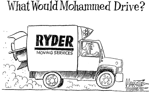
Doug
found himself blasted by the Council on American Islamic
Relations (CAIR) in an e-mail Jihad when he drew a cartoon
with the caption, "What Would Muhammad Drive?" The drawing
showed a man wearing Arab headdress and driving a Ryder
truck (a reference to Oklahoma City bomber, Timothy McVeigh).
It became one of Doug's most famous cartoons and inspired
thousands of angry, threatening e-mails.
Doug
wrote, "I was used to negative reactions from religious
interest groups, but not the kind of sustained violent intensity
of the Islamic threats. The nihilism and culture of death
of a religion that sanctions suicide bombers, and issues
fatwas on people who draw funny pictures, is certainly of
a different order and fanatical magnitude than the protests
of our home-grown religious true believers."
Marlette
continued, "As a child of the segregated South, I am quite
familiar with the damage done to the "good religious people"
of my region when the Ku Klux Klan acted in our name. The
CAIR organization that led the assault (on me), describes
itself as a civil rights advocacy group. Among those whose
"civil rights" they advocated were the convicted bombers
of the World Trade Center in 1993. They cannot be taken
seriously. For many of those who protested my cartoon, recent
émigrés, many highly educated, it was obvious that there
was not that healthy tradition of free inquiry, humor and
irreverence in their background that we have in the west.
There was no Jefferson, Madison, Adams in their intellectual
tradition. Those who have attacked my work, whether on the
right, the left, Republican or Democrat, conservative or
liberal, Protestant, Catholic, Jewish or Muslim, all seem
to experience comic or satirical irreverence as hostility
and hate. When all it is, really, is irreverence. Ink on
paper is only a thought, an idea. Such people fear ideas.
Those who mistake themselves for the God they claim to worship
tend to mistake irreverence for blasphemy."
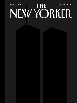
Another
indelible "cartoon" image was, of course, Art Spiegelman
and Françoise Mouly's "black on black" cover for the
Sept. 24th, 2001 issue of The New Yorker:
I
could go on and on about the power of this image, but will instead
defer to this
article, where Mouly reflected on creating the cover:
Ten
years ago, my husband, the cartoonist Art Spiegelman, our
daughter, and I stood four blocks away from the second tower
as we watched it collapse in excruciatingly slow motion.
Later, back in my office, I felt that images were suddenly
powerless to help us understand what had happened. The only
appropriate solution seemed to be to publish no cover image
at allan all-black cover. Then Art suggested adding the
outlines of the two towers, black on black. So from no cover
came a perfect image, which conveyed something about the
unbearable loss of life, the sudden absence in our skyline,
the abrupt tear in the fabric of reality.
Spiegelman,
whose legendary MAUS remains the only comic book to have ever won a Pulitzer
Prize, also wrote the extraordinarily powerful In
the Shadow of No Towers -- both his personal recollection
of what happened that day, and fury over how the Bush administration
exploited the tragedy.
It
may seem a bit inappropriate of me to have segued from the events
of 9/11 to the topic of cartoons, but I feel that such subject
matter -- in stark contrast to those ready to dismiss pen &
ink images as something flippant or inconsequential -- can nevertheless
carry substantial emotional and intellectual weight, and remains
an important medium in addressing both personal and world events.
August
15, 2011:
August
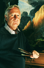
3, 2011: Bob Peak show revisited / Matthew Joseph Peak.
My
follow up to the Bob Peak
exhibit at the Motion Picture Academy is long overdue,
but better late than never. I visited the exhibit twice, and
still can't get over how stunning Peak's work looks in person.
Whereas seeing many other artists' original illustrations up
close tends to reveal their little faults and imperfections,
Peak's paintings and drawings often look better than their final
reproductions.
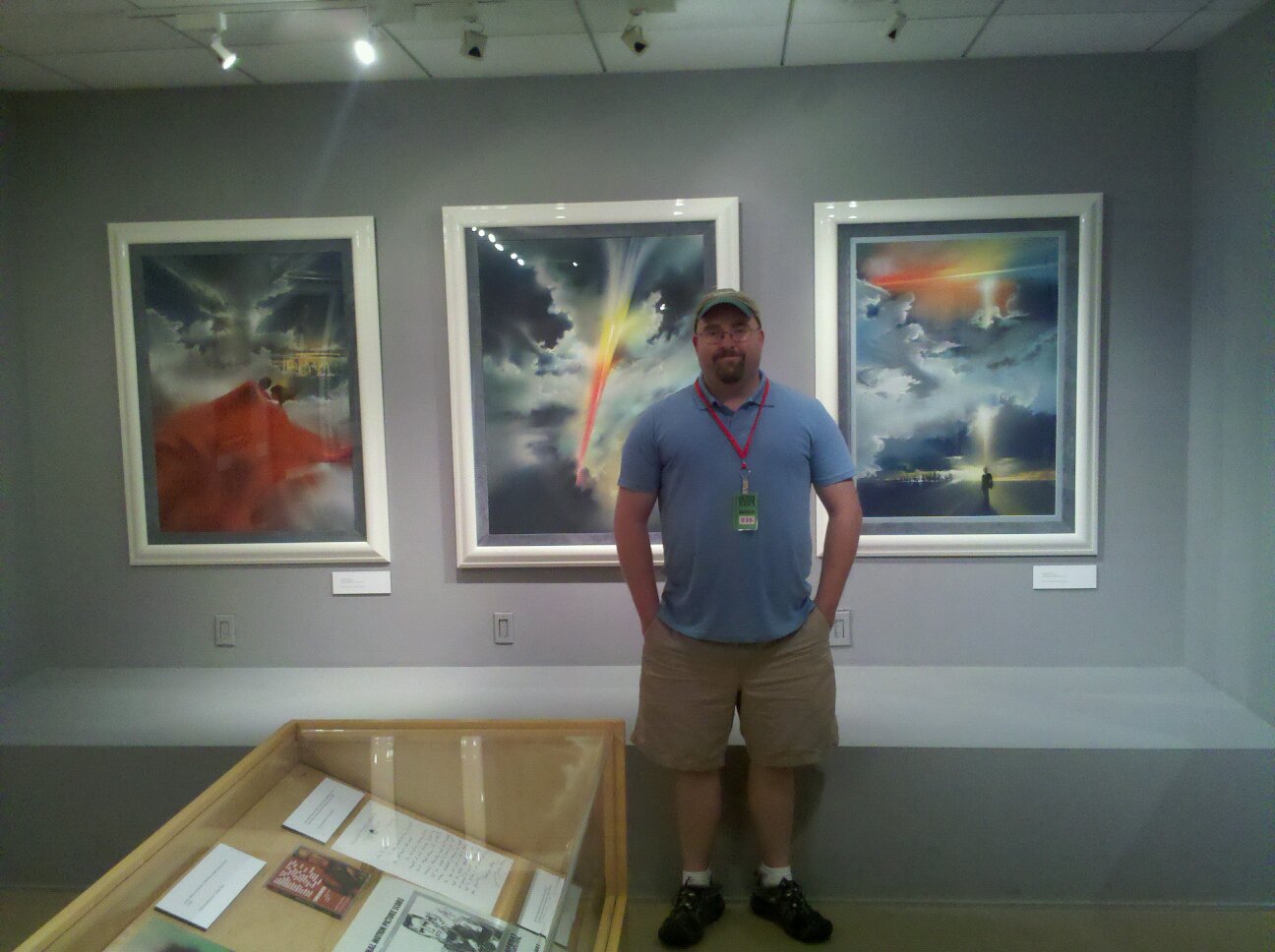
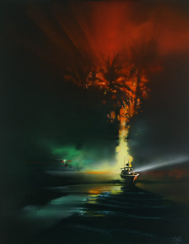
Above,
from left: 1.) Me, full figured a la Marlon Brando, standing
in front of Peak's illustrations for Superman. 2.)
My friend Michael
Gibney, standing in front of Peak's Apocalypse Now painting. 3.) One of Peak's secondary poster designs for Apocalypse Now. 4.) Peak's portrait of Timothy Dalton,
for an unused License to Kill poster concept. The
latter painting was not featured in the exhibit, but it's
one of my favorites of all Peak's work; I always felt it
was a terrible shame that it was rejected in favor of a blander,
far less interesting film campaign.
Recently
I've had several wonderful conversations with Peak's son, Matthew
Joseph, about his father's life, career, and body of
work. Matthew is a celebrated artist in his own right, whose
work I've also long admired. His posters for the original Nightmare
on Elm Street and Rush are classics, showing
some of his father's stylish influence, while bearing a unique
signature all its own.
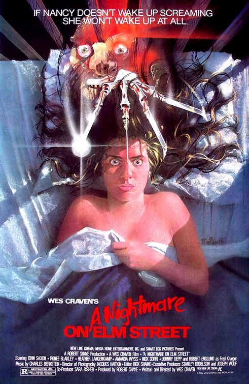
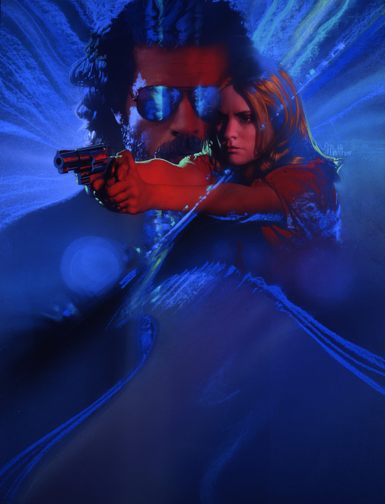
Above,
from left: 1.) Matthew Peak's poster for A Nightmare
on Elm Street, which, as with the film, has become iconic
in the annals of horror. 2.) Matthew's illustration for Rush is among my personal favorite posters of the
last quarter century, showing stylistic flourishes reminiscent
of his late father, but also his own personal touch. 3.)
Matthew's album cover illustration for the CD soundtrack
to Psycho. Film score lovers will almost certainly
recognize the artist's work, especially for numerous Varese
Sarabande and Star Trek albums.
I
first met Matthew at the opening reception of his father's exhibit
at the Nucleus Gallery, and admitted, rather embarassingly,
that when I was younger, I had often mistakenly attributed his
work to his father. I didn't mean this as a slight in any way,
but rather as a towering compliment, having held their collective
works in such a high regard. (Though it took me a few long,
rambling, awkward sentences to finally get that point across.)
Matthew described what it was like growing up, learning about
art under his dad's tutelage. How
extraordinary it must have been to have had the elder Peak as
a teacher!
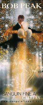
Matthew
recently created www.BobPeak.net,
an official resource into his late father's work. And for you
art collectors out there, check out THE
SANGUIN FINE ART GALLERY, where high-quality prints and originals of both Peaks' works are available
for purchase!
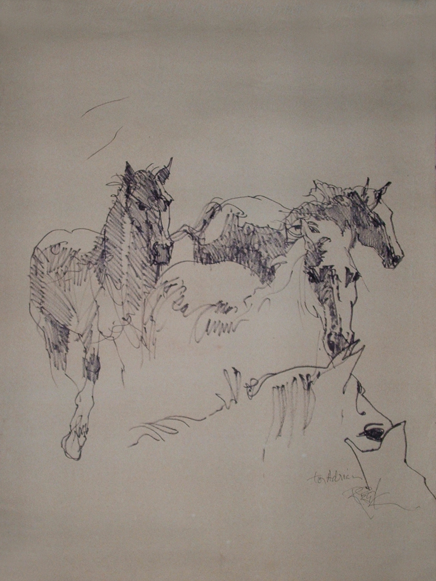
Shortly
before the Peak exhibit at the Motion Picture Academy came to
a close, I managed to splurge on an eBay auction of one of Bob
Peak's original sketches (image below). To the seller, the sketch
had a value of $55. To me, it was absolutely, irrefutably priceless.
July
31, 2011: More poster art news -- BBC article, and remembering
Kazuhiko Sano (1952-2011).
BBC
News featured this
little story about movie poster artists in their ENTERTAINMENT
& ARTS section back on July 22nd. I was happy that they
mentioned Richard Amsel by name, along with a small pic of his
rerelease poster for Raiders of the Lost Ark. I later
learned, however, that the original article had credited the
artwork to Drew Struzan, and it was only after Dorian Hannaway
contacted them that Richard's name was restored to its rightful
place. (Honestly, if you're going to write a story on movie
poster artists, a little research would do you well. Not that
writer Kev Geoghegan would have had to look very far; the AMSEL
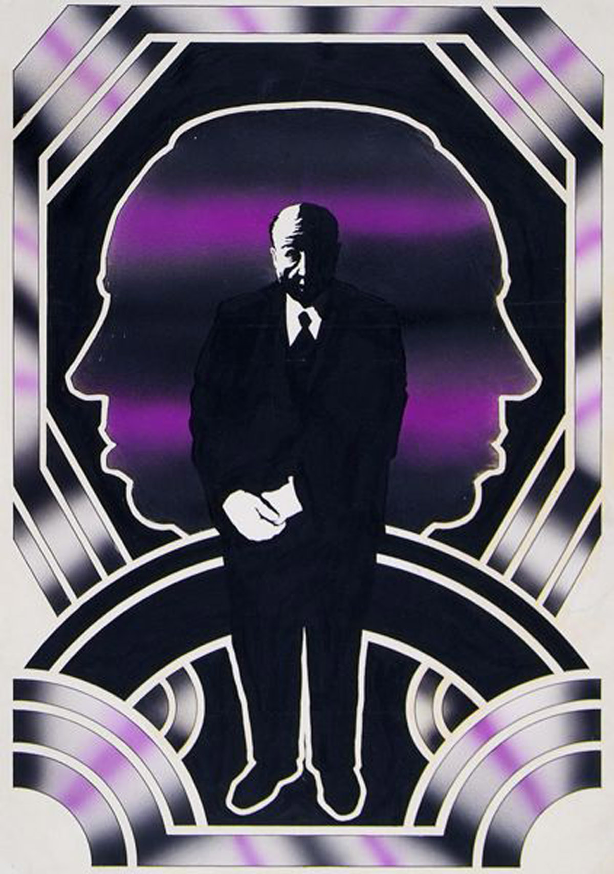
name is on the lower right corner of the piece!)
Remembering
Kazuhiko Sano (1952-2011)
In
sadder news, I recently learned that artist Kazuhiko Sano died
May 31st after a two year battle with cancer.
For
those unfamiliar with the name, you've likely seen his work
at one time or another. Sano created illustrations for organizations
including National Geographic, the Walt Disney Co., Paramount
Pictures, Chevron, Coca Cola and General Electric, among others.
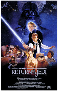
His most well-known works include movie posters for "Return
of the Jedi," and a commemorative postage stamp featuring Frank
Sinatra.
Though
his name may not be as readily known as some other famous
Star Wars poster illustrators, Kazuhiko Sano shares a special
place in the hearts of many Star Wars fans for his stunning
depiction of Luke, Han, Leia, Lando and others for the Return
of the Jedi Style "B" poster, released in 1983.
Sano,
who taught illustration at the Academy of Art College in San
Francisco, died of cancer last week.
Sano,
who was born in Tokyo in 1952, was a prolific illustrator,
lending his talents to clients such as the National Geographic
Society, United States Postal Service, the Walt Disney Company,
Coca-Cola, American Red Cross, and scores of others. His website
provides a generous sample of many of his professional and
personal works.
As
we remember Sano's iconic contribution to Star Wars poster
imagery, we should also acknowledge the artist's other works
set in our favorite faraway galaxy. The following three illustrations
showcase additional Star Wars inspired artworks done by Sano,
beginning with a trade magazine ad commissioned by George
Lucas during the early '80s to congratulate friend Steven
Spielberg on his E.T. The Extraterrestrial box office success.
After
debating the idea for years, I've finally set up a storefront
on the Imagekind website where prints of select pieces
of my artwork can be available for purchase. :)
July
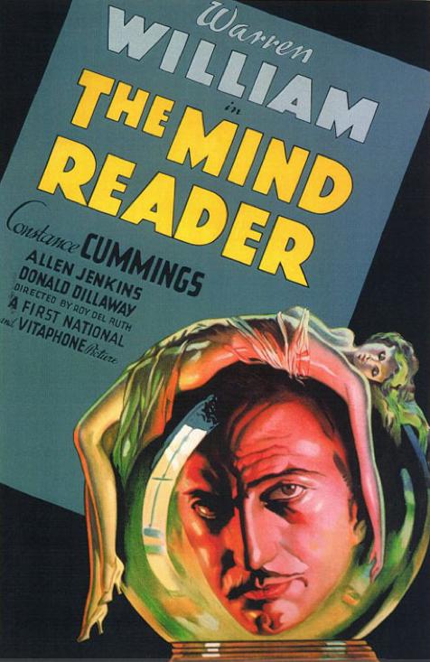
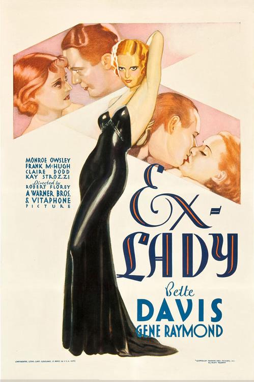
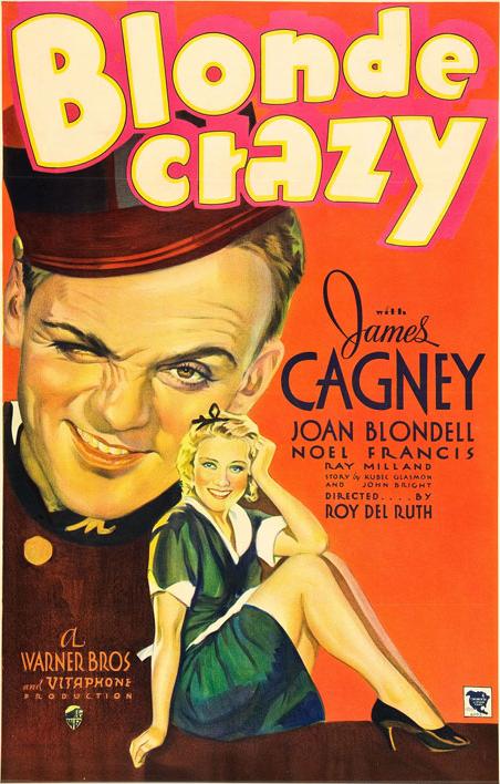
22, 2011: Pushing the boundaries of censorship.
David
Byrd sent a few of these to me -- some grand old movie posters for
films made in the early 1930's, right before the Motion
Picture Production Code was effectively enforced...for
the apparent betterment of corruptible youths and salaciously
sensitive persons across America.
It's surprising to see just how suggestive these films were
for their time; even the titles give reason to pause. While
cinema sex and violence seem to have escalated several hundred
times over throughout the past eight decades or so, it's still
pretty impressive that such films were not only able to be
made within the studio system, but feature marquee stars,
to boot.
No
doubt that that ever-devoted Republican Presbyterian himself,
the late Will Hayes (who was paid
a then staggering annual sum of $100,000 -- still a pretty decent
amount in my book), frowned on such indecent material.
Enjoy,
I say!
July
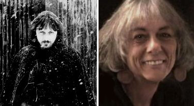
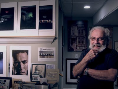
21, 2011: Sweet Byrd of youth...
Just
a reminder that tomorrow is the final day of my friend David
Byrd's art show at Brand
Library & Art Center. The gallery closes at 5pm, so
if you can make a last-minute visit, you'd better hurry!
I'll
be helping David take down the installation on Saturday. I've
been excited enough just at having one painting currently on
display in a show -- while David has an entire exhibit of his
lifelong career. Talk about putting things in perspective!
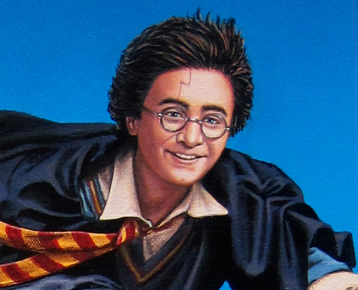
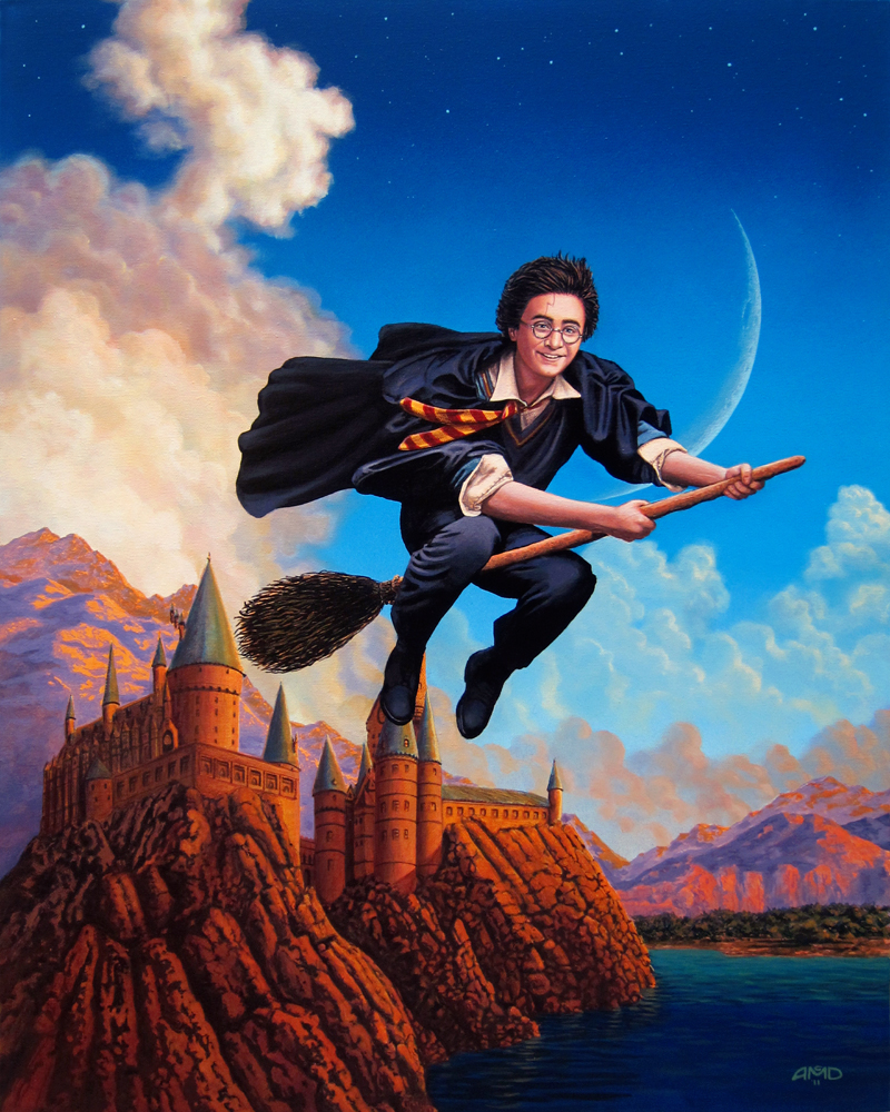
July
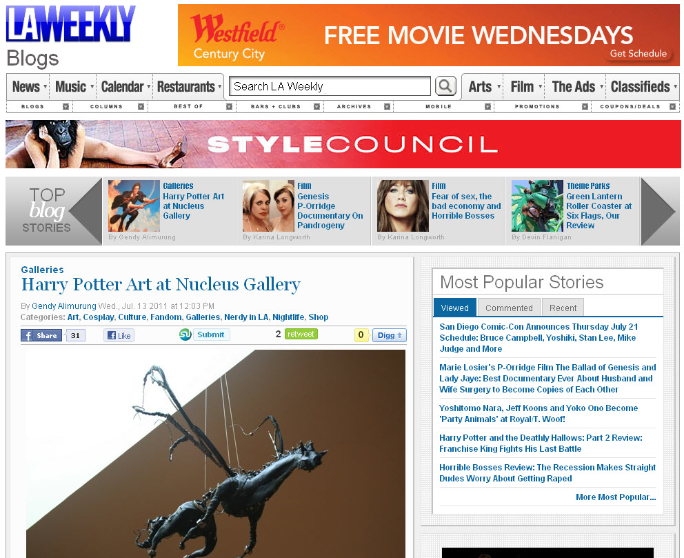
13, 2011: More Potter press; LA Weekly, etc...
The
online version of The
LA Weekly has actually featured my artwork as the
thumbnail image to their coverage of the Harry Potter art exhibit.
_
And
in case you wanted more, here's a new YouTube video about the
show, with my work shown at the 2:29 mark. Just try to forget
the creepy screengrab of the guy with pink hair. :)
July
10, 2011: Welcome back, Potter!
What
a day. Saw the last Harry Potter film at a special WB
screening inside the Arclight in the morning (yes, it was good),
an art lecture by my friend David Byrd in the afternoon (also
good), and finally the opening of the Harry Potter tribute art
exhibition at Gallery
Nucleus tonight -- which had at least several hundred attendees,
more than I ever possibly expected. More info to come.
Very
special thanks to all my friends who showed up, even though
the masses of other people -- and yes, there were indeed masses!
-- prevented my guests from being able to set so much as a foot
inside the gallery. To them, we'll certainly have to go back
when things are a little less crowded. (Lunch is on me, provided
we eat cheap!)
July
11th UPDATE: While I'm still trying to figure out how to
edit some of the video footage I shot, here's a decent YouTube
clip of the show -- which proves just how long the line was!
You can catch a quick glimpse of my piece at the 2:31 mark.
My
favorite part of the event, aside from the warm support my friends
showed me, was the opportunity to talk to some of the other
contributing artists. Some were beginners, others old pros,
and all were inspiring company. I managed to chat with (and
pay a little idol worship to) artists Drew
Struzan and William
Stout, whose works I revered all through my childhood. The
funniest part of the evening was just as I arrived at the gallery
and saw my painting on the wall for the first time. I was happy
that it was displayed in a fairly prominent place, where a number
of people were taking photos of it. As I stood by my artwork,
a voice from behind angrily exclaimed, "$3,600 for that???" I turned around to discover that it was none other than
my friend Brandon
Kleyla, the director of Indyfans,
looking back at me with an evil grin on his face.
July
1, 2011
TOTAL FILM article: The 30 Greatest Hand Drawn
Movie Posters.
TOTAL
FILM's George Wales has written an
interesting article on what he considers to be the 30
greatest hand drawn movie posters. While many of Wales'
choices made me wince -- the omission of works from artists
like Bob Peak, in favor of Z-grade, below Grindhouse level dreck
(Lesbian Vampire Killers? Are you kidding me?) is an
unforgiveable sin in my eyes -- I was admittedly happy to see
that artists like John Alvin and Drew Struzan were well represented.
And
what poster was deemed
#1, praytell? I'll give you a hint: It's something I agree
with wholeheartedly. :)
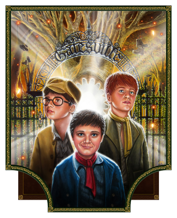
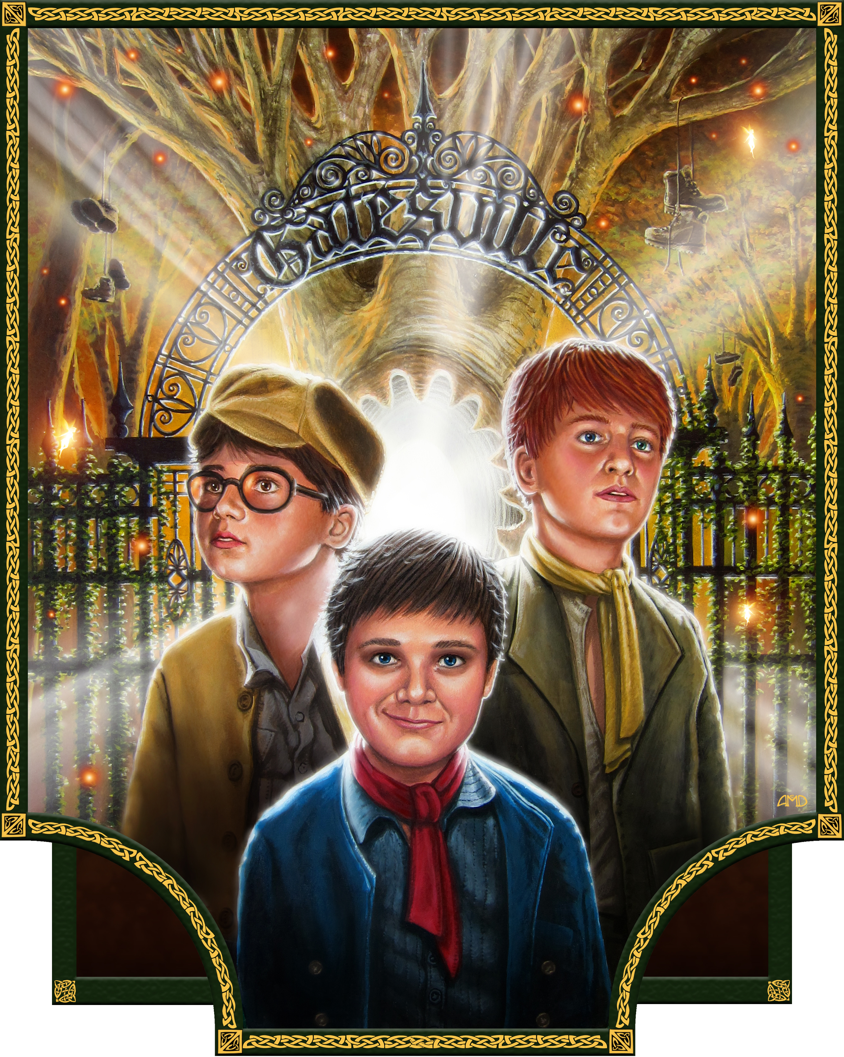
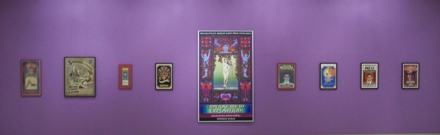
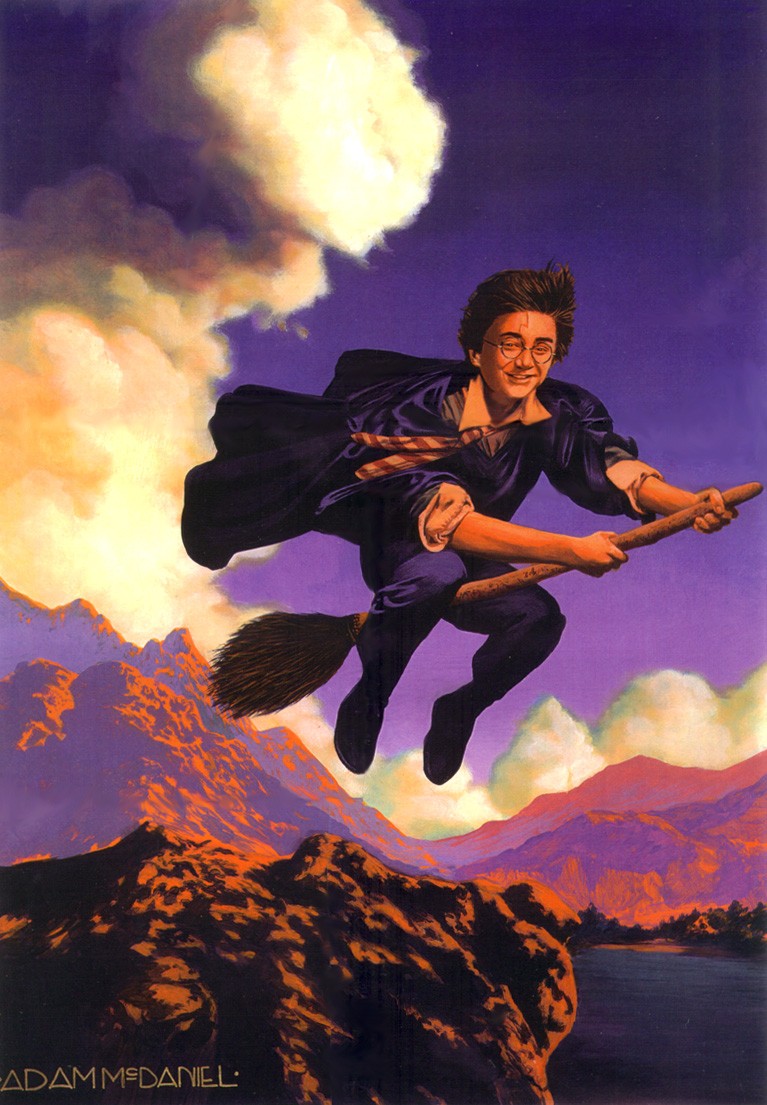
June 25, 2011 Gallery
Nucleus "Harry Potter" art event!
It
was about a year ago (how time flies!)
that one of my paintings was selected by Gallery Nucleus for their
upcoming Harry
Potter tribute art exhibition. I've been a longtime fan
of the gallery, which has showcased work from some of my favorite
artists and illustrators. Naturally I was thrilled at the opportunity
to have something of my own put on display there, but I faced
a big problem: I had already sold the original painting in question
-- a fact I curiously failed to mention when I submitted a pic
of the painting for their consideration.
With
the submission deadline approaching, I decided to not only repaint
the piece, but try to make it better. The original only took
a week or so to do, outside of my full time job. The new one
took considerably longer, as I wanted to add far more
detail and complexity.
2001
2011
This
shall be the first time my work is featured in a gallery in
California, alongside other artists such as Drew Struzan (who did the first films poster), Mary Grand Pre (who
illustrated the American book covers of the series), and fantasy
artist William Stout. I wont say my work is as good
as those other artists, but I can definitely guarantee
that its a lot less expensive!
I'll
be attending the opening night reception party on July 9th,
so by all means, stop by and say hello! The gallery will be
hosting Harry Potter themed contests and prize giveaways, so
it's fun for the whole family. If you can't make it, the show
is open through August 1st; those Harry Potter fans willing
to purchase artwork are particularly welcome. :)
GALLERY
NUCLEUS
210 East Main Street
Alhambra, CA 91801
July 9 - August 1, 2011
June
12, 2011 Happy
30th birthday to the film that made me fall in love with the
movies...
May
28, 2011
R.I.P.: Jeffrey Catherine Jones (1947-2011)
And
now we've lost another art giant.
Legendary
fantasy artist Jeffrey Catherine Jones passed away on
May 19th, from severe emphysema and bronchitis as well as hardening
of the arteries around the heart.
Born
Jeffrey Durwood Jones in 1944, Jones celebrated a long career
whose highlights included a 1970s run doing cover paintings
for major fantasy novels like Fritz Leiber's "Fafhrd and the
Gray Mouser" and a number of comics including "Idyl" for "National
Lampoons" and "I'm Age" for "Heavy Metal." While the world of
fantasy illustration and comics proper intersect less than one
might imagine, Jones was a figure whose work in both forms left
an impression on her peers. Her work was notably praised by
recently deceased fantasy legend Frank Frazetta as "the greatest
living painter."
Jones
also shared space with a slew of legendary comics talent in
the '70s under the name The Studio a group which included
Mike Kaluta, Bernie Wrightson and Barry Windsor-Smith. Jones
is also a rare example of a transgendered artist in the genre
world. Though a string of personal and financial issues saw
her fall on hard times in the early 2000s, recent years had
seen stable living conditions and steady production of new work
from the artist.
April
1, 2011
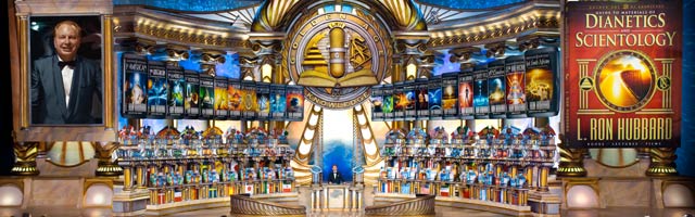
Consider this my mea culpa of 2011...
For
years I've mocked, ridiculed, and have been a strong opponent
of Scientology, but I'm beginning to understand that my views
were based on a biased, skewed, severe misunderstanding of The
Faith. I hope my co-workers, friends, family & loved ones will
understand and accept The Spiritual Journey I've now embraced,
and my pursuit of True Freedom in this Spiritual Existence....
From
the Scientology website:
A
civilization without insanity, without criminals and without
war, where the able can prosper and honest beings can have
rights, and where Man is free to rise to greater heights,
are the aims of Scientology. First announced to an enturbulated
world in 1950, these aims are well within the grasp of our
technology. Nonpolitical in nature, Scientology welcomes any
individual of any creed, race or nation. We seek no revolution.
We seek only evolution to higher states of being for the individual
and for society. We are achieving our aims. After endless
millennia of ignorance about himself, his mind and the universe,
a breakthrough has been made for Man. Other efforts Man has
made have been surpassed. The combined truths of fifty thousand
years of thinking men, distilled and amplified by new discoveries
about Man have made for this success.
Scientology
is the most vital movement on Earth today. In a turbulent
world the job is not easy. But then, if it were, we wouldnt
have to be doing it. We respect Man and believe he is worthy
of help. We respect you and believe you too can help. Scientology
does not owe its help. We have done nothing to cause us to
propitiate. Had we done so we would not now be bright enough
to do what we are doing. Man suspects all offers of help.
He has often been betrayed, his confidence shattered. Too
frequently he has given his trust and been betrayed. We may
err, for we build a world with broken straws. But we will
never betray your faith in us so long as you are one of us.
The sun never sets on Scientology. And may a new day dawn
for you, for those you love and for Man. Our aims are simple
if great. And we will succeed, and are succeeding at each
new revolution of the Earth. Your help is acceptable to us.
Our help is yours. And if you ever fuck with us, we'll sue
your ass into bankruptcy, have your family and friends shun
your existance, investigate and exploit every aspect of your
personal life, and leave you for dead in one of our faraway
detoxification centers.
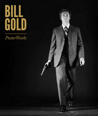
March
8, 2011 Bill
Gold: Posterworks
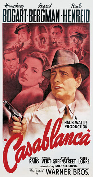
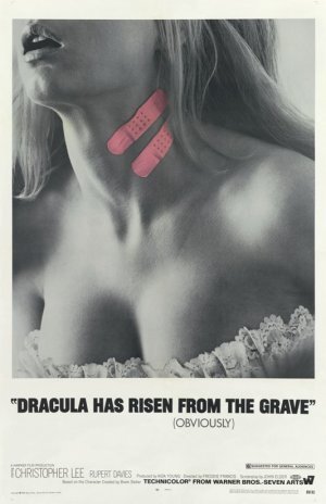
In
a career spanning six decades, Bill
Gold has worked on some of the most famous movie posters
of all time. Some of them he painted himself (CASABLANCA, at
right), others he conceived (THE STING, CAMELOT), and some of
them he photographed (FOR YOUR EYES ONLY -- perhaps the most
famous, and certainly the most controversial, poster design
of the James Bond series). Through them all, Gold displays not
only a strong artistic sensibility, but an innate power to capture
the spirit and personality of a film within a poster. (Not to
mention a cute sense of humor, as his poster for DRACULA HAS
RISEN FROM THE GRAVE demonstrates; it helped to make the little
Hammer horror film a big commercial hit.)
I
was fortunate to attend a Warner Bros. panel this afternoon,
where Gold, now 90 years young, discussed his career and longstanding
relationship with the studio. Most interesting was his personal
reflections on working with different directors. Clint Eastwood,
with whom Gold collaborated from DIRTY HARRY through MYSTIC
RIVER, seemed to have a "less is more", easygoing
approach, while Stanley Kubrick, in developing the campaigns
for A CLOCKWORK ORANGE and BARRY LYNDON, was a maddening perfectionist
-- requiring a WB courier to personally deliver artwork by air
from New York to England, back and forth several times.
I
asked Gold about what it was like to collaborate with other
illustrators like Bob Peak and Richard Amsel, whom Gold worked
with on CAMELOT and THE STING, respectively. Gold was a fan
of both artists, Peak being his most personal favorite, and
he stated that while creative collaboration can have its ups
and downs, in the end it's all about finding the right person
for the right style of job.
At
the end of the presentation, someone asked Gold if he had any
advice for aspiring artists looking to get their feet in the
door within the industry -- and on movie posters in particular.
His reply was both humorous and telling: "Learn to make
good coffee."
Gold
has a new book out, BILL
GOLD: POSTERWORKS -- a massively illustrated, 448 page
limited edition book chronicling his career, work, and artistic
process. It runs a steep price (about $650), but is lavish and
beautifully bound and encased.
Oh,
what I'd give to be a rich man... Or even middle class... Now
kindly excuse me while I sulk and heat up the nearby coffeemaker.
For
more info, check out these links:
The
artist's website.
Interesting article on Gold's career.
Feb.
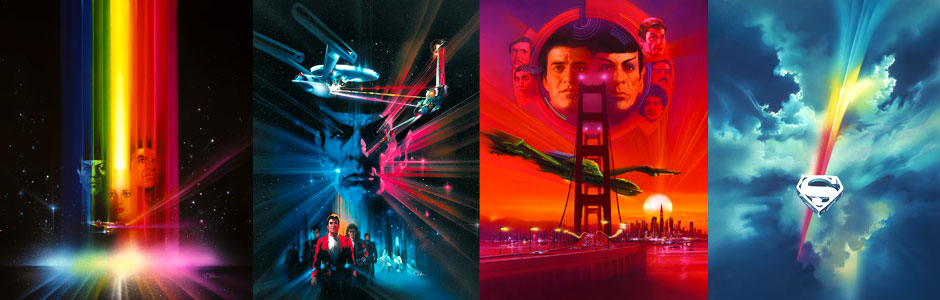
21, 2011 Bob
Peak exhibit at the Academy of Motion Picture Arts & Sciences.
I've
often raved on this site about the art of Bob
Peak, and for good reason. His work dominated
the sixties and seventies, with memorable contributions to films
like SUPERMAN, APOCALYPSE NOW, CAMELOT, PENNIES FROM HEAVEN,
and the first five STAR TREK films.
For
those who missed out on the 2009 exhibit at Gallery Nucleus,
fear not: an even larger, more comprehensive exhibit is currently
showing in Los Angeles at the Academy
of Motion Picture Arts & Sciences.
Bob
Peak: Creating the Modern Movie Poster
January 20 through April 17, 2011
8949 Wilshire Boulevard Beverly Hills, California 90211
Public viewing hours Tuesday Friday: 10 a.m. to 5 p.m.
Saturday Sunday: Noon to 6 p.m.
Closed Mondays.
From
the AMPAS website:
Artist
and designer Bob Peak (19271992) has been hailed as the
father of the modern Hollywood movie poster. His unique
style of motion picture advertising imagery will be on display
in the Academys Fourth Floor Gallery, where colorful, graphically
complex original paintings done for iconic movie poster
campaigns are shown alongside the final one-sheet posters
for such titles as My Fair Lady, Camelot, Superman,
Star Trek The Motion Picture and Apocalypse Now. Multiple
designs are presented for nearly 50 films from among the
more than 100 campaigns he designed in the 1960s, 70s and
80s. Bob Peak Among his many awards and accolades, Peak
received the Key Art Lifetime Achievement Award from The
Hollywood Reporter in 1992 for 30 years of outstanding contributions
to the film industry. He was only the second person to receive
this honor; the first, just the year before, was another
legendary graphic designer, Saul Bass.
Also,
I'm especially happy to learn on the artist's website that,
after years of delays, a comprehensive oversize coffee table
book on the Life and Art of Bob Peak is being
published and will be available in the fall of 2011.
Feb.
20, 2011 Fan
made poster art on Moviephone.
Moviephone
has this
great link to "The Best Movie Art Ever",
a selection of fan made movie posters from very gifted artists/illustrators
of a wide variety of styles and techniques. It's certainly worth
a look, as in some cases the concept posters are even more imaginative
than the official ones. (This one for INCEPTION, below right,
is such an example.)
Feb.
18, 2011 The
downside to having an online art portfolio...
...is
that it makes your work susceptible to copyright theft at the
hands of unsavory individuals. Take, for example, this less-than-lovely
looking T-shirt being
sold on eBay by a user named teesmeplease416,
for $19.95. They've already sold one, and state that at least
ten more are available. On the plus side, the shirt is "100%
cotton preshrunk", and is "printed using the highest
quality ink to garment technology..." The downside is that
they were using this artwork without my knowledge or consent.
Yes,
I've already reported this to the powers that be at eBay, though
I doubt it will have any effect on teesmeplease416's whopping
808 feedback rating.
This
is not the first time this artwork has unexpectedly
turned up somewhere. I'm actually quite flattered
that people think it's good enough to use, though admittedly
it'd be nice to get a piece of the $19.95 action.
Feb.
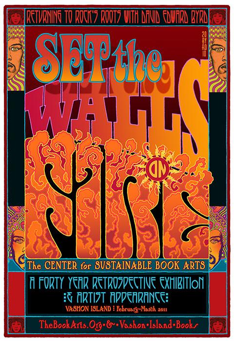
9, 2011 Upcoming
David Edward Byrd art exhibits.
David
Edward Byrdinformed me that he has two upcoming
art shows for 2011:
The
first, SET THE WALLS ON FIRE: Returning to Rock's Roots
with Artist David Edward Byrd, is on Vashon Island off
the north coast of Seattle. It's "a charming artist community
with many Galleries and B&Bs," David writes.
SET
THE WALLS ON FIRE
Saturday, February 26, 2011
Vashon Island Books Gallery
22100 Vashon Hwy SW
Vashon, WA 98070
Phone: 206.408.7017 http://thebookarts.org
The
second event, at Brand
Library in Glendale, CA, will literally be in my neck of
the woods; I could walk to it from my own home! This exhibition
will include several public programs, including a concert featuring
favorites from some of the musical theater works for which David
has created graphics, as well as exciting lectures on the history
of poster design. A poster designed by David for the exhibition
will also be produced and available to the public.
The
Byrd Show: 40 Years of Posters & Graphic Design
On view: June 11 - July 22, 2011
Reception: Saturday, June 11, 6-9 pm
For
more about the artist David Edward Byrd, visit his website.
I'm
happy to learn that my screenplay "In the Footsteps
of Thaddeus Thackeray" has been chosen as a semi-finalist
by Amazon
Studios, and was among their very first batch of script
selections.
This
particular script holds a lot of meaning to me, and over the
years it's been tossed back and forth by a lot of different
hands. Alas, nothing ever came to fruition. While I'm certainly
not holding my breath or quitting my day job, I am pleased that
many who have read the story (including this
one) were genuinely entertained by it.
2/5/2011
UPDATE:
Shortly
after this news broke, Amazon announced a separate contest for
the best videotaped reading of one of the semifinalist scripts.
The biggest catch was that it had a deadline of two weeks.
So...thinking
that my script had a good chance for this kind of venue (it's
a crowd pleaser, if I do say so myself), I called up friends,
coworkers, actors...made arrangements for equipment...a shooting
location...pulled any and every favor I could to muster to prep,
shoot, and edit a quality reading in less than two weeks' time.
It's a harder task than you'd think, but I was amazed and truly
touched by people's willingness to come together and help me
out, for no money and on such short notice.
That's
the good news. The bad news is that, less than four days before
our shoot was to happen, I noticed a small, fine-print clause
within Amazon Studios' voluminous guidelines -- a clause that
specifically stated Warner Bros. employees were inelible from
participating in the contest.
Yup,
that meant Warner Bros. employees like me.
Oh
well, I figured. Better to have learned that before the reading than to have had everyone go through with it, and
only then discover that our collective efforts didn't
qualify.
To
all my friends and colleagues who supported me and volunteered
your time and talents, I can not thank you enough. That alone,
more than the contest itself, has made this whole experience
very, very worth it. :)
Jan.
15, 2011 They've
made a house a home...and a work of art.
Kudos
to my
friends David
Edward ByrdandJolino
Beserra, whose home was prominently featured in today's LA
TIMES. Their beautiful house is a feast for the eyes,
and in a very fun, colorful way.
From
the online article:
Consider
the whimsy that frames the hearth in David Edward Byrd and
Jolino Beserra's 1928 Spanish bungalow. Clothed in broken
ceramics and found and treasured objects, the fireplace resembles
an outsize toy. The swirled mosaic pattern and jumble of shiny
fun make one suspect it's crowded with spirits.
Beserra,
left, was influenced by Watts Towers creator Simon Rodia.
"I volunteered for a summer helping with restoration in 1989
and loved the fluidity of his work," says Beserra, who calls
himself a consummate "puzzler." Other influences include Spanish
architect Antoni Gaudi and Philadelphia mosaic artist Isaiah
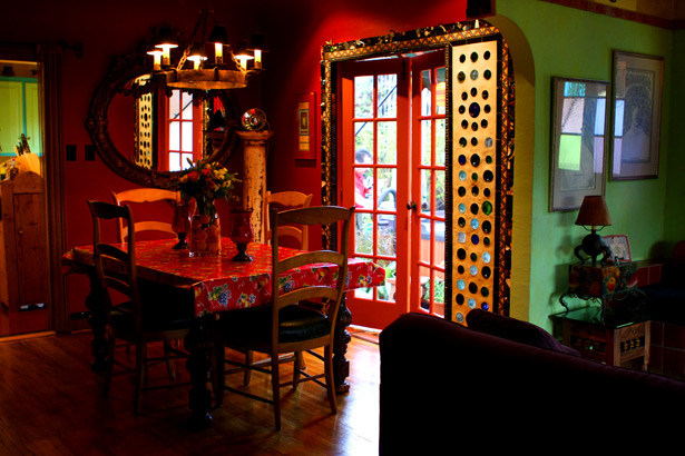
Zagar. Beserra's partner, David Edward Bryd, right, created
posters for Jimi Hendrix, the Who, the Grateful Dead, Jefferson
Airplane, the Woodstock music festival and Broadway plays;
he was a senior illustrator for Warner Bros. for 11 years.
It's
been a personal pleasure for me to know David and Jolino, and
every time I visit, they welcome me with a warmth and friendliness
that even their home seems to compliment.
__
Jan.
15, 2011 R.I.P.:
Diana Blake (1964-2010)
Just
over an hour ago, I learned of the passing of Diana Blake, whom
I worked with at Soundelux from 2000-2002. She died December
30th, and was only 46 years old.
She
and I worked closely together, and I'll never forget her strong
sense of humor, nor the magical spark she shared with her daughter,
Taylor -- whom I'd sometimes informally babysit whenever Diana
brought her to the office.
My
deepest condolences go out to her family and friends during
this heartbreaking time. You are all in my prayers.
Fare
thee well, Diana. You
left us far, far too soon.
Jan.
1, 2011
Happy
New Year!
The
snowstorms hitting the east coast caused my stay to be extended
by almost another week; fortunately, my office was closed anyway,
and not only did it give me the chance to spend more time with
family, but also see (and shovel) the snowfall that southern
California living has deprived me of for almost 15 years. (To
see my personal pics, check out my Facebook page, as they're too numerous to post here.)
I
was also able to visit two art/illustration galleries I'd longed
to see. The first was ILLUSTRATION
HOUSE in the Chelsea district of NYC. (Note to self, for
future reference: Next time you visit FAO Schwartz the day before
Xmas Eve, make sure to wear steel tipped shoes to protect your
toes from being repeatedly stepped on.)
The
second was THE ILLUSTRATED
GALLERY. I first heard of it through Michael Amsel back
in December, as he informed me that a number of Richard
Amsel's original pieces were now available there.
Its
location in Fort Washington, PA, struck me as more than a bit
inconspicuous, housed in a commercial/industrial area right
smack next to a YMCA, of all places. But after meeting gallery
owner Jordy Berman, and seeing the collection, I realised that
it's truly a labor of love. Just as you shouldn't judge a book
by its cover, you shouldn't judge an art gallery by the walls
that house it so much as the art it contains.
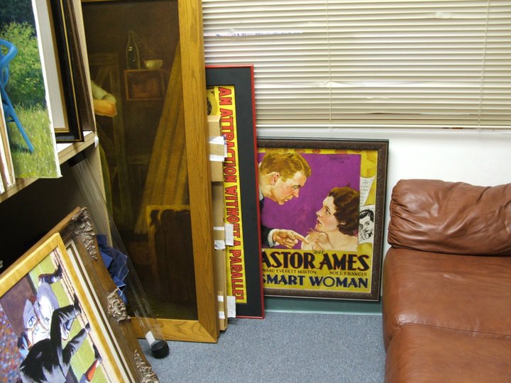
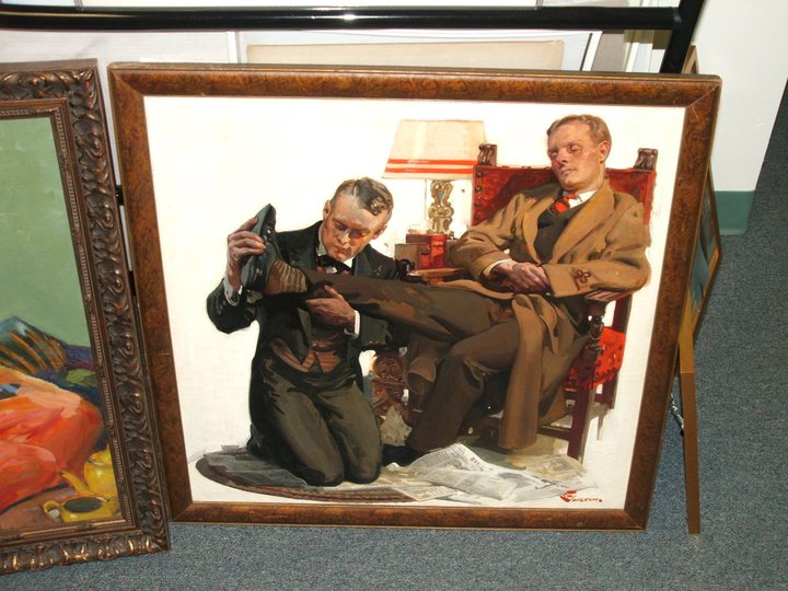
Indeed,
Berman's gallery is one of the largest private collections of
American illustration I've ever seen. Here are over 800 pieces,
many from the Golden Age of Illustration -- including such legends
such as Norman
Rockwell, Howard
Pyle, J.C.
Leyendecker, F.X.
Leyendecker, and Maxfield
Parrish. With
that kind of monumental collection, I can't believe I've never
heard of the gallery before! (Proof I've been in California
too long.) What years of my life I'd gladly sacrifice to be
able to afford one or two of these. Perhaps it's time I play
the lottery...
_
__
__
_
_
__
__
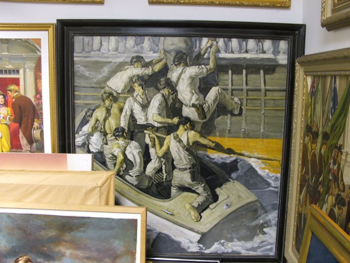
_
Assorted
pics of Berman's gallery.
Bottom left: An original J.C. Leyendecker.
Bottom right: Two of Amsel's orignal pieces.
Berman
was very gracious and cordial; he's been collection illustration
since the 1970's, and it's become a passion of his for quite
some time. Coincidentally, he was a friend of the Amsels, but
wasn't too familar with Richard's work until the artist's death.
I've updated my gallery pages to include new and corrected information
on Amsel's pieces.
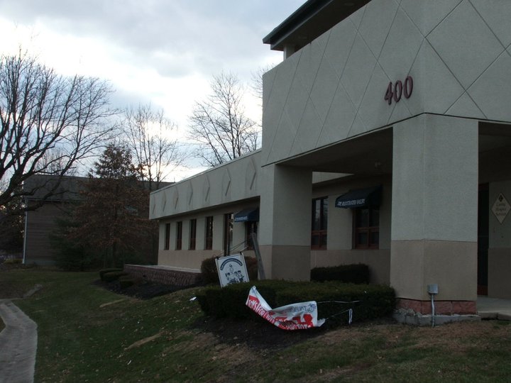
The Illustrated Gallery
400 Commerce Drive, Suite B
Fort Washington, PA 19034
215.740.0205
www.illustratedgallery.com

 Like
H.R. Giger was to Alien, Italian concept artist Ul
de Rico (aka Ulderico Gropplero di Troppenburg) was an instrumental
creative factor in bringing the film's unique, one of a kind
vision to life. When I first saw the movie at 11 years old,
the lush, colorful landscapes seemed oddly familiar, but I couldn't
quite understand why; I'd certainly never seen another movie
that looked that way before.
Like
H.R. Giger was to Alien, Italian concept artist Ul
de Rico (aka Ulderico Gropplero di Troppenburg) was an instrumental
creative factor in bringing the film's unique, one of a kind
vision to life. When I first saw the movie at 11 years old,
the lush, colorful landscapes seemed oddly familiar, but I couldn't
quite understand why; I'd certainly never seen another movie
that looked that way before. It
was some years later that I discovered the reason. De Rico was
also the artist and illustrator of
It
was some years later that I discovered the reason. De Rico was
also the artist and illustrator of 


 Though
his name may not be as readily known as some other famous
Star Wars poster illustrators, Kazuhiko Sano shares a special
place in the hearts of many Star Wars fans for his stunning
depiction of Luke, Han, Leia, Lando and others for the Return
of the Jedi Style "B" poster, released in 1983.
Though
his name may not be as readily known as some other famous
Star Wars poster illustrators, Kazuhiko Sano shares a special
place in the hearts of many Star Wars fans for his stunning
depiction of Luke, Han, Leia, Lando and others for the Return
of the Jedi Style "B" poster, released in 1983. 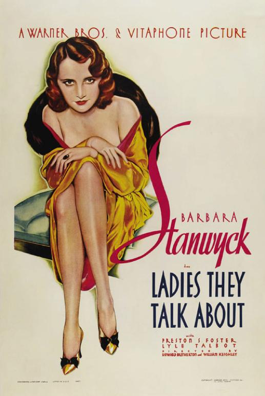

.jpg)
.jpg)

 Artist
and designer Bob Peak (19271992) has been hailed as the
father of the modern Hollywood movie poster. His unique
style of motion picture advertising imagery will be on display
in the Academys Fourth Floor Gallery, where colorful, graphically
complex original paintings done for iconic movie poster
campaigns are shown alongside the final one-sheet posters
for such titles as My Fair Lady, Camelot, Superman,
Star Trek The Motion Picture and Apocalypse Now. Multiple
designs are presented for nearly 50 films from among the
more than 100 campaigns he designed in the 1960s, 70s and
80s. Bob Peak Among his many awards and accolades, Peak
received the Key Art Lifetime Achievement Award from The
Hollywood Reporter in 1992 for 30 years of outstanding contributions
to the film industry. He was only the second person to receive
this honor; the first, just the year before, was another
legendary graphic designer, Saul Bass.
Artist
and designer Bob Peak (19271992) has been hailed as the
father of the modern Hollywood movie poster. His unique
style of motion picture advertising imagery will be on display
in the Academys Fourth Floor Gallery, where colorful, graphically
complex original paintings done for iconic movie poster
campaigns are shown alongside the final one-sheet posters
for such titles as My Fair Lady, Camelot, Superman,
Star Trek The Motion Picture and Apocalypse Now. Multiple
designs are presented for nearly 50 films from among the
more than 100 campaigns he designed in the 1960s, 70s and
80s. Bob Peak Among his many awards and accolades, Peak
received the Key Art Lifetime Achievement Award from The
Hollywood Reporter in 1992 for 30 years of outstanding contributions
to the film industry. He was only the second person to receive
this honor; the first, just the year before, was another
legendary graphic designer, Saul Bass.

 I'm
happy to learn that my screenplay "In the Footsteps
of Thaddeus Thackeray" has been chosen as a semi-finalist
by
I'm
happy to learn that my screenplay "In the Footsteps
of Thaddeus Thackeray" has been chosen as a semi-finalist
by 


