Revisiting
THE BROTHERHOOD AND THE SHIELD:
THE THREE THORNS
Some years
ago, my good friend Mike Gibney asked me to illustrate the first
cover of his book series, The Brotherhood and the Shield.
Though he liked my original
cover design, I was never really satisfied with it. Due to our
mutual financial situations at the time, hiring models or renting
costumes was simply not an option, leaving Mike to forward me several
generic photos found online to use as references -- all a bit blurry,
fragmented, and just not quite right.
People often
assume artists can whip up a perfect image of a figure or clothing
from scratch, and while a number of artists have such a gift, I
myself do not. I always try to find references somehow, somewhere,
but searching for volunteers can be a bit hard -- especially when
the subjects you're painting are children. As much as I love kids,
they're not exactly part of my social circle!
For years
I had asked Mike for an opportunity to redo the first cover of the
series. During that time I had painted two more book covers, completely
out of order -- adding to the confusion of how the characters would
develop. When Mike decided to turn his book trilogy into a six-part
epic (!), what was originally to be the cover of second book
became the third, and a cover for the "new" book
two had to be created.
|
|
|
|
|
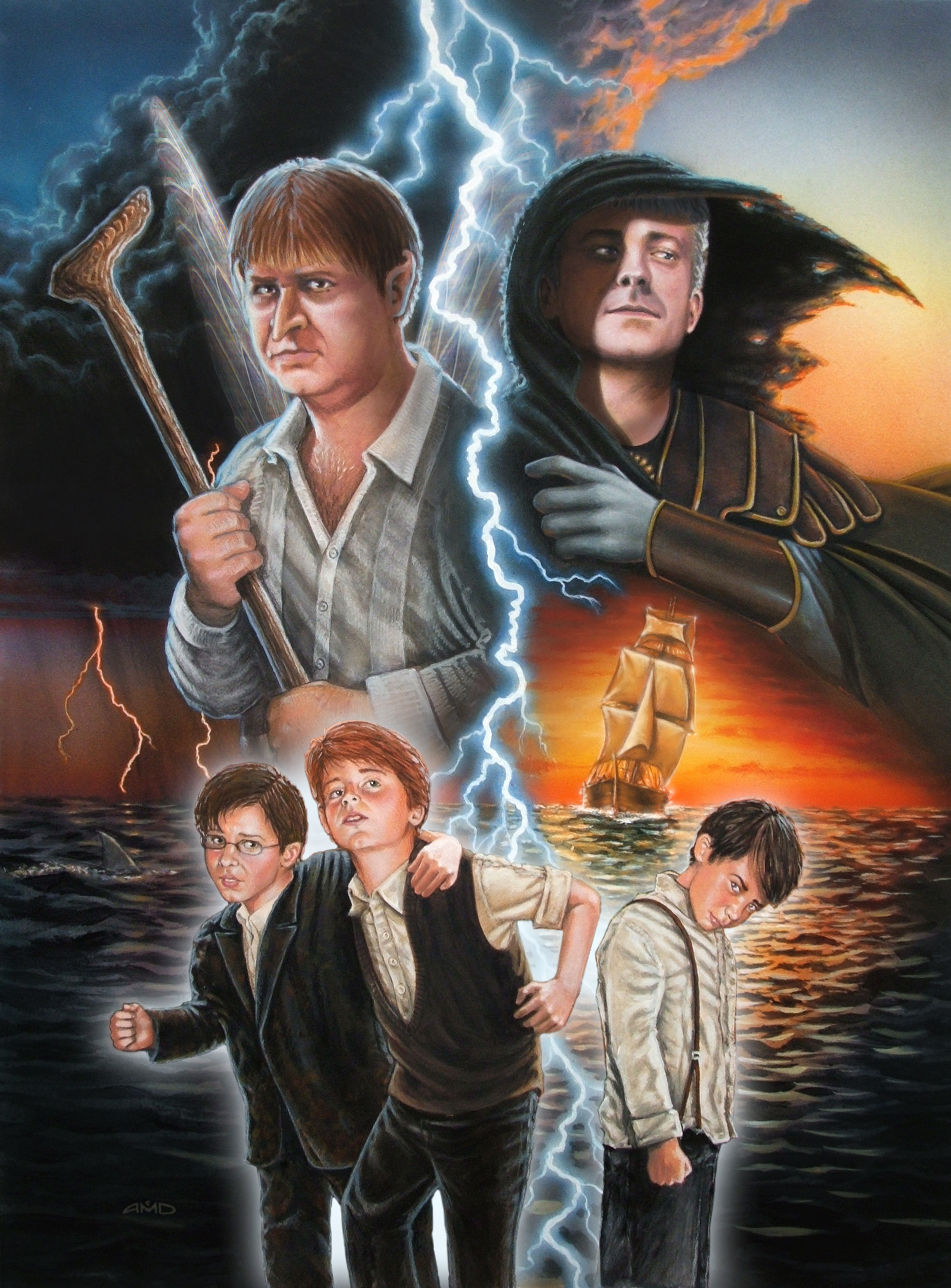
Book
1: The Three Thorns
This was the original cover design, made in 2007.
|
Book
2: Legion of the Two Knights
Chronologically the third cover I made, when it was decided
to break book one into two separate books.
|
Book
3: The Lost Prince
The second cover I painted, for what was originally to be
book 2. This one is set some years later.
|
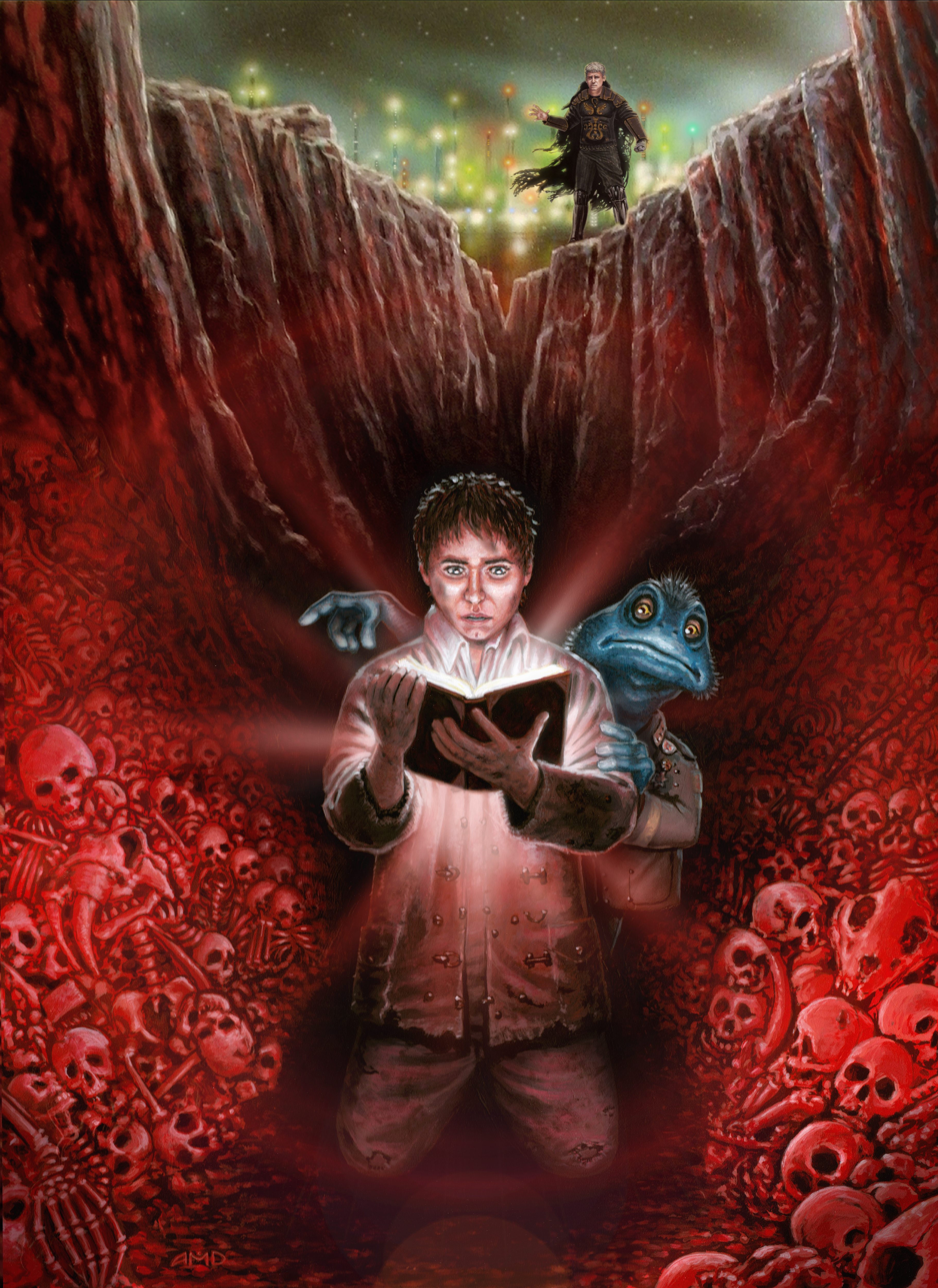
As the lead
characters age from 12 (in book 1) to 16 (book 3), we wanted a progression
-- and consistancy -- in how they look and mature. When doing book
three, The Lost Prince, I had to imagine how a character
from book one would look four years older. When illustrating book
two, Legion of the Two Knights, I then had to backtrack and
paint a cover featuring the characters again aged twelve...but
this time I was able to use models, thanks to a coworker whose two
sons were eager to volunteer.
Ahh, yes...I
said his two sons, not three. And there are three
brothers in the series. So one of the boys actually posed for two
of the characters. God, I hate math.
Explaining
all this feels like the "retconning" of characters and
events in the Star Wars series, as we were faced with the
obvious problem that the characters of Legion no longer resembled
those shown on the first cover of Three Thorns. That the
original first cover also made the boys look far too old gave me
all the more reason to go back and set things right.
Happily, after
much persuasion, Mike finally agreed, and so I was able to use some
of the references photos I'd taken for Legion and redo -- and rethink
-- The Three Thorns...
|
|
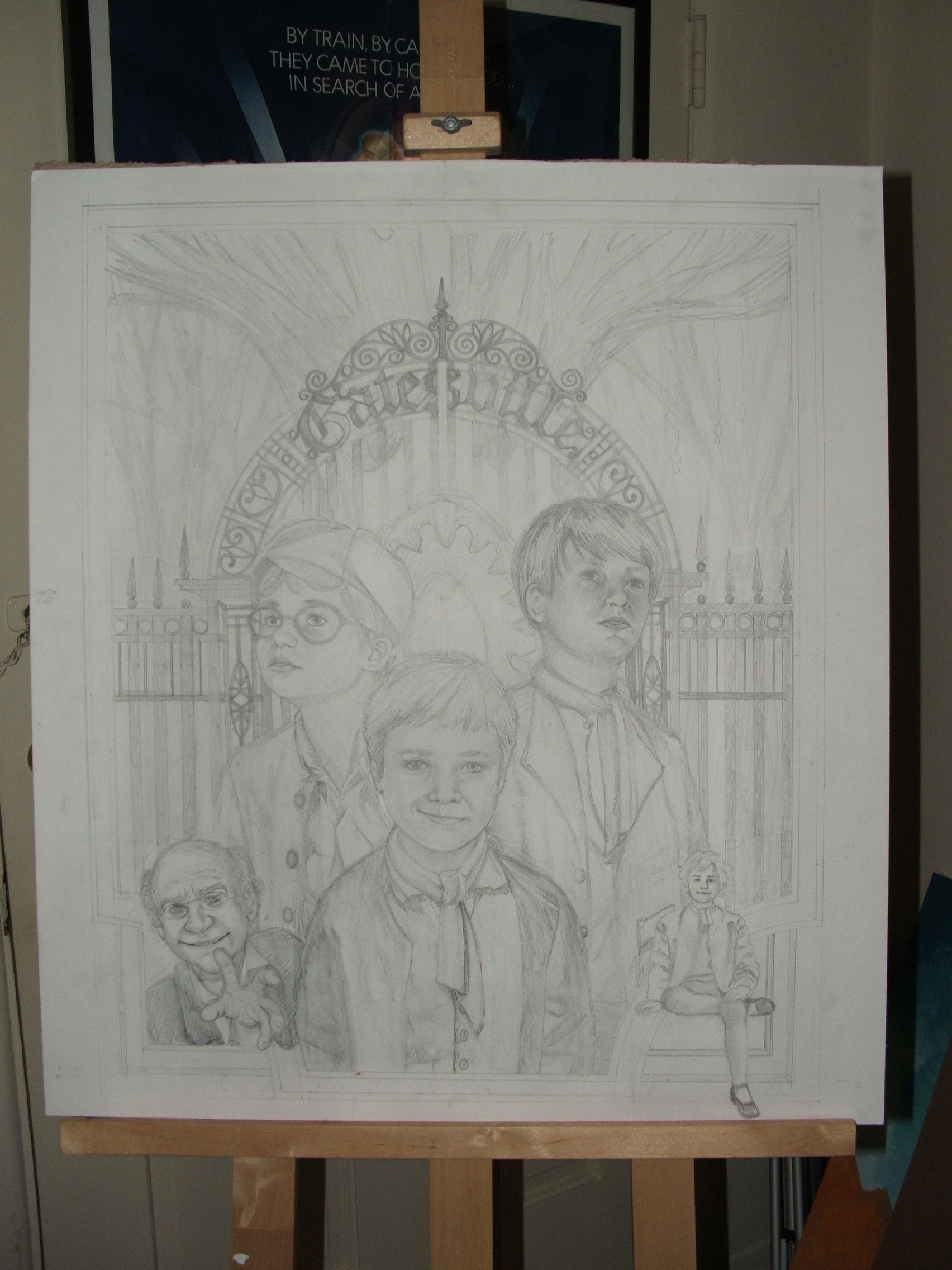
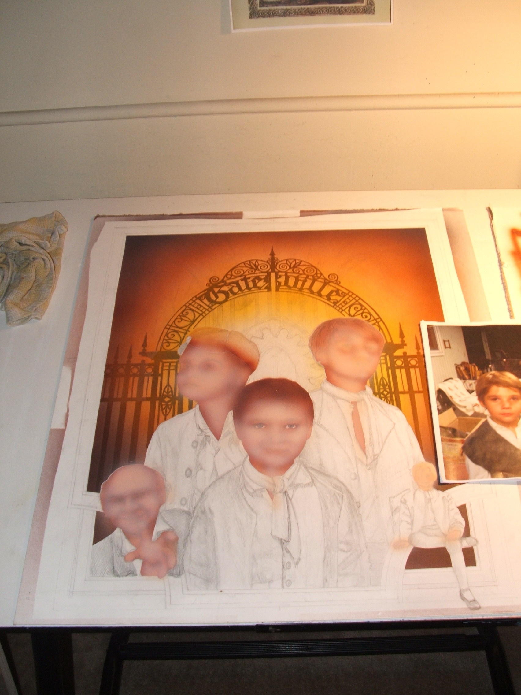
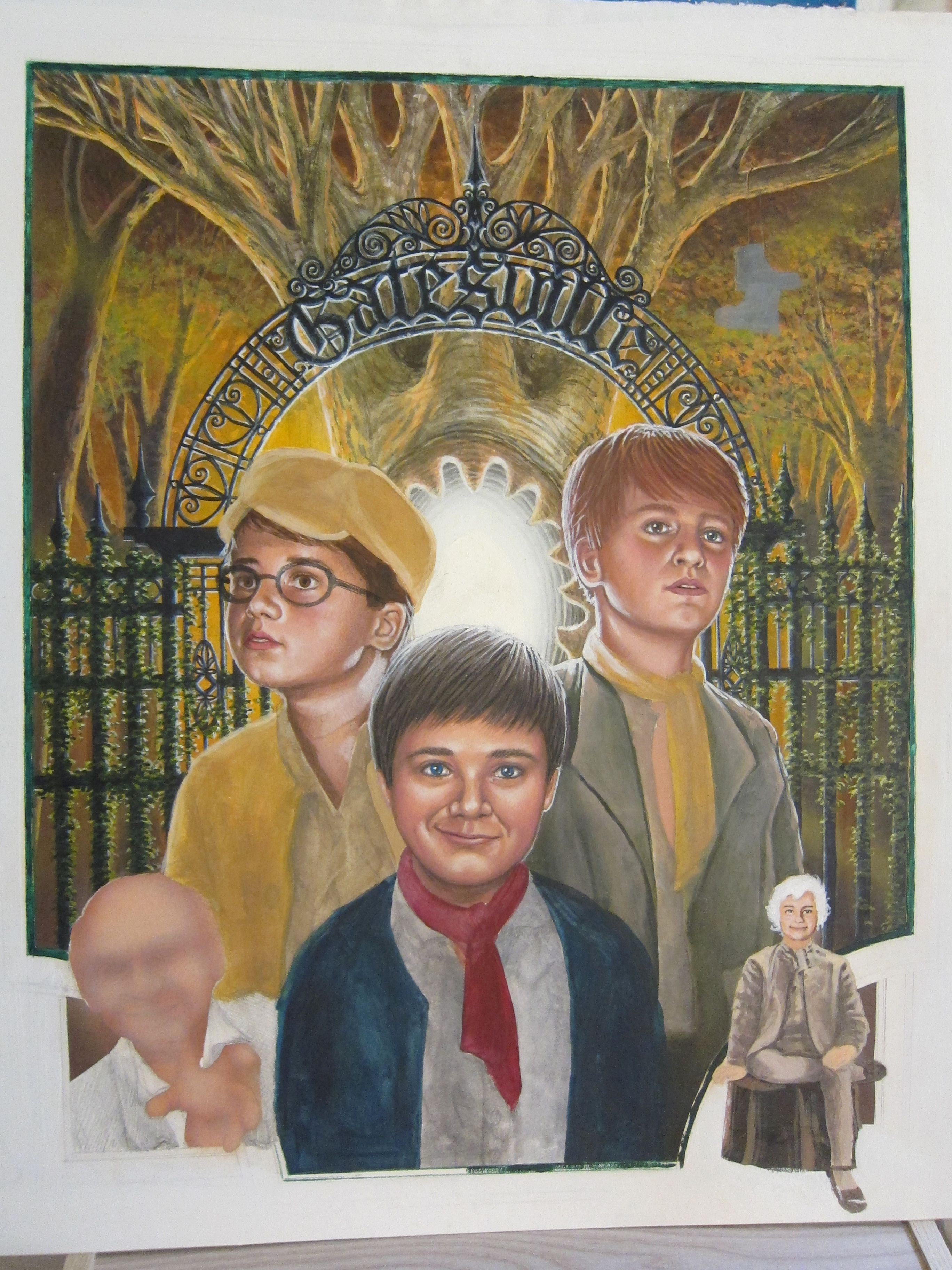
The
sketch. This was a very collaborative process, as I wanted
to use the tree and gate elements from the original design,
while putting more emphasis on the boys in closeup. Mike,
the author, was very specific, however, in the colors that
should be used, the clothes, hairstyles, and expressions.
He
also wanted to feature two of the minor characters in the
story, so I tried adding them as corner design elements to
frame the main picture. My original sketch of Jennings (the
old man in the lower left) wasn't quite what Mike envisioned,
so, being an artist himself, he helped sketch in what the
character should look like, and his pose. In retrospect, the
character's size and position seems to cramp the composition,
but hindsight, of course, is 20/20...
|
|
|
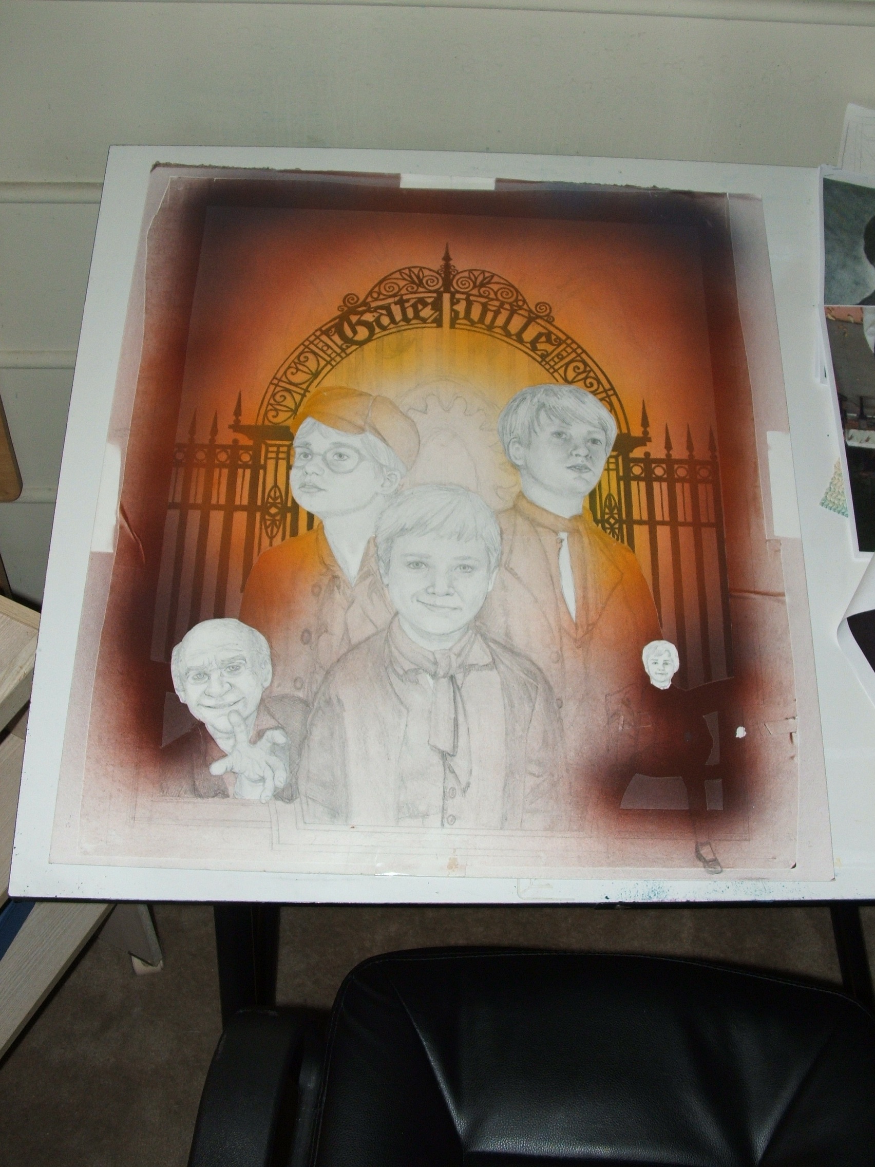
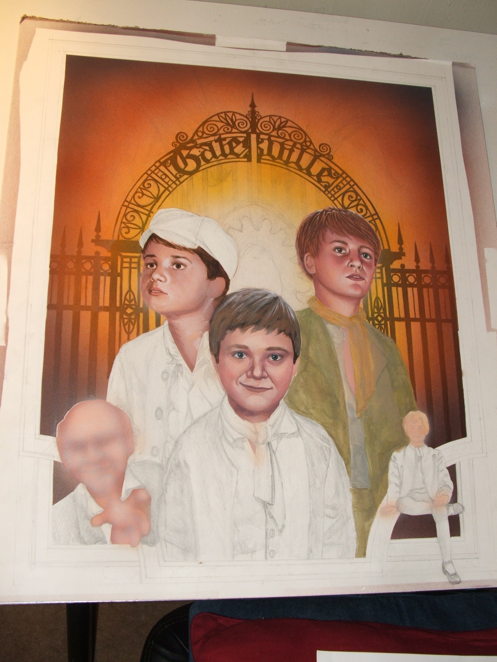
I
painted in the gate loosely using black gesso, knowing that
I'd be covering it over with more paint before going back
to repaint it and add details. I then airbrushed the basic
colors of the background to help set the palette, masking
out the faces with frisket adhesive.
|
|
|
Drew
Struzan makes airbrushing look too easy; I always end up using
the paints too thickly, not allowing for much of the original
drawing to show through. |
|
|
To
compensate for this error, I decide to paint in the characters
a bit loosely, and then go back to finishing the background
to see how the back and front elements play off each other.
I try to get an overall sense of how the colors and light will
look before diving into painting and drawing the details of
people, as I want them to look better integrated with their
environment. |
|
|
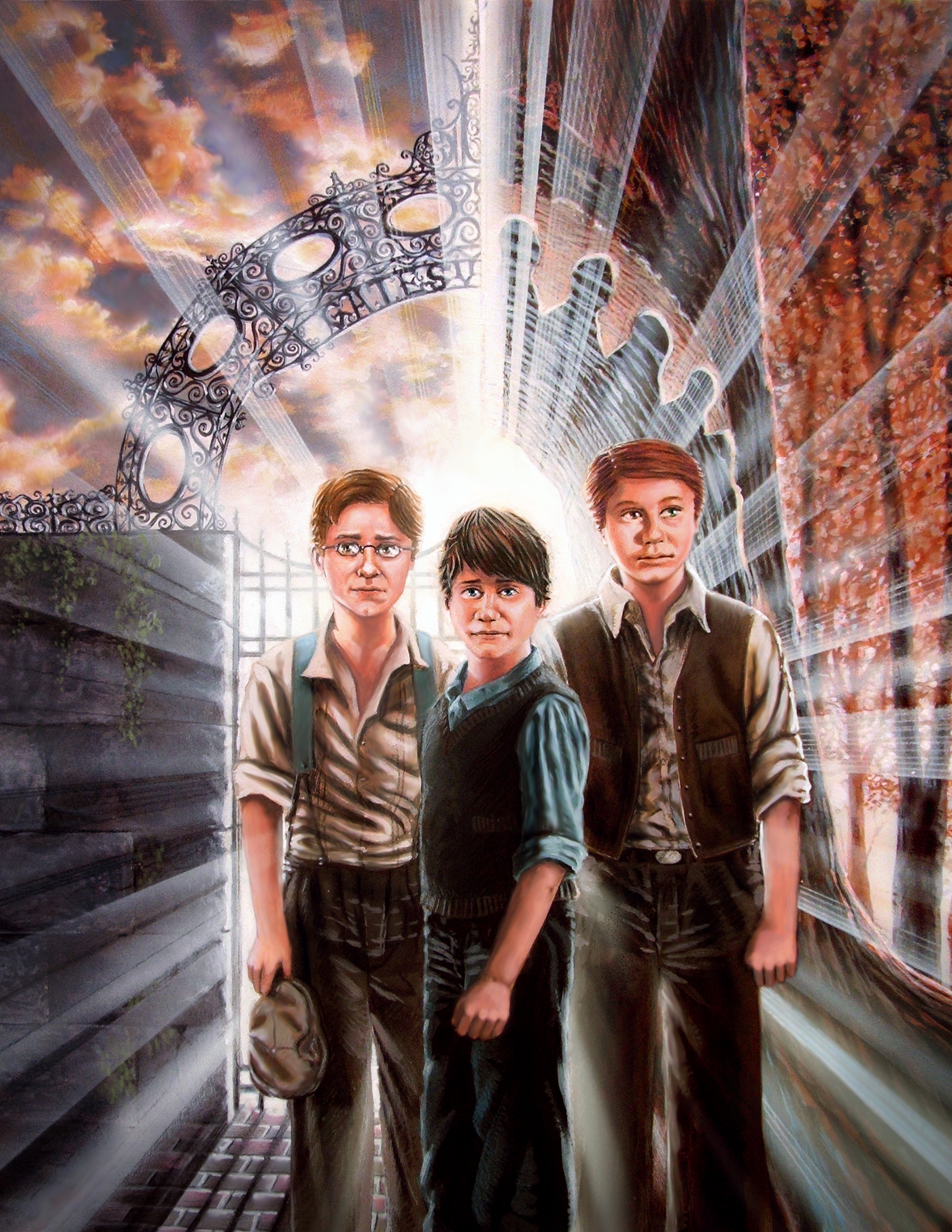
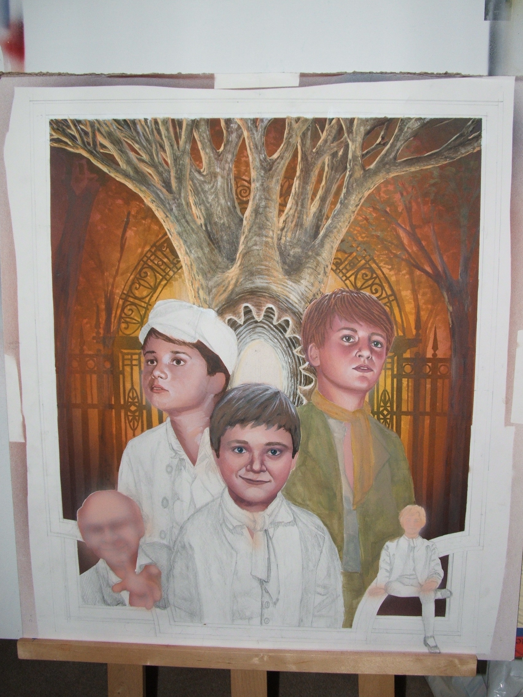
The
tree -- a mysterious gateway into another world, with a portal
at its heart. This was a design element in the first book,
and I wanted to keep it here.
The
drawing was loosely based on a real tree I saw by the South
Pasadena public library; it's quite a monstrous, but beautiful
thing, and in drawing it here, it dawned on me to make it
look like a character itself, with eye sockets and wild hair
and arms. Though the gate and light effects would eventually
obscure it a bit, I hoped the painting kept some of the tree's
character, mystery and menace.
|
|
|
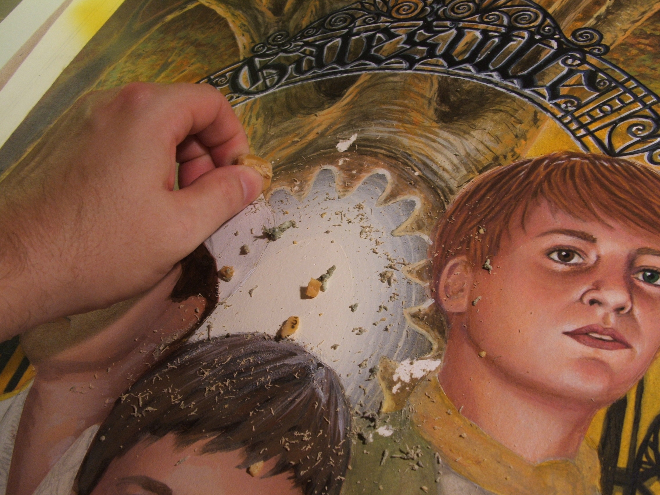
After
painting the gate back in, I wanted to add some glowing effects
from the center of the portal. I used a masking fluid, similar
to rubber cement, for those areas I didn't want to airbrush
-- and a near disaster resulted in the middle of the night when
the paper began to peel off as I tried removing the frisket.
After spending a few minutes gently rubbing away the masking
with a soft, crumbly eraser -- by this time it was after 3am
-- I went to bed to avoid the onset of a heart attack. |
|
|
The
clothes I painted in loosely at first, again to see how all
the elements tied together. Mike was very specific about colors,
here; he wanted the background to have golds, browns, and greens,
and was very descriptive and exacting with what the boys' clothes
would be. I particularly liked how the center character, Benjamin,
wore an outfit inspired by the Artful Dodger in Oliver! It
really helps to set him apart from the earth tones of everything
around him. |
|
|
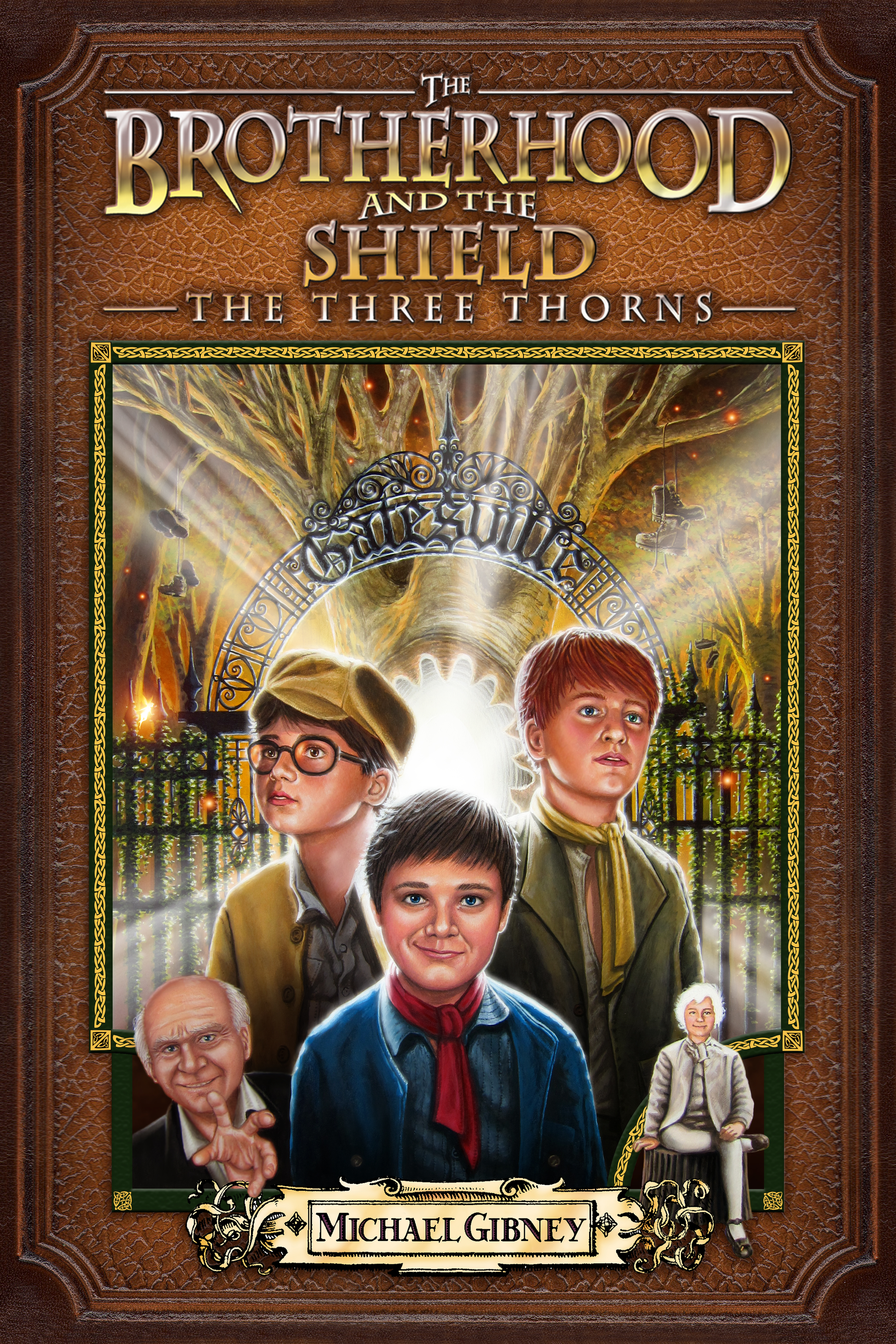
This
was an early mockup of the cover. I decided it was easier
-- and much more flexible -- to add the lighting effects digitally
rather than by airbrushing. The fairies and embers were also
digital elements that photoshop made easy.
At
this point I was under an unfortunate time crunch, sleeping
about two to three hours a night for almost two weeks straight,
as I had to both work at my full time job at Warner Bros.,
and try to meet a deadline that Mike had already pushed out
a few times to accomodate my schedule. He was extremely patient
and understanding; it seems whatever estimate of time I think
a job is going to take, it always ends up requiring three
or four times the number of days or hours.
|
|
|
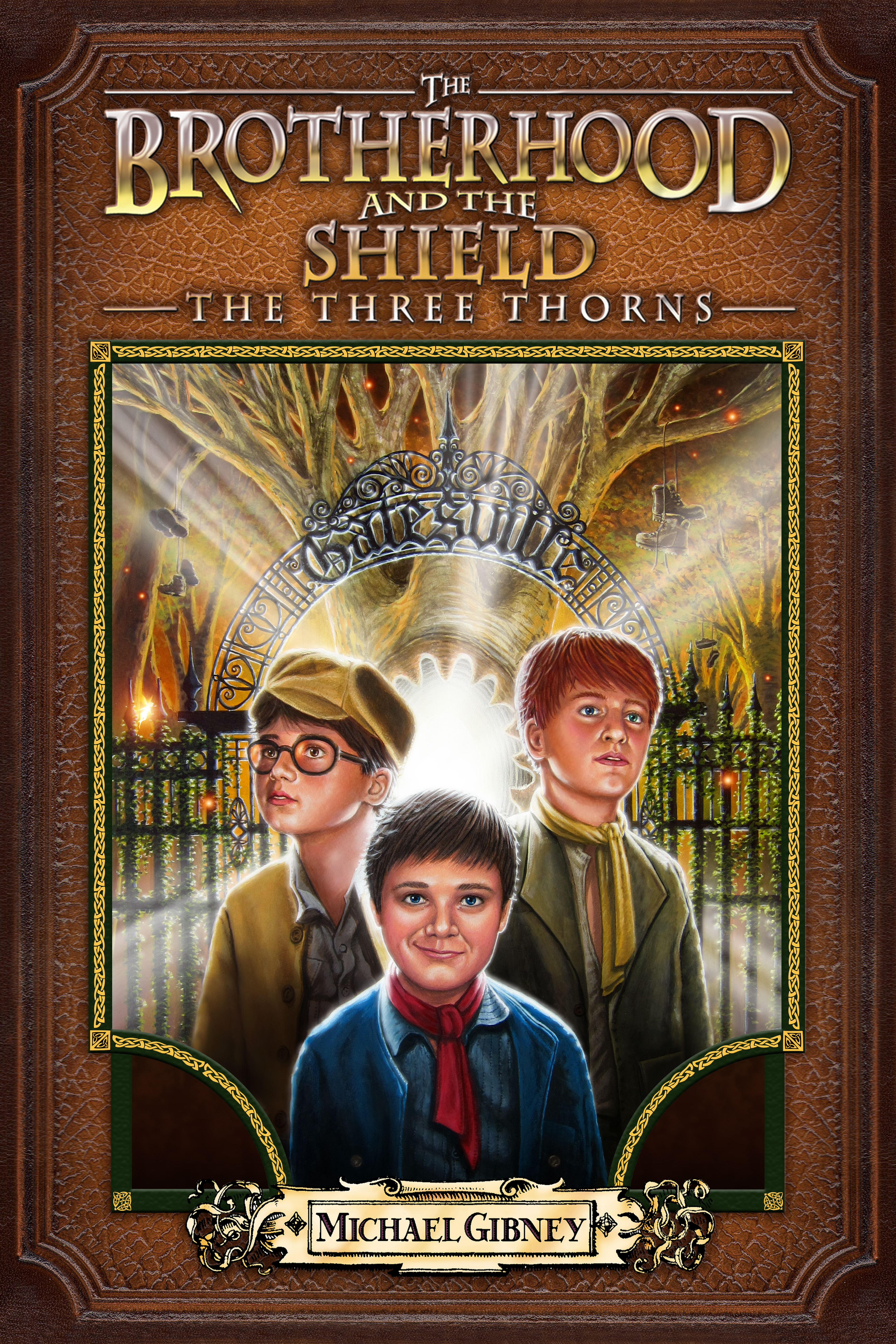
Mercifully,
I was allowed to create a version of the cover without the
corner characters, and this omission was something I was grateful
for. (I wouldn't mind going back and redoing improved versions
of them, though.)
Mike
wanted a celtic pattern to frame the artwork, and believe
it or not, I originally planned to do it by hand. Having fallen
behind schedule and in exhaustion, I asked Mike if I could
do it digitally. Always nice to have an understanding client.
With
the celtic frame and name plaquard, again Mike was very specific
on the choice of colors and design. While my own ideas may
differ here and there on a given project, it's always more
rewording to work with someone who has a specific, concrete
vision, and can easily get their creative ideas across.
|
|
|
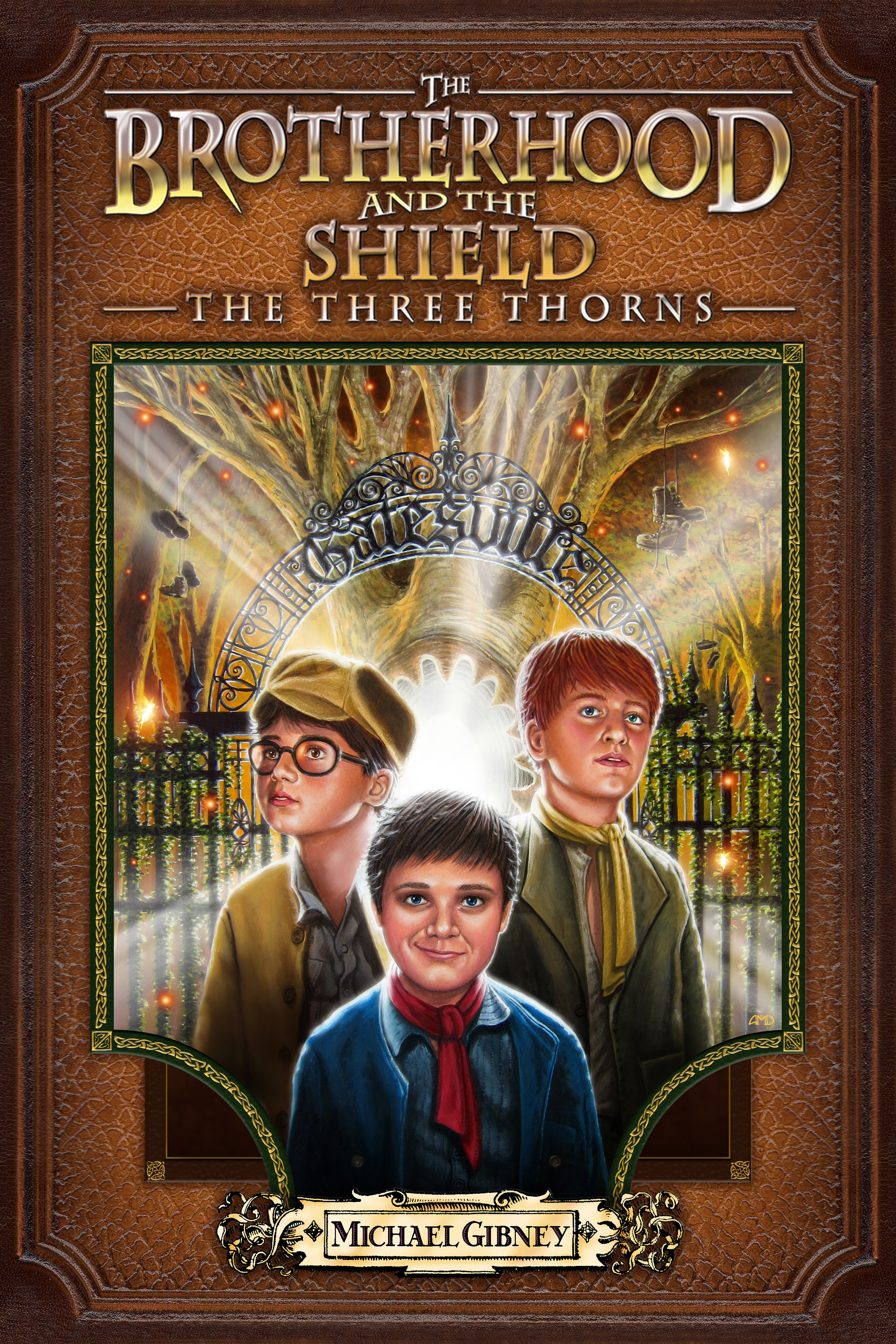
As
much as I love to champion traditional, hand drawn illustration,
I have to admit that photoshop and digital tinkering makes
my job a lot easier. Even subtle changes that would take hours
to paint can be done in a few minutes digitally. This was
the case with the center boy's eyes; Mike wanted them darkened
to a very specific point,
hinting that there may be something more to his cherubic face
and sly grin.
As
to what that hint is...well, you'll just have to read the
books!
I
also did an alternate version of the cover, changing some
of the colors of the borders, embossing the celtic pattern,
slightly moving the placement of the eyes of the boy on the
right, and reducing the size of the name plate.
|
The
finished illustration, which is now one of my personal favorites: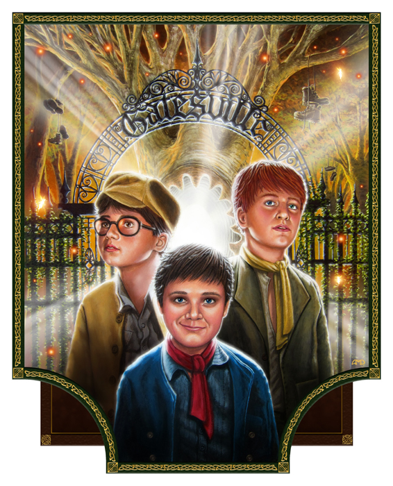
|
|