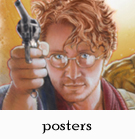
HARRY
POTTER PARRISH
CLICK HERE if embedded video does not appear.
I
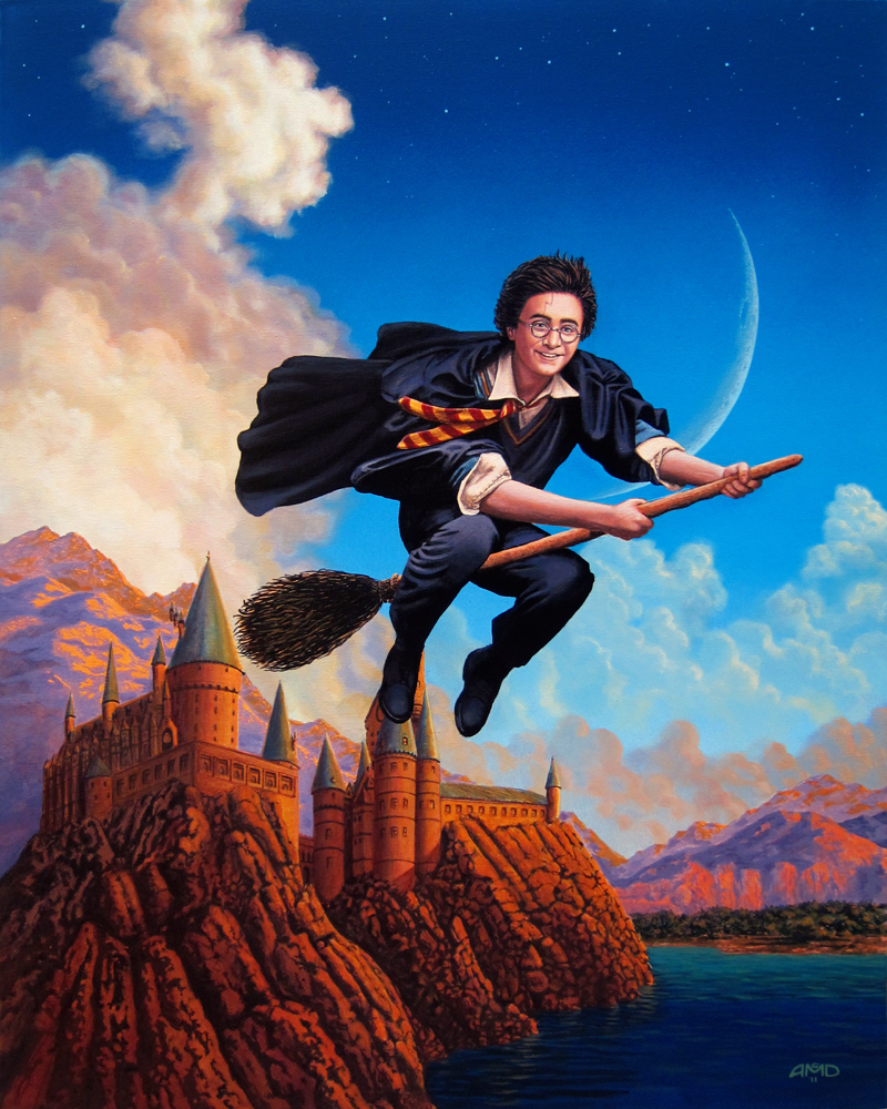
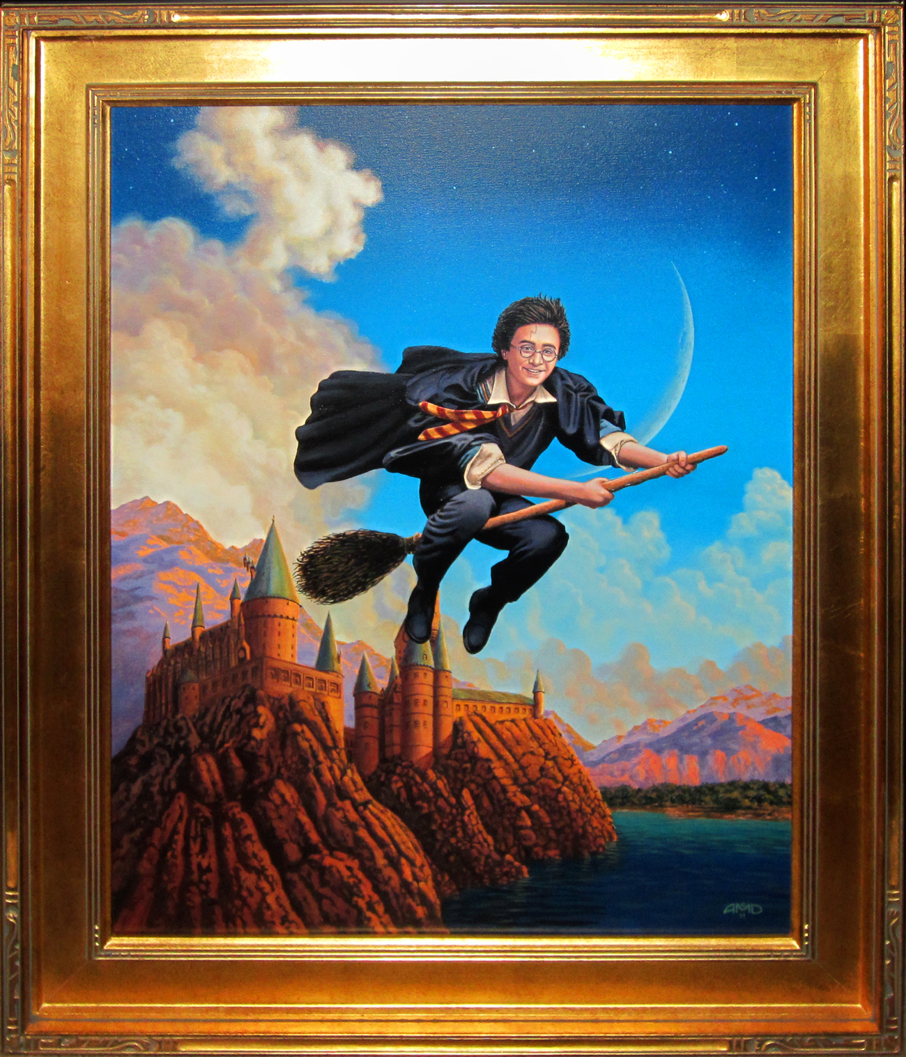
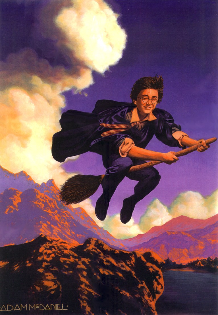
revisited my 2001
painting of Harry Potter for a special gallery exhibit of Harry
Potter artwork -- only this time the project took far, far longer
than a week to finish! Inspiration taken from Annie Leibowitz photo
of actor Daniel Radcliffe set against backdrop inspired by Maxfield
Parrish's Ecstasy (1929).
|
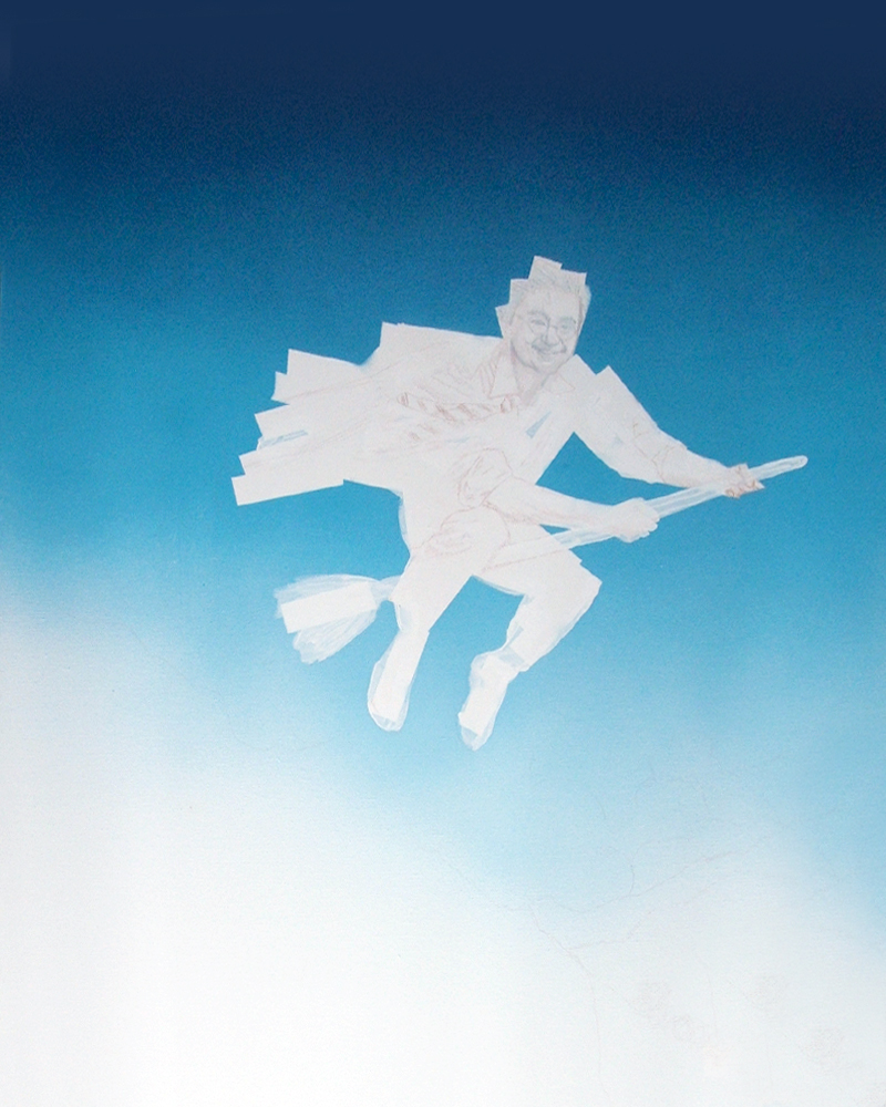
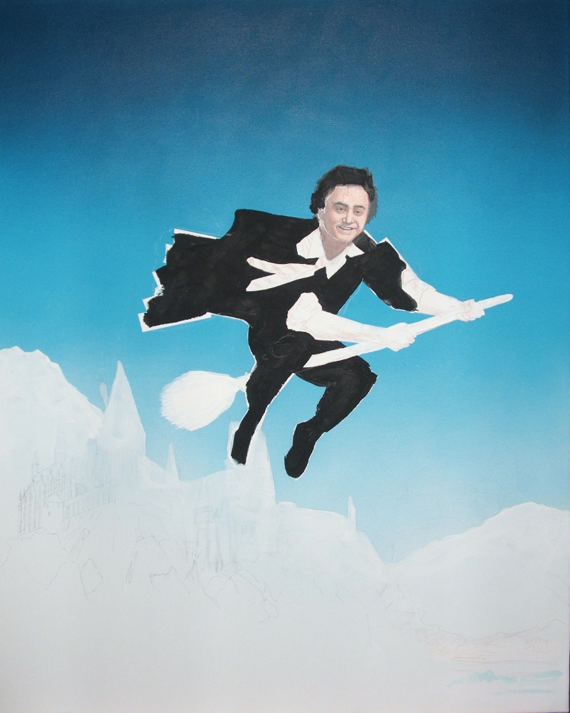
Stage
1: After sketching in the figure, I airbrushed the sky background
using four gradients of white to navy blue. I tried getting
that "Parrish Blue" hue as best I could, though
in these early photos it looks more green than bright blue.
It
was a full week after airbrushing the canvas that I finally
noticed that every object in my apartment -- from books in
my living room to furniture in my bedroom -- was covered in
a thin layer of powdery blue dust! I spent a full weekend
cleaning everything; I'm sure some residue remains here and
there.
After
painting the sky, I used white and black gesso to paint in
Harry's body and the mountain/castle backdrop. |
|
|
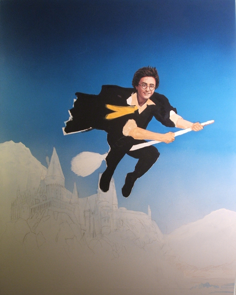
Stage
2: I started adding in a monochromatic layer of gold/yellow/orange,
initially hoping to duplicate the look that Parrish often painted
his figures. |
|
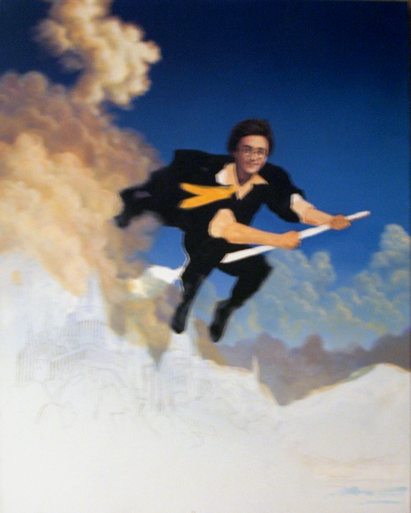
Stage
3: Unsure just how Harry would look with such a limited color
palette, I opted to paint in the clouds to see and compare how
the background and foreground elements would work. Painting
in the clouds took considerably longer than I thought; I was
trying to make this look like an oil painting, even though it
was in acrylics, and used many, many thin layers and washes
of different colors to make the clouds look dimensional. |
|
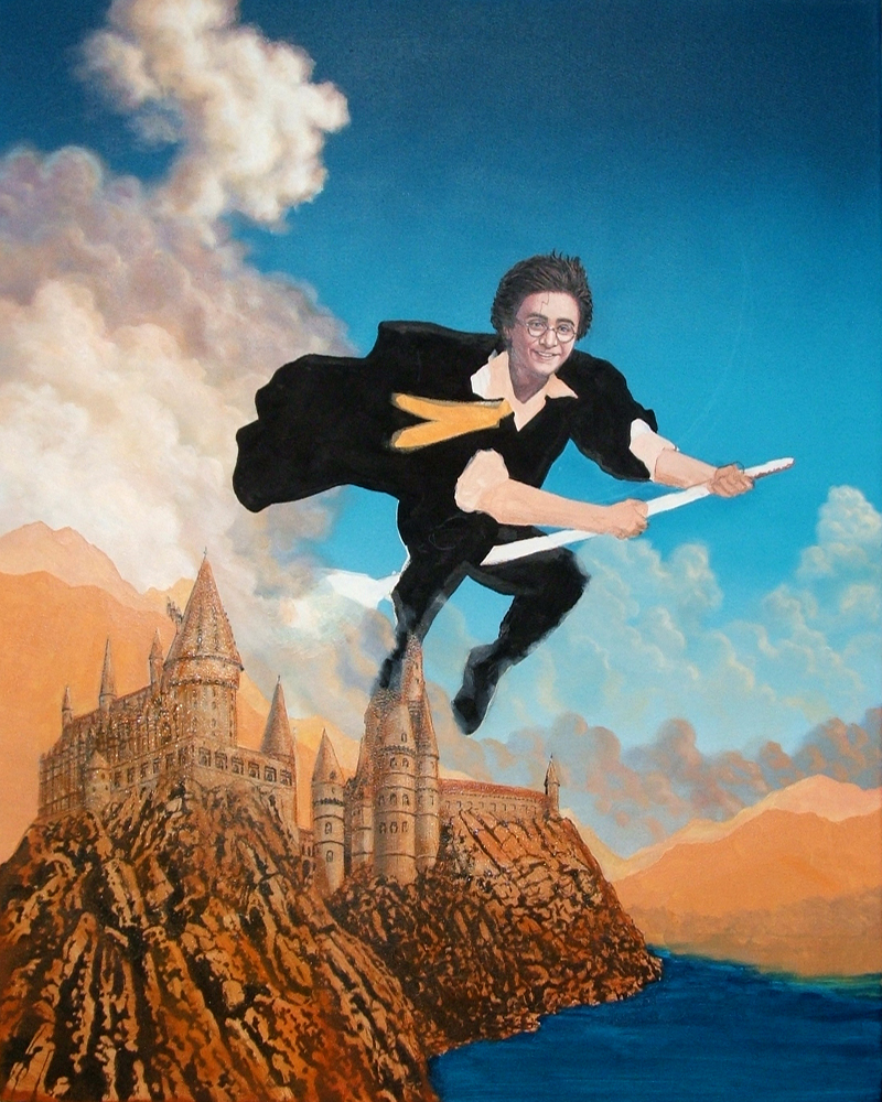
Stage
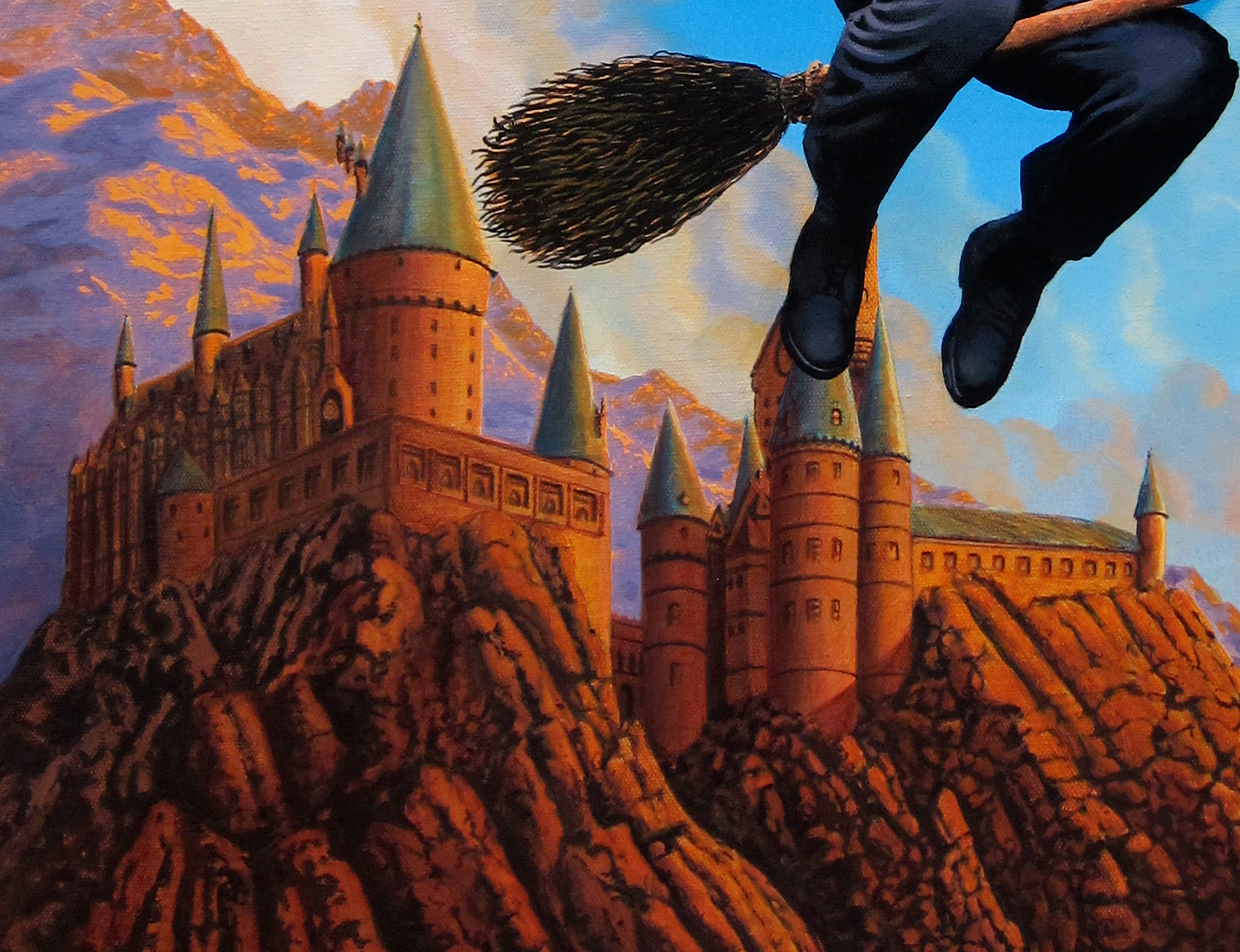
4: I begin with Hogwarts by first roughly painting it in with
black gesso, and then adding color layers on top of it. |
|
Stage
5: In keeping with the Parrish color scheme, I painted, repainted...and
repainted...and repainted the caste, trying to find the
exact color blend to make it work. It was orange at first, then
I added more yellow, then went over it with washes of red, brown,
purple, and orange. The castle alone took about a week to finish. |
|
|
Stage
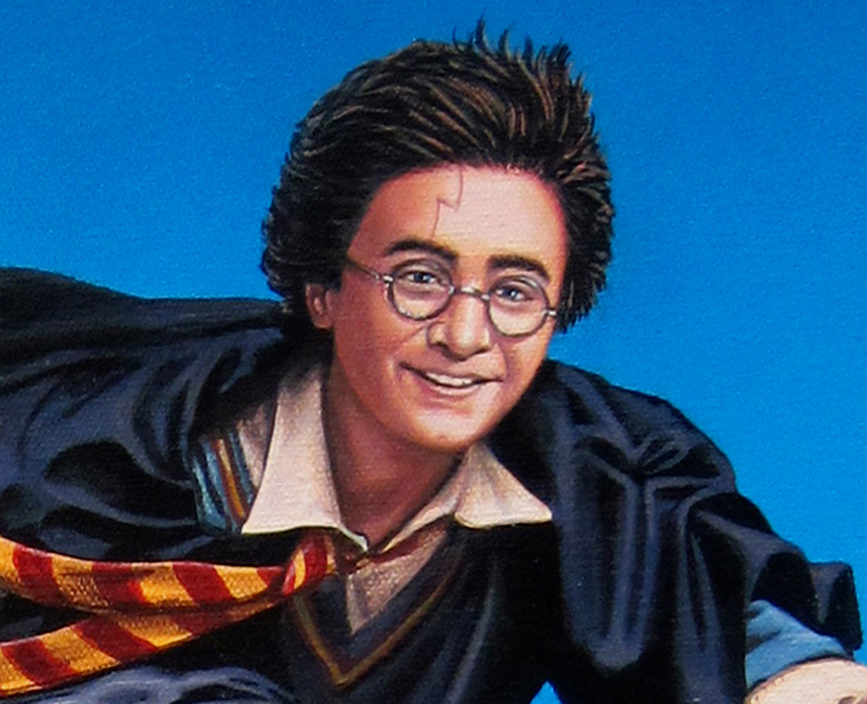
6: With the background done, I go back to Harry. I abandoned
the monochrome/gold idea for skin tones, which I had used
with the 2001 painting, in favor of more natural skin tones
-- though I tried to keep them very warm and saturated.
Fine
tuning the details of Harry's face took a good eight hours,
as, like the castle, I kept experimenting with color tones
and shading.
While
the end result doesn't exactly keep with the Parrish color
scheme I had originally intended, I think it does evoke a
little of the legendary illustrator's work. |
|
|
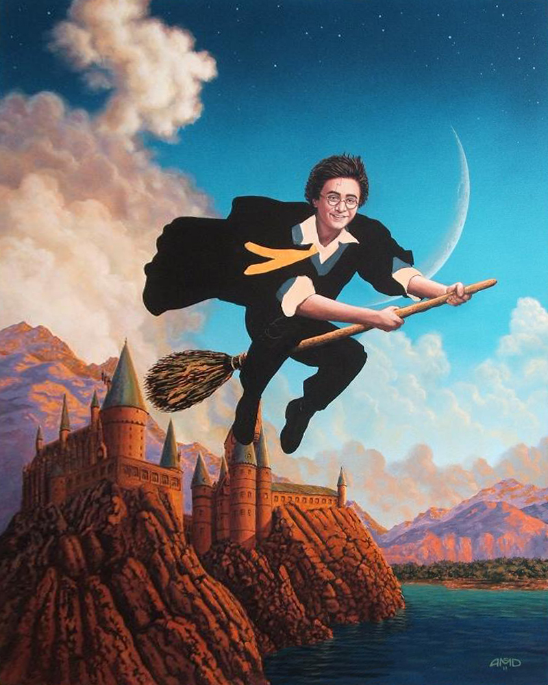
The
finished painting, which is now one of my personal favorites:
Opening night at the Nucleus Gallery's
Harry Potter tribute art show.
Alhambra, CA, July 10th, 2011
|


