November 22, 2014: ROCK AND ROLL OVER! THE 28TH LIVE AUCTION! VOTED THE WORLDS LARGEST PSYCHEDELIC ERA INSPIRED AUCTION!
Hey guys, I wanted to pass along news of a Rock Art auction tomorrow, featuring legendary work from leading artists -- including my dear friend David Edward Byrd...
November 23, 2014 - 8AM PST
Please join us for a rockin' auction that pays homage to the music scene of the 60's and 70's psychedelic era. PashCo Posters is hosting our quarterly rock auction - the last of the year, on November 23rd, 2014 starting at 8am (Pacific). In this collection you will find an amazing assortment of vintage and rare items, signed and numbered lithos, beautiful 60's silkscreens, a massive collection of original mint, near mint and VG+ posters, and of course a few surprises.
Featured this quarter is a selection of MINT, SIGNED DAVID BYRD posters, including his two newest (Prince and CSNY) never available to the public. You'll also find Blacklight, Anti-war, Rock, Hippy, Peace and Love in this quarter's offerings, and some very rare Zappa framed mint items. There really is something for everyone, from the budding collector to the advanced aficionado.
Once again, we hope to have the camera and audio working so you can hear some history behind each piece. Please join us and Rock on!
August 13, 2014: New TWENTY-FOUR BY THIRTY-SIX trailer.
Whoa! Check out this trailer for TWENTY-FOUR BY THIRTY-SIX, a documentary in progress about movie poster art. I'm especially happy that the trailer opens with Richard Amsel, and hope the film will help ensure his creative legacy.
Look fast for the bloated guy with the green baseball cap:
May 28, 2014: TWENTY-FOUR BY THIRTY-SIX documentary.
On Monday I was interviewed for TWENTY-FOUR BY THIRTY-SIX, a documentary on movie poster artwork. When I first heard about the project some months ago, I was very, very intrigued, and to actually be a part of it now is a big thrill.
The film is a labor of love by a team of documentary filmmakers who have been traveling the world interviewing artists and fans. It's unique in that it's not just about traditional movie poster art (and it's decline in recent years), but the movement among fans -- many of them illustrators themselves -- who, through independent means, are taking it upon themselves to resurrect an art long thought dead...and it's become so popular that the movie studios are finally taking notice.
Thanks to Kevin Burke for being such an engaging interviewer, and for letting me drool over his amazing digital camera setup. (Yes, Kevin, I suffer camera envy.)
February 10, 2014: MUSIC TO MY EYES: Byrd Poster exhibit.
David will also be giving a special lecture on the history of the poster this Thursday, Feb. 13th, at 5pm.
May 4, 2013: Thank you, Mark Raats!
I want to give very special thanks to Lucasfilm artist Mark Raats, who not only took the time to sign the RAIDERS IMAX mini-posters I sent him, but also included, much to my surprise, a special custom-made full sized 27x40 poster, featuring the unmodified version of his original artwork. (I wrote a bit about it in my Sept. 7th, 2012 post.)
My photos (above) don't really do Raats' poster justice. I've therefore included these images below to better illustrate the artist's original color scheme (left), versus the orange hue adjustments featured on the final version (right). I particularly favor Raats' use of more subtle, dusty earth tones; they better reflect the look and feel of the film itself.
I also marvel at Raat's use of line in developing shading, texture, and color -- particularly with faces.
I'm delighted to add his work to my collection, and that Mark personalized it, along with a touching, heartfelt letter, means the world to me.
January 12, 2013: Illustrating Modern Life: The Golden Age of American Illustration from the Kelly Collection
I just came back from the opening night reception of a fantastic art exhibit at the Frederick R. Weisman Museum of Art at Pepperdine University, in Malibu, CA. For those of you in the area, this is an extremely rare opportunity to see original works from J.C. and F.X. Leyedecker, Norman Rockwell, Maxfield Parrish, N.C. Wyeth, and Howard Pyle. The exhibit runs from January 12 through March 31.
Clockwise from top left: J.C. Leyendecker, "Florist." Coles Phillips, "The Magic Hour."
N. C. Wyeth, "The Boy's King Arthur." Howard Pyle, "Dead Men Tell No Tales."
From the museum's press release:
Illustrating Modern Life: The Golden Age of American Illustration from the Kelly Collection features over 60 works from one of the most fascinating periods in American art. The Golden Age of American Illustration arose between 1880 and 1930, when revolutions in printing technology and mass mailing resulted in a meteoric rise of new magazines. Publishers and advertisers turned to illustrators to create eye-catching, hand-rendered paintings that would appeal to a growing public of modern consumers.
The original oil paintings, watercolors, and ink drawings in this exhibition, rarely seen on the West Coast, include some of the finest examples produced by the best artists of the genre.
The art created by renowned talents such as Howard Pyle, N. C. Wyeth, J. C. Leyendecker, Maxfield Parrish, and Norman Rockwell has entered the pantheon of 20th century American culture and still captivates audiences today.
Pyle, regarded as the father of American illustration, invented the quintessential pirate character that still inspires movies over a century later. His student N. C. Wyeth (father of painter Andrew Wyeth) gained national fame for his paintings done for the Scribner's Illustrated Classics series of novels. The iconic imagery he created for books such as Treasure Island and Kidnapped helped establish the era's vogue for adventure stories.
Leyendecker invented new urbane and stylish figures that captured the knowing sophistication of the modern era. He transformed both illustration and retailing by creating his Arrow Collar Man, a fictitious "celebrity" whose extraordinary popularity established the country's first national advertising campaign.
Rockwell, who began his career by emulating Leyendecker, captured the heart of the nation for decades with his keen sensitivity to the nuances of human behavior, which he used to create poignant depictions of life in small-town America.
"I am thrilled to bring a collection of such outstanding art to Southern California," said Michael Zakian, director of the Frederick R. Weisman Museum of Art and curator of the exhibition. "Like many Americans I remember seeing these artists in magazines such as The Saturday Evening Post and in old books. To see the originals firsthand is a real treat. Most people will be surprised to discover that many of the works were rendered in a rich, painterly manner. Even though much of that effect was lost in the printing process, these illustrators saw themselves as fine artists. They took pride in their craft and wanted their work to meet the standards of the best painters from the past. It is particularly fascinating to see a group of paintings by Dean Cornwell. People in L.A. are familiar with his work through the monumental murals of California history that he did in the historic downtown Los Angeles Public Library in 1932."
The Kelly Collection of American Illustration is regarded as one of the nation's largest and finest private holdings of this material. It was formed over the last 30 years by Richard Kelly, an individual respected in the field for his attention to quality and his commitment to documenting this period of art. He has earned the highest respect from colleagues in the field and was selected by Art & Antiques magazine as one of the top 100 collectors in America.
Illustrating Modern Life: The Golden Age of American Illustration from the Kelly Collection is accompanied by a hard-cover, 128-page exhibition catalog featuring an essay on the art by Zakian, as well as an interview with Kelly by David Apatoff, author of Robert Fawcett: The Illustrator's Illustrator; Albert Dorne, Master Illustrator; the forthcoming The Life and Art of Bernie Fuchs; and the popular blog Illustration Art. ...
Works are on view at the Weisman Museum in the Gregg G. Juarez Gallery, West Gallery, and Ron Wilson-Designer Gallery.
Located on Pepperdine's main campus at 24255 Pacific Coast Highway in Malibu, CA, the museum is open Tuesday through Sunday, 11 a.m. to 5 p.m., and is closed on Mondays and major holidays. There is no admission charge.
For more information, call (310) 506-4851, or visit: http://arts.pepperdine.edu/museum
January 11, 2013: Tribute to David Grove, Feb. 27, 1940 - Oct. 25, 2012.
I'm terribly saddened to learn of the passing of illustrator David Grove last October, which I only heard about a few days ago.
Grove was a giant in the illustration world, whose work was well known throughout the 1970's and 1980's. His striking movie posters, book covers, and advertisements evoked comparisons to Bernie Fuchs, frequently employing a rubbing technique in his painting process, whereby dark colors would be rubbed away to reveal lighter colors underneath -- a painstaking, challenging process whose end result looks deceptively simple.
I actually had been working on a book cover these last few weeks inspired by Grove's special style, and printouts of his work are currently peppered all over my drafting table. I had intended to write to him when the work was done to show my appreciation...but alas, now it is too late. While I never met him personally, I feel quite heartbroken.
Movie posters were only a small part of Grove's body of work, but they left a huge impression on me throughout my childhood. Grove's illustration for SOMETHING WICKED THIS WAY COMES, in particular, is darkly, eerily beautiful, and captures the atmosphere of Ray Bradbury's book even better than the film itself did:
It's bittersweet that Grove's passing should so closely follow several major milestones in his career: he was recently inducted into the Society of Illustrators Hall of Fame, had a one man retrospective at the Museum of American Illustration in New York, and had just published the book "David Grove - An Illustrated Life". The latter book I had bought last summer, and it's far more than just a collection of pictures; Grove provides us with a memoir about his life and travels that read every bit as colorful as his art -- by turns funny and poignant, to downright startling. He also provides rare insight into his painting process, something artists and illustrators will savor.
Well, RAIDERS OF THE LOST ARK is back in theaters, and in IMAX, to boot. I'm seeing it tomorrow, and am greatly looking forward to it. (One of the big pleasures of living in the L.A. area is that many of my favorite films -- Raiders, 2001, North by Northwest, Harold and Maude, to name a few -- are routinely screened in revivial theaters each year, so I no longer bother even watching them on TV.)
Lucasfilm artist Mark Raats has created a lively poster for this special release, evoking a bit of the old Drew Struzan's style:
What's especially interesting about this poster, however, is how Raats originally conceived the design, which was quite different from the final image. Forget that the title was rebranded to the clumbsily wordy "Indiana Jones and the Raiders of the Lost Ark" -- that was Lucasfilm's doing, and the marketing-minded change never made logical sense to me. (After all, Indiana Jones himself is but one of the many characters "raiding" the ark, and the title was in no need of fixing, anyway...) To back up Raats' claims of innocence, here is his original, completed artwork, and digital poster mock-up, before the powers that be ... well, um, exercised their powers:
If you look closely at Raats' comps (below center and right), you'll notice something else that's very interesting: the artist pays tribute to Richard Amsel's very first Raiders poster, with a portrait of Indy standing in front of the original Amsel background:
For reference, here's Amsel's original poster from 1981:
I'm also glad to see that at least part of Amsel's rerelease poster is featured on the upcoming Blu-Ray set. It's known as Indy's "heroic" pose, and perfectly captures the character. (Only Richard Amsel could get away with depicting a gritty, worldly hero sporting a smirking grin, without making it look too cheesy or silly.) I'm not particularly fond of some of the obvious digital "tweaks" made to Amsel's drawing -- I suspect they were trying to make it look more painterly -- but I'm glad that pose remains as the definitive Indiana Jones portrait.
I'm curious to know the artist who created the background character montage. (See below.) While I'm not blown away by it -- I'm a harsh critic -- I think it succeeds in complimenting, rather than distracting from the central figure.
UPDATE: Mark himself reached out to me on Facebook with the following response:
Adam, firstly allow me to thank you for the supremely thoughtful review and secondly, let me thank you for protecting my ‘innocence’. All to often we encounter glib comments or flippant posts that fail to serve much purpose but happily, this is not one of them.
Before I comment on the illustration itself, let me say to those individuals blaming me (I kid you not) that I was NOT responsible for changing the name - its been the marketing title since 2000 but it will always be ‘Raiders of the lost Ark’ for me (see my original concepts).
Mindful of the fact that I’m writing this on RICHARD AMSEL’s appreciation page I would like to say that embarking on this project was not easy given Richard (and Drew’s) long association with the franchise. I was painfully aware that this is regarded by some as hallowed ground so, I tread as carefully and respectfully as I could while at the same time, trying to make something that was unique to my taste and artistic style. BTW, my artwork was originally created to celebrate the 30th anniversary of Raiders of the Lost Ark but as sometimes happens, it was ultimately rediscovered and used for the IMAX and Blu-Ray release.
As you know, there IS a studio tendency to let the Photoshop pilot's loose on original art which I don't understand or support and in this case, my color palette was drastically changed to a more vibrant orange. Other changes were also made but my intention was always to have something that was less visually punishing - indeed, something that looked more subtle and aged. I’ve always deeply admired Amsel’s gorgeous original and what I tried to achieve with my painting was a more muted palette of sand and gold - one that I hoped would pay homage to Amsel’s elegant original.
You’re right about my initial comps because I seriously considered using more of Richard’s original poster in my new piece simply because it is THE Raiders poster and I struggled to work out how I was going to make a new artwork without including a significant homage to him. In the end however the result was too self conscious (weak) in my opinion and so I went in another direction hoping to discover a new solution that would embrace all the elements that we have all come to love and respect over the years.
Although I know WHY it happened, the thing that has always bothered me about Amsel’s original, was that the Ark is missing from the illustration. Although it does appear in the second poster I wanted it to be more prominent considering that its the most profoundly glorious prize. I also wanted to return Indiana Jones to the character who’s slightly mean, cavalier, mercenary and dangerous and this is why I chose to place him straight down the middle of the composition. For the rest, I chose to use elements that were - for me - things I remembered vividly from when I first saw the movie as a young man serving in the military.
As far as the Blu-Ray box goes, the lovely internal artwork was done by my friend and Lucasfilm colleague Jason Palmer. Like you, I’m delighted to see Amsel’s original Indy standing boldly on the cover (I have the same reservations regarding the treatment though) and while I can’t be certain, its possible Jason was responsible for the montage as well.
Thank you once again for your post sir. I am truly honered to have been given the opportunity to add some modest value to the Indiana Jones franchise.
Mark, thanks so much for your thoughtful, fascinating comments!
July 29, 2012: Howard Terpning art exhibit & book signing.
Once again I must open another post with the babbling prelude, "I haven't updated this site in ages because of such-and-such, with life-such-and-such getting in the way, etc... etc..."
Well, fact is, I've been a bit lazy. There are so many things I've been meaning to mention, it all somehow gets the better of me, and I procrastinate as a result. Sorry, guys.
And so ... onto the first of many hopeful "catch up" entries I'll be making over the next few weeks.
In January I posted an entry on the movie poster art of HOWARD TERPNING, who, after the Vietnam War, abandoned a hugely successful commercial illustration career in favor of a new life in Arizona, working as a fine artist -- painting scenes of the American Indians and the American West.
It wasn't soon after that I learned the Gene Autry Museum would be hosting a collection of Terpning's Western paintings -- an exhibit called "Tribute to the Plains People" -- and, best of all, the artist himself would be making a rare public appearance, signing his book of the same name.
Tribute to the Plains People
hardcover now available at Amazon
The show was fantastic, filled with large paintings created over the last four decades. On a technical level, I was repeatedly struck by Terpning's use of color, composition, and lighting. But even more breathtaking was his sense of storytelling -- for many of the paintings feature action with significant meaning, from images of high adventure to more somber depictions of death and destruction.
__
While the romantic view of "The American West" has become an integral part of American folklore and culture -- from dimestore books and novels, to radio and movie serials, and an entirely unique, enduring genre of motion pictures and television series -- it's sobering to think that the seemingly immortal period was, in truth, only represented by a few short decades, and marked the death knell of an entire culture and civilization.
Terpning's work, while certainly beautiful and often romantic, doesn't shy away from these facts, as many pieces are imbued with a profound sense of sadness. Many of the Indian characters within his paintings seem fully aware of their cultures' numbered days, and the inevidable changes to come -- both for their people and the land they live in.
Now 84, Terpning is a burly, handsome fellow who easily looks a good twenty years younger, and remains busy as ever.
Another one of the exhibit's delights was a documentary film about the artist, intercutting scenes profiling Terpning's life and career with a behind the scenes look at his latest creation. I love seeing a master's artistic process -- learning how a painting first develops from an idea, to the technical process used to bring it to life. I'm sure the DVD will be made available sometime in the near future; it's a great thing to watch, and very well done.
UPDATE: The documentary is called Howard Terpning: Portrait of a Storyteller, and is available for purchase on DVD. A trailer for the film can be seen on YouTube:
May 9, 2012: Maurice Sendak, 1928-2012
When I graduated from Vassar College (waaaay back on May 19, 1996), our class' commencement ceremony was held outdoors, in what seemed like a sweltering 100 degree+ weather under an unforgiving sun. Faculty members gave speech after speech -- all formal, stately, unimaginative pseudo-lectures with a lot of talk but little ideas. During this, my mom briefly fainted from the heat, and I almost joined her from the boredom.
Ah, but then Maurice Sendak took the podium...and for a few precious minutes, all was right with our world. His wasn't some formal, pretty speech; it was a delightful, touching, honest and pulls-no-punches sharing -- filled with energy, wit, and life, life, life. “So be our brave new world!" he exclaimed. "Denounce the money-changers and defy the hype, the sleaze, the deadly cynicism that chokes the hope out of all our lives. I invite you to take the plunge. And when the hard work is done, have safe sex and let the wild rumpus begin!"
I've donated a print of my "Circus Style" RAIDERS poster (a tribute of sorts to the classic Drew Struzan / Charles White III STAR WARS poster), along with a ceramic coffee mug carrying the "ROPE" image, to benefit Leah Esquenazi -- a little girl striken with a crippling series of illnesses that has left doctors baffled. She needs round the clock medical care and supervision, and the mounting medical bills have finacially devasted her parents.
March 29, 2012: BYRD/SKOLNICK - A Tale of Two Posters show
My friend David
Edward Byrd will be part of a two-Man retrospective, along with Arnold Skolnick, opening on April 1st, 2012 at The Museum at Bethel Woods, which is on the site of the legendary Woodstock Festival that occurred in August of 1969.
David created the first of the posters, when the festival was originally planned to take place in Wallkill, New York. When the location was switched to Woodstock, David was unavailable to update the design, so Arnold Skolnick stepped in with an alternate poster -- and the rest is history.
Both artists will be at the show April 27th - 29th, and will be interviewed on Saturday, April 28th at 2pm, followed by a "meet and greet" with the public. David will also be selling & signing posters at a booth during the Poster Fair.
Here's a great video that actually mentions the posters, starting at the 2:43 mark...
March 24, 2012: Art, storytelling...and DINOSAURS!
Show me a child who doesn’t love dinosaurs, and you’re likely to show me a very lonely, melancholy child.
While my own childhood may have had bouts of loneliness/unhappiness, I not only adored dinosaurs, but was obsessed with them. I owned a copy of virtually every illustrated dinosaur book available in the country, it seemed, and I could memorize (and correctly pronounce) every species’ name and characteristics. This was right around the time of great new discoveries being made about the Age of Reptiles. Years before Jurassic Park hit movie theaters, Robert Bakker’s groundbreaking The Dinosaur Heresies and William Stout’sThe New Dinosaurs offered fascinating, revisionist insight -- creatures once presumed to be slow, dumb, and lumbering, were in fact fast, mostly warm blooded, complex, and very, very smart.
Alas, as I grew older my interest in dinosaurs (and perhaps much of my imagination) waned, taking back seat to other things in life – school, love affairs, work, stress, money… What I’d give to have my inner child back!
It wasn’t until about twelve years ago that I finally read James Gurney’s Dinotopia book series, and my interest in dinosaurs was rekindled. Feeling exhausted one rainy day, I called in sick from work and spent the afternoon snuggled up with my cat, reading Gurney’s lavishly illustrated, charming story – part Jules Verne, part Edgar Rice Burroughs, and a little bit of Jurassic Park thrown in for good measure. Forget the dull, derivative miniseries it spawned; while elephantine in scale (especially for television), it wasn’t faithful to Gurney’s original story, misguidedly transplanting it from the 19th century to modern times…and filling it with cheesy pop references, dull dialog, and many, many plot clichés.
I don’t think my saying Gurney is a genius is uncalled for; his artistic talent alone in on par with the best of the Golden Age of Illustration. But his expertise goes well beyond the realm of art. He’s part anthropologist, paleontologist, archaeologist, architect and engineer – extensively researching locations, designs, costumes, and cultures, and mixes them altogether in his books with a great deal of imagination and wit.
I met Gurney back in November of 2007, when he gave a lecture about his work at the LA Public Library. He struck me as very soft-spoken but eloquent, possessing a keen intellect…not to mention a really, really good memory. (When I introduced myself during a special reception, his first words to me were, "Oh! You have a blog or website with your artwork on it, right?", to which I was so shocked and amazed to hear -- this guy has seen MY stuff! -- that I felt myself on the verge of happy tears.)
For you Dinotopia fans, Gurney has just released a special 20th anniversary edition of his book, filled with new illustrations – as well as insightful peeks into his creative process. Artists (and art fans) may also find invaluable knowledge in his art instruction books Color and Light and Imaginative Realism, which elaborate on his painting techniques and creative approaches.
I’m also a huge fan of his daily weblog, “Gurney Journey”, which is filled with entries on not just art, but writing and storytelling -- so there’s something to appeal to the daydreamer in each of us…even those who can’t draw a straight line.
January
24, 2012: The poster art of Howard Terpning
You'd
think that an artist behind some of the most famous film
posters of all time would have become a household name
like Norman Rockwell, but Howard
Terpning isn't someone often recognized,
even within film circles. And strangely enough, that may
be exactly what Terpning himself wants.
In
my opinion, the roster of prestige, blockbuster films
Terpning did posters for exceeds those of any other artist.
And if you think I'm exaggerating, look at some of these
as proof:
Forget
that Gone With the Wind, The Sound of Music, and Doctor Zhivago (top row) are among the highest grossing
films of all time. (GWTW still ranks #1 by an extremely
wide margin, with inflation taken into account -- take that, Avator, Titanic and Star Wars.)
The posters themselves are ubiquitous, not to mention
artistically stunning...
Yet
Terpning, whose work seemed the very cornerstone of 1960s
movie poster art, abandoned his commercial career in favor
of other creative pursuits. After spending time in Vietnam
as a civilian combat artist, he returned to the States
-- reportedly profoundly changed from the experience --
and moved to Arizona, embarking on painting scenes and
landscapes of the American West.
Terpning
-- who is happily still with us -- has often stated that
his commercial work was often creatively unfulfilling,
and his subsequent career as a fine artist has won him
much acclaim. But while books of his Native American and
Western art have been available for some time, I've yet
to see any collections of his film posters published.
And that's perhaps the way he wants it.
Thankfully,
there are some excellent resources online dedicated to
Terpning's film work:
November 20, 2011: The otherworldly work of Ul de Rico
One
of my favorite childhood movies was THE
NEVERENDING STORY, an elaborate 1984
fantasy directed by Wolfgang Petersen, and based on Michael
Ende's beloved children's
book (or at least the first half of it, as
purists will admit). I recently watched the film again
at a screening in Los Angeles, and was particularly struck
by how unique its fantastic world looked. Cynics may carp
about some of the film's dated special effects and animatronic
work, but for its time it was quite astonishing, and there's
never been another film quite like it. (Even the film's
sequels grossly pale in comparison.) And in spite of their
technical limitations, I personally feel there's far more
magic to be found within those practical effects crafted
with love and care in service to the story, than in anything
glossy, digitized GCI can offer. (After all, who would
seem more believeable to you: Kermit the Frog or Jar Jar
Binks?)
Like
H.R. Giger was to Alien, Italian concept artist Ul de Rico (aka Ulderico Gropplero di Troppenburg)
was an instrumental creative factor in bringing the film's
unique, one of a kind vision to life. When I first saw
the movie at 11 years old, the lush, colorful landscapes
seemed oddly familiar, but I couldn't quite understand
why; I'd certainly never seen another movie that looked
that way before.
It
was some years later that I discovered the reason. De
Rico was also the artist and illustrator of The
Rainbow Goblins, a book my mother had
given to me when I was very, very young. This gift was
not chosen by coincidence, for even then, Mom always encouraged
my artistic endeavors, and somehow knew that I'd take
an instant liking to the book's vivid illustrations --
even if I wasn't quite old enough to read the words. When
the book was reprinted in the late 1990's, I was quick
to buy another copy. (Here's to you, Mom.)
Ul
de Rico's website features not only his
professional work, but pieces from his early years and
training at the Munich Academy of Fine Arts. You can also
see some of his early concept sketches for The NeverEnding
Story, including landscapes and character designs. (I've
included a few samples here, along with screen captures
from the final film.)
November
2, 2011: Hollywood is DEAD!
I
meant to post this Halloween morning, but have either
been too busy at work, or too exhausted from partying.
("Partying" at my age is hardly hardcore, but
still wears me out nonetheless!) So I'm sorry if this
post is a bit late in the game...
For
some years now, artist/illustrator Matt Busch has been
creating some very popular movie poster parodies, reimagining
classic film posters with a zombie twist. They're all
darkly humorous and macabre, of course -- even the reworked
titles are funny -- but I'm particularly struck by the
technical level at which Busch recreates each poster.
They're not digital touchups of existing work (as my spoof
posters usually are), but hand drawn and painted,
emulating the painting styles of diverse artists and their
respective techniques.
“I
grew up on great movies," Busch states, "but
the movie posters themselves are almost more vivid in
my memory as iconic images. So the opportunity to really
study the original master artists like Drew Struzan, John
Alvin, Bob Peak, Richard Amsel and others has been awesome.”
Be
sure to check out Busch's HOLLYWOOD
IS DEAD website, which offers oodles of
fun even after the Halloween season.
September
11, 2011:
My
thoughts and prayers go to all those we lost on 9/11,
their friends and family, as well as those who are still
trying to find some healing ten years beyond that tragic
day.
I
was back on the east coast at the time, visiting my family
in Pennsylvania, and watched everything unfold, as millions
did, live on the television. My mom, sister and I all
huddled together, and dad (thankfully) returned from his
New Jersey office and stayed at home in the days that
followed. While I was scared at the thought of having
to fly back to Los Angeles, I realized how lucky I was
to be safe, to have my family safe, and -- luckiest of
all -- to have my friends living and working in New York
safe. (In an extraordinary turn of events, one of my childhood
friends worked in the World Trade Center. When I finally
was able to get through to my home phone's voicemail,
I found a message from him out of the blue, which he had
left just the day before, stating that he was actually
on a business trip in California for the week!)
In
2001 my
website was in its infancy, and I remember
posting this cartoon image (right) in response to the
tragedy. It was done by legendary cartoonist Doug Marlette
in covering the 1986 space shuttle Challenger disaster.
The simplicity the image somehow managed to perfectly
express so many feelings -- of mourning and loss, of patriotism,
and of a profound collective understanding of the human
condition.
A
picture can be worth more than a thousand words; it can
evoke a thousand feelings.
In
researching this cartoon for today's post, I was saddened
to learn that Marlette
had died in a traffic accident four years ago.
It seems to be such a trivial, unfitting end to so illustrious
a career; not only had Marlette won the Pulitzer Prize
for his cartoons, but was an award winning author and
playwright.
Like
the best of editorial writers, Marlette didn't shy away
from controversial subjects, and in examining them, he
not only wanted people to react, but to make them
think. Take, for example, this story excerpted
from The
Cagle Post:
Doug
found himself blasted by the Council on American Islamic
Relations (CAIR) in an e-mail Jihad when he drew a
cartoon with the caption, "What Would Muhammad Drive?"
The drawing showed a man wearing Arab headdress and
driving a Ryder truck (a reference to Oklahoma City
bomber, Timothy McVeigh). It became one of Doug's
most famous cartoons and inspired thousands of angry,
threatening e-mails.
Doug
wrote, "I was used to negative reactions from religious
interest groups, but not the kind of sustained violent
intensity of the Islamic threats. The nihilism and
culture of death of a religion that sanctions suicide
bombers, and issues fatwas on people who draw funny
pictures, is certainly of a different order and fanatical
magnitude than the protests of our home-grown religious
true believers."
Marlette
continued, "As a child of the segregated South, I
am quite familiar with the damage done to the "good
religious people" of my region when the Ku Klux Klan
acted in our name. The CAIR organization that led
the assault (on me), describes itself as a civil rights
advocacy group. Among those whose "civil rights" they
advocated were the convicted bombers of the World
Trade Center in 1993. They cannot be taken seriously.
For many of those who protested my cartoon, recent
émigrés, many highly educated, it was obvious that
there was not that healthy tradition of free inquiry,
humor and irreverence in their background that we
have in the west. There was no Jefferson, Madison,
Adams in their intellectual tradition. Those who have
attacked my work, whether on the right, the left,
Republican or Democrat, conservative or liberal, Protestant,
Catholic, Jewish or Muslim, all seem to experience
comic or satirical irreverence as hostility and hate.
When all it is, really, is irreverence. Ink on paper
is only a thought, an idea. Such people fear ideas.
Those who mistake themselves for the God they claim
to worship tend to mistake irreverence for blasphemy."
Another
indelible "cartoon" image was, of course, Art
Spiegelman and Françoise Mouly's "black on black"
cover for the Sept. 24th, 2001 issue of The New
Yorker:
I
could go on and on about the power of this image, but
will instead defer to this
article, where Mouly reflected on creating
the cover:
“Ten
years ago, my husband, the cartoonist Art Spiegelman,
our daughter, and I stood four blocks away from the
second tower as we watched it collapse in excruciatingly
slow motion. Later, back in my office, I felt that
images were suddenly powerless to help us understand
what had happened. The only appropriate solution seemed
to be to publish no cover image at all—an all-black
cover. Then Art suggested adding the outlines of the
two towers, black on black. So from no cover came
a perfect image, which conveyed something about the
unbearable loss of life, the sudden absence in our
skyline, the abrupt tear in the fabric of reality.”
Spiegelman,
whose legendary MAUS remains the only comic book to have ever won a Pulitzer
Prize, also wrote the extraordinarily powerful In
the Shadow of No Towers -- both his
personal recollection of what happened that day, and fury
over how the Bush administration exploited the tragedy.
It
may seem a bit inappropriate of me to have segued from
the events of 9/11 to the topic of cartoons, but I feel
that such subject matter -- in stark contrast to those
ready to dismiss pen & ink images as something flippant
or inconsequential -- can nevertheless carry substantial
emotional and intellectual weight, and remains an important
medium in addressing both personal and world events.
August
3, 2011: Bob Peak show revisited / Matthew Joseph Peak.
My
follow up to the Bob
Peak exhibit at the Motion Picture Academy
is long overdue, but better late than never. I visited
the exhibit twice, and still can't get over how stunning
Peak's work looks in person. Whereas seeing many other
artists' original illustrations up close tends to reveal
their little faults and imperfections, Peak's paintings
and drawings often look better than their final reproductions.
Above,
from left: 1.) Me, full figured a la Marlon Brando,
standing in front of Peak's illustrations for Superman.
2.) My friend Michael
Gibney, standing in front of Peak's Apocalypse
Now painting. 3.) One of Peak's secondary poster
designs for Apocalypse Now. 4.) Peak's portrait
of Timothy Dalton, for an unused License to Kill poster concept. The latter painting was not featured
in the exhibit, but it's one of my favorites of all
Peak's work; I always felt it was a terrible shame
that it was rejected in favor of a blander,
far less interesting film campaign.
Recently
I've had several wonderful conversations with Peak's son, Matthew
Joseph, about his father's life, career,
and body of work. Matthew is a celebrated artist in his
own right, whose work I've also long admired. His posters
for the original Nightmare on Elm Street and Rush are classics, showing some of his father's
stylish influence, while bearing a unique signature all
its own.
Above,
from left: 1.) Matthew Peak's poster for A Nightmare
on Elm Street, which, as with the film, has become
iconic in the annals of horror. 2.) Matthew's illustration
for Rush is among my personal favorite posters
of the last quarter century, showing stylistic flourishes
reminiscent of his late father, but also his own personal
touch. 3.) Matthew's album cover illustration for
the CD soundtrack to Psycho. Film score lovers
will almost certainly recognize the artist's work,
especially for numerous Varese Sarabande and Star
Trek albums.
I
first met Matthew at the opening reception of his father's
exhibit at the Nucleus Gallery, and admitted, rather embarassingly,
that when I was younger, I had often mistakenly attributed
his work to his father. I didn't mean this as a slight
in any way, but rather as a towering compliment, having
held their collective works in such a high regard. (Though
it took me a few long, rambling, awkward sentences to
finally get that point across.) Matthew described what
it was like growing up, learning about art under his dad's
tutelage. How extraordinary it must have been to have
had the elder Peak as a teacher!
Matthew
recently created www.BobPeak.net,
an official resource into his late father's work. And
for you art collectors out there, check out THE
SANGUIN FINE ART GALLERY, where high-quality
prints and originals of both Peaks' works
are available for purchase!
Shortly
before the Peak exhibit at the Motion Picture Academy
came to a close, I managed to splurge on an eBay auction
of one of Bob Peak's original sketches (image below).
To the seller, the sketch had a value of $55. To me, it
was absolutely, irrefutably priceless.
July
31, 2011: Kazuhiko Sano (1952-2011).
In
sadder news, I recently learned that artist Kazuhiko Sano
died May 31st after a two year battle with cancer.
For
those unfamiliar with the name, you've likely seen his
work at one time or another. Sano created illustrations
for organizations including National Geographic, the Walt
Disney Co., Paramount Pictures, Chevron, Coca Cola and
General Electric, among others. His most well-known works
include movie posters for "Return of the Jedi," and a
commemorative postage stamp featuring Frank Sinatra.
Though
his name may not be as readily known as some other famous
Star Wars poster illustrators, Kazuhiko Sano shares
a special place in the hearts of many Star Wars fans
for his stunning depiction of Luke, Han, Leia, Lando
and others for the Return of the Jedi Style "B" poster,
released in 1983.
Sano,
who taught illustration at the Academy of Art College
in San Francisco, died of cancer last week.
Sano,
who was born in Tokyo in 1952, was a prolific illustrator,
lending his talents to clients such as the National
Geographic Society, United States Postal Service, the
Walt Disney Company, Coca-Cola, American Red Cross,
and scores of others. His website provides a generous
sample of many of his professional and personal works.
As
we remember Sano's iconic contribution to Star Wars
poster imagery, we should also acknowledge the artist's
other works set in our favorite faraway galaxy. The
following three illustrations showcase additional Star
Wars inspired artworks done by Sano, beginning with
a trade magazine ad commissioned by George Lucas during
the early '80s to congratulate friend Steven Spielberg
on his E.T. The Extraterrestrial box office success.
July
22, 2011: Pushing the boundaries of censorship.
David
Byrd sent a few of these to me -- some grand
old movie posters for films made in the early 1930's,
right before the Motion
Picture Production Code was effectively enforced...for
the apparent betterment of corruptible youths and salaciously
sensitive persons across America.
It's
surprising to see just how suggestive these films were
for their time; even the titles give reason to pause.
While cinema sex and violence seem to have escalated several
hundred times over throughout the past eight decades or
so, it's still pretty impressive that such films were
not only able to be made within the studio system, but
feature marquee stars, to boot.
No
doubt that that ever-devoted Republican Presbyterian himself,
the late Will Hayes (who was paid
a then staggering annual sum of $100,000 -- still a pretty
decent amount in my book), frowned on such indecent material.
Enjoy,
I say!
July
21, 2011: Sweet Byrd of youth...
Just
a reminder that tomorrow is the final day of my friend David
Byrd's art show at Brand
Library & Art Center. The gallery closes
at 5pm, so if you can make a last-minute visit, you'd
better hurry!
I'll
be helping David take down the installation on Saturday.
I've been excited enough just at having one painting currently
on display in a show -- while David has an entire exhibit
of his lifelong career. Talk about putting things in perspective!
June
25, 2011:
Shameless promotion of my own work.
Since
this site's inception in 2008, I've tried to focus it
exclusively on the life and career of Richard Amsel and
movie poster art in general. So forgive me for now steering
a little bit off topic by discussing my own artwork
here -- something that, until now, I've tried to limit
to my
personal website.
It
was about a year ago (how time flies!) that one of my
paintings was selected by Gallery Nucleus for their upcoming Harry
Potter tribute art exhibition. I've been
a longtime fan of the gallery, which has showcased work
from some of my favorite artists and illustrators. Naturally
I was thrilled at the opportunity to have something of
my own put on display there, but I faced a big problem:
I had already sold the original painting in question --
a fact I curiously failed to mention when I submitted
a pic of the painting for their consideration.
With
the submission deadline approaching, I decided to not
only repaint the piece, but try to make it better. The
original only took a week or so to do, outside of my full
time job. The new one took considerably longer,
as I wanted to add far more detail and complexity.
2001
2011
This shall be the first time my work is
featured in a gallery in California, alongside other artists
such as Drew Struzan (who did the first film’s poster),
Mary Grand Pre (who illustrated the American book covers
of the series), and fantasy artist William Stout. I won’t
say my work is as good as those other artists’, but I
can definitely guarantee that it’s a lot less expensive!
I'll
be attending the opening night reception party on July
9th, so by all means, stop by and say hello! The gallery
will be hosting Harry Potter themed contests and prize
giveaways, so it's fun for the whole family. If you can't
make it, the show is open through August 1st; those Harry
Potter fans willing to purchase artwork are particularly
welcome. :)
GALLERY
NUCLEUS
210 East Main Street
Alhambra, CA 91801
July 9 - August 1, 2011
May
28, 2011:
R.I.P.: Jeffrey Catherine Jones (1947-2011)
And
now we've lost another art giant.
Legendary
fantasy artist Jeffrey Catherine Jones passed away
on May 19th, from severe emphysema and bronchitis as well
as hardening of the arteries around the heart.
Born
Jeffrey Durwood Jones in 1944, Jones celebrated a long
career whose highlights included a 1970s run doing cover
paintings for major fantasy novels like Fritz Leiber's
"Fafhrd and the Gray Mouser" and a number of comics including
"Idyl" for "National Lampoons" and "I'm Age" for "Heavy
Metal." While the world of fantasy illustration and comics
proper intersect less than one might imagine, Jones was
a figure whose work in both forms left an impression on
her peers. Her work was notably praised by recently deceased
fantasy legend Frank Frazetta as "the greatest living
painter."
Jones
also shared space with a slew of legendary comics talent
in the '70s under the name The Studio – a group which
included Mike Kaluta, Bernie Wrightson and Barry Windsor-Smith.
Jones is also a rare example of a transgendered artist
in the genre world. Though a string of personal and financial
issues saw her fall on hard times in the early 2000s,
recent years had seen stable living conditions and steady
production of new work from the artist.
April
9, 2011: THE KEY ART AWARDS website relaunches
Those
with an interest in movie posters and film advertising
should check out THE KEY ART AWARDS' official
website and Facebook
page. They've long been overdue, and I'm glad
that there's finally an official forum for this four-decades-old
organization.
The
Hollywood Reporter's Key Art Awards is entertainment's
most recognized awards competition for advertising
and communications. Celebrating it's 40th Anniversary
in 2011, the Key Art Awards is renewing its original
commitment to celebrate and reward creative excellence
and its impact on modern culture. The Key Art Awards
remains focused on evolving with the industry in order
to acknowledge the most current, breakthrough work.
New ideas, technologies and techniques are expanding
the ways in which filmmakers, television producers
and game developers can reach out to audiences in
an increasingly competitive landscape. The Key Art
Awards is proud to honor the creative teams that produce
the best work in entertainment advertising.
My
two big gripes, though, are that: 1.)
The website has yet to create a listing or archive of
past winners (of whom Richard Amsel was one), and 2.)
Their Facebook posts seem more dedicated to pop culture
happenings and celebrity gossip (American Idol, anyone?) than to the art of film advertising, or those
artists working behind it.
March
8, 2011: Bill Gold: Posterworks
In
a career spanning six decades, Bill
Gold has worked on some of the most famous
movie posters of all time. Some of them he painted himself
(CASABLANCA, at right), others he conceived (THE STING,
CAMELOT), and some of them he photographed (FOR YOUR EYES
ONLY -- perhaps the most famous, certainly the most controversial,
poster of the James Bond series). Through them all, Gold
displays not only a strong artistic sensibility, but an
innate power to capture the spirit and personality of
a film within a poster. (Not to mention a cute sense of
humor, as his poster for DRACULA HAS RISEN FROM THE GRAVE
demonstrates; it helped to make the little Hammer horror
film a big commercial hit.)
I
was fortunate to attend a Warner Bros. panel this afternoon,
where Gold, now 90 years young, discussed his career and
longstanding relationship with the studio. Most interesting
was his personal reflections on working with different
directors. Clint Eastwood, with whom Gold collaborated
from DIRTY HARRY through MYSTIC RIVER, seemed to have
a "less is more", easygoing approach, while
Stanley Kubrick, in developing the campaigns for A CLOCKWORK
ORANGE and BARRY LYNDON, was a maddening perfectionist
-- requiring a WB courier to personally deliver artwork
by air from New York to England, back and forth several
times.
I
asked Gold about what it was like to collaborate with
other illustrators like Bob Peak and Richard Amsel, whom
Gold worked with on CAMELOT and THE STING, respectively.
Gold was a fan of both artists, Peak being his most personal
favorite, and he stated that while creative collaboration
can have its ups and downs, in the end it's all about
finding the right person for the right style of job.
At
the end of the presentation, someone asked Gold if he
had any advice for aspiring artists looking to get their
feet in the door within the industry -- and on movie posters
in particular. His reply was both humorous and telling: "Learn to make good coffee."
Gold
has a new book out, BILL
GOLD: POSTERWORKS -- a massively illustrated,
448 page limited edition book chronicling his career,
work, and artistic process. It runs a steep price (about
$650), but is lavish and beautifully bound and encased.
Oh,
what I'd give to be a rich man... Or even middle class...
Now kindly excuse me while I sulk and heat up the nearby
coffeemaker.
For
more info, check out these links:
The artist's website.
Interesting article on Gold's career.
Feb.
21, 2011:Bob
Peak exhibit at the Academy of Motion Picture Arts & Sciences.
I've
often raved on this site about the art of Bob
Peak, and for good reason. His work dominated
the sixties and seventies, with memorable contributions to films
like SUPERMAN, APOCALYPSE NOW, CAMELOT, PENNIES FROM HEAVEN,
and the first five STAR TREK films. He was an artist Richard
Amsel himself greatly admired, and took inspiration from.
For those
who missed out on the 2009 exhibit at Gallery Nucleus, fear
not: an even larger, more comprehensive exhibit is currently
showing in Los Angeles at the Academy
of Motion Picture Arts & Sciences.
Bob
Peak: Creating the Modern Movie Poster
January 20 through April 17, 2011
8949 Wilshire Boulevard Beverly Hills, California 90211
Public viewing hours Tuesday – Friday: 10 a.m. to 5 p.m.
Saturday – Sunday: Noon to 6 p.m.
Closed Mondays.
From the
AMPAS website:
Artist
and designer Bob Peak (1927–1992) has been hailed as the
“father of the modern Hollywood movie poster.” His unique
style of motion picture advertising imagery will be on display
in the Academy’s Fourth Floor Gallery, where colorful, graphically
complex original paintings done for iconic movie poster
campaigns are shown alongside the final one-sheet posters
for such titles as “My Fair Lady,” “Camelot,” “Superman,”
“Star Trek – The Motion Picture” and “Apocalypse Now.” Multiple
designs are presented for nearly 50 films from among the
more than 100 campaigns he designed in the 1960s, ‘70s and
‘80s. Bob Peak Among his many awards and accolades, Peak
received the Key Art Lifetime Achievement Award from The
Hollywood Reporter in 1992 for 30 years of outstanding contributions
to the film industry. He was only the second person to receive
this honor; the first, just the year before, was another
legendary graphic designer, Saul Bass.
Also,
I'm especially happy to learn on the artist's website that,
after years of delays, a comprehensive oversize coffee table
book on the Life and Art of Bob Peak is finally
being published, and will be available in the fall of 2011.
Feb. 20, 2011: Fan
made poster art on Moviephone.
Moviephone
has this
great link to "The Best Movie Art
Ever", a selection of fan made movie posters from
very gifted artists/illustrators of a wide variety of styles
and techniques. It's certainly worth a look, as in some cases
the concept posters are even more imaginative than the official
ones. (This one for INCEPTION, below right, is such an example.)
Feb. 9, 2011: Upcoming David Edward Byrd art exhibits.
David
Edward Byrd informed me that he has two upcoming
art shows for 2011:
The
first, SET THE WALLS ON FIRE: Returning to Rock's Roots
with Artist David Edward Byrd, is on Vashon Island off
the north coast of Seattle. It's "a charming artist community
with many Galleries and B&Bs," David writes.
SET
THE WALLS ON FIRE
Saturday, February 26, 2011
Vashon Island Books Gallery
22100 Vashon Hwy SW
Vashon, WA 98070
Phone: 206.408.7017 http://thebookarts.org
The second
event, at Brand
Library in Glendale, CA, will literally be in my
neck of the woods; I could walk to it from my own home! This
exhibition will include several public programs, including a
concert featuring favorites from some of the musical theater
works for which David has created graphics, as well as exciting
lectures on the history of poster design. A poster designed
by David for the exhibition will also be produced and available
to the public.
The
Byrd Show: 40 Years of Posters & Graphic Design
On view: June 11 - July 22, 2011
Reception: Saturday, June 11, 6-9 pm
For more
about the artist David Edward Byrd visit his website.
Feb.
5, 2011:
Express Yourself: A Major New Showcase Of Gay Portraiture.
Hide/Seek
is not exactly hidden, but to find it, you have to thread your
way upstairs and through the crowds visiting a hugely popular
Norman Rockwell exhibit at the adjacent Smithsonian American
Art Museum in Washington, D.C. Hide/Seek: Difference and Desire
in American Portraiture at the National Portrait Gallery is
a smaller show, but it marks the first time a major museum in
the United States has dedicated an entire exhibition to gay
and lesbian portraiture.
"To
see artwork, all by gay men and women in this country, all
exhibited in a place like this — it's amazing," enthused a
visitor, Gary Fisher of Washington, D.C. He added tartly,
"It's about time."
Salutat (1898) by Thomas Eakins.
The
artists are actually not all gay, but the subjects generally
are. Co-curator Jonathan Katz is an eminent queer studies
scholar and art historian. He agrees that the Smithsonian's
involvement is a landmark achievement. "For a gay man of my
generation to understand the federal government as a helpmeet
was, shall we say, a new feeling," he observed.
Katz
came of age as an art historian in 1989, when the Corcoran
Gallery of Art canceled a retrospective of Robert Mapplethorpe's
photographs. Their confrontational gay and S&M content stirred
a furor in Congress. Since then, Katz says, major museums
have basically blacklisted exhibitions focusing on gay sexuality.
He put together this one with the Portrait Gallery's David
C. Ward, and its reviews have been terrific. Ward credits
that in part to their different perspectives.
"Jonathan
is gay, I'm straight," Ward said. "Jonathan is the outside
guy; I'm the inside guy."
Ward
says Hide/Seek is one of the biggest and most expensive shows
the National Portrait gallery has ever launched, with over
a hundred works of art. The show includes an ad for Arrow
dress shirts from 1914 that pictures a pair of handsome bachelors
enjoying domestic bliss. The illustrator, J.C. Leyendecker,
used his boyfriend as one of the models.
Other
pieces in the exhibition include a pair of somber grey paintings
by Jasper Johns and Robert Rauschenberg. Lovers for six years,
the artists completed the paintings during their breakup.
And a moving conceptual piece by Felix Gonzalez-Torres, Untitled
(Portrait of Ross in L.A.), is a pile of Jolly-Rancher-type
candies that weighs 175 pounds. That was the weight of his
lover Ross Laycock, who died of AIDS-related complications.
Viewers take candies until the piece vanishes, evoking the
subject's slow passing — and his sweetness.
As well
as portraiture by well known gay artists, such as Andy Warhol,
Annie Leibovitz and Romaine Brooks, Hide/Seek also includes
work by straight artists that seem to suggest an appreciation
of same-sex erotics. For example, A 1979 portrait, titled
The Clearing by Andrew Wyeth, of a handsome young beefcake
with flowing blonde hair evokes a male Helga, the artist's
female lover of many years.
Ward
explained: "Wyeth said when you paint somebody's portrait
you fall a little bit in love when them."
Hide/Seek
will come to a close the day before Valentine's Day, 2011,
but many of its images and much of its scholarship is available
on its
website.
Jan. 15, 2011: They've made a house a home...and a work of art.
Kudos to my friends David
Edward Byrd andJolino
Beserra, whose home was
prominently featured in today's LA
TIMES. Their beautiful house is a feast
for the eyes, and in a very fun, colorful way.
From the
online article:
Consider
the whimsy that frames the hearth in David Edward Byrd and
Jolino Beserra's 1928 Spanish bungalow. Clothed in broken
ceramics and found and treasured objects, the fireplace resembles
an outsize toy. The swirled mosaic pattern and jumble of shiny
fun make one suspect it's crowded with spirits.
Beserra,
left, was influenced by Watts Towers creator Simon Rodia.
"I volunteered for a summer helping with restoration in 1989
and loved the fluidity of his work," says Beserra, who calls
himself a consummate "puzzler." Other influences include Spanish
architect Antoni Gaudi and Philadelphia mosaic artist Isaiah
Zagar. Beserra's partner, David Edward Bryd, right, created
posters for Jimi Hendrix, the Who, the Grateful Dead, Jefferson
Airplane, the Woodstock music festival and Broadway plays;
he was a senior illustrator for Warner Bros. for 11 years.
It's been
a personal pleasure for me to know David and Jolino, and every
time I visit, they welcome me with a warmth and friendliness
that even their home seems to compliment.
__
Sept.
25, 2010: R.I.P.: FRANK FRAZETTA (1928-2010)
Consider
this the grandfather of belated tributes: Frank Frazetta, whose
illustrations of semi-clad, impossibly muscled warrior heroes
(and even lesser-clad, voluptuous women) pitted against against
ferocious monsters in exotic, faraway fantasy worlds, died of
a stroke last May.
Franzetta's
work is the stuff of legend. His covers for a number of paperback
books -- from Tarzan to John Carter of Mars -- often matched,
if not exceeded the popularity of the stories from which they
were inspired. His cover for Conan the Adventurer (pictured
here) is particularly iconic.
Mr.
Frazetta was a versatile and prolific comic book artist who,
in the 1940s and ’50s, drew for comic strips like Al Capp’s
“Lil’ Abner” and comic books like “Famous Funnies,” for which
he contributed a series of covers depicting the futuristic adventurer
Buck Rogers.
A
satirical advertisement Mr. Frazetta drew for Mad earned him
his first Hollywood job, the movie poster for “What’s New Pussycat?”
(1965), a sex farce written by Woody Allen that starred Peter
Sellers. In 1983 he collaborated with the director Ralph Bakshi
to produce the animated film “Fire and Ice.”
His
most prominent work, however, was on the cover of book jackets,
where his signature images were of strikingly fierce, hard-bodied
heroes and bosomy, callipygian damsels in distress. In 1966,
his cover of “Conan the Adventurer,” a collection of four fantasy
short stories written by Robert E. Howard and L. Sprague de
Camp, depicted a brawny long-haired warrior standing in repose
on top of a pile of skeletons and other detritus, his sword
thrust downward into the mound, an apparently naked young woman
lying at his feet, hugging his ankle.
The
cover created a new look for fantasy adventure novels and established
Mr. Frazetta as an artist who could sell books. He illustrated
many more Conan books (including “Conan the Conqueror,” “Conan
the Usurper” and “Conan the Avenger”) and works by Edgar Rice
Burroughs (including “John Carter and the Savage Apes of Mars”
and “Tarzan and the Antmen”).
“Paperback
publishers have been known to buy one of his paintings for use
as a cover, then commission a writer to turn out a novel to
go with it,” The New York Times reported in 1977, the same year
that a collection of his drawings, “The Fantastic Art of Frank
Frazetta,” sold more than 300,000 copies.
Frank
Frazzetta was born in Brooklyn on Feb. 9, 1928, and as a boy
studied painting at a local art school. (Early in his career,
he excised one z from his last name because “with one z it just
looked better,” Mr. Pistella said. “He said the two z’s and
two t’s was too clumsy.”)
Mr.
Frazetta began drawing for comic books of all stripes — westerns,
mysteries, fantasies — when he was still a teenager. He was
also a good enough baseball player to try out for the New York
Giants.
The
popularity of Mr. Frazetta’s work coincided with the rise of
heavy metal in the early 1970s, and his otherworldly imagery
showed up on a number of album covers, including Molly Hatchet’s
“Flirtin’ With Disaster” and Nazareth’s “Expect No Mercy.” Last
year, Kirk Hammett, the lead guitarist for Metallica, bought
Mr. Frazetta’s cover artwork for the paperback reissue of Robert
E. Howard’s “Conan the Conqueror” for $1 million.
Mr.
Frazetta married Eleanor Kelly, known as Ellie, in 1956. She
served as his occasional model and as his business partner;
in 2000 she started a small museum of her husband’s work on
their property in East Stroudsburg, Pa. She died last year.
Mr.
Frazetta is survived by three sisters, Carol, Adel and Jeanie;
two sons, Alfonso Frank Frazetta, known as Frank Jr., and William
Frazetta, both of East Stroudsburg; two daughters, Heidi Grabin,
of Englewood, Fla., and Holly Frazetta, of Boca Grande, Fla.;
and 11 grandchildren.
After
Ellie Frazetta’s death, her children became embroiled in a custodial
dispute over their father’s work, and in December, Frank Jr.
was arrested on charges of breaking into the family museum and
attempting to remove 90 paintings that had been insured for
$20 million. In April, the family said the dispute over the
paintings had been resolved, and the Monroe County, Pa., district
attorney said he would drop the charges.
So
many art giants have passed recently -- Bernie Fuchs, Robert
McCall, Tim Hildebrandt and John Alvin among them.... Richard
Amsel and Bob Peak have been gone for a number of years now....
Drew Struzan has retired....
It's
sad, as I wonder not only who's left, but if there's even a
demand for such artistic talents anymore. Movie posters have
been reduced to bland, insert-actors'-faces-here Photoshop templates.
Even book covers, once the common, bread-and-butter market for
illustrators, are now rendered through recycled Illustrator
fonts, stamped over stock photos culled from royalty-free digital
piles.
There
are some guys left whose work I love, and are still at it. Guys
like James Gurney, William Stout, Greg Hildebrandt, and -- of
course -- my very good friend David Byrd. But ask yourself: Where is the next great illustrator? Is there a new generation
of artists on the way? And, most importantly, will art agencies
and publishers be wise enough to put such talents to good use?
July
1, 2010: So, just who did the most TV GUIDE covers?
I had
heard from several sources that Richard Amsel did more TV
GUIDE covers than any other artist -- and repeated that
presumed fact often on this site. But I recently read that the
legendary Al
Hirschfeld had actually matched Amsel's
number of 37 published covers, while creating an additional
four that remain unpublished. (Amsel also had at least three
-- possibly four -- that were unpublished, including this
one.)
Nevertheless,
it's remarkable to note that while Hirschfeld's covers spanned
several decades, Amsel's output was framed within just 13 years,
from 1972 to 1985. And there's no doubting that many more covers
sporting that marvellous "AMSEL" stamp would have
graced the magazine had we not lost the artist all too soon.
I'm not
so interested in the "Who did more?" question
as I am in ensuring the accuracy of this site, so if any of
you TV Guide fans know the definitive answer, it would be welcomed
wholeheartedly.
This
seemingly innocuous tidbit is yet another reminder to me that
my tribute page is in dire need of an update -- including more
information on Richard's life and work (particularly his aspirations
to work in animation), as well as some corrections and clarifications
to what I had written back in early 2008.
I hope to get to this by the end of the summer.
I may
have built this website, but it never would have existed without
the contributions of Richard's many friends and family members.
Nor could it thrive or be improved upon without the feedback
and input of his fans and admirers the world over.
June
13, 2010: Meeting Greg Hildebrandt
"The
Brothers Hildebrandt" are legends in the illustration world,
and especially known among sci-fi and fantasy fans for their Star Wars movie poster and the immensely popular Lord
of the Rings calendars. Twin brothers, Greg and Tim often
collaborated on projects (exchanging "shifts" in painting
duties -- a neat ability when facing tight deadlines), as well
as worked on their own. What made their partnership so extraordinary
was not just the consistant high calibre (and volume) of their
work, but that they were so creatively sympatico, it's impossible
-- for me, at least -- to distinguish one artist's work from
the other. (Take, for example, Tim's Secret
of NIMH poster and compare it to the collaborated
works below.)
_ _
Sadly,
Tim passed away in 2006 due to complications from diabetes,
but Greg has continued their artistic legacy. I had the pleasure
of meeting him yesterday in Santa Monica, and he was extremely
kind, gracious, and receptive to my many annoying questions...
_
...the
first of which I was a little hesitant to ask: As he and his
brother collaborated so often throughout their careers, was
there ever any serious creative strain or severe difference
of opinions in approaching their many works? To my absolute
astonishment, Greg answered no -- and even marvelled
himself at just how well he and his late brother got along,
as close personal relationships can so often fall victim to
pressure while in the throws of creative collaboration.
Greg,
who blushed when I called him "sir" -- "Call
me Greg!", he laughed -- is a class act, and I was delighted
and honored to meet him at long last.
March 24, 2010: Alternate movie posters...
My
good friend (and fellow Vassar alum) Nathan Gray directed me
to this
great article about alternate poster designs inspired
by classic movies. Among them is the work of Travis
Coburn, who created "retro" style posters
of the leading nominees for this year's BAFTAS (including, lower
left, THE HURT LOCKER).
I
also found this
site, which explains the creation of a wonderful
poster (bottom center) inspired by 2001: A Space Odyssey, done by art student Sakke Soini . Needless to say, Mr. Soini
has quite a career ahead of him.
Finally,
check out the work of graphic designer Brandon
Schaefer, whose minimalist-style movie poster
designs, while appearing deceptively simple at first, are actually
quite complex, striking, and very, very memorable. (Such an
example is his poster for EMPIRE STRIKES BACK, bottom right.)
Seeing
such extraordinary talent is both inspiring and, frankly, makes
me feel all the more insecure about my
own work in comparison.
“One
of the joys of being an artist is the freedom to create
one’s own world.... Like the real world, these excursions
of the imagination are fraught with inaccuracies of perception—it
is rare that one glimpses through the veil of time even
a hint of tomorrow’s reality—nor does it seem important
to me whether one’s perceptions are right or wrong, the
pleasure is in making the predictions and doing the work.” — Robert McCall
Famed
Space Artist Robert McCall, 90, Dies SPACE.com / Robert Z. Pearlman
Artist
Robert McCall, whose visions of the past, present, and future
of space exploration have graced U.S. postage stamps, NASA mission
patches, and the walls of the Smithsonian, died on Friday of
a heart attack in Scottsdale, Arizona. He was 90.
Once
described by author Isaac Asimov as the "nearest thing to an
artist in residence from outer space," McCall's paintings first
attracted the public's attention in the 1960s on the pages of
LIFE, illustrating the magazine's series on the future of space
travel. He expanded on that theme at the invitation of director
Stanley Kubrick, who had McCall paint the advertising posters
for his seminal 1968 science fiction film, "2001: A Space Odyssey."
Since
then, many more have encountered McCall's space art through
canvases both very large and very small.
Perhaps
his most famous piece, the six-story "The Space Mural — A Cosmic
View" greets visitors to the National Air and Space Museum in
Washington, D.C. Painted over the course of eight months in
1976, McCall's depiction of the creation of the universe leading
to astronauts walking on the moon is seen by an estimated ten
million annually.
Others
of McCall's large murals can be found at NASA's Johnson Space
Center in Houston, Texas, at the Dryden Flight Research Center
in Lancaster, California, and at the Kansas Cosmosphere and
Space Center in Hutchinson. A number of his paintings decorated
the walls of the former Horizons pavilion at Walt Disney World
Resort's Epcot in Florida, and one remains on display at the
entrance to the park's iconic "Spaceship Earth" attraction.
At the
other end of the size spectrum but no less popular, McCall created
the art for 21 space-themed U.S. postage stamps, ranging in
subject from the moon landings to the unmanned probes sent to
Mars and Jupiter. His design for a commemorative marking the
Apollo-Soyuz Test Project adorned the largest stamp published
in the United States.
In 1981,
McCall designed eight stamps celebrating STS-1, the first flight
of the space shuttle. At mission commander John Young's request,
McCall also designed the insignia that Young and Bob Crippen
wore aboard Columbia for the two-day mission.
It was
through the stamps and patches that he created did McCall ultimately
see his artwork merge with their subject matter and enter space.
The Apollo 15 astronauts flew his "Decade of Achievement" two-stamp
pane to the Moon, and the last men to walk on the lunar surface
did so while wearing an Apollo 17 mission patch designed by
McCall.
"It is
something I continue to covet," shared McCall in a 2006 interview
with collectSPACE.com. "It was wonderful to really see this
emblem that I designed on the Moon, in real time from Mission
Control."
In 1973,
at the personal request of flight director Eugene Kranz, McCall
designed the original insignia to represent the Mission Control
teams. McCall also created patches for the third and fifth shuttle
crews, as well as the first to dock with
Russia's
Mir space station. His most recent patch was designed for back-up
spaceflight participant Barbara Barrett, a family friend, in
2009.
Continue
reading at collectSPACE.com about McCall's path to becoming a NASA artist and his view on
the future of spaceflight.
Bernie Fuchs, 76, an illustrator whose influential work for
magazines ranging from Cosmopolitan to Sports Illustrated seamlessly
blended qualities of traditional narrative with hints of abstract
composition, died of esophageal cancer Sept. 17 at a care facility
in Fairfield, Conn. He lived in nearby Westport.
Mr.
Fuchs was adept at balancing art and commerce. He met the needs
of mass-circulation magazines accustomed to Norman Rockwell-style
realism, but he injected a fresh vitality and impressionism
that became hugely popular and transformed the illustration
field. He even experimented with bold designs based on the abstract
expressionism movement popularized by painters Jackson Pollock
and Willem de Kooning.
One
vivid example, commissioned by McCall's magazine in the late
1950s, was a portrait
of two young couples relaxing in a small room after dinner.
One man is lying on the ground, his head nestled on a woman's
lap and smoking a cigarette as she strokes his hair. While the
image has the control and realism of Rockwell, it also has several
more dynamic features taken from avant-garde techniques: the
vigorous brush strokes; the tilted horizon that heightens a
sense of drama; a lampshade in the foreground that appears slightly
distorted; and, most strikingly, the placement of the couples
in the distance instead of being the center of the picture.
"Bernie
combined the best of both worlds," said illustrator Murray Tinkelman,
who directs the University of Hartford's master of fine arts
program and chairs the New York-based Society of Illustrators'
hall of fame committee. "He became the most emulated and imitated
illustrator in the field through the 1980s . . . when the vogue
turned to more decorative, whimsical, punkier illustrations
that were influenced by underground cartoons like those of Robert
Crumb."
Mr.
Fuchs entered the hall of fame in 1975. He was among the youngest
inductees on a roster that includes Rockwell, N.C. Wyeth, Winslow
Homer and John James Audubon.
Bernard
Leo Fuchs was born Oct. 19, 1932, in the coal mining town of
O'Fallon, Ill., and his father soon abandoned the family. As
a young man, Mr. Fuchs enjoyed drawing characters from Walt
Disney movies and "The Wizard of Oz," but his main interest
became jazz trumpet.
He
worked in a machine shop after high school, and the loss of
three fingers from his right hand ended his musical ambitions.
He enrolled in art school out of desperation, figuring it was
his only career prospect.
The
money he received from the accident paid for his art training
at Washington University in St. Louis, where he graduated in
1954. About this time, he married his high school sweetheart,
Anna Lee Hesse. She survives, living in Westport, along with
their three children, Cynthia Fuchs of Washington, Derek Fuchs
of Casselberry, Fla., and Ellise Fuchs of Torino, Italy; and
three grandchildren.
After
college, Mr. Fuchs went to work for a commercial art studio
in Detroit and found immediate success drawing the latest car
models for magazines, brochures and billboards. He captured
the chrome-dappled allure of the auto industry: happy Americans
enjoying themselves at picnics and on golf courses and accompanied
by their elegant cars.
"Others
might portray a married couple dressed formally in suits dazzled
by a car on the street, or a woman in a fancy ball gown swooning
over a car in a showroom, but Bernie's innovation was to put
the cars in real life situations with people in all kinds of
informal poses, having fun and even in some cases standing in
front of the car (heresy!)," illustration authority David Apatoff
wrote in an e-mail.
Several
top corporations in America took note of Mr. Fuchs's skill.
He relocated to suburban Connecticut in the late 1950s and became
one of the busiest commercial artists of the next 20 years,
working for businesses such as Coca-Cola and Seagram's, as well
as magazines including TV Guide and Look.
For
the publications, he created a range of illustrations, with
scenes from romance fiction and images that conveyed the grit
of athletes and the determination of presidents and civil rights
leaders. Mr. Fuchs often photographed his subjects and returned
to his studio to turn the images into illustrations. He said
his most challenging deadline story came in 1969, when Sports
Illustrated assigned him to cover the Rose Bowl in Pasadena,
Calif., and the Orange Bowl in Miami. He saw the Rose Bowl live,
lurking on the sidelines with his camera, and watched the game
in Miami on television. He finished six paintings in 36 consecutive
hours of work.
In
the course of a prolific career, he met many historic figures
of his era, including President John F. Kennedy, baseball player
Jackie Robinson, entertainers Frank Sinatra and Bob Hope, and
cellist Pablo Casals, who, ailing at 93, nevertheless played
a Bach cantata for Mr. Fuchs at the musician's villa in Puerto
Rico.
Starting
in the mid-1970s, Mr. Fuchs had contracts to illustrate postage
stamps and children's books. His paintings, whose subjects ranged
from images of the Old West to the Longchamps horse races in
France, were exhibited in galleries worldwide. Jill Bossert,
editor of Society of Illustrators books, once described Mr.
Fuchs's skill: "His colors shine with the brilliance of stained
glass as if lit from within. His equine pictures rival Degas."
July
23, 2009: So...who DID create that neat looking RAIDERS title
design?
During my recent interview
with The
Indycast,
host Ed Dolista and I wondered who it was that created the legendary
title design for RAIDERS OF THE LOST ARK. I had speculated
that it might have been Richard Amsel...but now, after all these
years, I finally have a definite answer, and wish to do my part
to get the word out.
The
logo -- whose typeface, like the film itself, has become so
commonly associated with action and adventure -- was the product
of Mike
Salisbury, and the final coloring was done
by Willardson White.
When
I asked Salisbury if he wanted to comment on his work, he kindly
referred me to his book, I
Sold Sex! Drugs & Rock 'N' Roll, which chronicles his career and many, many creative achievements. I
wholeheartedly look forward to reading it.
From
his website:
Salisbury
is recognized by his peers as one of the leading talents
in American brand design and the man behind the imprint
on a multitude of diverse products from Halo-the world's
most popular video game, Michael Jackson's white glove,
Rolling Stone, Surfer and Playboy magazines, O'Neill and
Gotcha surfwear, Levi's 501 jeans (a brand that Salisbury
created) along with some of the world's most recognized
corporate branding and product design for companies like
Volkswagen, Suzuki, Honda and Hasbro--the biggest toy company
in the world.
His
work is everywhere in the motion picture industry. Mike
helped created marketing campaigns for over 300 movies including
Aliens, Jurassic Park, Romancing The Stone, Raiders of The
Lost Ark and Moulin Rouge. In the film The People vs. Larry
Flynt, Flynt defends the First Amendment based on a concept
Mike Salisbury created for Hustler magazine.
The
exploding boxing gloves that interpreted Rocky IV to the
world – a Salisbury image so hot it became the visual symbol
for the film that didn't need the title for identification.
This visual metaphor became Salisbury's most copied graphic.
George Lucas collects Salisbury's work and recommended him
to Francis Ford Coppola who used Salisbury imagery creations
in Apocalypse Now.
His
music industry work includes creating album covers for George
Harrison, James Taylor, Randy Newman, Rickie Lee Jones,
Ry Cooder, and Ike & Tina. Mike developed branding identities
for Blue Note Records, RCA, United Artists Records and PolyGram.
Mike has a Grammy for album design.
Very special
thanks to Pat dePoortere for solving this mystery, and
for directing me to Salisbury's site!
May
12, 2009: THE ART OF BOB PEAK TO BE FEATURED IN UPCOMING EXHIBIT
Some
tangential "Amsel" news...and certainly something
to interest both poster artists and art admirers!
One of
the most imaginative and prolific illustrators of the 20th century, Bob Peak revolutionized advertising in the film industry
and is considered the "father of the modern movie poster." His
work for such films as CAMELOT, MY FAIR LADY, SUPERMAN, EXCALIBUR,
STAR TREK I-V, and APOCALYPSE NOW possessed a signature style
-- and a painting technique that was very, very much his own.
In addition
to work in the film industry, Peak illustrated 45 covers of
Time Magazine - including the well-known portrait of Mother
Teresa, now featured in the National Portrait Gallery Smithsonian
Institution along with his paintings of Anwar Sadat and Marlon
Brando.
Next month,
Gallery Nucleus will feature a collection of Peak's original
artwork, in addition to a rare selection of iconic movie posters
and advertising work. This will indeed be a rare and exciting
opportunity to view in person, a massive retrospective into
the range and versatility of a 20th Century Master...an artist
who Richard Amsel himself greatly admired.
THE
ART OF BOB PEAK June 6, 2009 - June 23, 2009
Gallery Nucleus
210 East Main St.
Alhambra, CA 91801
ph 626.458.7477
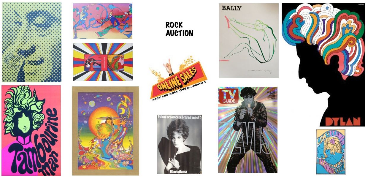
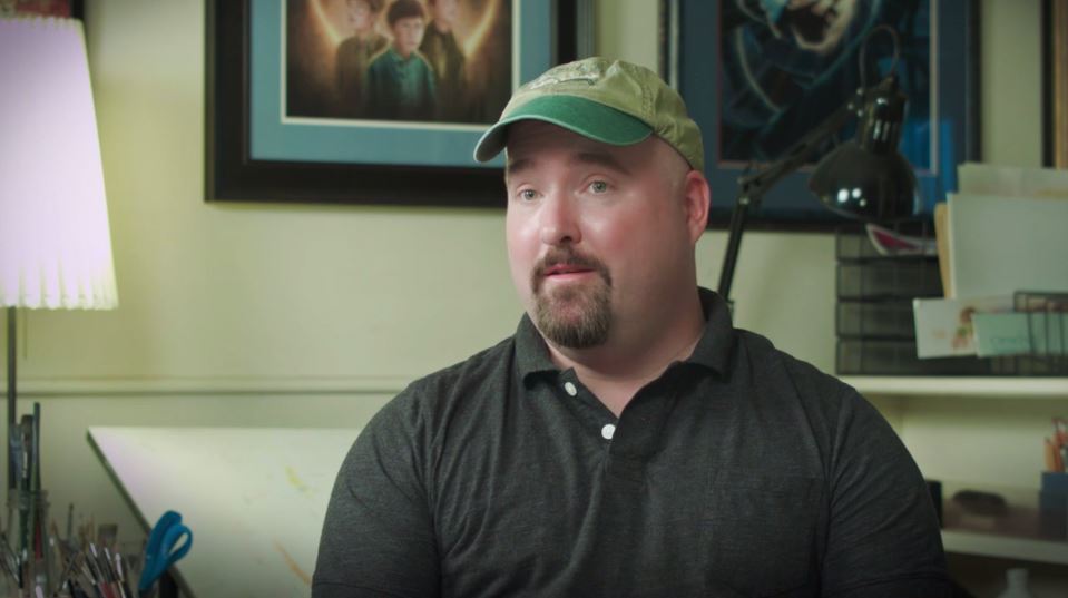
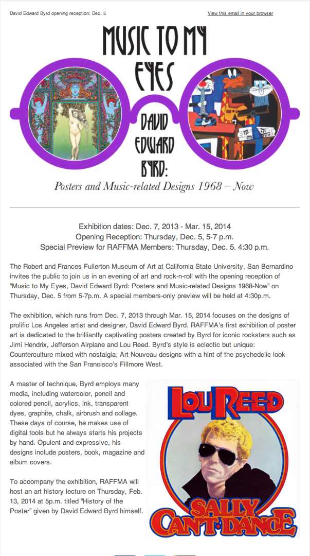
.JPG)
.JPG)
.JPG)
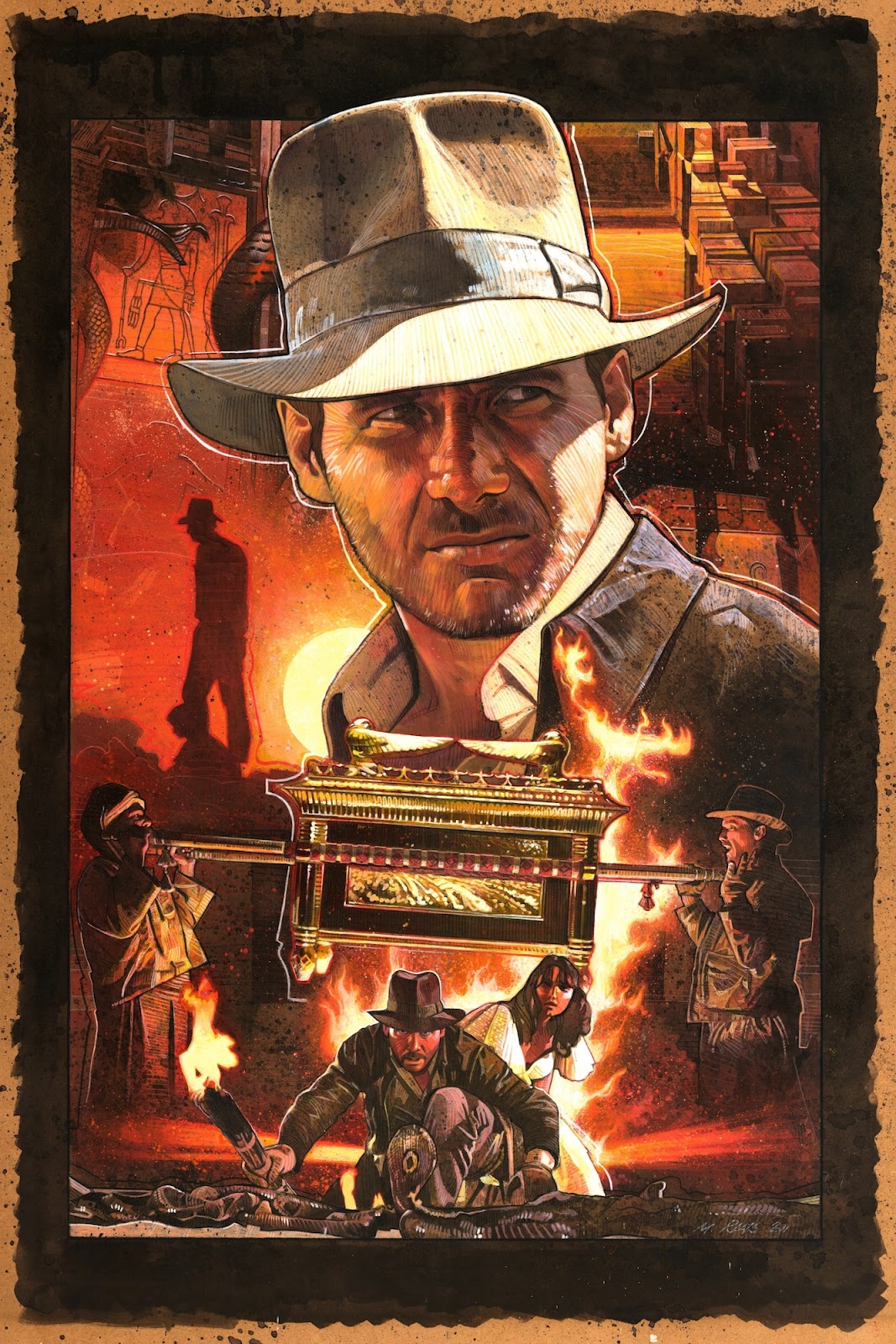
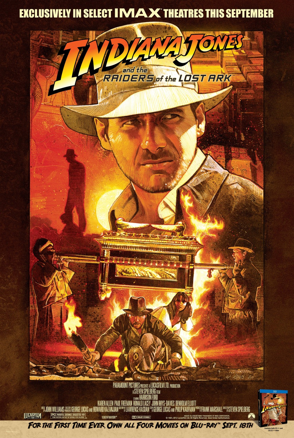


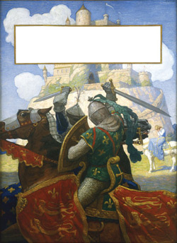
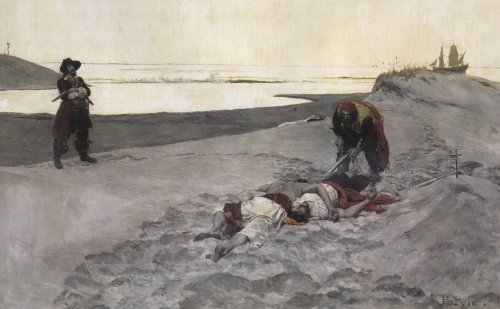

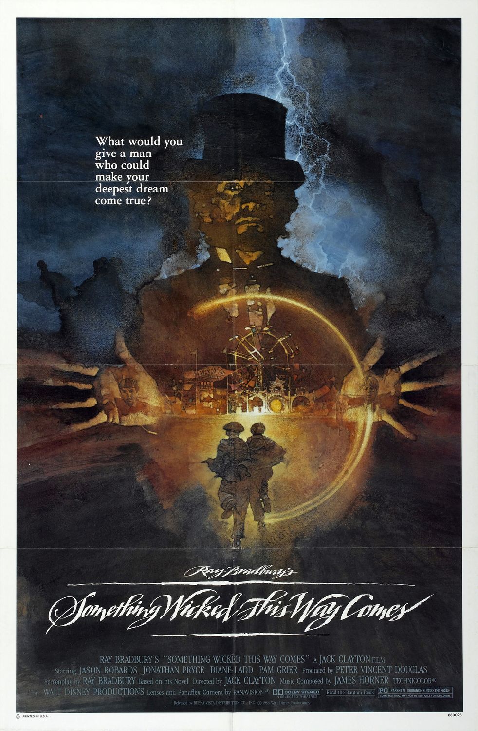

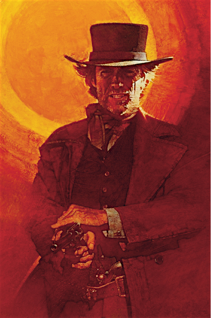
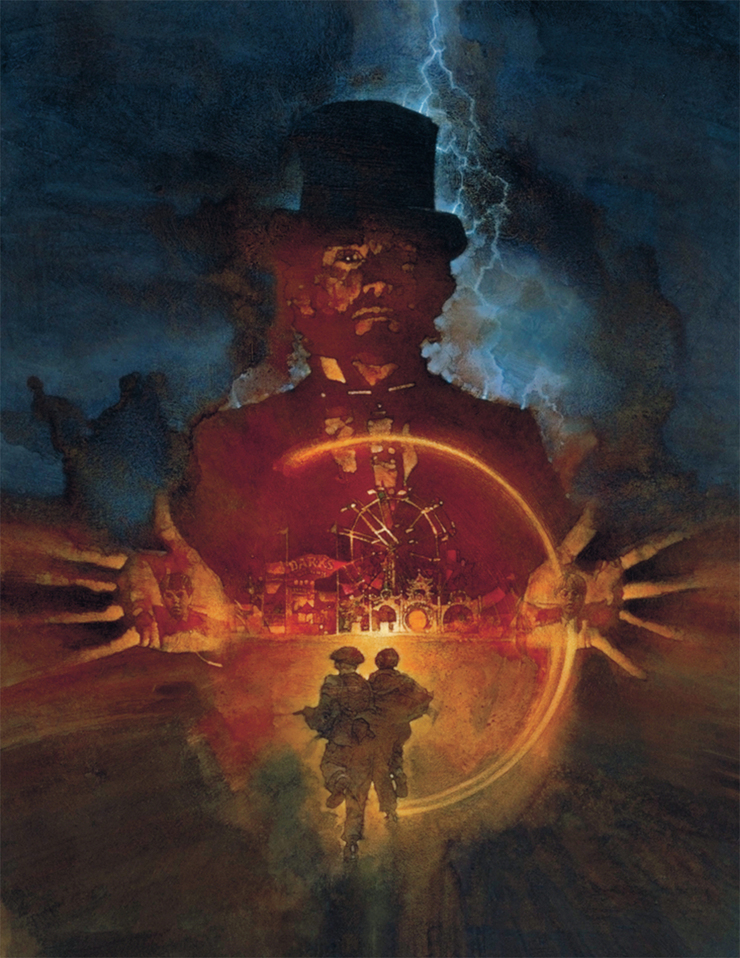
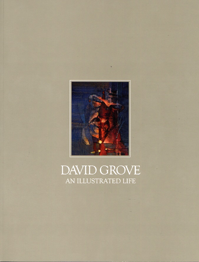
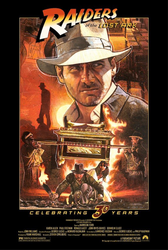
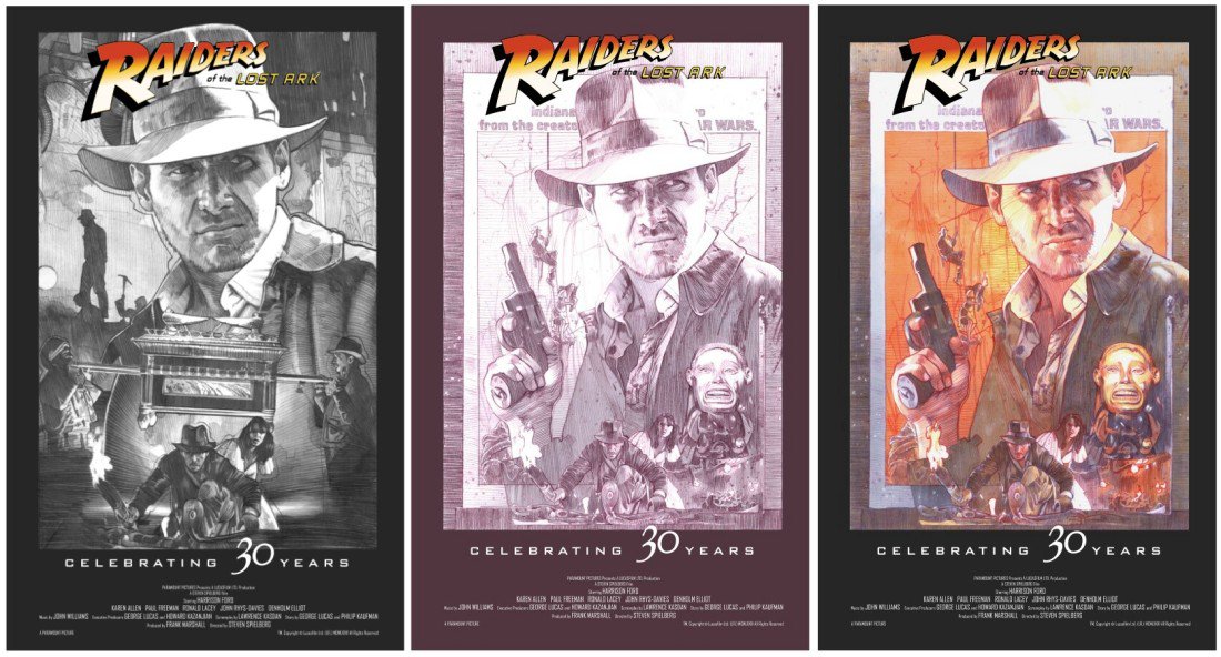
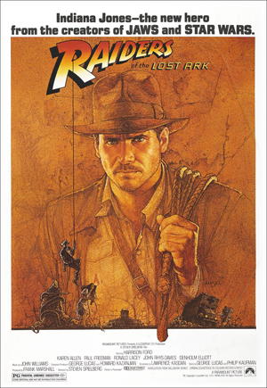
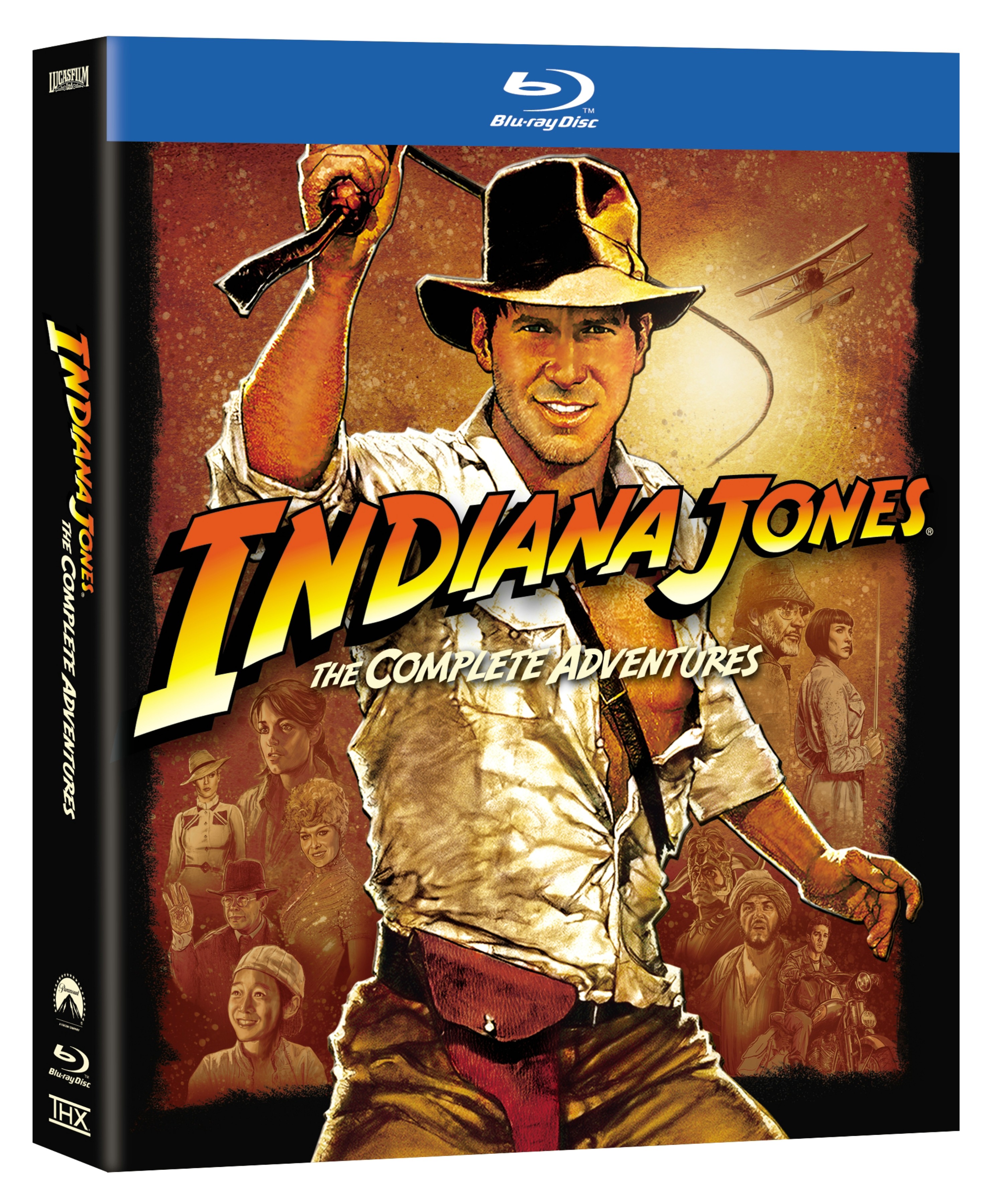
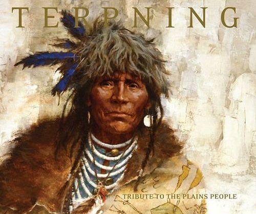
.JPG)
.JPG)
.JPG)
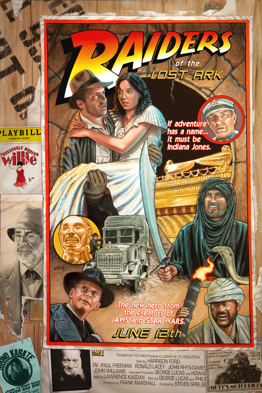

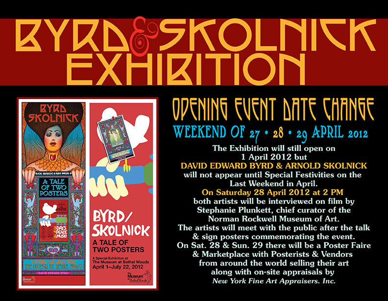
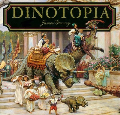 Alas, as I grew older my interest in dinosaurs (and perhaps much of my imagination) waned, taking back seat to other things in life – school, love affairs, work, stress, money… What I’d give to have my inner child back!
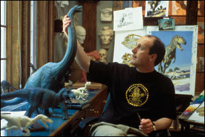
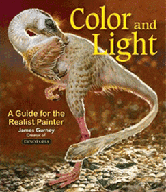
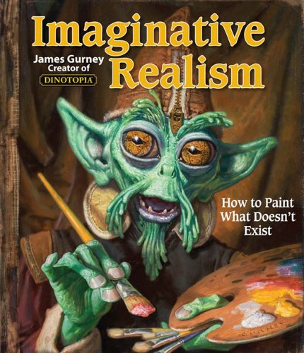
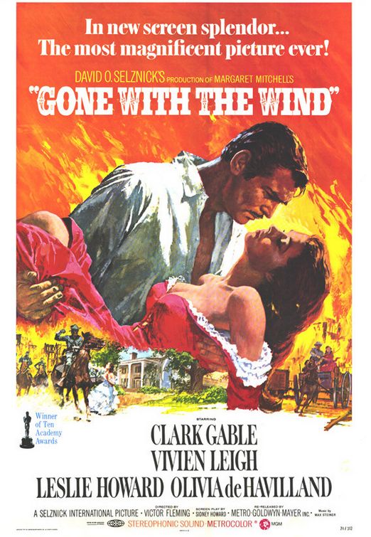


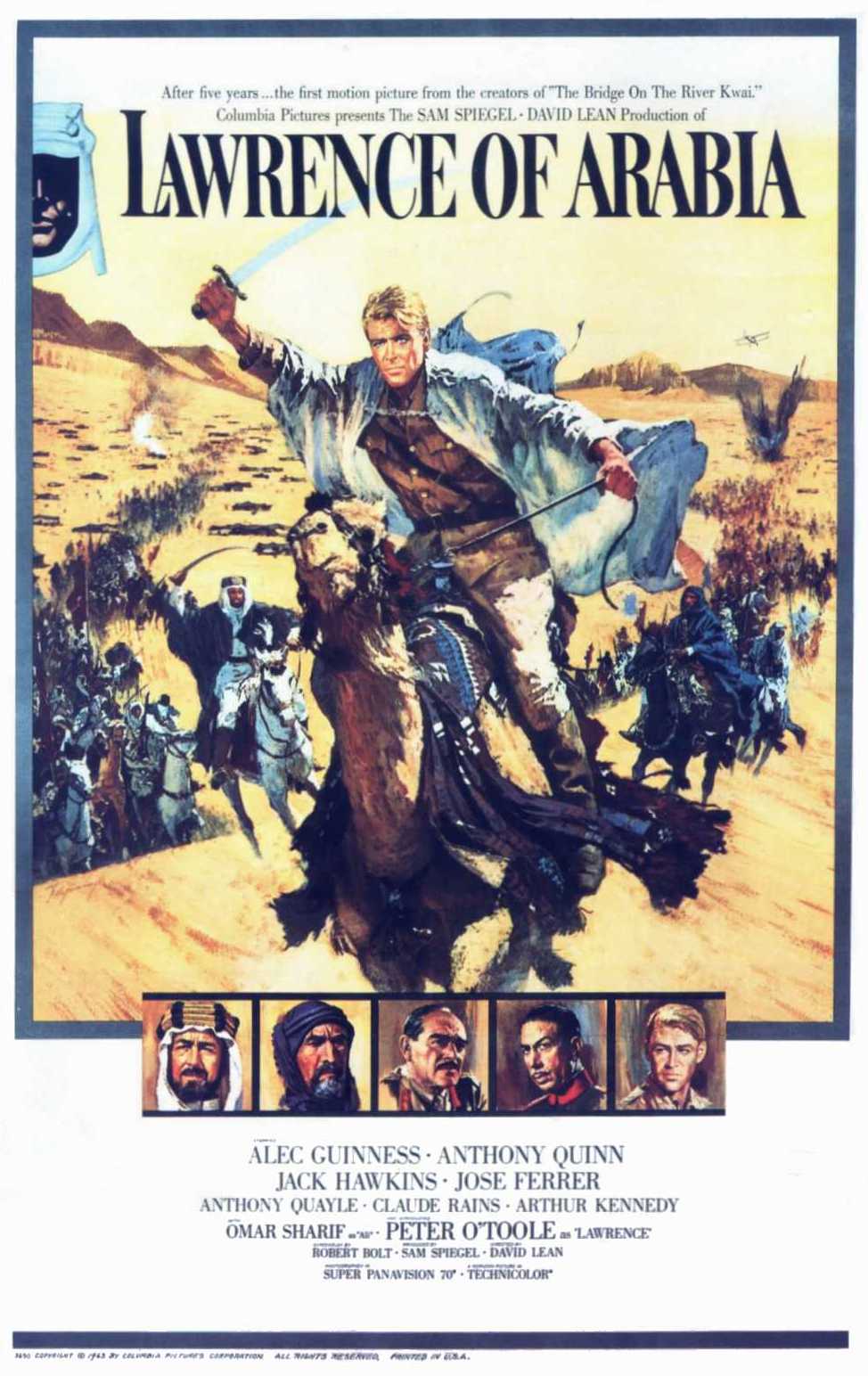
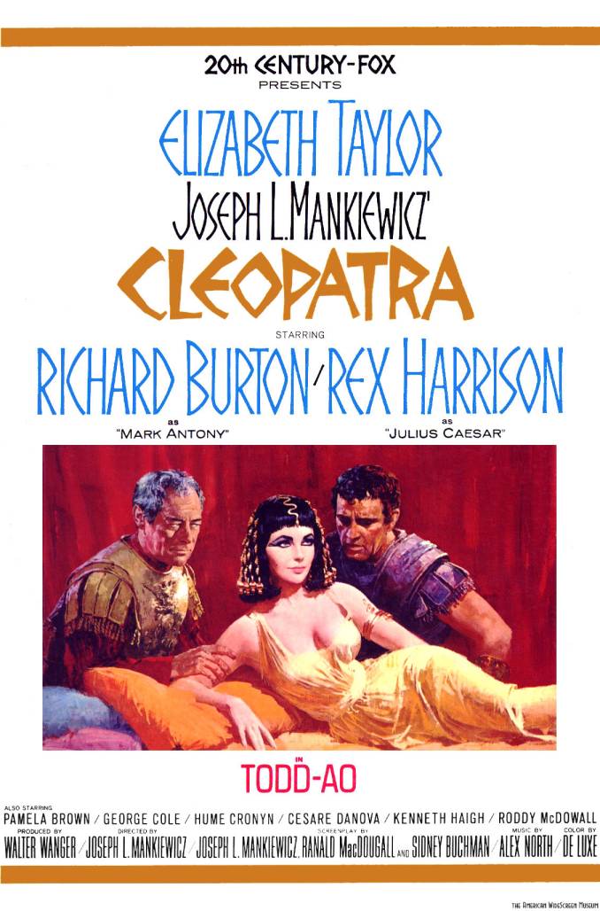
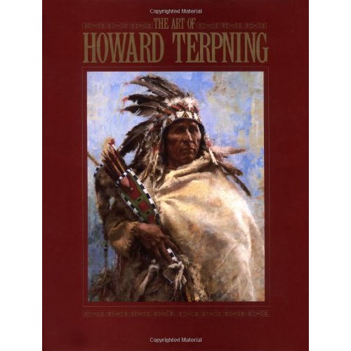
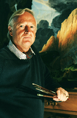 Like
H.R. Giger was to Alien, Italian concept artist Ul de Rico (aka Ulderico Gropplero di Troppenburg)
was an instrumental creative factor in bringing the film's
unique, one of a kind vision to life. When I first saw
the movie at 11 years old, the lush, colorful landscapes
seemed oddly familiar, but I couldn't quite understand
why; I'd certainly never seen another movie that looked
that way before.
Like
H.R. Giger was to Alien, Italian concept artist Ul de Rico (aka Ulderico Gropplero di Troppenburg)
was an instrumental creative factor in bringing the film's
unique, one of a kind vision to life. When I first saw
the movie at 11 years old, the lush, colorful landscapes
seemed oddly familiar, but I couldn't quite understand
why; I'd certainly never seen another movie that looked
that way before.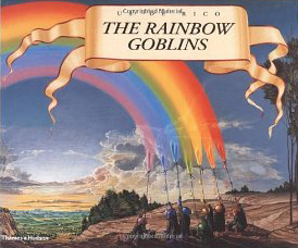 It
was some years later that I discovered the reason. De
Rico was also the artist and illustrator of
It
was some years later that I discovered the reason. De
Rico was also the artist and illustrator of 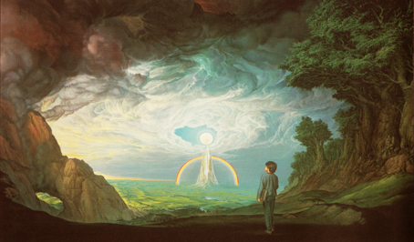
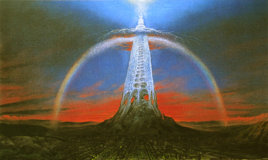

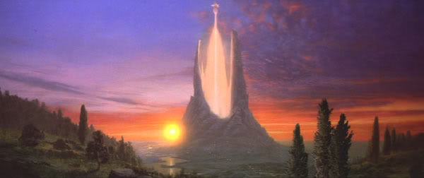
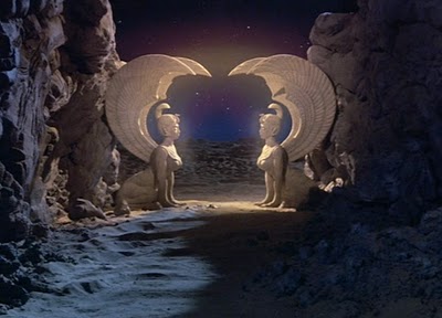
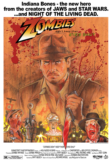
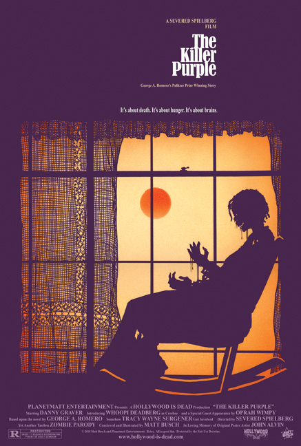

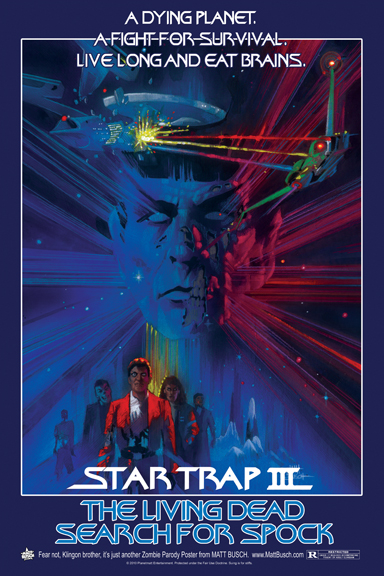
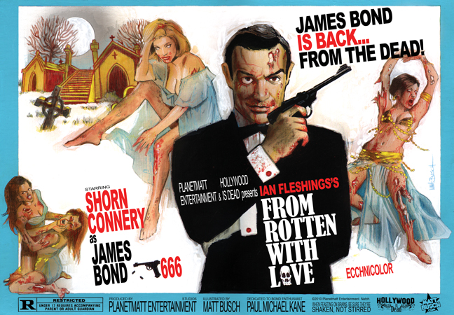
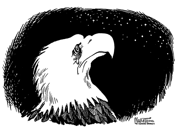
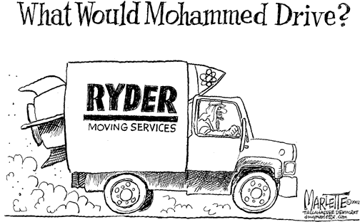
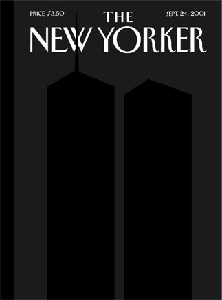
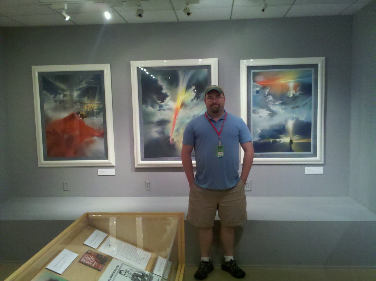

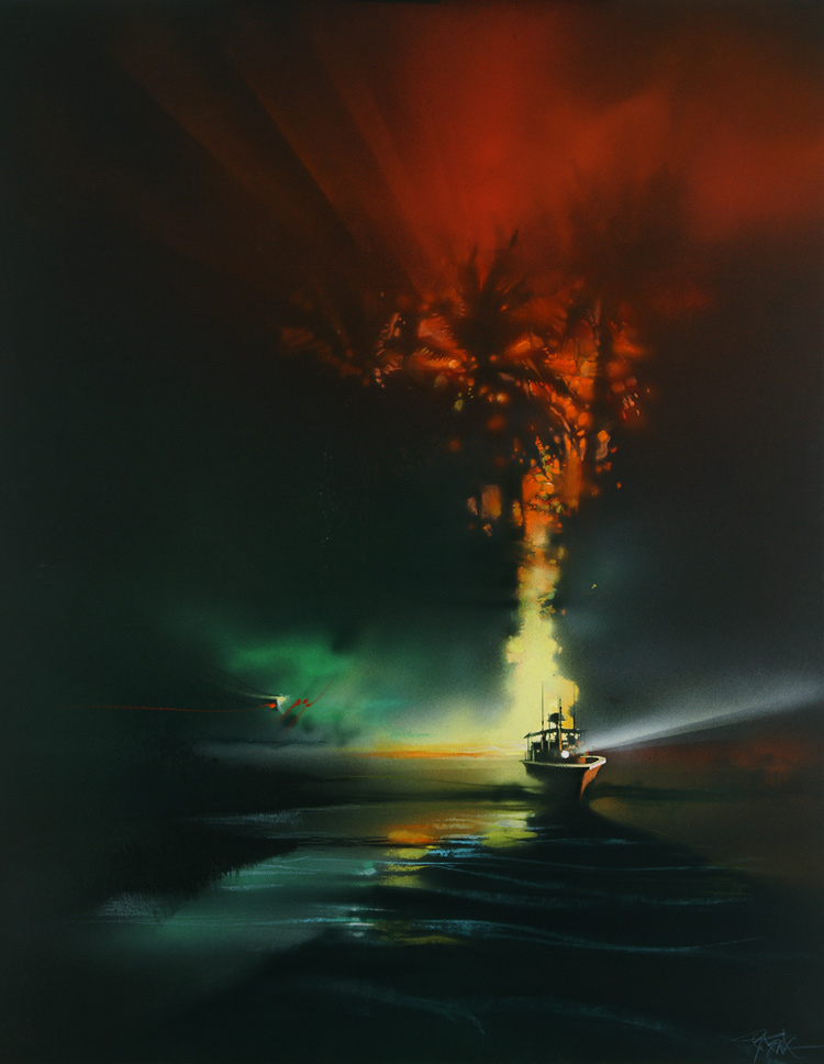

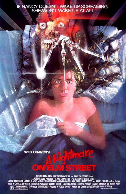
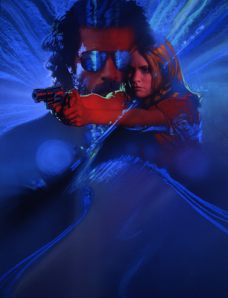
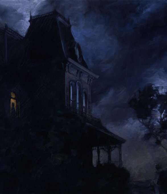
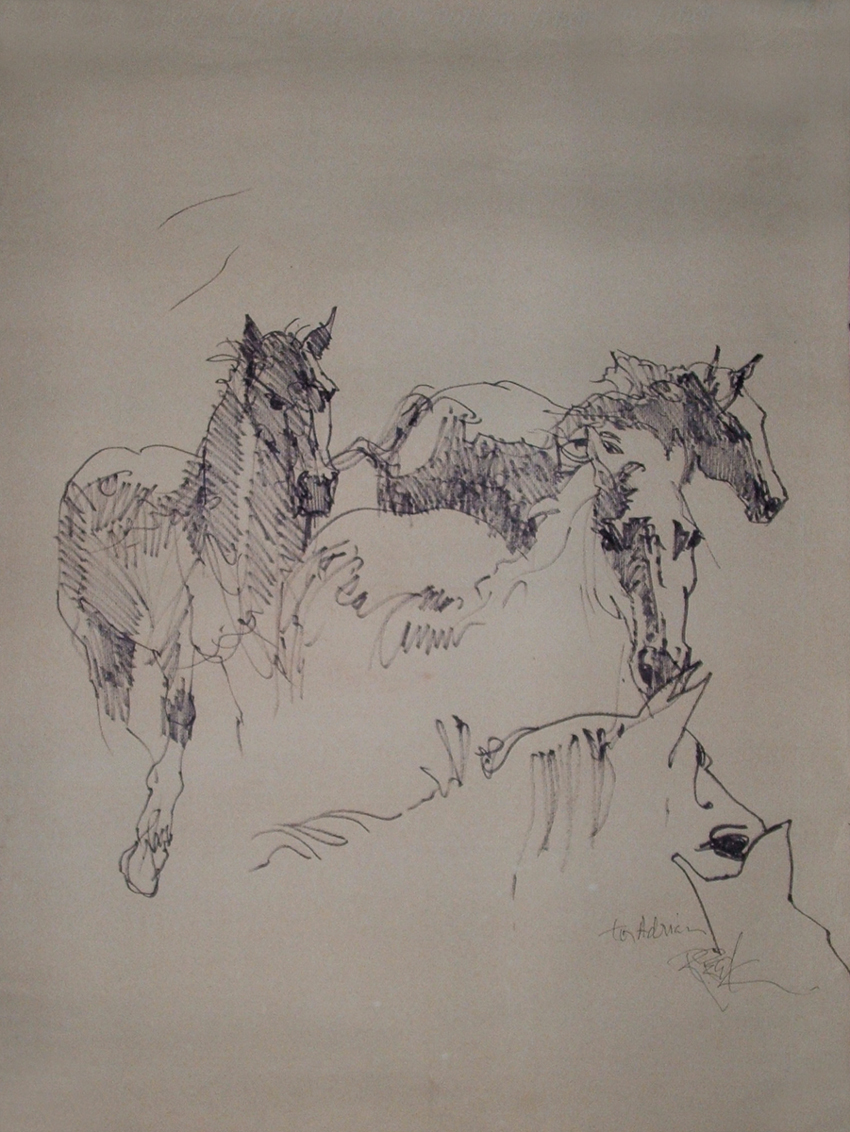

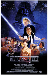
 Though
his name may not be as readily known as some other famous
Star Wars poster illustrators, Kazuhiko Sano shares
a special place in the hearts of many Star Wars fans
for his stunning depiction of Luke, Han, Leia, Lando
and others for the Return of the Jedi Style "B" poster,
released in 1983.
Though
his name may not be as readily known as some other famous
Star Wars poster illustrators, Kazuhiko Sano shares
a special place in the hearts of many Star Wars fans
for his stunning depiction of Luke, Han, Leia, Lando
and others for the Return of the Jedi Style "B" poster,
released in 1983. 
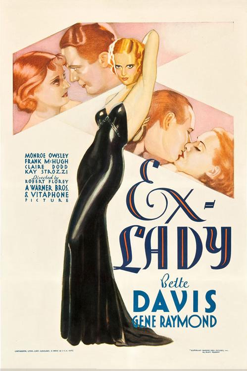

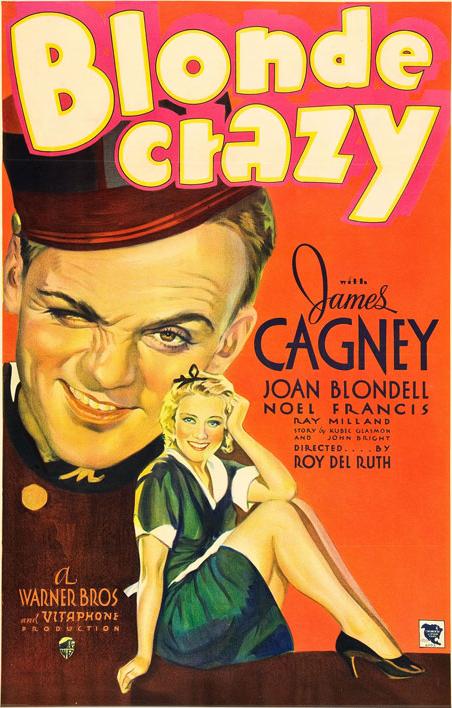
.jpg)
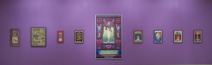
.jpg)
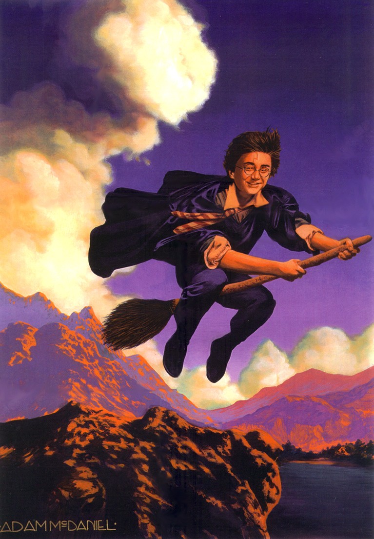
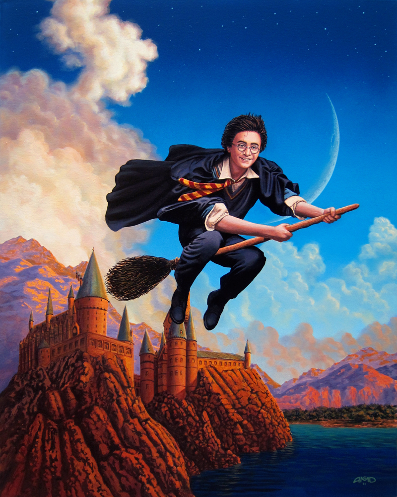

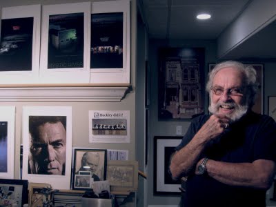
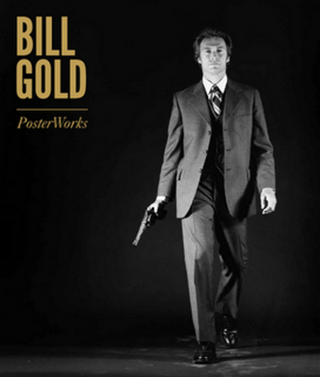
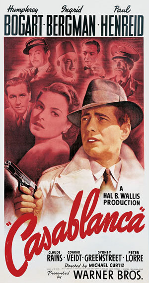
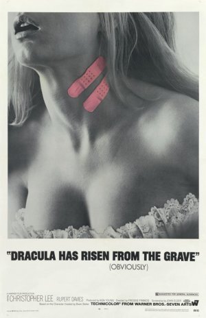
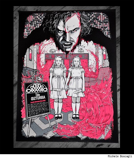

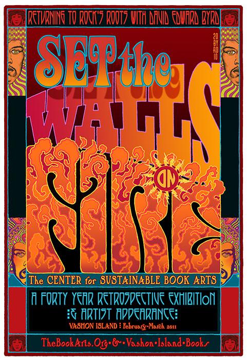
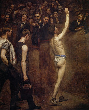
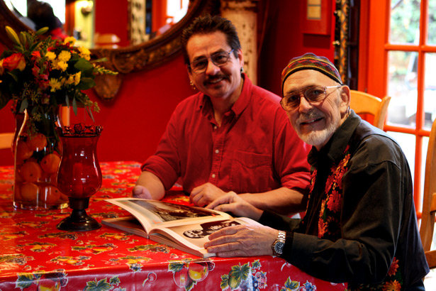


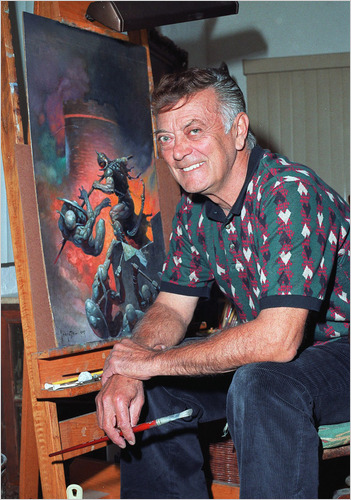
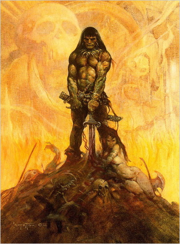
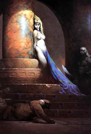
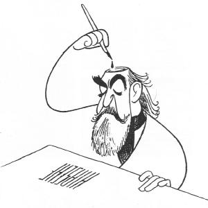
 This
seemingly innocuous tidbit is yet another reminder to me that
my tribute page is in dire need of an update -- including more
information on Richard's life and work (particularly his aspirations
to work in animation), as well as some corrections and clarifications
to what I had written back in early 2008.
I hope to get to this by the end of the summer.
This
seemingly innocuous tidbit is yet another reminder to me that
my tribute page is in dire need of an update -- including more
information on Richard's life and work (particularly his aspirations
to work in animation), as well as some corrections and clarifications
to what I had written back in early 2008.
I hope to get to this by the end of the summer.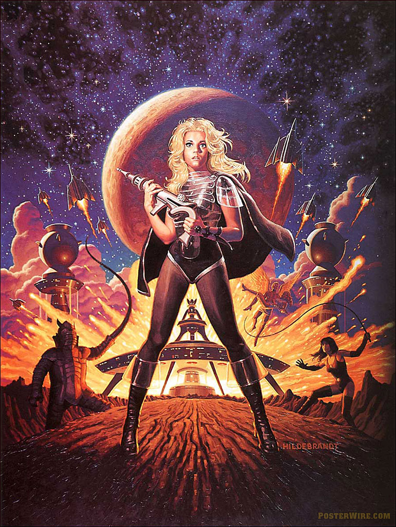

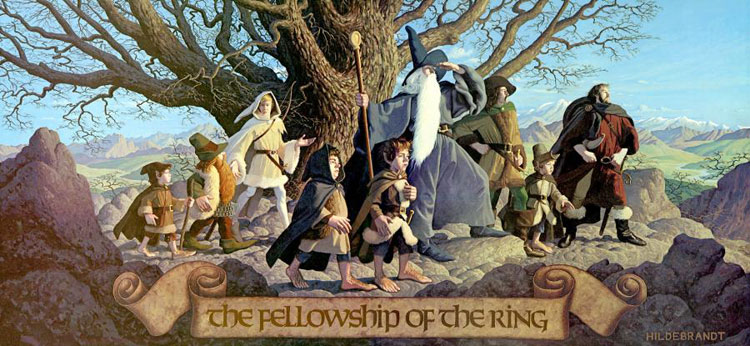
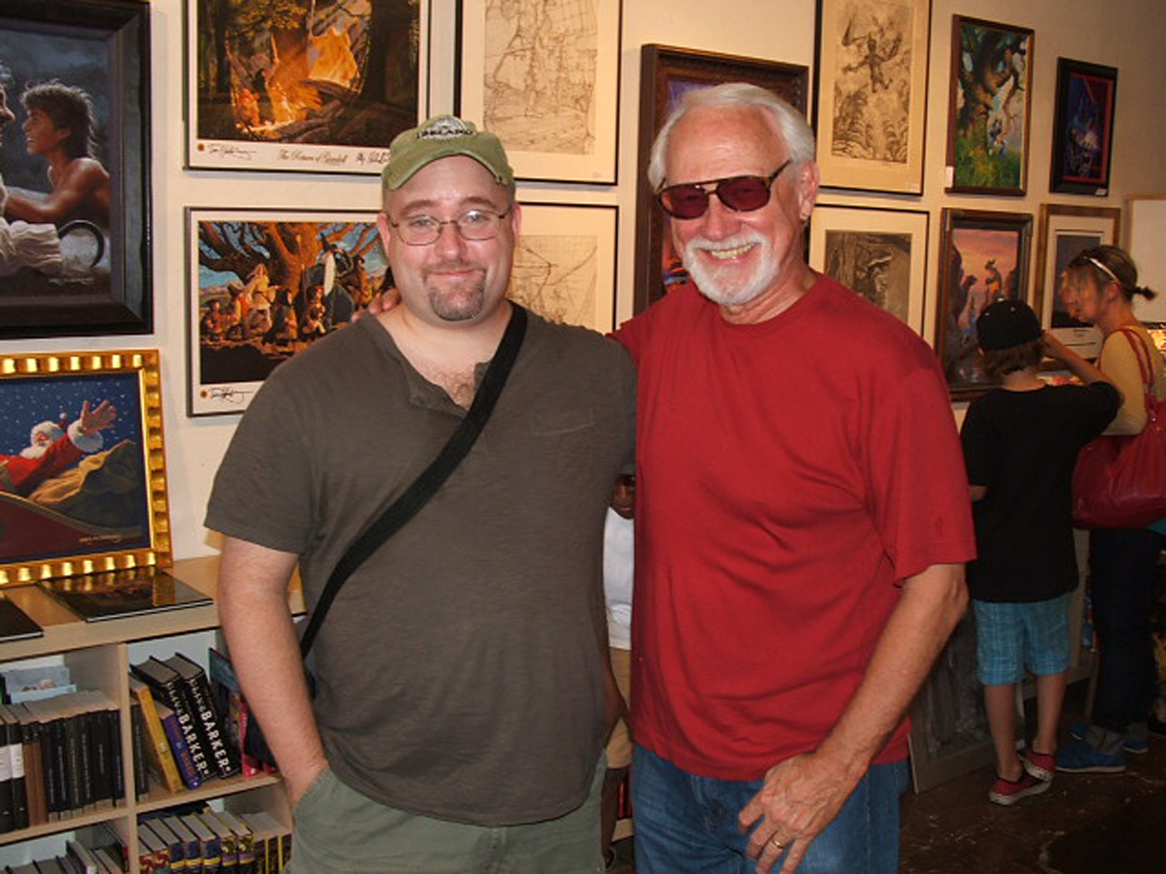
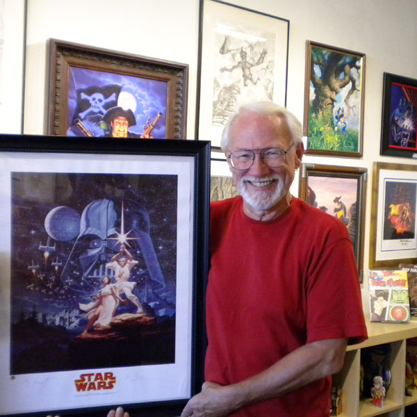

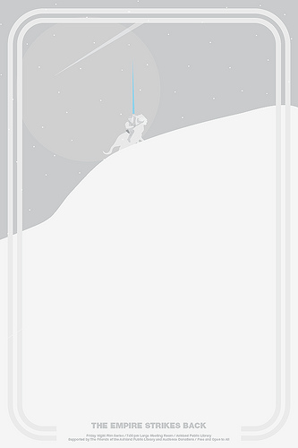
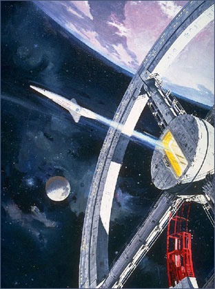
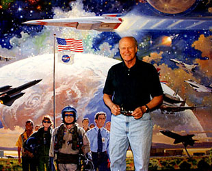 Once
described by author Isaac Asimov as the "nearest thing to an
artist in residence from outer space," McCall's paintings first
attracted the public's attention in the 1960s on the pages of
LIFE, illustrating the magazine's series on the future of space
travel. He expanded on that theme at the invitation of director
Stanley Kubrick, who had McCall paint the advertising posters
for his seminal 1968 science fiction film, "2001: A Space Odyssey."
Once
described by author Isaac Asimov as the "nearest thing to an
artist in residence from outer space," McCall's paintings first
attracted the public's attention in the 1960s on the pages of
LIFE, illustrating the magazine's series on the future of space
travel. He expanded on that theme at the invitation of director
Stanley Kubrick, who had McCall paint the advertising posters
for his seminal 1968 science fiction film, "2001: A Space Odyssey."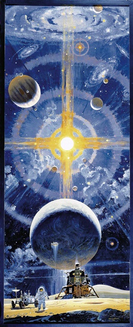 Perhaps
his most famous piece, the six-story "The Space Mural — A Cosmic
View" greets visitors to the National Air and Space Museum in
Washington, D.C. Painted over the course of eight months in
1976, McCall's depiction of the creation of the universe leading
to astronauts walking on the moon is seen by an estimated ten
million annually.
Perhaps
his most famous piece, the six-story "The Space Mural — A Cosmic
View" greets visitors to the National Air and Space Museum in
Washington, D.C. Painted over the course of eight months in
1976, McCall's depiction of the creation of the universe leading
to astronauts walking on the moon is seen by an estimated ten
million annually. 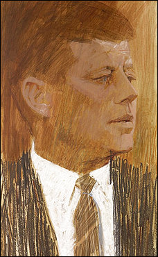
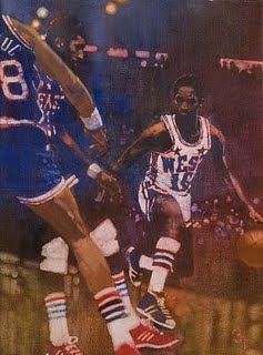 "Others
might portray a married couple dressed formally in suits dazzled
by a car on the street, or a woman in a fancy ball gown swooning
over a car in a showroom, but Bernie's innovation was to put
the cars in real life situations with people in all kinds of
informal poses, having fun and even in some cases standing in
front of the car (heresy!)," illustration authority David Apatoff
wrote in an e-mail.
"Others
might portray a married couple dressed formally in suits dazzled
by a car on the street, or a woman in a fancy ball gown swooning
over a car in a showroom, but Bernie's innovation was to put
the cars in real life situations with people in all kinds of
informal poses, having fun and even in some cases standing in
front of the car (heresy!)," illustration authority David Apatoff
wrote in an e-mail. 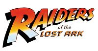 The
logo -- whose typeface, like the film itself, has become so
commonly associated with action and adventure -- was the product
of
The
logo -- whose typeface, like the film itself, has become so
commonly associated with action and adventure -- was the product
of 
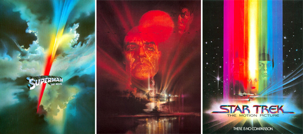
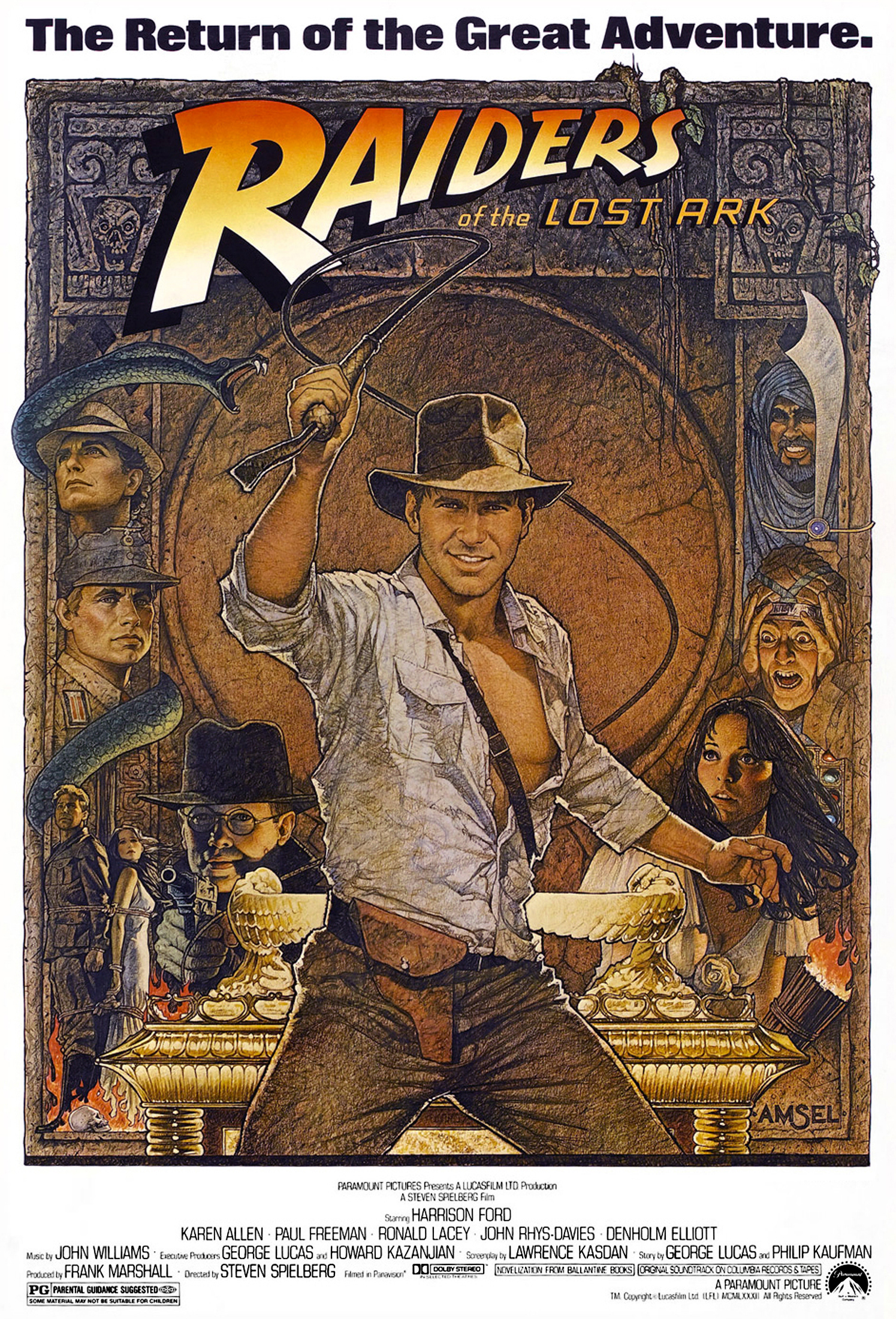
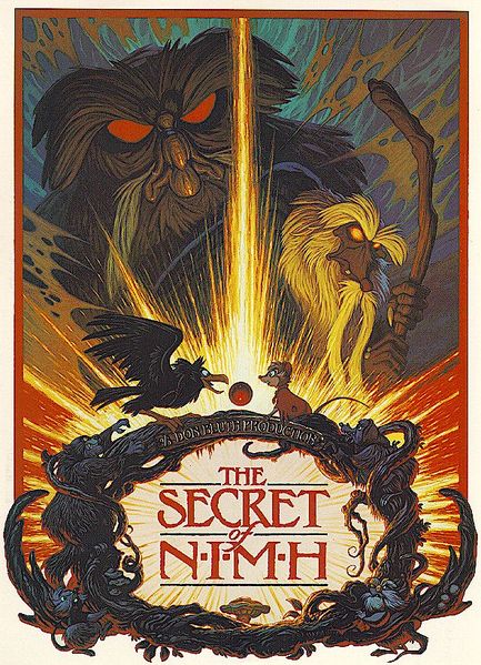
