And here it is. After months of redesign, transferring old files, cleaning up and replacing images, the new and (hopefully) improved Richard Amsel Appreciation site is now live for you to enjoy -- including new images, reworked scans, updated data, and a new layout with additional pages. I've also added the additional domain name Richard-Amsel.com, to follow the previous RichardAmsel.info.
There may be some failed links and a few glitches here and there. I'll need a little more time to properly go through the site now that it's live. Please contact me if you need to report any technical problems.
I originally intended to have all news items archived on the new WIX server, but that was just too monumental a task. The original news archive will therefore be maintained here, on the old server, while more recent items (as of 2015) will also appear on the WIX site. For all other obsolete pages, I've included this convenient banner to direct users to the new site:
To those who ask, I never met Richard Amsel. I was only twelve when he died, and it would be another fifteen years before I knew what the man even looked like -- much less the circumstances of his death, or the colorfulness of his life. But Amsel's work has always meant so much to me; it's as influential and as magical as the movies themselves. For that, the art and the artist deserve to be remembered.
I hope, for my part, that this site will help preserve his legacy. It's a perpetual work in progress, with new additions and information added as I gather them. I welcome your contributions and feedback, and hope you'll help ensure that Amsel's work is remembered in the years to come.
Please understand that this is not an official website, though it has received wide support from members of Amsel's family, his friends and colleagues. While I'm happy to respond to any questions, I do not speak on behalf of the Amsel estate, nor can I offer professional art appraisals.
August 13, 2015: Mea Culpa...
Mea culpa. Two works on my website that I previously attributed to Richard Amsel were NOT done by Amsel... They were done by illustrator Ann Meisel, a contemporary of his, whose style was similar to Amsel's early work. As I revamp the site, I'm doing further research into images from Amsel's early years -- a period that can be difficult to collect work from. There's also so much false information out there that a number of works mistakenly attributed to Amsel manage to fool even me...
__
August 1, 2015: Amsel's original Nancy Reagan TV GUIDE portrait and David Byrd illustrations to go up for auction in August!
Earlier this year I interviewed David Byrd about his friendship with Richard Amsel. David still has one of Amsel's original TV GUIDE cover illustrations -- a portrait of Nancy Reagan that was featured in their June 22, 1985 issue.
How David acquired the painting is a bit of a funny story, but I digress. This, along with a number of David's own illustrations and prints, will be up for auction by the BID NETWORK ONLINE (BNO) in August. Here is a promotional video they did of David:
The Reagan portrait goes up for auction on AUGUST 13th. CLICK HERE to go to the BNO's direct page for this item; it represents a rare opportunity to own an Amsel original, and the starting bid is extremely reasonable. (And you don't have to be a Republican to appreciate it! Just say YES!)
Also, David is putting up for auction a number of originals and high quality limited prints of his own work, including his legendary Rock N' Roll concert posters, broadway and theatre posters, and other film and TV related artwork. Here are links to each of the series within BNO's website:
Years ago, Richard Amsel's friend Michael Danahy relayed a story to me regarding a Barbra Streisand portrait Amsel had painted in the style of Gustav Klimt -- which was stolen while on exhibit at the Philadelphia Art College. "The painting was gorgeous," he said. "I was shocked when I found out, and I asked Richard if he was okay. I thought he'd be so upset, but instead he laughed ... he was compensated $147,000, and was thrilled! He told me, 'God, I hope they don't find it, otherwise I might have to give all that money back!'"
It's been over forty years since that painting's whereabouts were known...but now I'm happy to say it has been found by an avid art collector, and remains in great condition -- as the following photo proves:
I'll post more news on this piece shortly.
July 30: Amsel's portrait of Bette Midler was in the running for Smithsonian's "Recognize wall."
This news from last November must have skipped over my head, but here it is, from a Nov. 28th article in the Washington Post concerning Amsel's legendary Bette Midler portrait:
The National Portrait Gallery pulled three images from its vast collection last month and asked the Internet to pick the one to hang in a prominent space.
The ballot gave biographical information about the choices — artist Georgia O’Keeffe, civil rights activist James Meredith and singer Bette Midler — but it raised a baffling question: Why these three seemingly disparate images? What was the connection?
The answer might surprise you.
But first, the winner was Arnold Newman’s photograph of O’Keeffe, which received 43 percent of the 3,829 votes cast, according to the museum. Meredith came in a distant second with 30 percent, and Midler third.
As a result, the photograph of O’Keeffe has been placed on the museum’s Recognize wall — off the gallery’s G Street lobby — which is the space it uses to react to public events. It’s where a portrait of Robin Williams was displayed after the comedian’s death, for example, and where an image of Katy Perry was featured when she performed at the nearby Verizon Center this summer.
Museum officials declared the crowdsourcing project a success, and they have plans for a second vote early next year. Balloting lasted only two weeks because “the Internet doesn’t have a long attention span,” program manager Allison Jessing said. “We wanted that sense of urgency.”
And the voting happened only online, as a way to avoid ballot stuffing in the gallery and to engage audiences beyond the museum walls.
But why these three? Jessing said they couldn’t just open the vault and bring out any image they wanted — it is a museum after all, with often-controlling curators and conservators at the ready with a lusty “no.” So a small committee started with eight or 10 pieces that were “conservation-ready and display-ready” and pared them down to these three.
The connective tissue is Kleenex thin: Each had an anniversary during the time of the project, although none is a milestone. O’Keeffe’s 127th birthday would have been Nov. 15 (she was born in 1887) and Midler turns 69 on Dec. 1. Meredith became the first African American student at the University of Mississippi — a significant event in the civil rights movement — on Oct. 1, 1962, 52 years ago.
Ian Cooke, who manages the program with Jessing, said the head-scratching is welcome.
“One of the things we hope to do is showcase the breadth of our collection,” he said. Cooke and Jessing are already researching the next group of choices to present to audiences next year. “One of the things we’re excited about, that’s baked into what we do, is we are in a two-way relationship and we want to hear back from” visitors, Cooke said. “We want to expand the conversation.”
May 9: Ultra-rare RAIDERS lithographs!
My good friend Richard Dean Starr kindly brought over these gems for me to see: extremely rare 1:1 lithographs of Richard Amsel's RAIDERS OF THE LOST ARK posters, made directly from the original illustrations back in 1981 and 1982, respectively. These are only two of the few (perhaps four in total, I heard) that exist, with other copies reportedly owned by Lucas and Spielberg. They represent the most accurate reproductions of Amsel's original, untouched artwork, and are the next best thing to owning the originals.
These pics don't do them justice, as I've never seen the artwork look so sharp or vibrant. Absolutely stunning to behold.
December 31, 2014: Two new images!
As 2014 comes to a close, I have two new images to share, thanks to Teresa Ghiretti Amsel: Richard Amsel's portrait of W.C. Fields, and a J.C. Leyendecker-inspired Bicentennial poster. I'm not sure what these might have been used for, or if they were ever reprinted anywhere. The source photos were of substandard quality, and I cleaned them up as best I could.
These will be added to the gallery page soon.
December 29, 2014: Amsel tribute show from 2007; details on abandoned book project.
Since creating this site, I've had occasional conversations with artist and fellow Amsel fan, Randal Tolbert. He just provided me with some images of an Amsel tribute exhibition in North Carolina he curated back in 2007, before (and unrelated to) the 2009 retrospective in Philadelphia. While the show did not feature any original pieces, it did contain a lovely assortment of posters and album covers, and was done with the participation of several Amsel colleagues and family members.
Randal kindly provided the following details about the show, and addressed the single most-requested topic I get inquiries about from fans: the possibility of an Amsel retrospective art book.
When you love collecting, as I always you collect what you love and what you can afford. As a kid, I collected "Peanuts," "Famous Monsters from Film Land," and every "TV Guide" I could find with Richard's art on the cover. I was just blown away by his work, then I began to seek him out and when I saw the first "Raiders" film poster, I HAD to have it. As I got older, I found other items Richard did and then I amassed a huge collection of his print work. As an artist myself, I was in awe of his talent and though I was trained in a different capacity in fine art, I felt what Richard was doing blurred the lines the art world frequently establishes.
For some unknown reason, when I moved to NYC, it didn't occur to me then to look him up, this was about 1981. What was I thinking? Dumb. Then when I read about Richard's death and the auction of his work, I began to think about a coffee table book.
After making nice with Christie's and doing various other detective work, I found and got in touch with Gary Bralow; went to meet him and discuss the possibility of this idea of a book. I began to put together a dummy, which I worked on with Gary and tracked down pieces I didn't know existed, then sadly toward the end of Gary's life, the project seemed to come to a standstill and a lot of my work on it was lost, which had been in Gary's possession. I'm not completely sure what happened to it.
Sometime later, with two years prep work, begun in 2005, I began to organize what I felt was a very deserving exhibit for Richard which was to travel to various libraries and art schools. I met and talked with at length all these people who had worked with Richard in a professional capacity, as well as curator from "The Illustration House" and "The Illustrator's Society." Not only was Richard prolific in such short a time but was greatly admired and respected. I felt his work was slipping away from popular culture and ranked up there with Peak, John Alvin, Saul Bass, Byrd, Struzan and others. So the inspiration for the exhibit was born.
The first show was in the spring of 2007 with both hung and cased pieces in North Carolina and was a smash. With contributions from Jerry Alten (TV Guide and others there), RCA, Michael Amsel, Tony Walton and many others. Most people were very kind and then unfortunately, some claiming rights to Richard's work got upset with me ... and so rather than rock the boat, that was the only show.
Richard's work still continues to inspire young artists and illustrators everywhere and I hope one day a comprehensive traveling exhibit of his work along with a catalog will occur, so others can be exposed to a wonderful artist. That would be my wish.
December 23, 2014: THE SHOOTIST original art up for auction.
Brian Lebel's OLD WEST EVENTS is featuring Richard Amsel's original illustration for the poster of Don Siegel's acclaimed 1976 western THE SHOOTIST. The auction will be on Saturday, January 24th.
This has long been among my absolute favorite Amsel pieces, and I wish I had the cash to put up a winning bid. It really captures Amsel's extraordinary gift for both period nostalgia and montage -- assembling a would-be, jumbled smorgasbord of actors' faces into a clean, beautifully composed image. This was John Wayne's final film, and few actors could claim to have such a fitting valedictory. Amsel's work further added to Wayne's mythic status by having the actor's eyes hidden in shadow.
UPDATE: The original artwork sold at auction on the floor for $19,360.00!
December 10, 2014: Wuthering Heights...
Once again, we must extend a round of very special thanks to a fellow Amsel fan for their contribution. This time it's Scot Ryersson, who provided this scan of Emily Brontë's "Wuthering Heights" (An Enriched Classics Edition, 1972), with the cover illustration by Richard Amsel. I'll be adding it to the gallery in the near future.
December 2, 2014: Even Old Blue Eyes got the Amsel treatment...
Very special thanks to Amsel fan Randal Tolbert for the heads-up on this one: Richard Amsel's illustration of Frank Sinatra, featured on two different albums for RCA VICTOR: 1972's THIS LOVE OF MINE (left), and the 1976 Sinatra/Dorsey collection PURE GOLD (right). I had never seen this artwork until now, and am grateful for Randal's contribution.
I'll be adding this, and other recent images featured on this news page, to the gallery sections of this site later in the month. I'm hoping to dedicate a little free time over the holiday break to reorganize this site a little bit.
In researching these Sinatra albums, I also came across the below image for I'LL SEE YOU IN MY DREAMS. While it strongly resembles Amsel's style during that period of the early 1970's, I can not yet verify it as one of his. Does anyone have more info on it?
November 23, 2014: New TV GUIDE and ad images.
My dear friend Chris Smith, a lifelong TV GUIDE collector, recently uncovered two Amsel illustrations within back TV GUIDE issues. It's hard trying to track down such interior images, and these are something special.
The Gary Coleman artwork, from their Feb. 1, 1986 issue, was unique in that it was published posthumously -- less than three months after Amsel's death. I also suspect it was originally developed as a proposed cover story, but for whatever reason was postponed and relegated to a featurette.
Chris also sent me a pencil illustration ad for DYNASTY, which I'd never seen before.
Judy Goldman also sent me a snapshot of a CINEMA COLLECTORS ad that featured Amsel's illustration of Marilyn Monroe -- which I suspect repurposed his SEVEN YEAR ITCH poster. I remember seeing this ad when I was a kid, and even ordered a RAIDERS OF THE LOST ARK poster from them because of it. Even at eleven, I was an Amsel freak. :)
Update! Randal Tolbert, a longtime Amsel fan, verified that this SEVEN YEAR ITCH image was originally used not for a poster but the film's reissue on laserdisc back in the 1980's.
November 22, 2014: Amsel's alternate comps for MAD MAD: BEYOND THUNDERDOME!
Consider this discovery as 180 degrees of awesome. I just found two images online of Amsel's alternate designs for MAD MAX: BEYOND THUNDERDOME -- the third of George Miller's epic apocalyptic action series, and the last film poster Amsel completed before his death. (His work on JEWEL OF THE NILE only consisted of a few preliminary sketches...and one *might* be able to find them if they look hard enough.)
November 18, 2014: Bonhams' auction, "There's No Place Like Hollywood!" to feature Amsel's GWTW cover.
One of the fertility idols Indiana Jones hunted in RAIDERS OF THE LOST ARK, Sam's legendary piano from CASABLANCA, and Richard Amsel's original TV Guide cover illustration featuring GONE WITH THE WIND are among the treasures featured in Bonhams' upcoming auction, "There's No Place Like Hollywood," to be held in NYC on Monday, Nov. 24th at 1pm. I managed to get a sneak peek at the preview within their Hollywood location earlier this month. (Special thanks to Richard Atkins for the heads up!)
I must have taken over a hundred photos of the various items, but I obtained special permission to feature just the Amsel artwork photos here. Due to the location and lighting of the framed piece, it was hard to get a great snapshot without glare.
Update! Here are details from the Bonhams' catalog. I managed to buy the last softcover copy they had available when I visited that Sunday afternoon, and only got around to scanning it now. Unfortunately, this auction did not have a winning bid.
September 7, 2014: New and improved images!
During a recent trip back east to visit family, I spent an afternoon in Philly with Joseph Amsel, Richard's nephew. I had not seen him since the 2008 art show at the University of the Arts, though we've spoken frequently over the phone in the years since. Joseph is a very enterprising and creative fellow in his own right, having worked on documentaries and videos since graduating college. He's also an accomplished videographer and photographer -- check out his web site and take a look.
He shared with me a number of his uncle's original sketches and personal photos, which have never been published. I dare not post them here as we're saving them for a special occasion (more on that later), but can share with you some images of book covers that I was unaware of until now, which I'll soon add to the galleries on this site:
Also among the images was one of Amsel's illustrations for WOODSTOCK, which he sent out to ad agencies. I noticed that his original piece had different colors from the modified image I found online; it also had Amsel's signature.
Another improved image Joe provided was for TV 70, a TV Guide-style magazine:
Finally, last night I was visiting THE LAST BOOKSTORE in downtown L.A. for the first time. In the $1 book section, I chanced upon The Nostalgia Quiz Book by Martin A. Gross, which features a cover illustration by Amsel. (Below left.) I'd seen a variant of this before, which was rereleased as Trivia Quizzes. (Below right.)
August 14, 2014: THE WHO'S TOMMY -- the Grammy award-winning album.
I've been meaning to post this for ages. In 1972, the rock opera TOMMY was released in a special orchestral version featuring the London Symphony Orchestra, conducted by David Measham of arrangements by Wil Malone. It was issued in boxed-set LP format, featuring original artwork and photography. It won the Best Album Package Grammy in 1974.
The "wrap" cover, front and back by Wilkes & Braun, Inc.
I obtained the album through eBay, and it's really a masterpiece to behold, featuring contributions from some of the leading illustrators of its time. Rather than just showing Amsel's contribution -- a portrait of Pete Townsend (top left) -- I opted to scan all the artwork. It's presented here in order of appearance.
August 13, 2014: TWENTY-FOUR BY THIRTY-SIX trailer.
Whoa! Check out this trailer for TWENTY-FOUR BY THIRTY-SIX, a documentary in progress about movie poster art. I'm especially happy that the trailer opens with Richard Amsel, and hope the film will help ensure his creative legacy.
Look fast for the bloated guy with the green baseball cap:
August 10, 2014: Amsel interview from AFTER DARK.
This one's been a long time coming: a scan of the full article on Richard Amsel for After Dark: The National Magazine of Entertainment. It was written by Henry Edwards, and was published in November 1973, when Amsel was only twenty-five years old. Even then, his work was gaining national attention.
Interesting to note that the photo of Amsel was taken by none other than Kenn Duncan, a legendary dance and celebrity photographer, who himself succumbed to AIDS in 1986.
AFTER DARK was a curious publication for its time. While it wasn't deliberately positioned as an official "gay" magazine -- or designed exclusively for a gay and lesbian readership, for that matter -- it was targeted to affluent, highly cultured New Yorkers and arts patrons, knowing full well that many of them were gay. This is quite apparent within the magazine's paid advertisements, with page after page of less-than-subtle adult and erotic-themed ads.
I decided to include some scans of interior pages beyond the Amsel interview, as they include Amsel's illustration for the Bette Midler/Barry Manilow show, a Triton Gallery ad for David Edward Byrd's posters, and a "MUSCLE UP!" ad featuring a future actor turned governor:
August 7, 2014: The Geranium on the Window...
Very special thanks to Amsel fan and illustrator Randal Tolbert for identifying this one: a single page illustration Amsel did for Albert Cullum's The Geranium on the Window Sill Just Died But Teacher You Went Right On.
The book was published in 1971 by Harlin Quist, Inc., and is a very interesting discovery, with each page illustrated by a different artist -- each in their own, unique style. Other artists include Philippe Weisbecker, Norman Adams, J.K. Lambert, John Alcorn, and Elwood Smith; there are 29 in all.
Amsel's illustration is reminiscent of his inner jacket artwork for Bette's Midler's Songs for the New Depression album, done in 1976:
August 6, 2014: A little TV GUIDE fail...
With all the covers Richard Amsel did for TV GUIDE over the years, one would think the publication would give him a fitting tribute in their celebratory issue, TV GUIDE MAGAZINE BEST COVERS - VOLUME 1. But alas, they had a little screwup...
The good news: Amsel is mentioned in the issue. The bad news: the one "Amsel" cover they feature was actually done by another artist!
If VOLUME 2 should come to pass, here's hoping the magazine editors do a little more homework. I already took the liberty of notifying them of the mistake through their website.
June 12, 2014: This is Maurice Chevalier!
Ooooh la la! I just found these images -- two more Amsel album covers for RCA. The first, THIS IS MAURICE CHEVALIER, is done in the lovely art nouveau style; even Amsel's signature seems Parisian! For the second, THIS IS BENNIE GOODMAN, I've only been able to find images of the front; if anyone can provide a pic of the full, unfolded album, I'd appreciate it.
June 6, 2014: Early paperback book images...
The website revamp is going at a snail's pace due to an art commission I'm dealing with that will swamp my free time. In the meantime, however, I've come across two old paperback books Amsel did the covers for:
Popcorn Venus by Marjorie Rosen
Cover for 1974 Avon edition (USA).
It's surprisingly challenging to track down paperback book illustrations from this period in Amsel's early career, and frankly I don't even know how many he did; he was a very busy man, it seems!
Another challenge is verifying what work is actually Amsel's, particularly when the only available pictures are of very poor quality. Consider this image of an alternate hardcover edition of POPCORN VENUS that someone claimed has an Amsel cover. While it resembles Amsel's early style, I can not verify its authorship.
May 27, 2014: Just say NANCY!
David Edward Byrd shared with me recent photographs of Richard Amsel's original illustration of former first lady Nancy Reagan, done for the June 22, 1985 issue of TV GUIDE.
It truly is a stunning work -- Amsel himself amusingly stated that he was proud of the way he captured her teeth! -- and shows just how delicate and subtle the original artwork is when compared to the final reproduced cover. It's also one of Amsel's last pieces, completed just a few months before his death.
To learn more about this remarkable illustration, David welcomes you to email him at jolinobyrd@roadrunner.com.
May 23, 2014: "EMERALD CITY" interview with Amsel, Byrd from 1978.
Count this as one for the illustrators' history books: an excerpt from the New York local access show, The Emerald City, featuring interviews with Richard Amsel and David Edward Byrd. It aired on October 30, 1978.
By all personal accounts I've heard, Amsel was very shy in front of cameras, and this is, to the best of my knowledge, the only video footage of the artist discussing his career. David Byrd, on the other hand, is obviously anything but reserved here...and I'm happy to say he's just as spirited now as he was then. (The rest of us should be so lucky...)
This clip was made possible thanks to the kind permission and assistance of The Lesbian, Gay, Bisexual & Transgender Community Center National History Archive, who were extremely helpful in providing me with a DVD copy, taken from their best available video master.
For more information on "Emerald City" please contact:
Rich Wandel Center Archivist / Historian
The Lesbian, Gay, Bisexual & Transgender Community Center National History Archive
208 West 13th Street New York, NY 10011
Email: RichW@gaycenter.org http://www.gaycenter.org/community/archive
May 22, 2014: Website redesign!
At long last, I've been making progress in redesigning the look of this site. I had debated doing something very interactive, but due to time constraints -- and my fondness for ease and simplicity -- I opted for something a little more straightforward and classic.
The galleries and tribute article will be reworked, but I wanted to at least complete the news pages as a starting point. For this, I thought it best to segregate news related directly to Amsel's work and career from other tangental news related to movies, art, and other artists.
Recent updates will be posted on the main NEWS PAGE. For older entries, I've consolidated all the previous archived news pages (again, segregating items directly related to Amsel vs. other posts); these can be found by clicking on the red ARCHIVES button at the bottom of each section.
Hope you enjoy.
December 3, 2013: TVGuide.com's Amsel tribute.
TV Guide pays tribute to Amsel's covers in its December 2nd online issue, and I want to thank editorial assistant Elizabeth Wagmeister for providing me with a PDF. She had reached out to me some weeks ago in researching the article, and I was only too happy to oblige.
October 25, 2013: Dangerous Summer paperback.
Special thanks to Scot Ryersson for pointing this one out to me: Amsel's cover for the 1969 paperback release of Dangerous Summer, by Carolyn G. Hart. Keep in mind the artist was only 21 when he did this!
October 8, 2013: Additions to the gallery.
I've been meaning to give this site a major makeover, and was deliberately postponing making new updates until the entire overhaul was ready. As that's taking longer than I originally thought, I've decided it's time to finally post some updates that have been long overdue.
Last May I visited Judith Davis Goldman at her home in New York. She was one of Richard's closest friends, and helped care for him in his final days. She and I had been corresponding for over a year about Richard's life and work, so by the time we finally came face to face, it felt more like a reunion of old friends than an introduction.
Judy was so gracious, and the two of us exchanged quite a few colorful stories. Much of what she told me will be detailed in my Amsel tribute page in the near future. In the meantime, let me share a few new images for you:
Goldman often modeled for Amsel's illustrations.
Here is his original photograph of her, used
for the poster BEYOND THE LIMIT.
Goldman owns Amsel's original illustration
of BEYOND THE LIMIT.
ABOVE: Goldman also has the printed poster
on display, neighboring the original artwork.
Amsel signed it for her with the above message.
AT RIGHT: The original, unused Amsel artwork
for the film ALL NIGHT LONG. Seeing it marked
the first time I ever saw it in color. This is the best
image I was able to capture with my camera,
without having to remove the delicate artwork
from its frame.
May 5, 2013: Edge magazine's mention of Amsel's Silver Star award.
I recently came across the Summer 2009 edition of The University of the Arts magazine, edge, which includes a brief mention of Amsel's pothumous Silver Star Award for distinguished alumni.
March 2, 2013: Scott Fitzgerald biography
Very special thanks to Ed Edo Dennis, who provided this image of Amsel's cover to the Ballantine paperback edition of Scott Fitzgerald.
January 25, 2013: A Walk in the Rain...
Here's another one of Amsel's magazine illustrations I found, thanks to eBay. This was featured in the September, 1972 issue of Ladies Home Journal:
December 30, 2012: New images - Body and Soul, What's Up Doc?, and Eleanora Duse.
Here's a nice little update to wrap up 2012 -- three new images of Amsel artwork! The first is the final paperback book cover Amsel did for ELEANORA DUSE; it remains my personal favorite out of all Amsel's book illustration work. The second image is a color detail of Ryan O'Neal and Barbara Streisand for the film WHAT'S UP DOC?; this was found online, and I did a bit of digital editing to remove some text from the artwork.
The final image is a special one, as I haven't seen it before -- Amsel's album cover for Columbia Records' 3-disc vinyl release, BODY AND SOUL: FIVE DECADES OF JAZZ ERA SONG.Heartfelt thanks to Amsel fan and graphic designer Jeff Crawford for providing this image!
November 17, 2012: New images - Nijinsky (paperback and Blu Ray), Good Housekeeping, and Indy...
Richard's sister, Marsha, recently provided me with a photo of a centerfold illustration he had created for a GOOD HOUSEKEEPING article. (Marsha herself modeled as the girl in the mirror!) While the original pages are in poor condition, I've digitally cleaned up the photo a bit. I'm not sure what the date of this issue is (or the artwork), so if anyone knows, please pass it on!
Here's another rarity from the 1970's: while Amsel did the movie poster for the 1980 film NIJINSKY, I wasn't aware that he had also illustrated a 1971 Pocket Books paperback edition of the book that inspired the film. Very, very special thanks to Richard Pastor for this long-lost image:
Finally, I'm happy to see Amsel's work continues to be used in recent rereleases of his films. His original poster art for the film NIJINSKY was featured on the new Blu-Ray edition, and a modified version of his legendary Indiana Jones portrait was prominently placed on movie posters for AMC's nationwide marathon of the adventure series. For NIJINSKY, again we have an example of how much the colors of an illustration can vary; they look much warmer (with more emphasis on purples than blues) than the earlier scan I made from the old Christie's catalog.
November 10, 2012: LOS ANGELES magazine's profile of poster artists, circa 1983...
I've had a number of wonderful, heartfelt conversations with Richard Amsel's sister, Marsha, and recently she informed me of a LOS ANGELES magazine article from 1983, profiling movie poster artists. After scrutinizing eBay for a few weeks, I finally got my hands on a copy, and it's an extraordinary time capsule or sorts, reminding me of my childhood in the early 1980's -- where VCRs and "car phones" were luxury items costing several hundred dollars, polo silk shirts cost $39.95...and a posh condo in Los Angeles was still more than I could afford.)
It's good enough that Amsel himself is profiled in the article, but what's really special is that it contains a rare photograph of the artist alongside his work. Notice, too, the size of the original pieces; while most poster artists customarily produce work at the same scale (if not larger) of the final printed images, Amsel's work was usually a bit smaller -- but so detailed that the images would not lose anything when blown up to poster size. (The original RAIDERS poster is such an example.)
And -- God! -- look how YOUNG Amsel looks. It's hard to think that, by this time, he was already one of the leading poster artists in the country, nearly fifteen years into his professional art career. It's also hard to think that he would die less than three years later, at an age a year younger than I am now.
Alas, of all the artsists profiled, only two are still with us -- the great Drew Struzan, of course, and Bob Tananbaum, whose extensive work has evolved into portraiture, western, and sports themes. The others passed away all too soon, tragically long before their time; Peak in 1992 from a head injury, and Alvin of a heart attack in 2008. (The latter on the same day this very website was created.)
My hat's off to all these guys -- with sincere thanks for the inspiration they've given me.
July 7, 2012: Amsel's DYNASTY artwork
While it's pretty easy to find images on the web of Amsel's published covers for TV Guide, it's a bit challenging to find any illustrations featured for pages inside the magazine. This is one of them -- a portrait of Dynasty's Rock Hudson and Linda Evans.
I'd like to give very special thanks to Judith Goldman, who provided me with a snapshot of Amsel's original drawing. She was a close friend of the artist's, and even modeled for some of his pieces
I'm trying to track down more of such images, and hope to create a new page specifically for them. In the meantime, I've placed this on the MISC. WORKS page.
April 18, 2012: More new & improved images!
Many heartfelt thanks to Thomas Haller Bachanan for allowing me to share these new scans of Amsel illustrations -- including a previously unseen concept sketch of Barbara Streisand in Yentl.
March 23, 2012: More new and improved images!
David Layton has again provided me with another new and improved image, this time of one of my favorite Amsel pieces -- the Katherine Hepburn portrait for TV Guide. My previous pic on this site was muddier and not as detailed, but this better reproduces the work's true, warm, delicate colors. Having seen the original illustration with my own eyes, I'm now reminded of how remarkable and sensitive Amsel's artistic touch was.
One of the challenges I've had with this site is trying to find sharp, high quality images that best represent Amsel's work. Many of the images here were either scans I made myself, or culled from images online...but when I don't have the original art available for comparison, there's a wide margin of error in how the colors are represented.
Take, for example, the below two images of THE DIVINE MISS M album cover illustration. One is a high rez pic I scanned from a catalog; the other a smaller pic of the album itself found online. Both the artist and (especially) his subject would likely scream upon finding that a red-headed diva's locks have suddenly turned a pale, sickly dark brown! So, for completion's sake, I opted to feature both images here. This is yet another reason why I always welcome your contributions to this site.
March 20, 2012: New & improved image of the John C. Attle poster
Special thanks to David Layton, a new member of the Richard Amsel Facebook group, for sharing this image of the John C. Attle poster. It's the clearest, brightest pic of it I've seen thus far! :)
February
28, 2012: Mary Tyler Moore in TV Guide
The
Jan. 23-Feb. 5 issue of TV GUIDE includes
an interview with Mary Tyler Moore, and looks back at
a number of covers that featured her. Amsel's portrait
of the actress is among her very favorites. "What
I like about this is that I look absolutely gorgeous,"
Moore says. "Not that I'm a prima donna; it's just
that this was a nice change of pace."
Special
thanks to my good friend Chris Smith for letting me borrow
this issue.
February
8, 2012: Amsel's GQ covers
I
finally managed to find an image of Amsel's cover illustration
for GQ's December, 1972 issue -- a stunning work of beauty,
painted in homage to the work of Gustav Klimt. I've featured
it here next to Amsel's other cover for March of '74;
two wildly different styles, yet both very recognizable
"Amsels". Enjoy.
__
January
29, 2012: The LA Art Show
Last
Saturday I visited the Los
Angeles Art Show for the first time
in years. It used to be held at a different venue (inside
various airplane hangars), but this year it was at the
LA Convention Center. I must say the center seemed a highly
more appropriate setting -- though I may be a bit biased,
as the new location is considerably closer to my home.
My
favorite part of the show was, of course, The International
Vintage Poster air, where art galleries from around the
world showcased geniune, original lithographic posters
-- Art Nouveau, Art Deco, and Mid-century Modern dating
from the 1890's Belle Époque to the stylized 1930s, and
on through the Atomic Age. My only regret about going
was not having enough money to buy anything...
One
of the exhibitors, Gregg Yaneff of the Yaneff
Gallery, even had Richard Amsel's HELLO DOLLY poster up for sale. My eyes
lit up when I saw it, as Yaneff was flipping through the
posters, describing each one to a captive audience. When
I mentioned this site to him, and my familiarity with
the artist's work, he kindly indulged me as I explained
-- to him and the crowd around us -- the fun backstory
behind Amsel's poster. (Amsel did it while he was still
just an art student in Philadelphia, winning a nationwide
contest by 20th Century Fox.)
For
my efforts, Yaneff kindly offered the poster to me at
a very, very good price -- but with my rent and car payments
right around the corner, I had to regrettably turn him
down. I feel it's only fair for me to give him a little
shout out here in appreciation.
Here's
a great little video Yaneff made, "History of the
Poster Belle Epoque". It, and the gallery's site,
are definitely worth checking out:
January
9, 2012: Adrian Curry's "Movie Poster of the Week";
Different approaches to marketing THE LONG GOODBYE.
There's
a great weekly blog by Adrian
Curry on "Notebook",
an extremely addictive and insightful online magazine
about film culture. Curry's posts are dedicated to the
art of film posters, and they're a must read.
I
first discovered his blog through his
writeup on the work of Harold Seroy,
a New York artist who created large, ultra-rare "two
sheet" posters since the 1930s. Looking through his
work is like discovering an ancient treasure, and my hat's
off to Mr. Curry for sharing it with the rest of us. Here
are some samples of the late Seroy's work:
__
Turns
out Curry also featured Richard Amsel's work on his blog
-- smart man, he is! -- in an
extensive post about the marketing of
Robert Altman's THE LONG GOODBYE:
When
the film premiered in 1973 at a weekend retrospective
of Chandler movies in Tarrytown, New York, it was
not well received. Altman was present for a Q&A and
sensed a hostile response to the film. It opened to
lackluster reviews and disappointing grosses in L.A.
(where it played Grauman's Chinese), Chicago, Philadelphia
and Miami and was promptly pulled from distribution
before its New York opening. The rumors were that
it was going to be re-edited, if not shelved, but
instead United Artists analyzed the reception the
film had received and decided that the fault lay with
the misleading ad campaign for the film that made
it look like a straightforward detective story. So
the studio spent $40,000 on a new campaign designed
by Mad magazine artist Jack Davis...whose cartoon
illustrations had already enlivened It's a Mad,
Mad, Mad, Mad World and Woody Allen's Bananas. Davis's poster, seen below, reimagines the film as
a wacky free-for-all with Altman as ringmaster. Elliott
Gould still has a cat on his shoulder, but no revolver
in his belt, and you only have to look at the difference
between Van Pallandt's dogs in each poster—one sleek
and aristocratic, the other mangy and feral—to see
how these posters are worlds apart. Altman's speech
bubble ("Hi! I'm high-powered director Robert Altman")
pre-empts criticism that this is not your father's
Philip Marlowe (something the Tarrytown audience hadn't
been prepared for) by declaiming "This film is full
of fun—murder, maiming, drunkenness, infidelity, topless
yoga freaks, four-letter words—everything!" ....
The
film was finally released in New York six months after
the original opening and got a new lease of life,
ending up on the New York Times' Ten Best list. In
Mitchell Zuckoff's recent oral biography of Altman,
David Picker, the head of United Artists at the time,
who had championed both Gould and Altman for the film
(though Peter Bogdanovich was actually his first choice
to direct) says "I found [Altman's] conduct in relation
to us at United Artists and toward me personally incomprehensible.
He took credit for something that we did. We're talking
about the entire way the picture was released. I liked
that picture a lot and I didn't like the way our marketing
people initially distributed it. I pulled it out of
release and did a whole new marketing campaign, and
Altman took credit for it. He didn't have the grace
to give us credit for it, and I told him to go fuck
himself." Meanwhile the studio, or at least its international
marketing department, must have decided that audiences
overseas would accept the film as a more straightforward
private-eye thriller, hence the international release
poster below, artist unknown.
Above,
left to right: Amsel's two poster designs, MAD
Magazine artist Jack Davis' more comic approach
to the poster,
and an international poster (artist unknown) that
highlights the more traditional thriller/suspense
elements to the film.
Curry's
blog is truly a labor of love, and definitely worth checking
out.
December 29, 2011: SFO Museum features Amsel artwork in
current television exhibit
After
celebrating Christmas with family in Pennsylvania, I had
a connecting US Airways flight through San Francisco International
Airport during my return home. It turned out to be one
of the worst experiences I've ever had at an airport.
When I could not find my gate information on the travel
kiosk, I spent 10 minutes tracking down a single US Air
employee -- who directed me to another terminal, where
I had to, all over again, go through the process of standing
in a long line to check in (and pay for) my one bag, and
standing in another long line to go through security.
It was all so disorganized, chaotic, and I barely made
my flight in the nick of time.
The
only saving grace I found within the airport was in terminal
3, where I was able to glance through two exhibits on
display -- Television: TV in the Antenna Age, and
a retrospective of TV Guide.
I
managed to snap some quick photos, though I was literally
running and panting, and didn't have any time to spare.
Poster-sized displays of a number of iconic TV Guide covers
were lined up alongside a conveyor walkway, including
Amsel's Lucille Ball illustration.
For
more on the exhibit, go to the official
SFO website. It runs through February 2012.
(And if you fly with US Airways as I did, maybe you'll
"run through it", too.)
November
22, 2011: New page on miscredited work
I've
now created this
page dedicated to those posters
often incorrectly attributed to Richard Amsel, as I feel
it's an important topic worthy of further commentary.
November
10, 2011: Regarding Polanski's THE TENANT
I
received an email from someone asking to confirm whether
or not Amsel created the poster for Roman Polanski's THE
TENANT...and I vaguely recall pondering that very same
question long ago, upon seeing the artwork for the first
time.
Dorian
Hannaway has confirmed that this is NOT Richard Amsel's work, though it certainly evokes the artist's
style during that period. That Amsel did a poster for
Polanski's CHINATOWN might lead one to surmise his creating another illustration
for the director...but alas.
October
4, 2011: Fruit of the Loom ad from 1971
Ah,
the discoveries through eBay. I managed to find this Fruit
of the Loom ad Amsel did back in 1971, pulled from
the pages of Playboy. You can easily see a bit
of the J.C. Leyendecker influence here.
September
17, 2011: THE BIG SLEEP
I
managed to find an image of the "movie tie-in"
paperback edition of THE BIG SLEEP, which
differs from the final poster a bit, omitting the lion
doorknocker -- obviously removed to make room for the
title -- and changing the appearance of Candy Clark's
face and hair. The two images (center and right) look
like the same piece of art, only which one was the original,
and which one was the modified?
Left:
Amsel's preliminary design. Center: The final poster.
Right: The paperback book cover.
July
31, 2011: More poster art news
BBC
News featured this
little story about movie poster artists
in their ENTERTAINMENT & ARTS section back on July
22nd. I was happy that they mentioned Richard Amsel by
name, along with a small pic of his rerelease poster for Raiders of the Lost Ark. I later learned, however,
that the original article had credited the artwork to
Drew Struzan, and it was only after Dorian Hannaway contacted
them that Richard's name was restored to its rightful
place. (Honestly, if you're going to write a story on
movie poster artists, a little research would do you well.
Not that writer Kev Geoghegan would have had to look very
far; the AMSEL name is on the lower right corner of the
piece!)
July
1, 2011:
TOTAL FILM article: The 30 Greatest Hand Drawn Movie Posters.
TOTAL
FILM's
George Wales has written an interesting article on what
he considers to be the 30
greatest hand drawn movie posters. While many
of Wales' choices made me wince -- the omission of works
from artists like Bob Peak, in favor of Z-grade, below
Grindhouse level dreck (Lesbian Vampire Killers?
Are you kidding me?) is an unforgiveable sin in my eyes
-- I was admittedly happy to see that artists like John
Alvin and Drew Struzan were well represented.
And
what poster was deemed
#1, praytell? I'll give you a hint: It's something
I agree with wholeheartedly. :)
March
12, 2011: A quick hello to LONG GOODBYE...
I
came across this alternate illustration Amsel had created
for Altman's film version of THE LONG GOODBYE.
Dorian Hannaway kindly verified its authorship.
Feb.
23, 2011:Common
cases of mistaken authorship.
One of
the great faults of the web is how easily (and widely) misinformation
can be spread. Such is the case with Richard Amsel's illustrations,
as, time and time again, I see that people mistakenly credit
him for other artists' works. It's
time to clear the air and shed a little light on those film
posters often incorrectly identified as his:
BARRY
LYNDON
Even
a number of leading movie poster art websites have wrongly
credited this one to Amsel; it's style certainly evokes
the late artist's work.
The
truth, though, is that this poster was the work of Charles
Gehm.
The
design of this poster is subject to more than a bit of
controversy. When you compare Richard
Amsel's original illustration, which was subsequently
rejected by the studio, to the one used in the final poster,
done by artist Drew Struzan, there's no denying an uncanny
similarity. Is it a case of two great minds thinking alike?
Possibly. (In
full disclosure, I've only heard one side of the story,
and it's not my intension to throw out any accusations
here.) But for those wishing to hear more about this subject,
I discussed it in greater detail in an episode of the INDYCAST some time ago. Needless to say, they're
both great posters, done by two great artists.
Jan.
2, 2011: Amsel originals now at THE ILLUSTRATED GALLERY (UPDATED)
Back
in December, Michael Amsel informed me that a number of Richard's
original pieces were now available through THE
ILLUSTRATED GALLERY. So, while visiting family
in Pennsylvania for the holidays, I managed to pay the gallery
a visit.
Its
location in Fort Washington, PA, struck me as more than a bit
inconspicuous, housed in a commercial/industrial area right
smack next to a YMCA, of all places. But after meeting gallery
owner Jordy Berman, and seeing the collection, I realised that
it's truly a labor of love. Just as you shouldn't judge a book
by its cover, you shouldn't judge an art gallery by the walls
that house it so much as the art it contains.
Indeed,
Berman's gallery is one of the largest private collections of American illustration
I've ever seen. Here
are over 800 pieces, many from the Golden Age of Illustration
-- including such legends such as Norman
Rockwell, Howard
Pyle, J.C.
Leyendecker, F.X.
Leyendecker, and Maxfield
Parrish. With
that kind of monumental collection, I can't believe I've never
heard of the gallery before! (Proof I've been in California
too long.) What years of my life I'd gladly sacrifice to be
able to afford one or two of these. Perhaps it's time I play
the lottery...
_
__
__
_
_
__
_
Assorted
pics of Berman's gallery.
Bottom left: An original J.C. Leyendecker.
Bottom right: Two of Amsel's orignal pieces.
Berman
was very gracious and cordial; he's been collection illustration
since the 1970's, and it's become a passion of his for quite
some time. Coincidentally, he was a friend of the Amsels, but
wasn't too familar with Richard's work until the artist's death.
I've updated my gallery pages to include new and corrected information
on Amsel's pieces.
The
Illustrated Gallery
400 Commerce Drive, Suite B
Fort Washington, PA 19034
215.740.0205
www.illustratedgallery.com
_
_
_
Dec.
6, 2010: Crazy Sundays
I've
spent the better part of a year tracking this one down: Amsel's
cover design for the Pocket Books' paperback edition of CRAZY
SUNDAYS: F. SCOTT FITZGERALD IN HOLLYWOOD. I finally
found it on eBay, and just received it in the mail. It was a
bit worn for wear, but I tried digitally cleaning it up a little
bit here.
This book
by author Aaron Latham was published numerous times in the early
1970s, including Pocket Books in 1972 and 1975, as well Viking
in 1971. Trying to find which one donned Amsel's
cover was challenging, as no images were available.
I came
across this
alternate image a few months back, and assumed
the art was of Amsel's authorship; it bore a similar painting
style to Amsel's work of the period, but I was presumptuous.
Two things bugged me about it, too: there was no artist's signature
on the cover, and, frankly, its rather bland design did not
strike me as particularly impressive. (If anyone has more information
on this artwork, please let me know.)
I'm happy
to see that this newly (re)discovered image not only bears Amsel's
signature, but it's much more effective and striking.
Dec.
4, 2010: Mozart lives!
I
came across this album cover art on Amazon almost by chance,
but vaguely remember seeing it on prominent display in music
stores back when I was a child. Amsel did the cover art for
Time Life Music's THE MOZART COLLECTION, released in 1984 --
no doubt fueled by the enormous success of the film AMADEUS
at the time. To my knowledge, this is Amsel's last known album
cover.
Sept.
23, 2010: This is Helen O'Connell, full-figured!
Special
thanks to Tony Hill for providing an image of Amsel's complete double album cover for RCA Victor Records' This is Helen
O'Connell. While the front only showed an illustration
of the singer's face, we can now see that there was much more
to the artwork -- including Amsel's signature at the bottom!
Thanks
again, Tony!
July
1, 2010: So, just who did the most TV GUIDE covers?
I had
heard from several sources that Richard Amsel did more TV
GUIDE covers than any other artist -- and repeated that
presumed fact often on this site. But I recently read that the
legendary Al
Hirschfeld had actually matched Amsel's
number of 37 published covers, while creating an additional
four that remain unpublished. (Amsel also had at least three
-- possibly four -- that were unpublished, including this
one.)
Nevertheless,
it's remarkable to note that while Hirschfeld's covers spanned
several decades, Amsel's output was framed within just 13 years,
from 1972 to 1985. And there's no doubting that many more covers
sporting that marvellous "AMSEL" stamp would have
graced the magazine had we not lost the artist all too soon.
I'm not
so interested in the "Who did more?" question
as I am in ensuring the accuracy of this site, so if any of
you TV Guide fans know the definitive answer, it would be welcomed
wholeheartedly.
This
seemingly innocuous tidbit is yet another reminder to me that
my tribute page is in dire need of an update -- including more
information on Richard's life and work (particularly his aspirations
to work in animation), as well as some corrections and clarifications
to what I had written back in early 2008.
I hope to get to this by the end of the summer.
I may
have built this website, but it never would have existed without
the contributions of Richard's many friends and family members.
Nor could it thrive or be improved upon without the feedback
and input of his fans and admirers the world over.
June
13, 2010: Comments by fellow artist Richard Adkins.
I
recently received this lovely email, and thought it was worth
sharing:
Hi,
My name is Richard Adkins and I am a huge Richard Amsel
fan. I too, am an illustrator, only a year younger than
Richard would be now. At the time I entered the field professionally,
illustration was being supplanted by photography, yet there
was just a little interest remaining in illustration, particularly
in the 70s and 80s in airbrush illustration.
I
worked for NBC from 1973 to 1980 and the network graphics
department provided newspapers and magazines with art for
upcoming programs. Newspapers particularly would take advantage
of the free NBC art for their local T.V. guides. At NBC
there were numerous artists, and each of us had the ability
to work in the style of more noted illustrators - but for
a whole lot less money. One of my "artists" that I imitated
was Richard Amsel, (the other was caricaturist Jack Davis).
The most noted of the Amselesque art I did were the "More
to Come" cards for Johnny Carson's Tonight show. Carson
hand picked the art, and he liked my illustrations ala Amsel
of famous NBC radio stars. The set was among the most popular
and "Art Direction" magazine wrote an article on them featuring
photos of the cards (although illogically in black-and-white).
I thought you might enjoy them.
Thanks
for the great Amsel work - he was far and away the best
illustrator of that period.
Sincerely,
Richard
Adkins
Thanks
to you, too, Richard! No doubt Amsel himself would have been
honored by your comments -- and your incredible work!
Bravo!
Richard
provided scans of some of his illustrations done for The
Tonight Show with Johnny Carson. You can definitely see
the homage to Amsel's work. Absolutely amazing.
Adkins
himself has had quite a remarkable career in Hollywood. To learn
more about his art and work, go to hollywoodandart.com and historyforhire.com.
He
was also able to provide info on the recent "ACT
ONE" illustration listed on ebay -- it wass
for a paperback book, not a movie poster -- as well as another
illustration during his early career:
BTW,
the woman in the Amsel illustration on ebay is Gertrude
Lawrence and the man on the right is George S. Kaufmann.
Amsel did a number of paperbacks in the 70s including "Crazy
Sundays" about F. Scott Fitzgerald., so that perhaps that
illustration is for a paperback version of a biography of
Moss Hart. Amsel is highly unlikely to use an image of a
famous person without actually having that person as the
subject (as other illustrators have done).
Left:
Amsel's book cover for ACT ONE by Moss Hart (likely
for Ballantine's 1970
paperback edition).
I'm still hoping to confirm this, but the timing certainly
fits in with Amsel's style during his early career.
Right:
Amsel's book cover for Crazy Sundays: F. Scott Fitzgerald
in Hollywood by Aaron Latham.
I don't know if it was for the Pocket
Books 1972 or 1975 editions, or Viking's
1971 edition.
I
recently found this
eBay auction for one of Richard's early works.
Here's the writeup from the item description:
This
is an original prototype of a movie poster by Richard Amsel.
The 1963 movie was to be "Act One" and was cancelled before
production. It was to star Warren Beatty. In her book Warren
Beatty: A Private Man, Suzanne Finstad writes: "By November,
when he and Natalie Wood were back in Hollywood, Beatty
still had no plans to star in a movie, though every studio
was courting him. Act One, his passion project, was cancelled,
and Beatty had discovered a central truth about himself,
one that would contribute to his legendary reputation for
procrastination...". It measures 21" X 13". It is in overall
great condition.
I spoke
briefly to Don Baca, the owner of the piece, who had acquired
it from (of all places) a garage sale in New Mexico! I also
consulted with Dorian Hannaway, who both verified Richard's
authorship, and remembered that Richard's mother originally
owned the painting many years ago.
The film
"Act One" was actually released in 1963, without Beatty's
involvement (George Hamilton took over the role). Though I have
doubts that this illustration reflects that specific film --
neither Beatty's nor Hamilton's likenesses are to be found,
and Amsel would have only been about 15 at that time -- I am
nevertheless intrigued by the work, and would be curious to
know more.
FOOTNOTE:
Don provided these images (image
1, image
2)of writing on the back of the artwork, to
further identify the piece.
UPDATE
6/13/2010: Artist Richard
Adkinsstated that this was done not for a film but a reissue of the source
book, ACT ONE by Moss Hart. Looking through Amazon, I
suspect it was for Ballantine's 1970
paperback edition, though I'm trying to confirm.
The timing certainly fits in with Amsel's style during his early
career.
Jan. 29, 2010: Old yearbook paintings!
As
the song goes, "Everything old is new again...", and
so for the new year it seems fitting that a lot of Amsel's early
work has finally come my way. Perhaps the earliest work I've
seen thus far comes from Marc Walther, a high school classmate
of Richard's. Upon discovering this website, Marc emailed me
some scanned illustrations Richard had made for their 1965 yearbook.
Marc writes:
Wow,
it has been a few years. You see, you are a young guy and
I am 62. Richard's parents had a nice toy store on Lancaster
Ave., in Ardmore. I used to go in there all the time with
him. He had such amazing talent that I always knew he was
going places. It is just a shame that he passed. Actually,
I only learned about his passing this past year, through
friends at high school. In any event, the yearbook was in
1965. He was the Art Editor.
These
early images not only showcase Amsel's developing creative talents,
but provide a touching, personal look into the artist as a young
man.
Jan.
28, 2010: Early Amsel book cover added to the gallery.
Last
night I wandered around a favorite used bookstore in downtown
Glendale when I found this old, battered paperback book perched
upon a rack. The cover caught my eye immediately, and lo and
behold, it was one of Richard's works. To make the $2.50 purchase
even more rewarding was that it was not only signed by the author,
but also by the two people he had dedicated the book to -- who,
in turn, gave the book to one of their mutual friends.
Dorian
Hannaway informed me that the original Amsel cover illustration
now resides within the University of the Arts, but this was
the first time she had actually seen a copy of the book itself.
Jan.
9, 2010: Early Amsel magazine illustrations added to the gallery.
For
me, one of the most rewarding things about this site is that,
no matter how familiar I may be with Richard's work -- or at
least presume to be -- new discoveries always turn up!
American
Art Archives is selling three magazine pages on eBay
featuring Richard Amsel's work, all from 1971. I've added them
to the MISC. WORKS page, and hope you enjoy them. (I'm
especially partial to his gorgeous illustration for "The
Earring".)
Nov,
22, 2009: Additions to the galleries!
Very
special thanks to David Edward Byrd for providing these new
images to me:
August
6, 2009: WHY Y Article & clip regarding the exhibit
Dorian
Hannaway and Mark Tocchet comment on Amsel's work, and the web page includes an abridged
audio version of the article.
July
23, 2009: So...who DID create that neat looking RAIDERS title
design?
During my recent interview
with The
Indycast,
host Ed Dolista and I wondered who it was that created the legendary
title design for RAIDERS OF THE LOST ARK. I had speculated
that it might have been Richard Amsel...but now, after all these
years, I finally have a definite answer, and wish to do my part
to get the word out.
The
logo -- whose typeface, like the film itself, has become so
commonly associated with action and adventure -- was the product
of Mike
Salisbury, and the final coloring was done
by Willardson White.
When
I asked Salisbury if he wanted to comment on his work, he kindly
referred me to his book, I
Sold Sex! Drugs & Rock 'N' Roll, which chronicles his career and many, many creative achievements. I
wholeheartedly look forward to reading it.
From
his website:
Salisbury
is recognized by his peers as one of the leading talents
in American brand design and the man behind the imprint
on a multitude of diverse products from Halo-the world's
most popular video game, Michael Jackson's white glove,
Rolling Stone, Surfer and Playboy magazines, O'Neill and
Gotcha surfwear, Levi's 501 jeans (a brand that Salisbury
created) along with some of the world's most recognized
corporate branding and product design for companies like
Volkswagen, Suzuki, Honda and Hasbro--the biggest toy company
in the world.
His
work is everywhere in the motion picture industry. Mike
helped created marketing campaigns for over 300 movies including
Aliens, Jurassic Park, Romancing The Stone, Raiders of The
Lost Ark and Moulin Rouge. In the film The People vs. Larry
Flynt, Flynt defends the First Amendment based on a concept
Mike Salisbury created for Hustler magazine.
The
exploding boxing gloves that interpreted Rocky IV to the
world – a Salisbury image so hot it became the visual symbol
for the film that didn't need the title for identification.
This visual metaphor became Salisbury's most copied graphic.
George Lucas collects Salisbury's work and recommended him
to Francis Ford Coppola who used Salisbury imagery creations
in Apocalypse Now.
His
music industry work includes creating album covers for George
Harrison, James Taylor, Randy Newman, Rickie Lee Jones,
Ry Cooder, and Ike & Tina. Mike developed branding identities
for Blue Note Records, RCA, United Artists Records and PolyGram.
Mike has a Grammy for album design.
Very special
thanks to Pat dePoortere for solving this mystery, and
for directing me to Salisbury's site!
July
21, 2009: THE DARK CRYSTAL original art up for sale!
With
the opening of Comic-Con in San Diego this week, Illustration
House will
have a special booth featuring an extraordinary number of original
pieces -- including works from Al Hirschfeld, J.C. Leyendecker,
Bob Peak, John Solie, and even Theodor S. Geisel ("Dr.
Seuss").
Richard
Amsel fans will be excited to learn that one of the artist's
most popular and famous pieces ever created will also be up
for sale -- the stunning poster art for Jim Henson's beloved
fantasy film, THE DARK CRYSTAL!
I've been
wondering for years where this artwork has been, and hope that
it will go to a loving home. I'd buy it myself...but the $16,500
pricetag is quite a bit beyond what my budget will allow.
July
13, 2009: INDYCAST revisited!
My
follow-up interview with Ed Dolista for the
INDYCAST is now online! In it, I discuss more
about the art
exhibit, as well as the late artist's life, work,
and career.
Other
issues addressed include the current decline of movie poster
art, David Edward Byrd's lecture, the search for a long-lost
"RAIDERS" comp, Amsel's love of (and ambitions toward)
animation, and an unspoken rivarly with fellow poster artist
Drew Struzan.
CLICK
HERE to listen to my new interview with the INDYCAST! (The previous
interview from last April can be found here.)
June 21, 2009: DEATH ON THE NILE sketches!
My friend
David Edward Byrd just sent me these scans of two long-lost
preliminary sketches Amsel did for the DEATH ON THE NILE poster!
The first of these (below left) presents an entirely different
alternate design from the one that was used (below right).
Thanks,
David!
May 24, 2009: AMSEL RECEIVES SILVER STAR AWARD
Michael
Amsel informs me that Richard has been awarded the University
of the Arts' SILVER STAR AWARD for outstanding alumni.
The announcement was made during the university's commencement last Thursday, and is available for viewing as an
on-demand webcast.
May
8, 2009: PHILADELPHIA INQUIRER REVIEW
It's sad
knowing that the exhibit will be coming to an end next week,
but Dorian Hannaway shared some happier news with me this morning:
a link to this wonderful review by The Philadelphia Inquirer.
April
29, 2009: MORE NEWS COVERAGE OF THE EXHIBIT
Two news
items about the exhibit have popped up: first, a nice writeup
from Philadelphia
Weekly, and Dorian Hannaway's radio interview
this morning with Sirius
channel 109. (I'm trying to get my hands on
a clip of the broadcast -- can anyone help?)
April
26, 2009: AMSEL ORIGINALS UP FOR AUCTION
I've
been working like crazy to catch up on recent updates, and am
finally able to pass along this great news...
The Illustration
House gallery in New York is auctioning
a small number of Amsel's original illustrations, including
some from the collection of Michael Amsel. Having spoken to
Michael and Illustration House president Roger T. Reed, I'm
happy to help spread the word so that would-be collectors may
seize this rare opportunity.
Reed
writes:
Most
visual artists tend to repeat themselves, in style or substance,
and this is only fair as they need to put food on the table,
and will be inclined to recycle that which was previously
successful. I have high respect for an artist who has the
courage to to perform without a safety net, and uses new
graphic devices, radical compositions, crazy materials,
and styles that draw upon all of the history of design.
As
a student of illustration history, I enjoy seeing that in
one picture, Richard is channelling Coles Phillips, and
in another, it’s Earl Moran. But it’s unfair to think of
him as an imitator; it’s more as if, faced with a blank
canvas and the challenge to reinvent his work yet again,
he took one of his heroes as a point of departure, but it
always led back to Amsel and his own radically fresh vision.
These
are some works included in the auction:
In
adding these pieces to my site, I felt it was important to distinguish
Amsel's personal portfolio and school projects from his "canon"
of official movie poster works. Therefore, Amsel's conceptual
illustrations for films such as Ryan's Daughter and Oliver! will reside under a new MISC.
WORKS gallery page, which also includes
his book and magazine cover illustrations, and ads.
April
25, 2009: PHOTOS FROM THE EXHIBIT
I'm
happy to share some photos taken last week of the exhibit, its
preparation, and David Byrd's wonderful lecture. You can find
them on the newly created THE EXHIBIT page, which
also includes information on the catalogs and archival prints
affiliated with the event.
David Edward Byrd
at the podium inside Hamilton Hall.
April
23, 2009
I
soon hope to post some photos from the exhibit's opening last
week, as well as David Byrd's wonderful lecture. In the meantime,
enjoy this snapshot of yours truly from Monday, April 13th,
as I was helping to paint one of more elaborate areas of the
gallery. (I'm probably a mere 3 or 4 feet off the ground, but
grew nervous with each step up that wobbly ladder.)
Once
again, Amsel fan Scot Ryersson has unearthed a
little gem. This alternate image (below) of MURDER ON THE
ORIENT EXPRESS was taken from a CD cover for "Poirot Goes
to the Movies." Scot states that Amsel was asked to modify
Lauren Bacall's portrait for the
final poster.
Thanks
again, Scot!
Here I am helping to paint the walls
of the "Raiders room", part of the Richard Amsel
art exhibit that opened last week.
April
21, 2009
This retrospective catalog is extremely
limited in quantity, and is the definitive resource on
Amsel's work.
I'm
back in L.A. for three days, and already I'm terribly missing
the east coast. There's just too much for me to write about
in just one sitting; I'll be making extensive updates over the
next few weeks, including a new page specifically about the
exhibit, and a special auction of Amsel originals from Illustration
House.
In
the meantime, here are some significant happenings:
The
Associated Press did a writeup on the exhibit, now circulated
everywhere from Kansas to Canada! Here's
a link to the article, as featured on Philadelphia's The Journal-Standard.
Art
and movie fans now have the opportunity to purchase special ARCHIVAL PRINTS of Richard Amsel's famous illustrations
for:
RAIDERS
OF THE LOST ARK (1982
rerelease)
MAD
MAX BEYOND THUNDERDOME
FLASH
GORDON
First
time available to the public, these beautiful, limited
edition of 1000 each, high quality, full color digital
prints are made from high resolution digital image files
color matched to the original illustration art and printed
using archival paper and inks.
Each
print measures 13" x 19", and costs $60.00 + shipping
& handling. (University of the Arts students receive a
discounted price of $35.00.) These are not reproductions of
the final movie posters, but of Amsel's original art -- without the text and titles. CLICK
HERE for an order form.
And
now...the definitive resource of the artist's work! To coincide
with the exhibit, The University of the Arts has produced
a special catalog, RICHARD AMSEL:
A RETROSPECTIVE (pictured above). This beautiful,
48-page book features color illustrations of highlights from
the exhibit, some of which have never before been published.
(Not even on this site!)
Also
included are personal tributes to Amsel (from such noted
celebrities as Bette Midler and Lily Tomlin), biographical
information on the artist, and a comprehensive list of all
his official movie posters and TV Guide covers.
I'm
literally halfway out the door to leave for the airport when
I checked my computer one last time, and found the "Indycast"
podcast now online.
CLICK
HERE to listen to my interview on the INDYCAST!
The
web podcast, a discussion of all things Indiana Jones, was a
lot of fun to do. Host Ed Dolista and I spoke on the phone for
nearly an hour, and unfortunately I was on the verge of a sneezing
fit for a large part of that time.
Did Ed edit my sneeze out as promised? You'll just have
to listen to the show to find out...
April
10, 2009
Two
days ago The Philadelphia Daily News featured an article
about the Amsel exhibit. You can read it HERE.
April
4, 2009
David
Edward Byrd just sent me this flyer regarding his upcoming lecture
at the Amsel exhibit:
Also,
last week I was interviewed by Ed Dolista for the
INDYCAST, to discuss Richard Amsel's life and
career. The web podcast, a discussion of all things Indiana
Jones, is expected to air around Saturday, April 11, and because
I'll be heading out to Philadelphia that week for the exhibit,
I won't be able to update the site until my return. I'll also
be doing a follow up interview in May, so there's more to come.
March
27, 2009
Fellow
fan and collector Scot Ryersson kindly provided me with some
images of Amsel's early work, including book
and album covers. Particularly impressive is Amsel's
drawing of Robert Redford for Argosy Magazine!
(Right.)
I'm
sure there's more to be found from this period in the artist's
career, so if any of you find anything, please...pass
it on!
Thanks
again, Scot, for your wonderful emails.
March
4, 2009
With the
exhibit soon to open, I'm looking to update and improve this
site as much as possible. This includes:
New
comments in the tribute
article from Richard's sister, Marsha Lee, with
whom I spoke late last year.
Additional
art added to the galleries, as well as some higher-quality
scans from new sources. This will be an ongoing project over
the next few weeks.
Why
oh why did I never hear about this before? Jerry Alten's
book THE ART OF TV GUIDE, from Bangzoom Publishers --
a definite must-read for any admirer of Amsel's work, and certainly
for any fan of illustration. From AMAZON:
Jerry
Alten started as Art Director of TV Guide in 1967, and for
almost 50 years he engaged the world's greatest illustrators
to provide the artwork for the pages of the widest circulated
magazine in the world. Unlike entertainment magazines today,
the digest-sized magazine relied almost solely on illustration,
and in many cases, it helped to support the careers of many
of the illustrators. Artists ranged from Norman Rockwell
to Charles Addams, Edward Gorey to Andy Worhol. Jerry Alten
provides a view behind-the-scenes of a magazine that featured
some of America's greatest celebrities, the artist who painted
them, and the interesting, highly entertaining, and sometimes
outrageous interactions between subject, artist, and art
director. The book is also a nostalgic look at the people
who helped make the medium what it is today.
February 25, 2009
The University
of the Arts' website now features a press release touting the
upcoming exhibit, and some never before published sketches that
are to be part of the showcase. To help them get the word out,
I've redirected this site's former domain name (www.RichardAmsel.com)
to the university's address. Here's
their press release:
'Richard
Amsel: A Retrospective' at Rosenwald-Wolf Gallery
Native
Philadelphian and university alumnus created “Raiders of
the Lost Ark” and many other movie posters
PHILADELPHIA
(February 13, 2009) – To mark the acquisition of the more
than 500-piece collection of illustrations and sketches
of alumnus Richard Amsel, The University of the Arts will
present "Richard Amsel: A Retrospective” at its Rosenwald-Wolf
Gallery (333 S. Broad St., Philadelphia) from April 15 –
May 14.
The
exhibition showcases more than 50 works from the world’s
largest collection of Amsel sketches and illustrations.
The show includes preliminary studies for “Raiders of the
Lost Ark” and “Mad Max: Beyond Thunderdome” movie posters;
Bette Midler album covers and posters; TV Guide cover portraits
of Elvis Presley, Lucille Ball, Johnny Carson and Katharine
Hepburn, and never-before exhibited or published sketches
providing a glimpse into Amsel’s process – from initial
sketches through finished art. The exhibition and catalogue
have been made possible by a grant from the Richard C. von
Hess Foundation.
A
1969 graduate of the Philadelphia College of Art (now The
University of the Arts), Amsel created some of the most
recognizable, iconic show business-related imagery of the
late 20th century before he died in 1985. His “AMSEL” signature
can be found on posters for more than 30 major motion pictures,
close to 40 TV Guide cover illustrations and numerous album
covers and concert posters.
A
close friend of Amsel’s and the director of Late Night Programming
at CBS Television in Los Angeles for 15 years, Dorian Hannaway
donated the collection and designated it as a teaching resource
for the university.
“I
believe University of the Arts students will be inspired
by seeing Richard’s original work,” Hannaway said. “My hope
is that it will educate future generations of artists. I’m
grateful that the university is preserving his art as well
as maintaining the legacy of one of its famous alumni.”
Once
catalogued and conserved, the collection will be made available
to scholars and researchers of illustration, film, television
and American pop culture of the 1970s and ’80s. Ultimately,
the retrospective will be made available to travel to other
universities, libraries and museums.
The
staging of the retrospective is a collaborative effort among
University of the Arts Museum Studies students and faculty
and entertainment business professionals. Joe Stewart of
the Emmy Award-winning Shaffner/Stewart team, set designer
for “Friends,” “Two and a Half Men” and “Rachael Ray,” designed
the multimedia environment housing the exhibit.
The
University of the Arts is the nation’s first and only university
dedicated to the visual, performing and communication arts.
Its 2,300 students are enrolled in undergraduate and graduate
programs on its campus in the heart of Philadelphia’s Avenue
of the Arts. The institution’s roots as a leader in educating
creative individuals date back to 1868.
February 22, 2009
Maya
Foo, a researcher at the Smithsonian's National Portrait Gallery,
recently discussed Richard Amsel's portrait
of Bette Midler at a Face-to-Face
portrait talk. It makes
for an interesting listen, though Foo commits the near unforgivable
sin of referring to THE STING as a sequel to BUTCH
CASSIDY AND THE SUNDANCE KID! (She clearly didn't see either
films.)

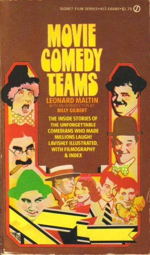
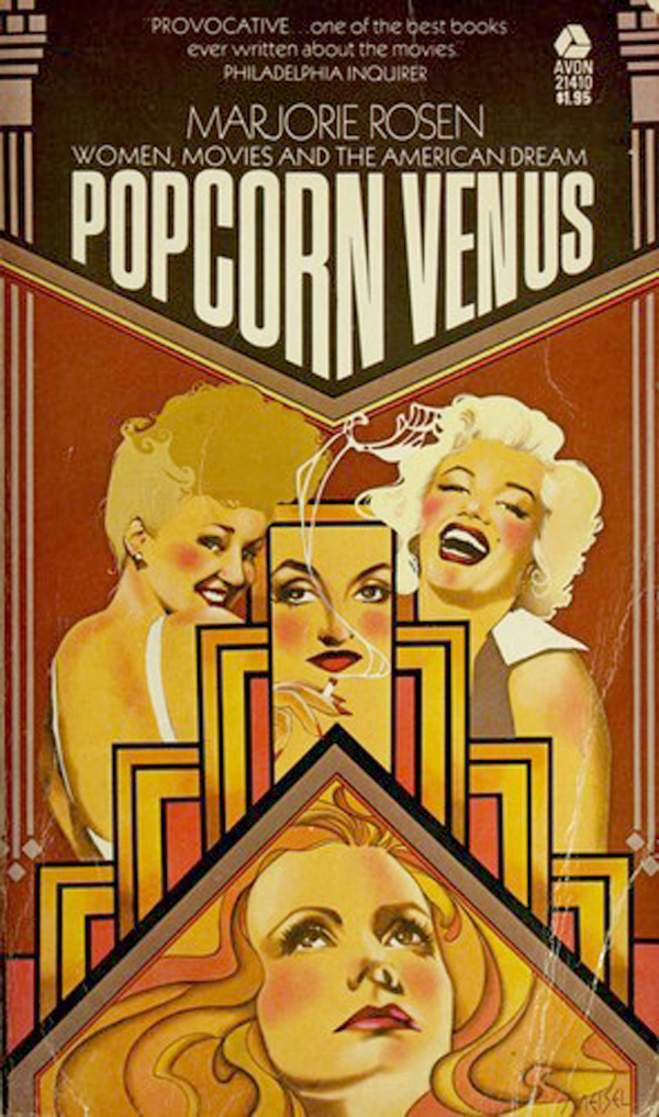
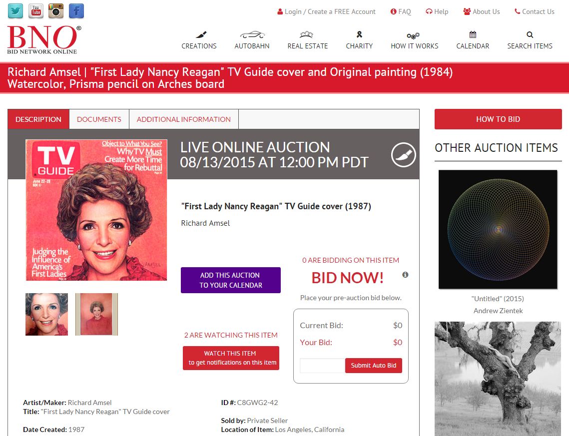
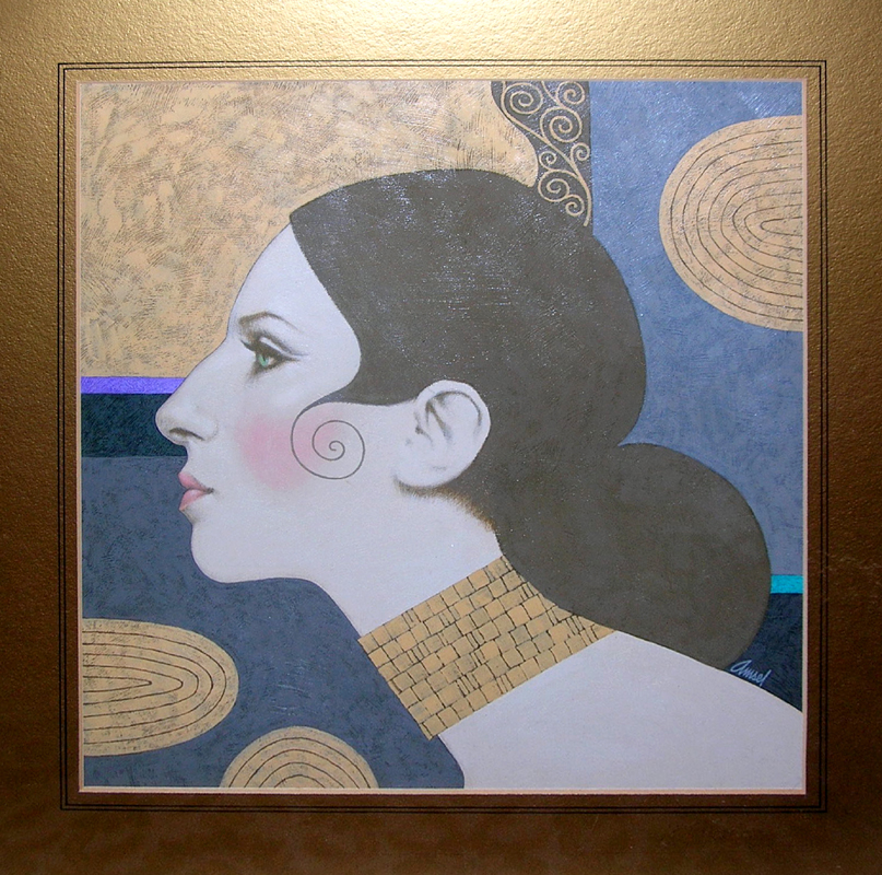
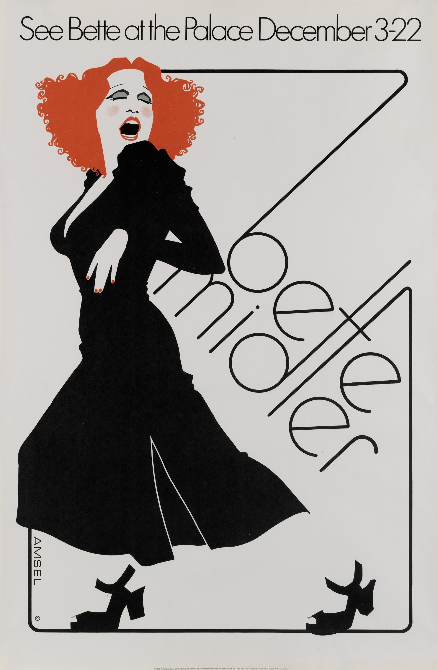
.jpg)
.jpg)
.jpg)
.jpg)
.jpg)
.jpg)
.jpg)
.jpg)
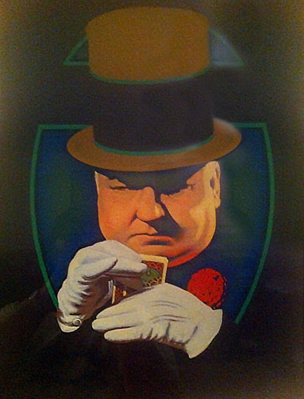
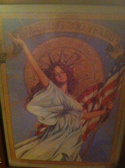
.JPG)
.JPG)
.JPG)
.JPG)
.JPG)
.JPG)
.JPG)
.JPG)
.JPG)
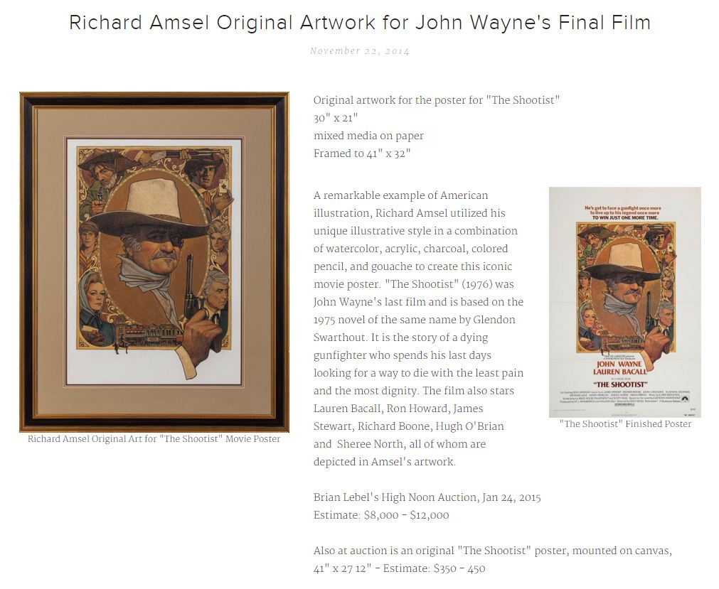
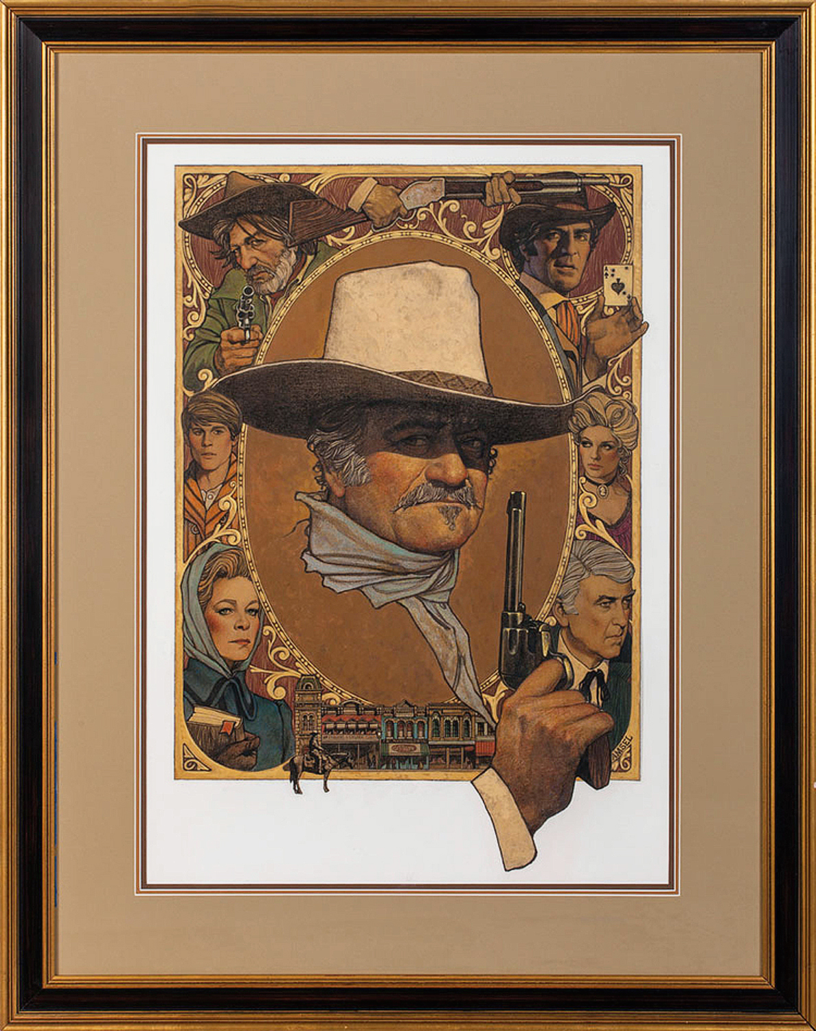
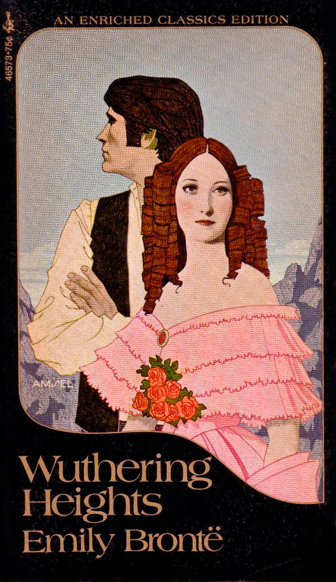
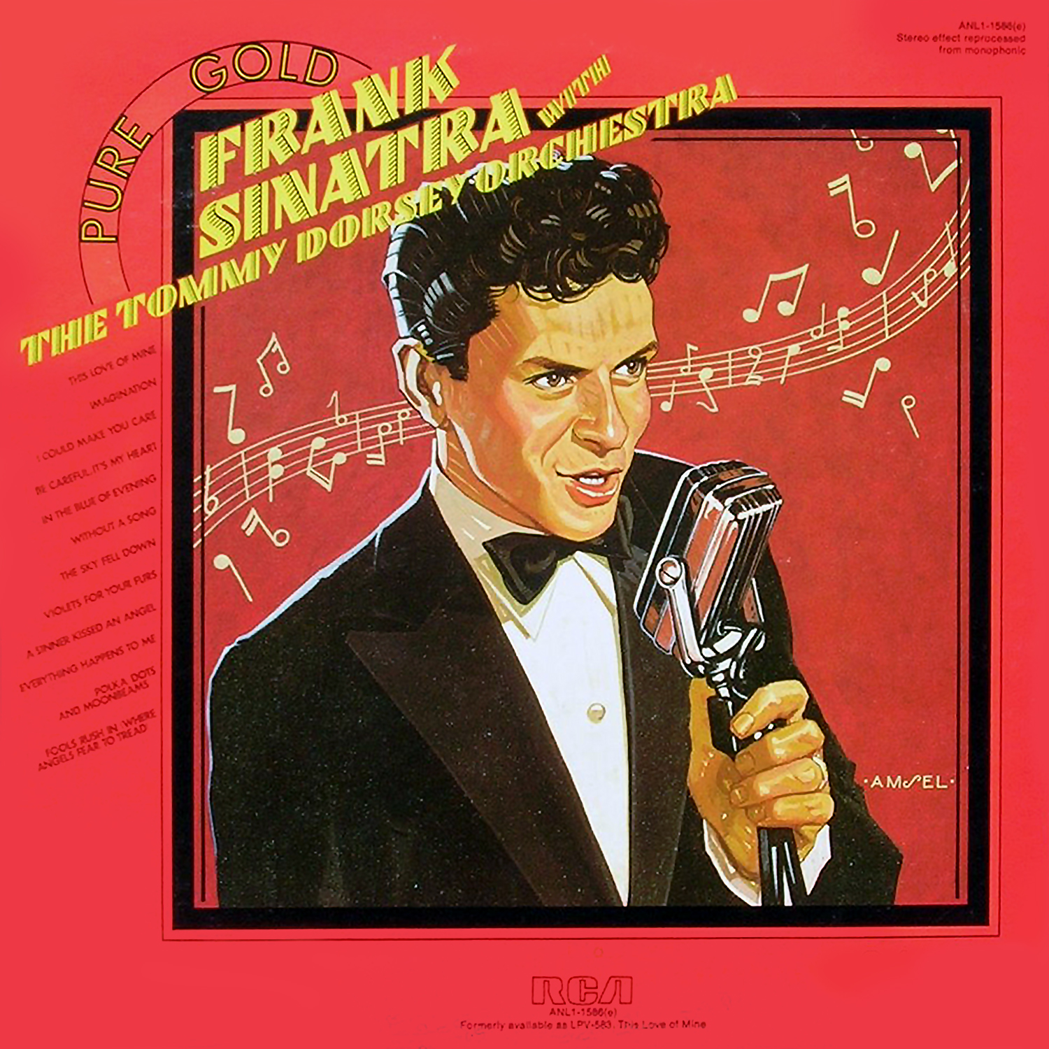
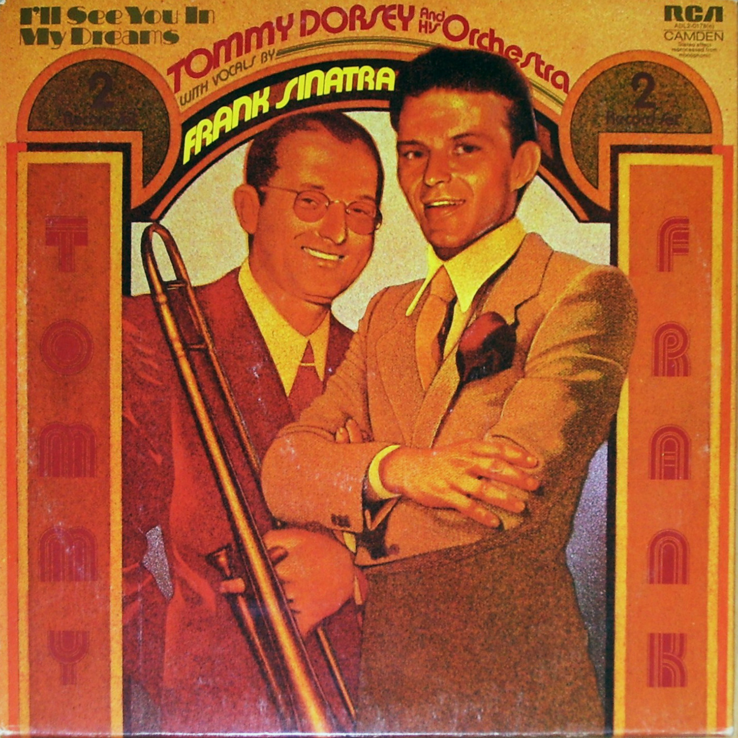
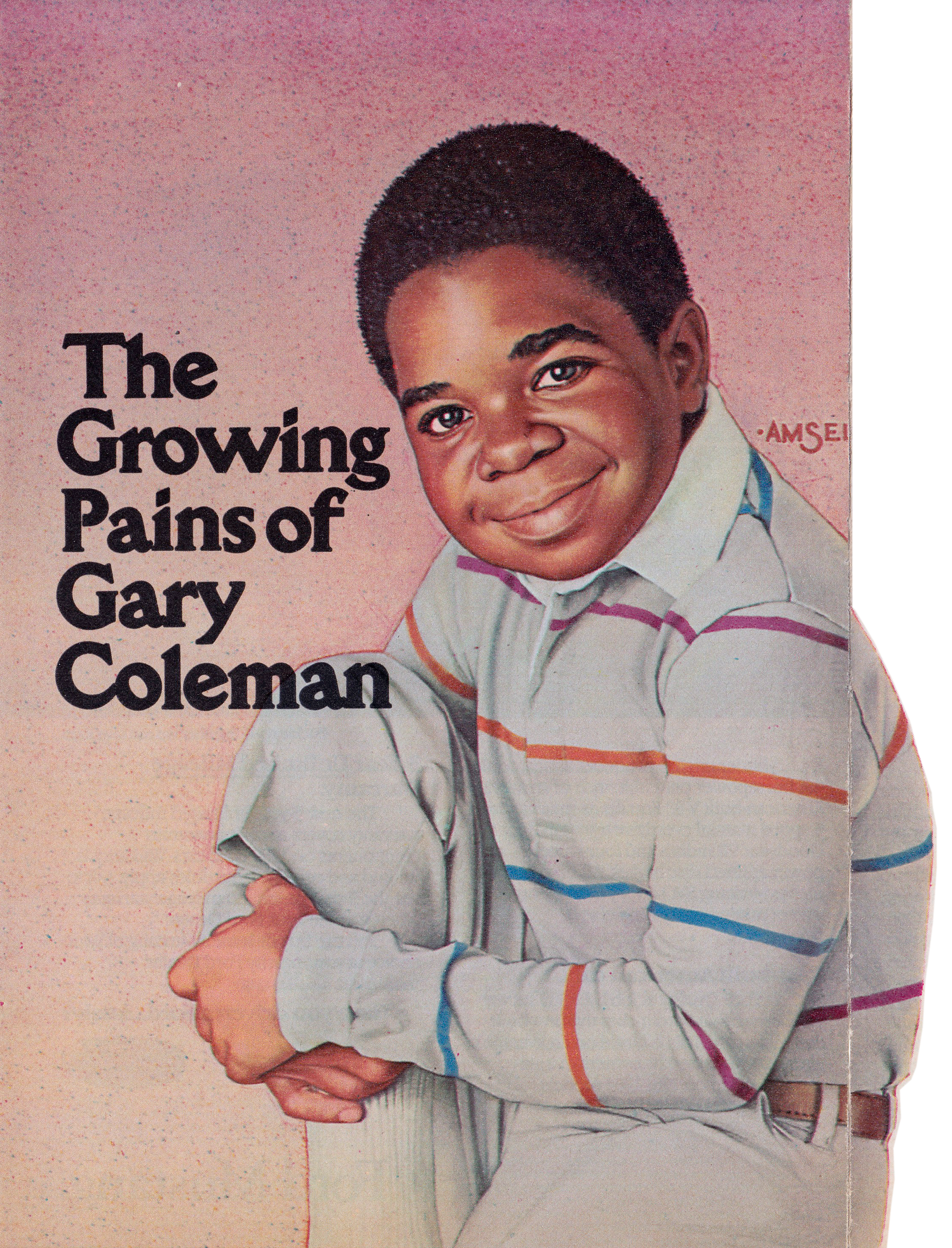
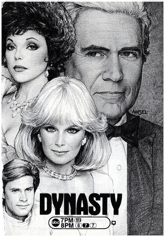
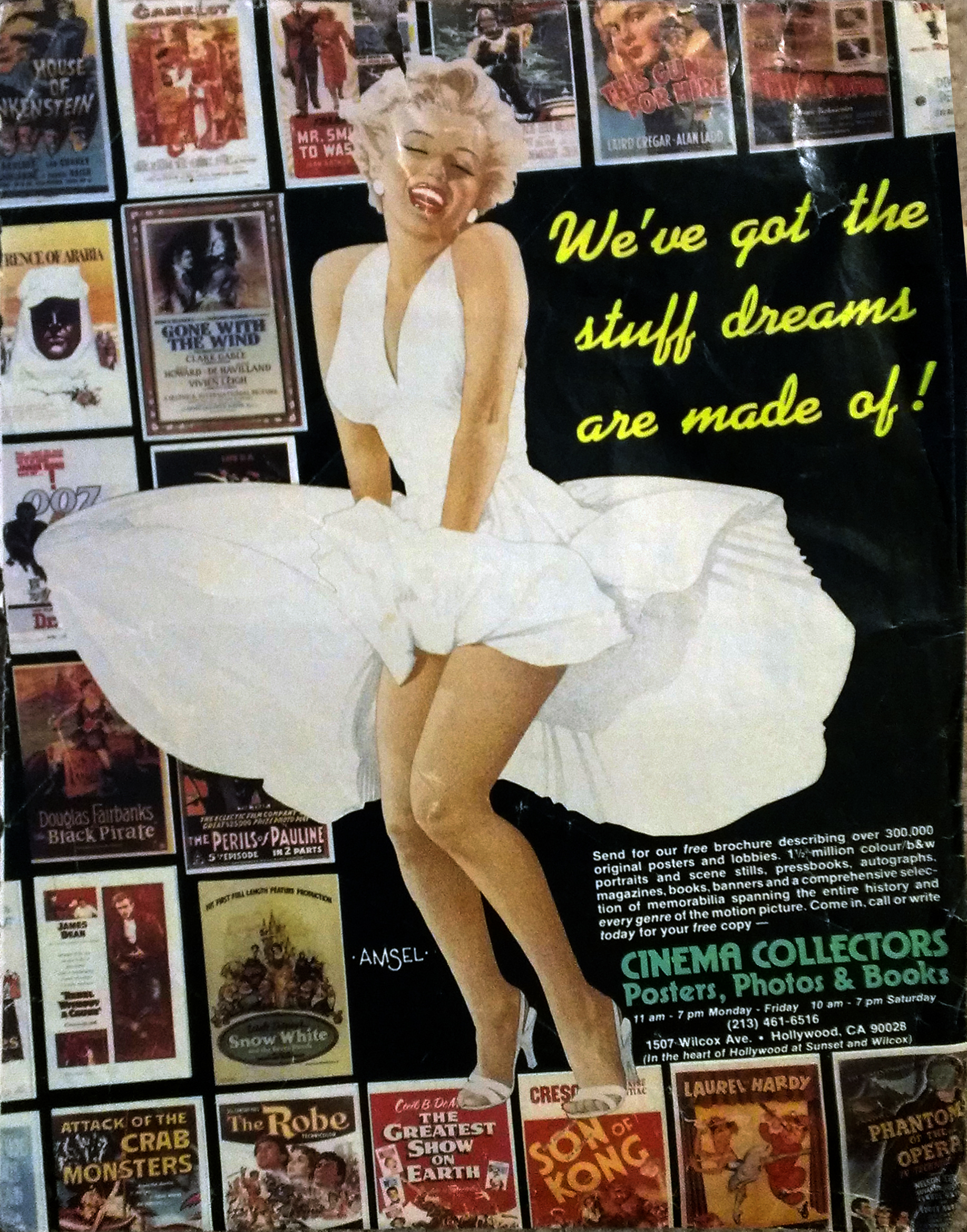
.jpg)
.jpg)
.jpg)
.jpg)
.jpg)
.jpg)
.jpg)
.jpg)
.jpg)
.jpg)
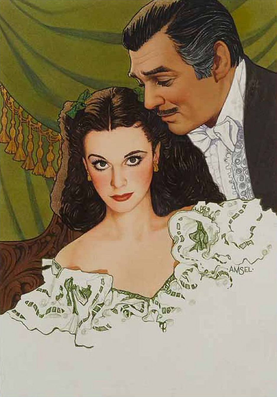
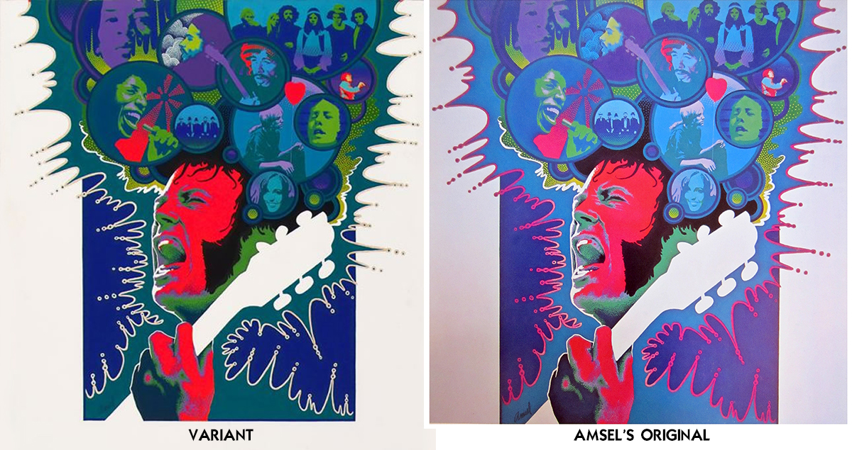

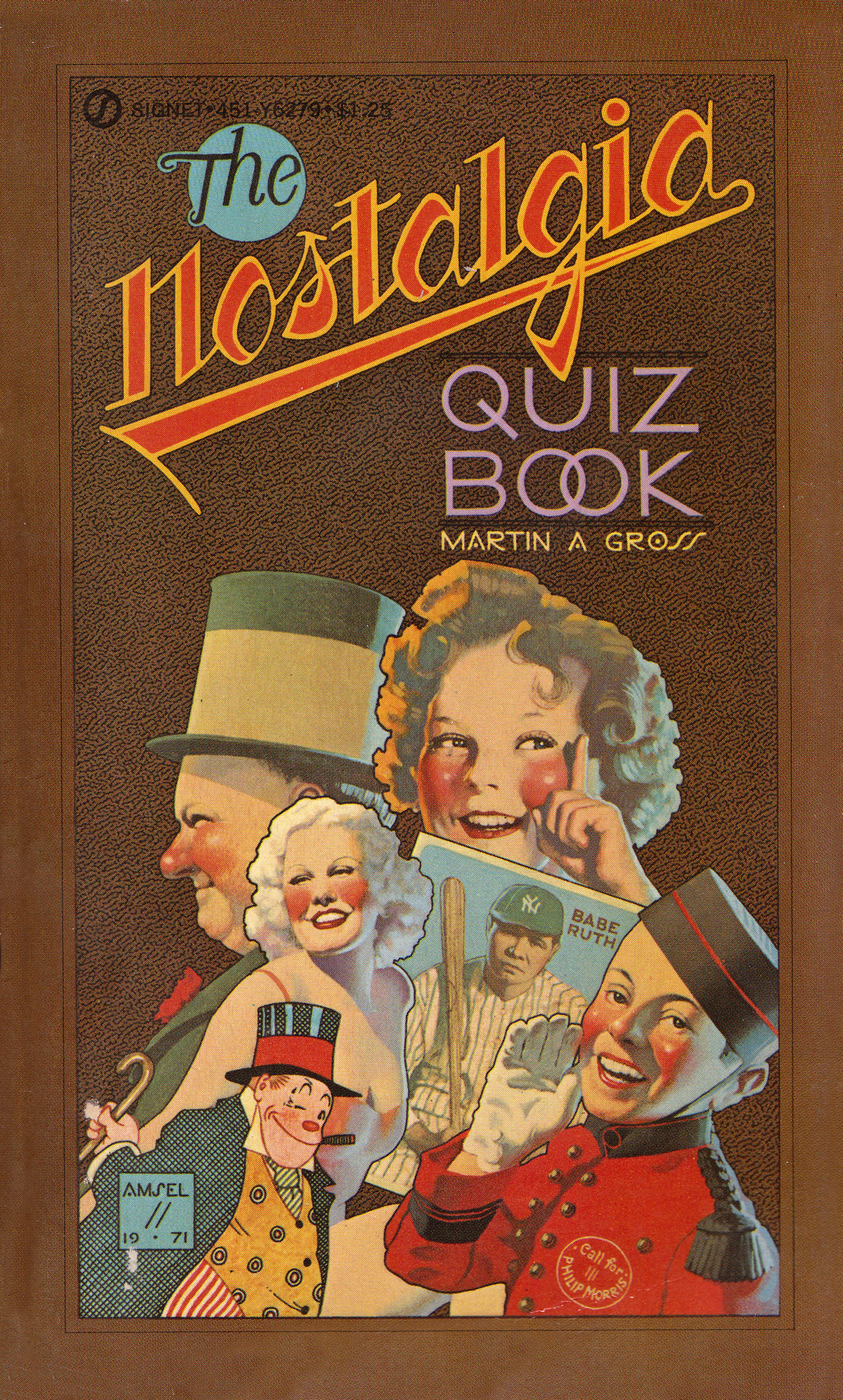
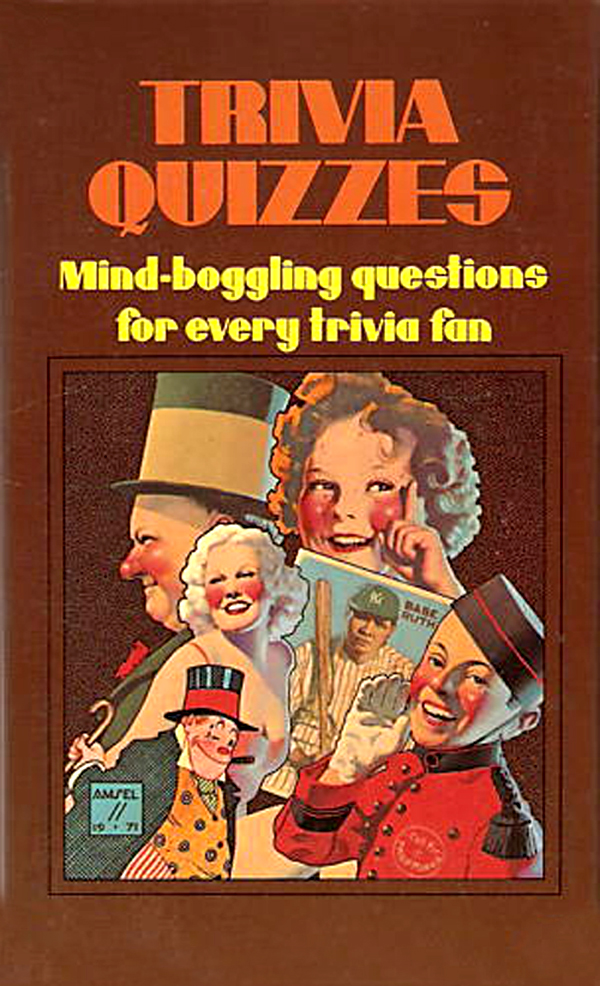
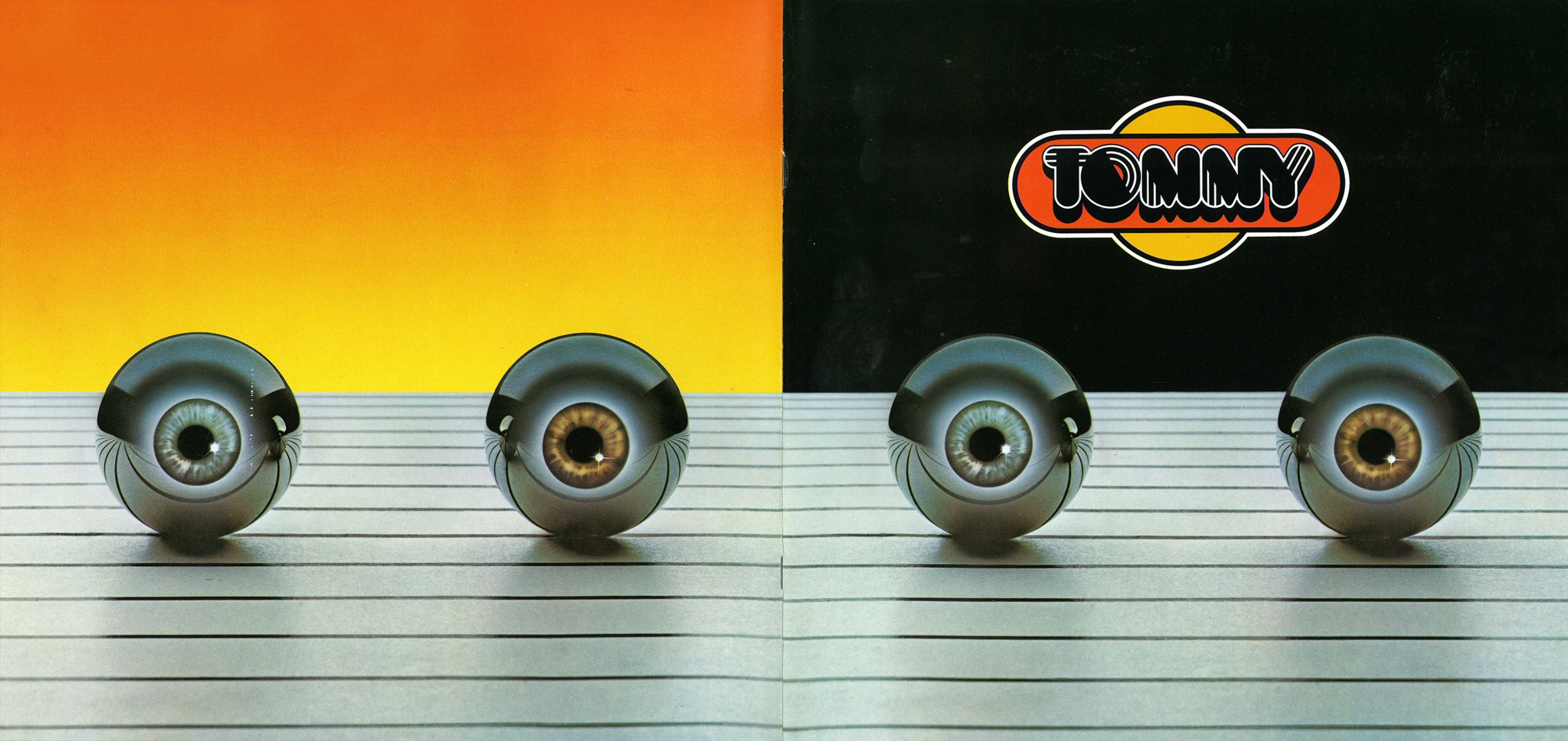
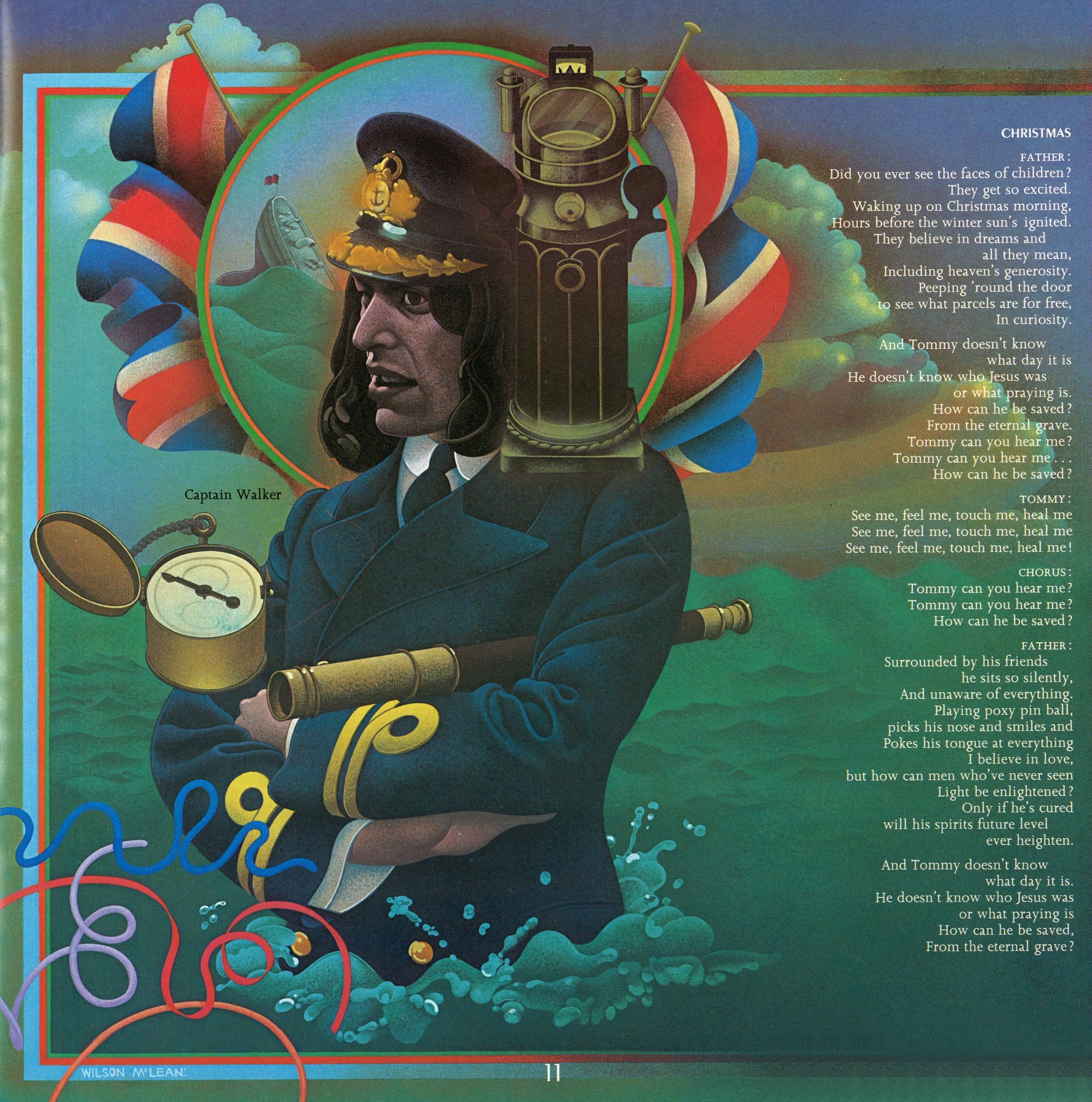

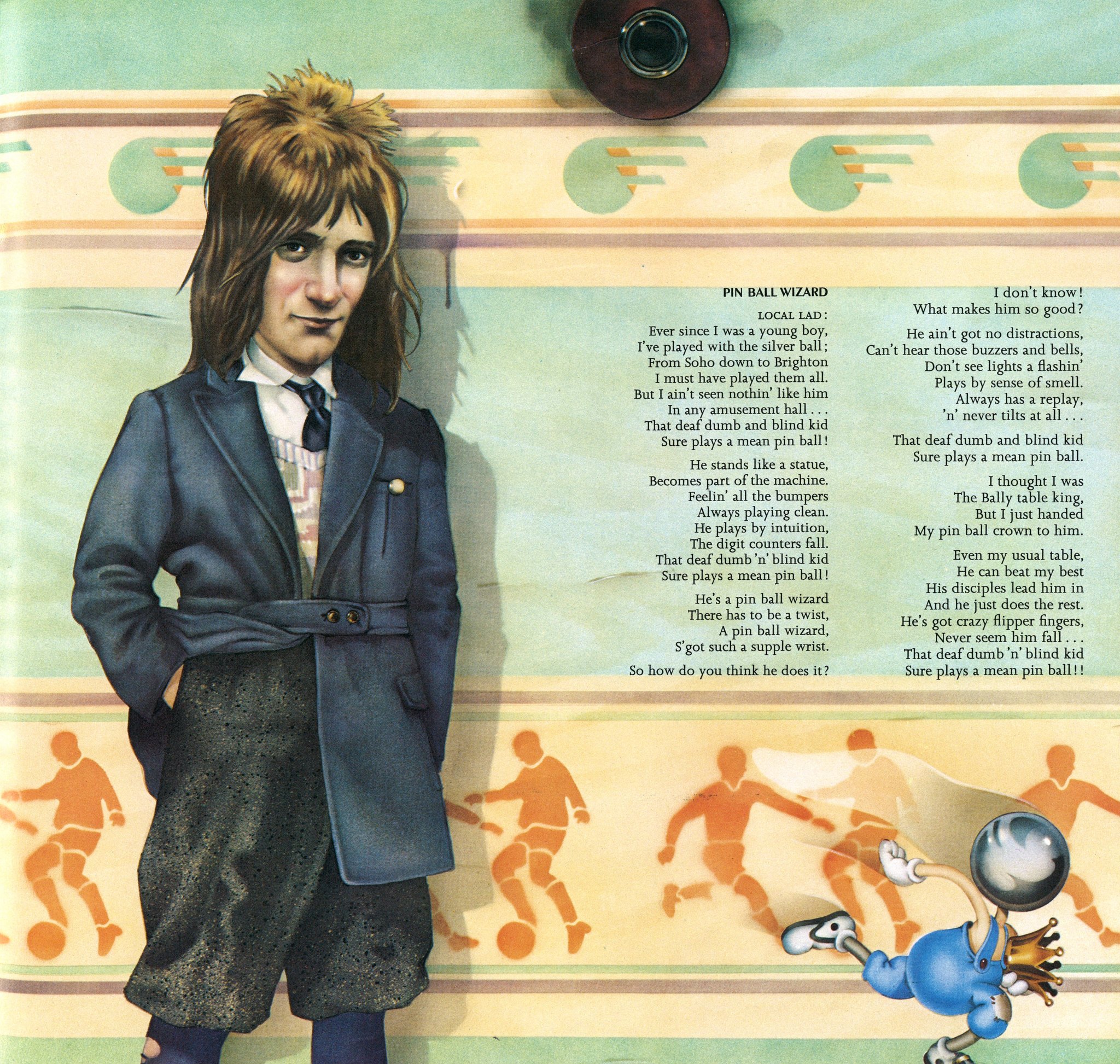
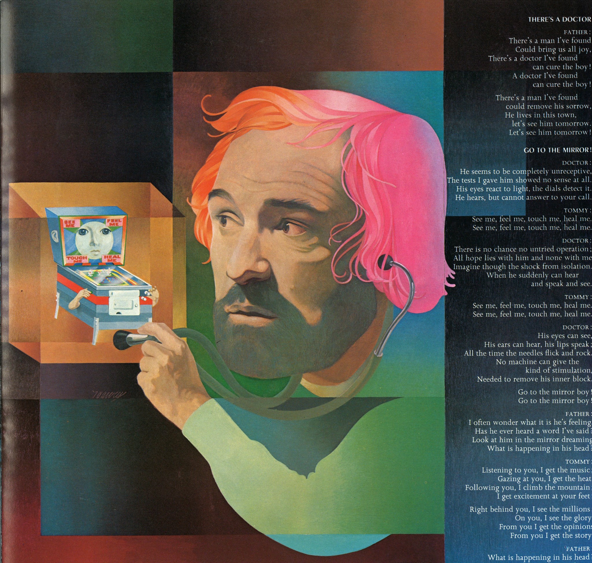
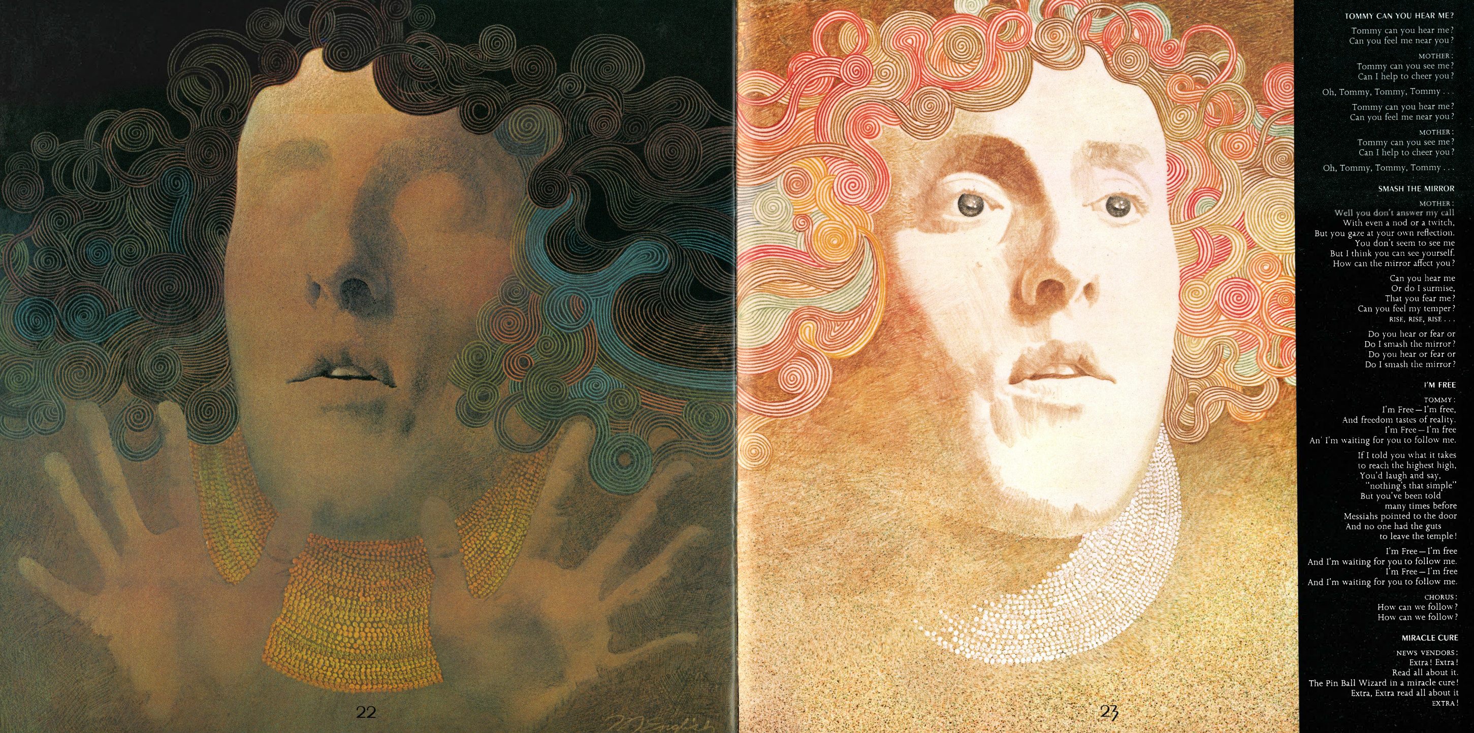
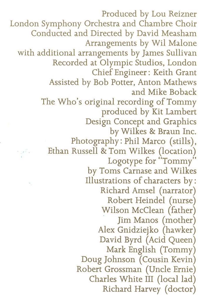
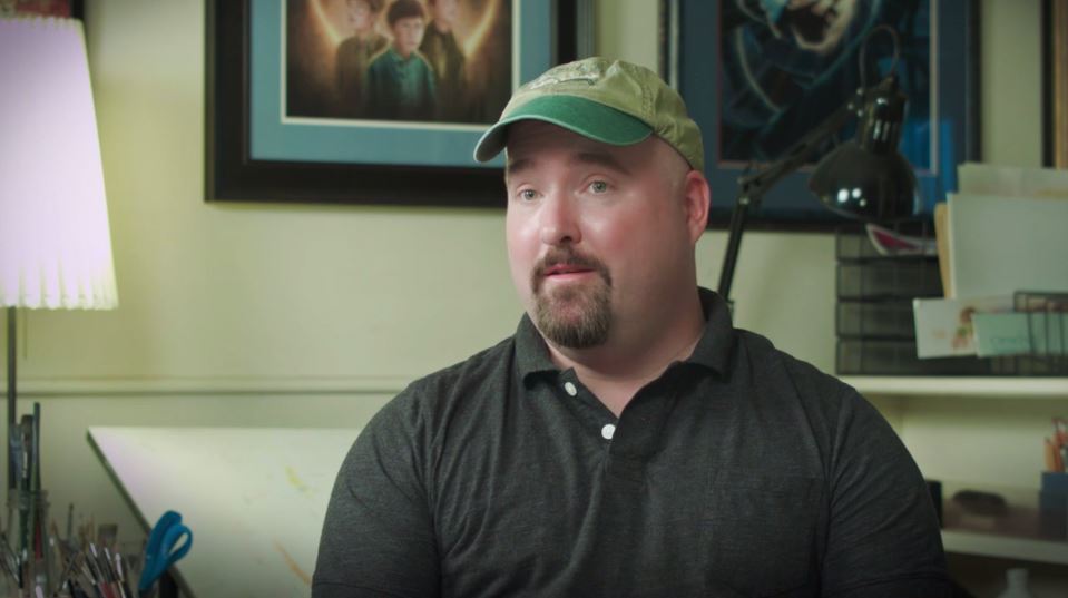
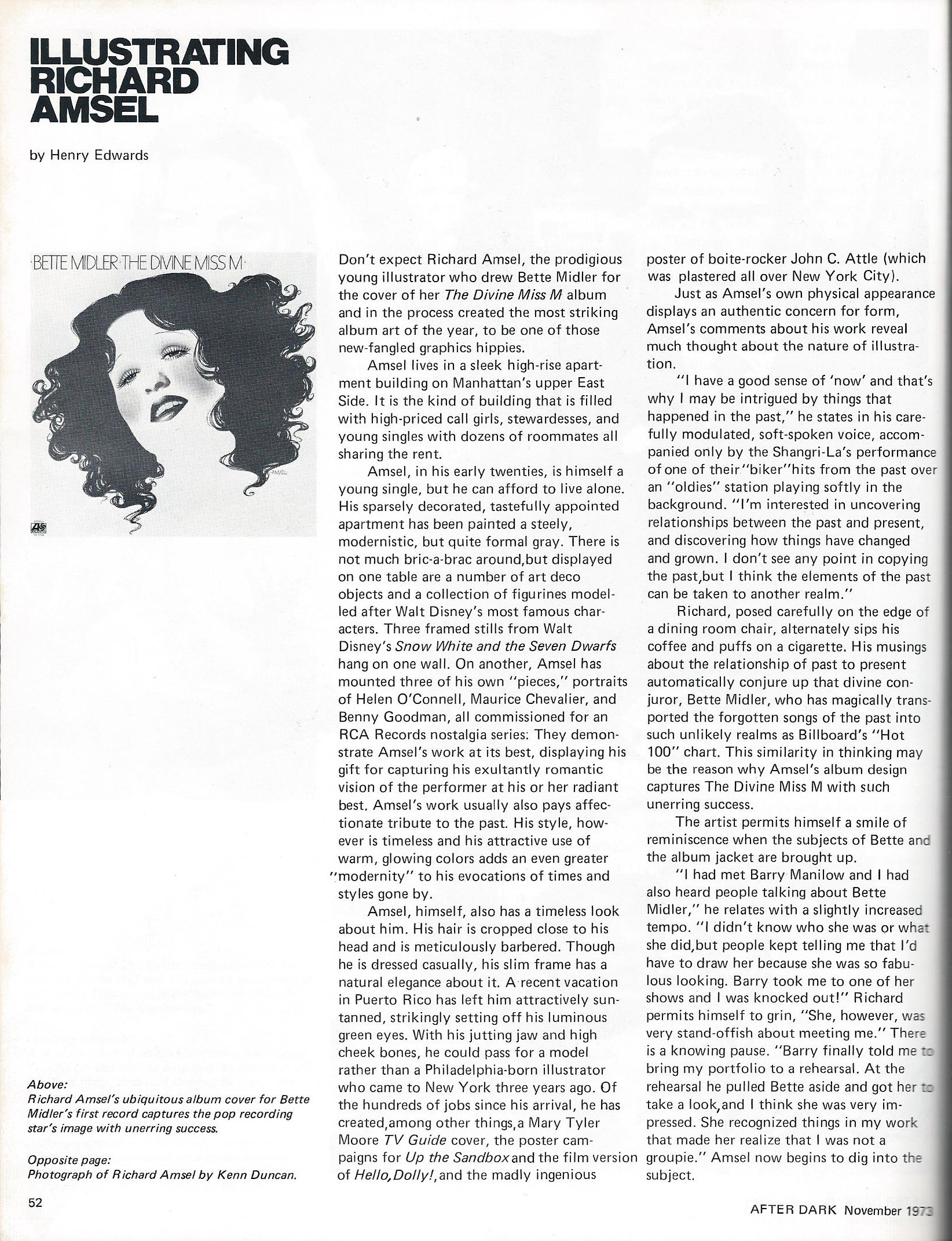
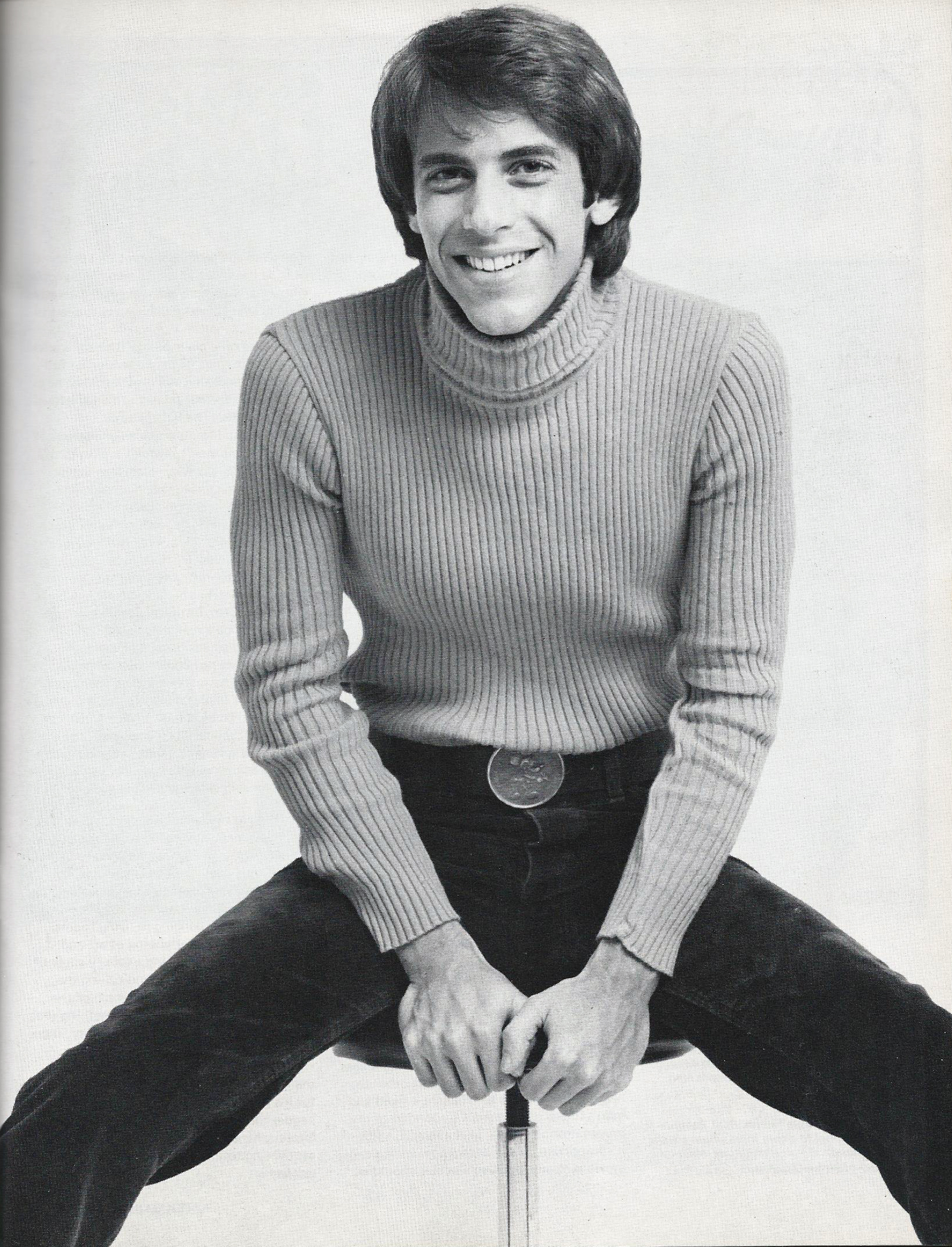
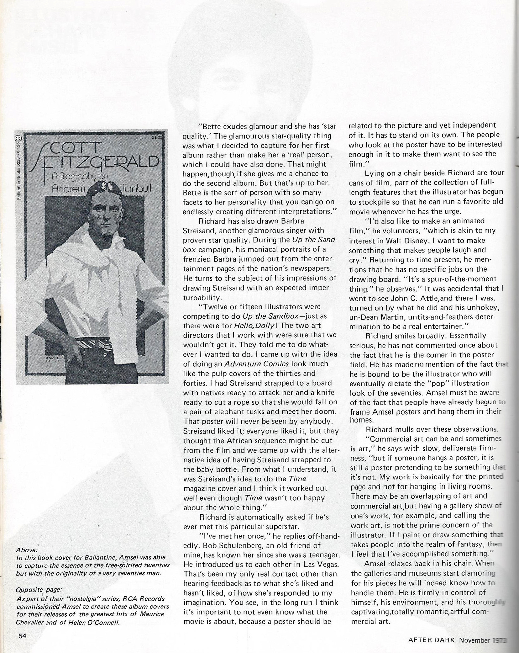
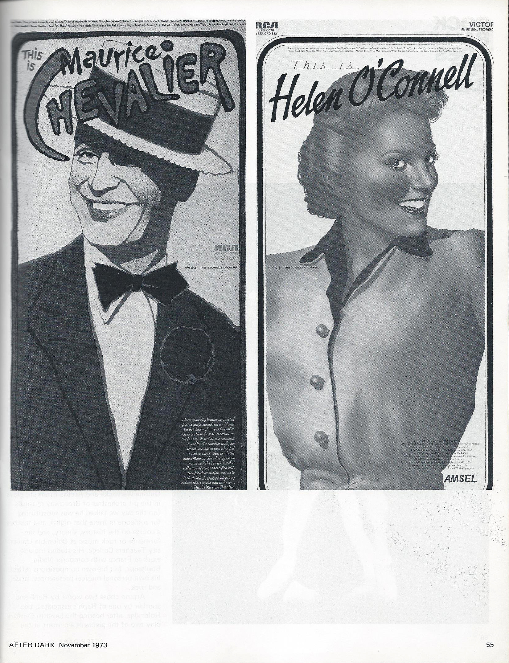
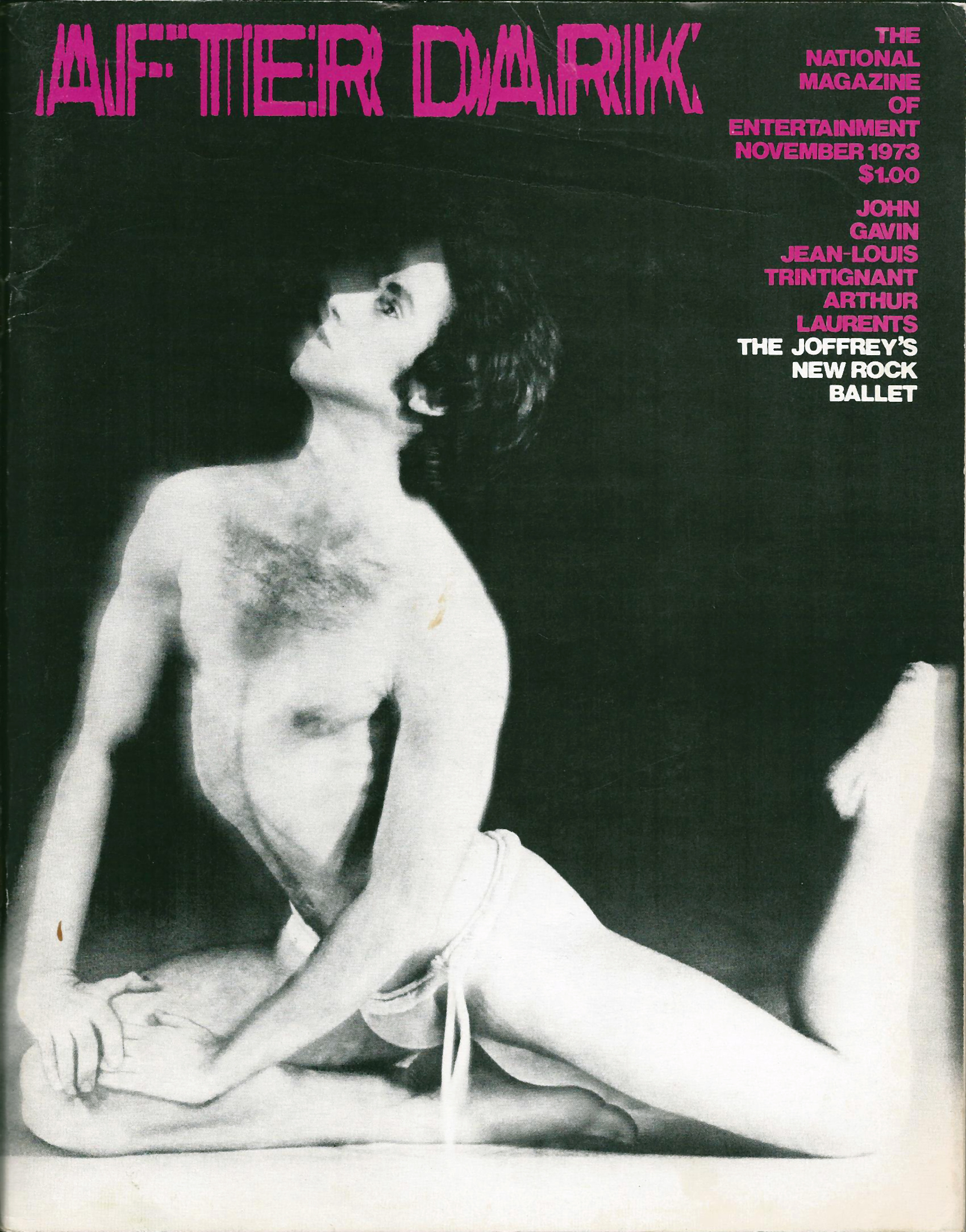

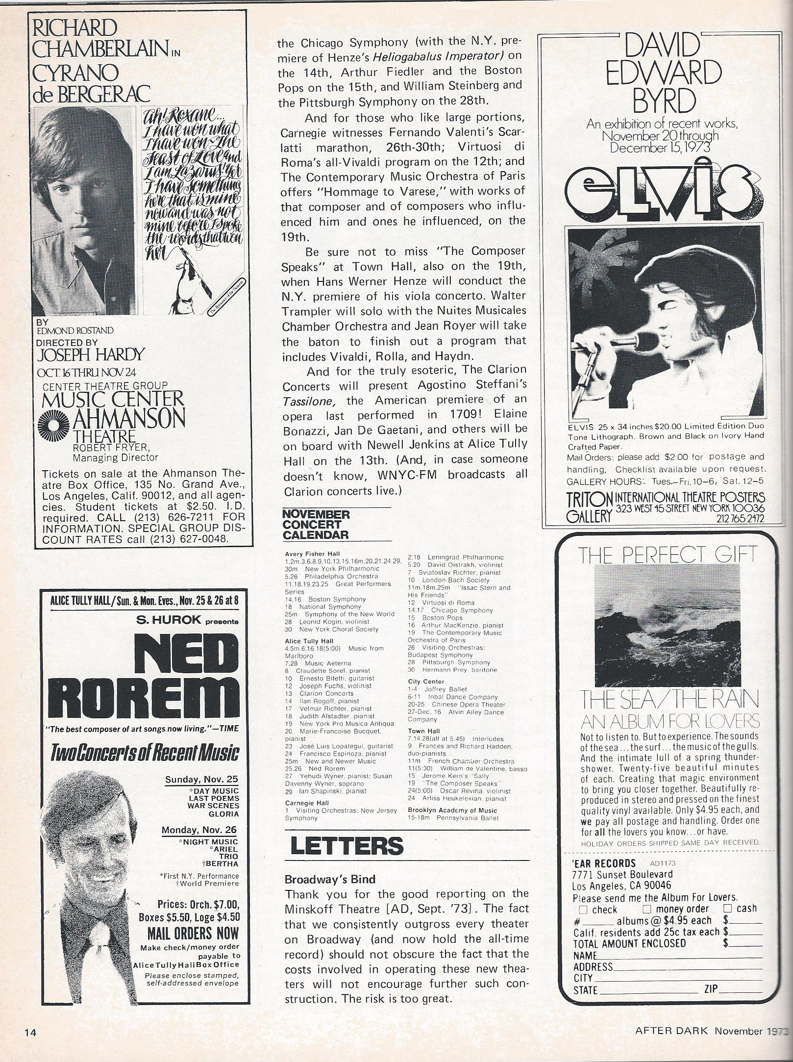
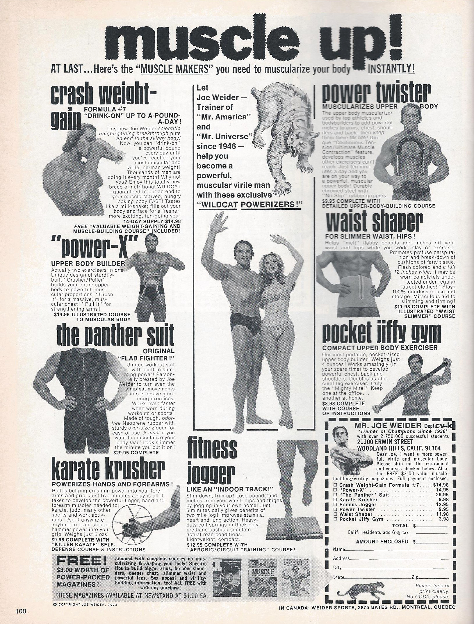
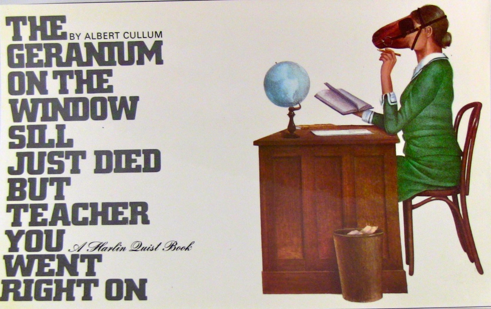
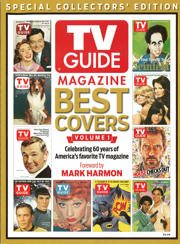


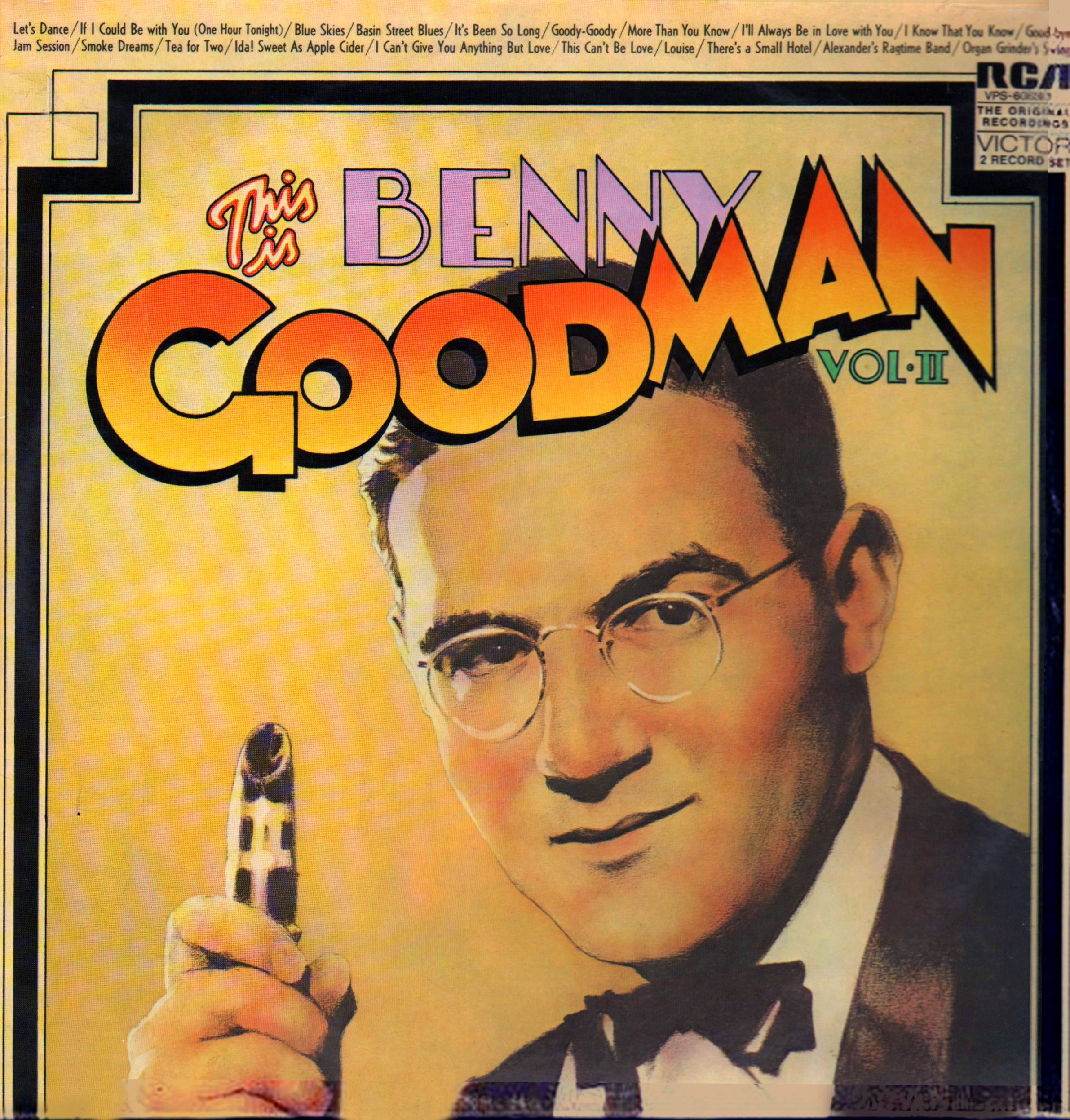
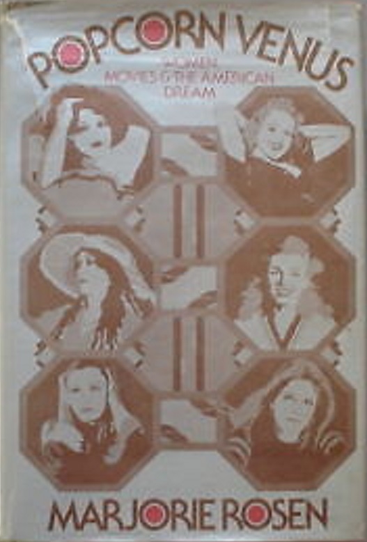
.jpg)
.jpg)
.jpg)

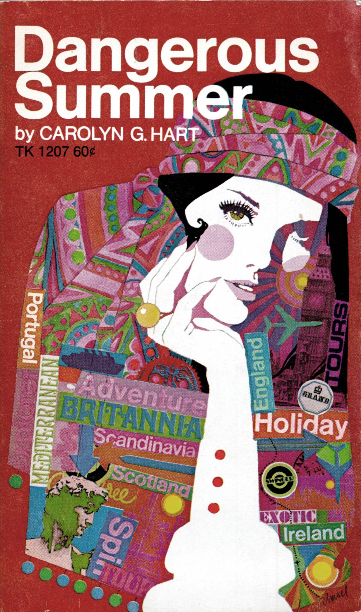


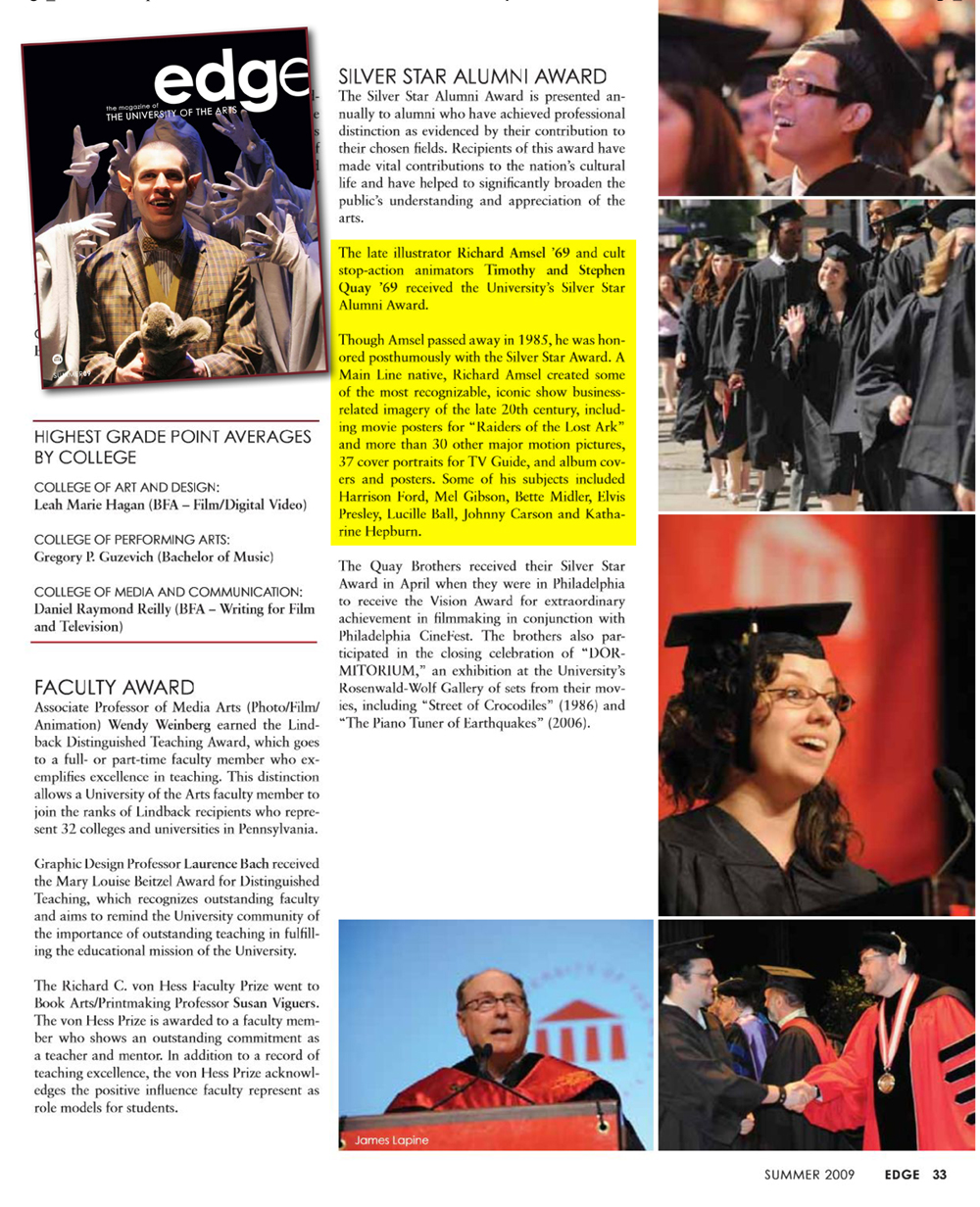
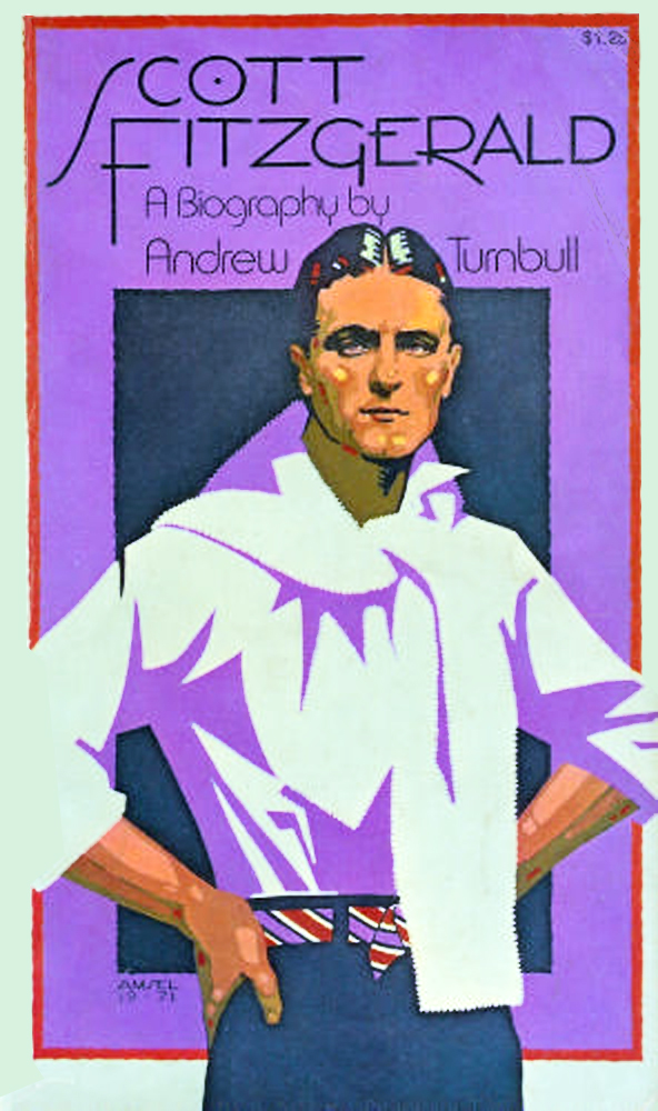
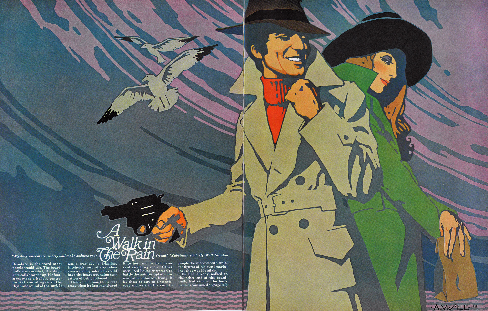
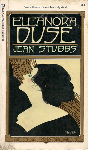
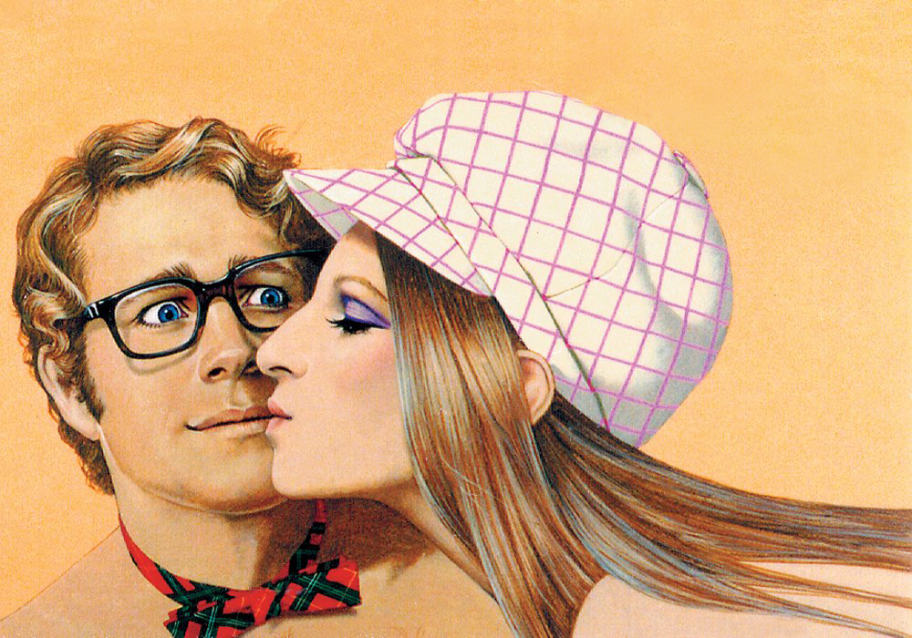

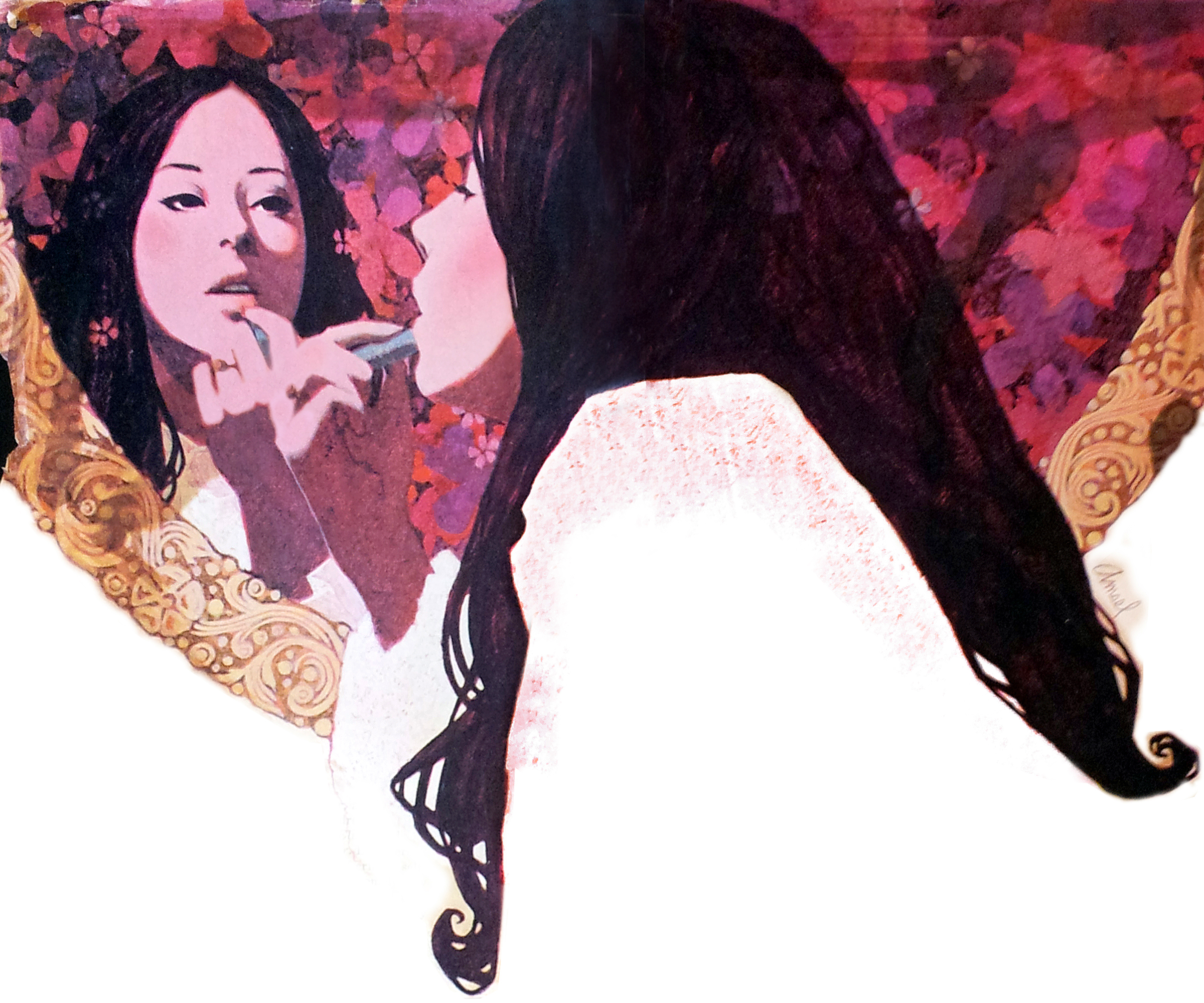

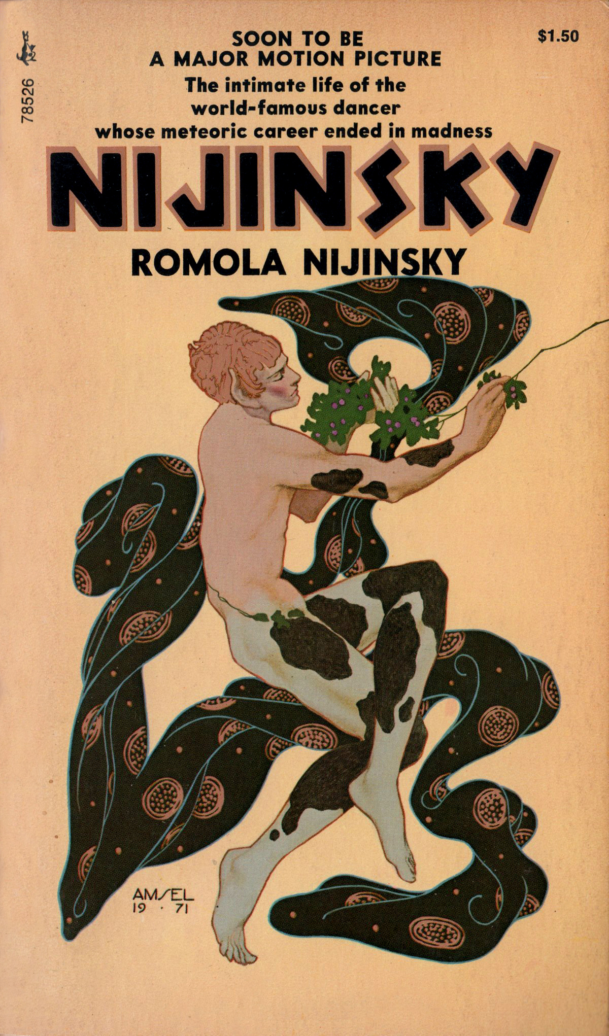
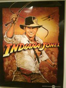
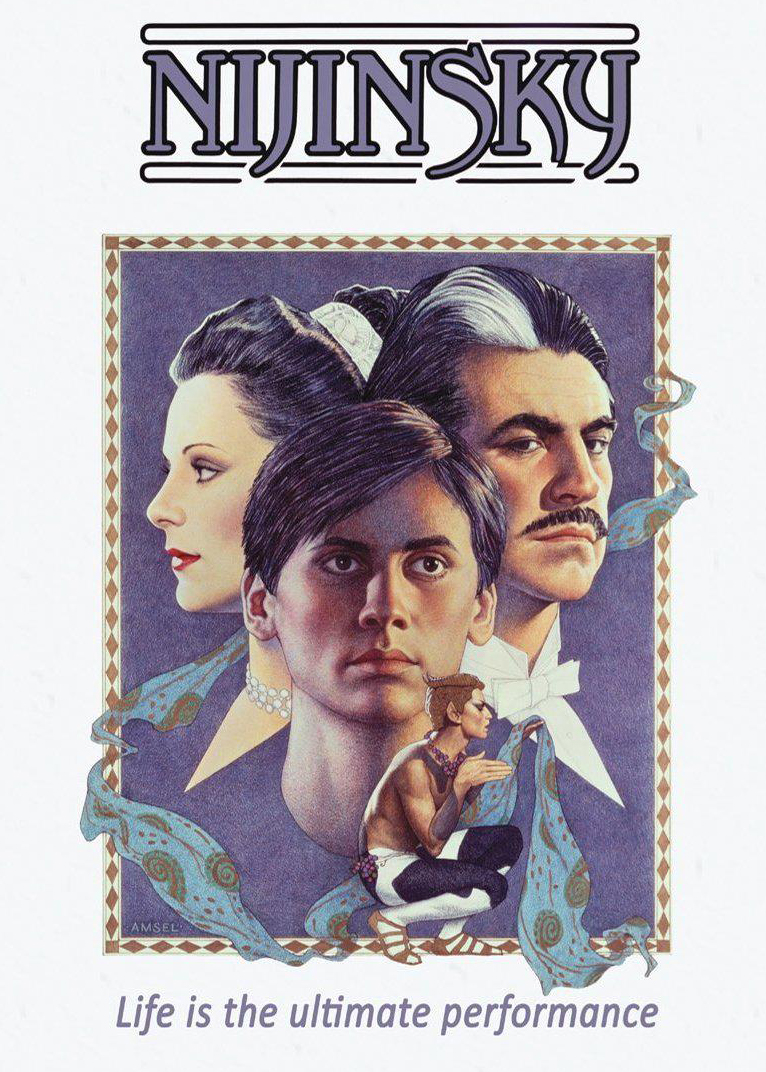
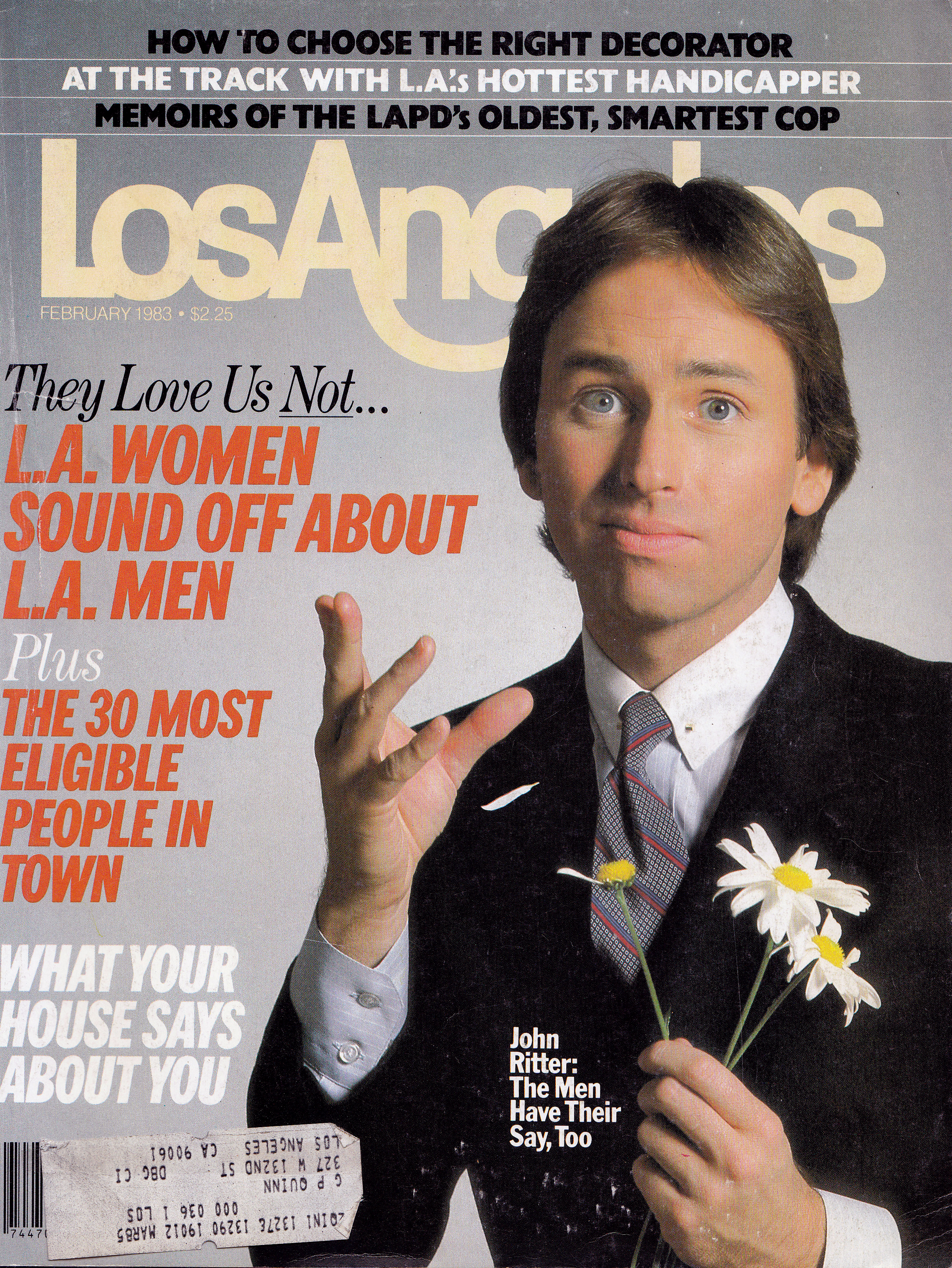
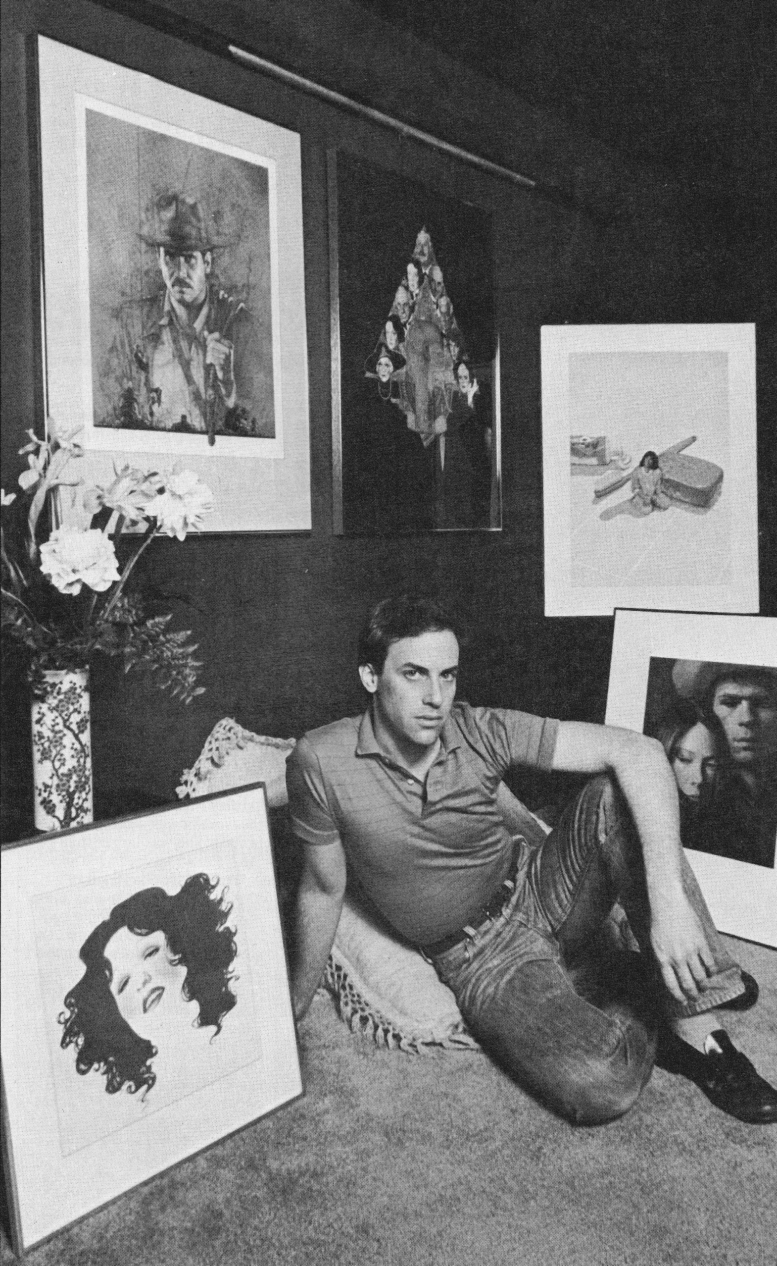

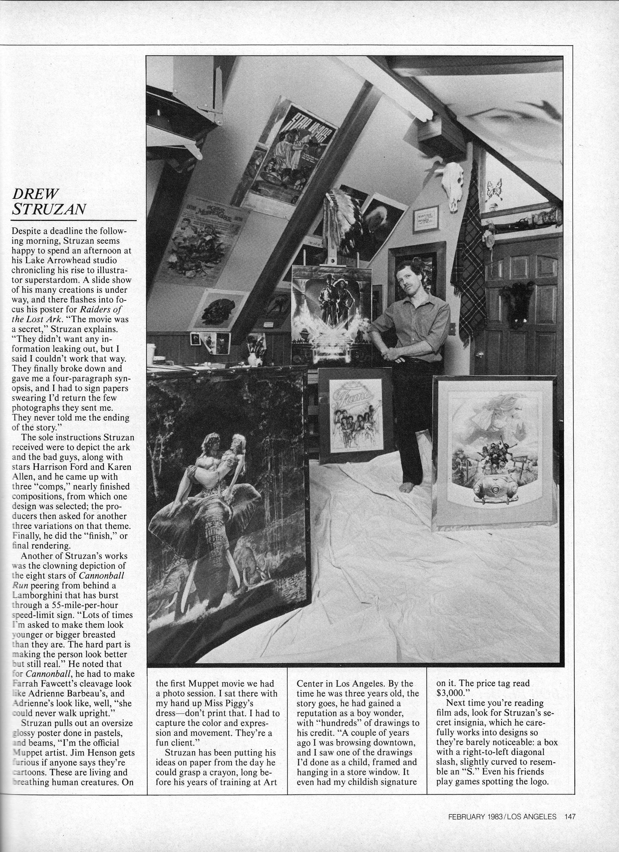
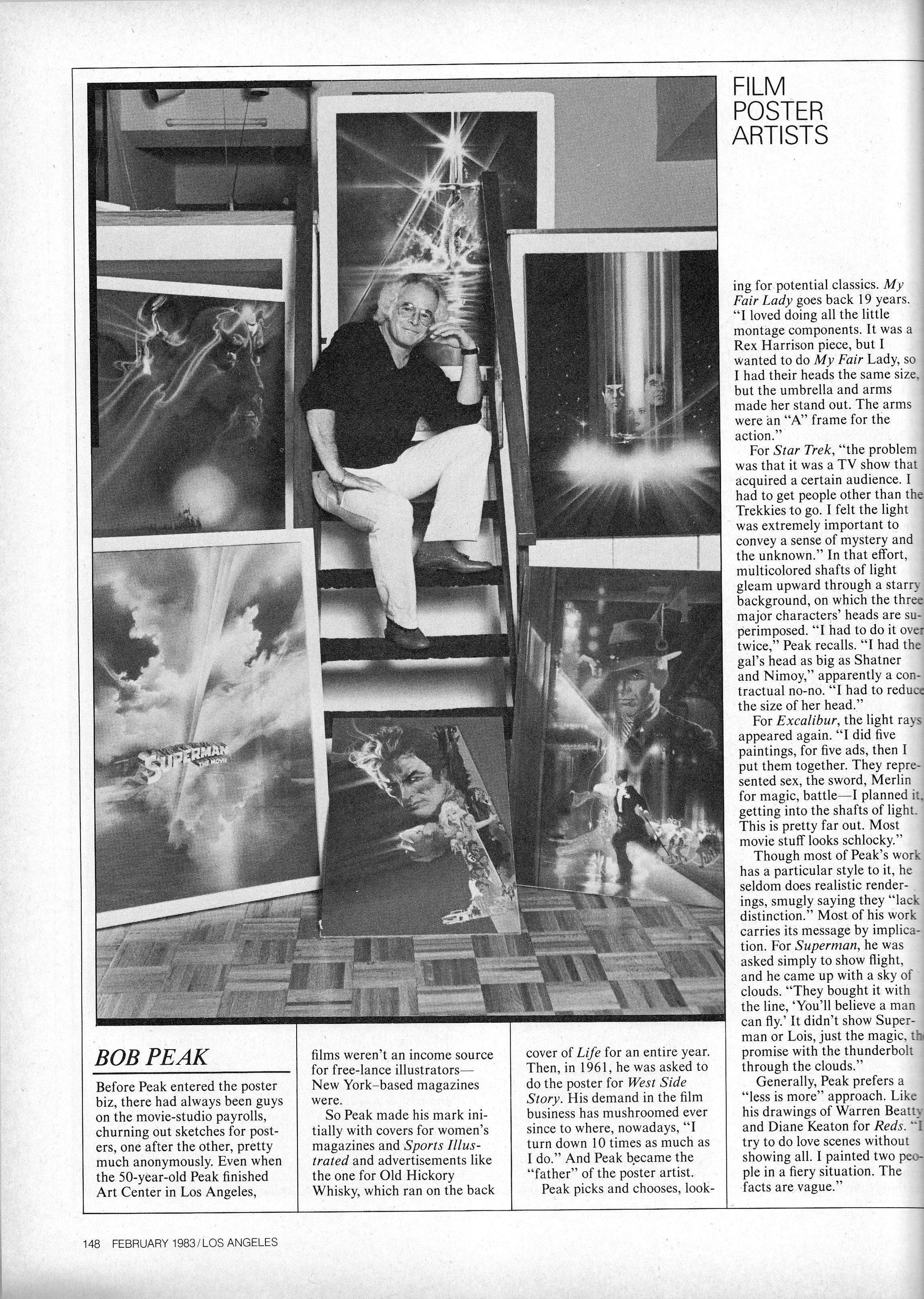

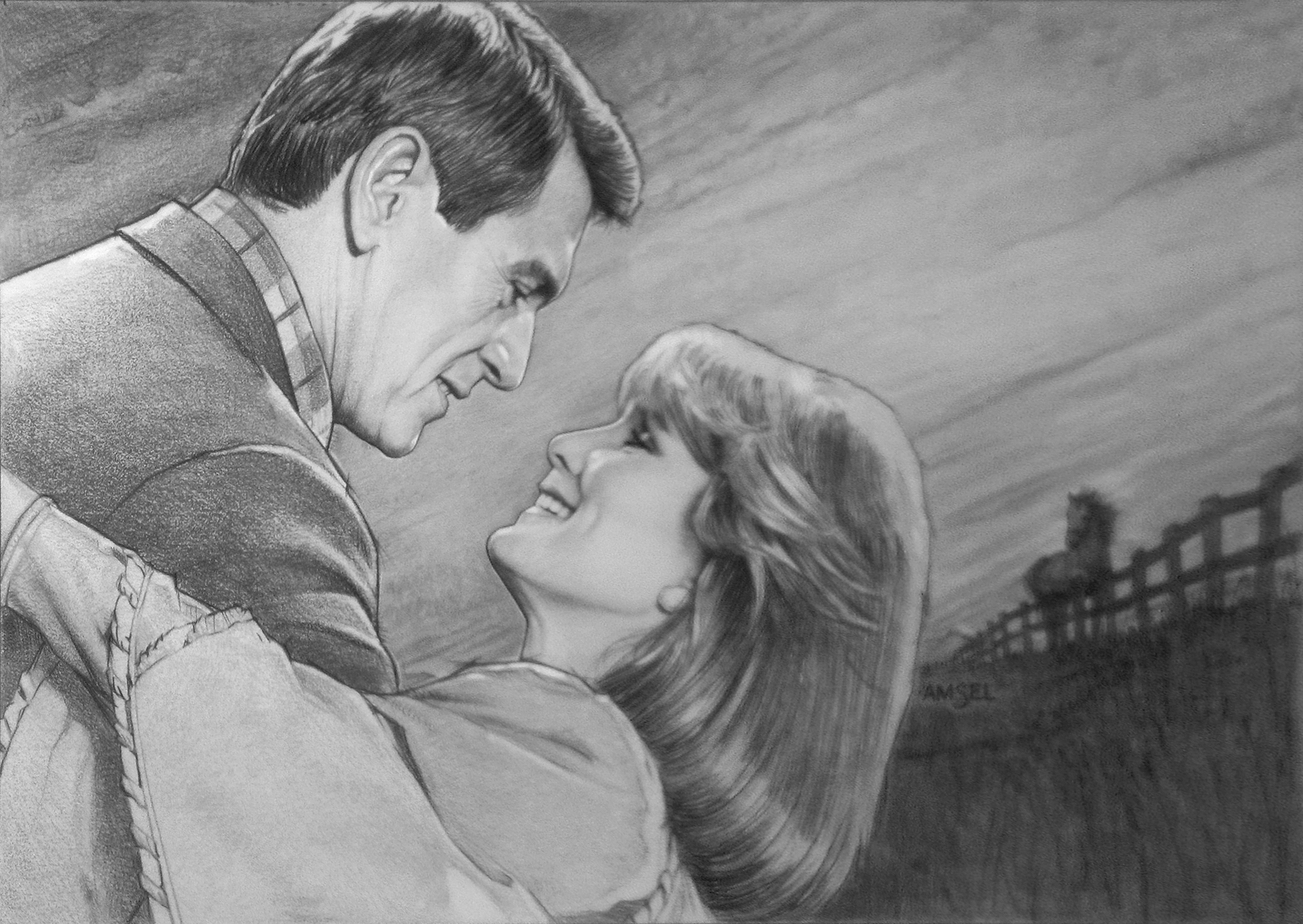


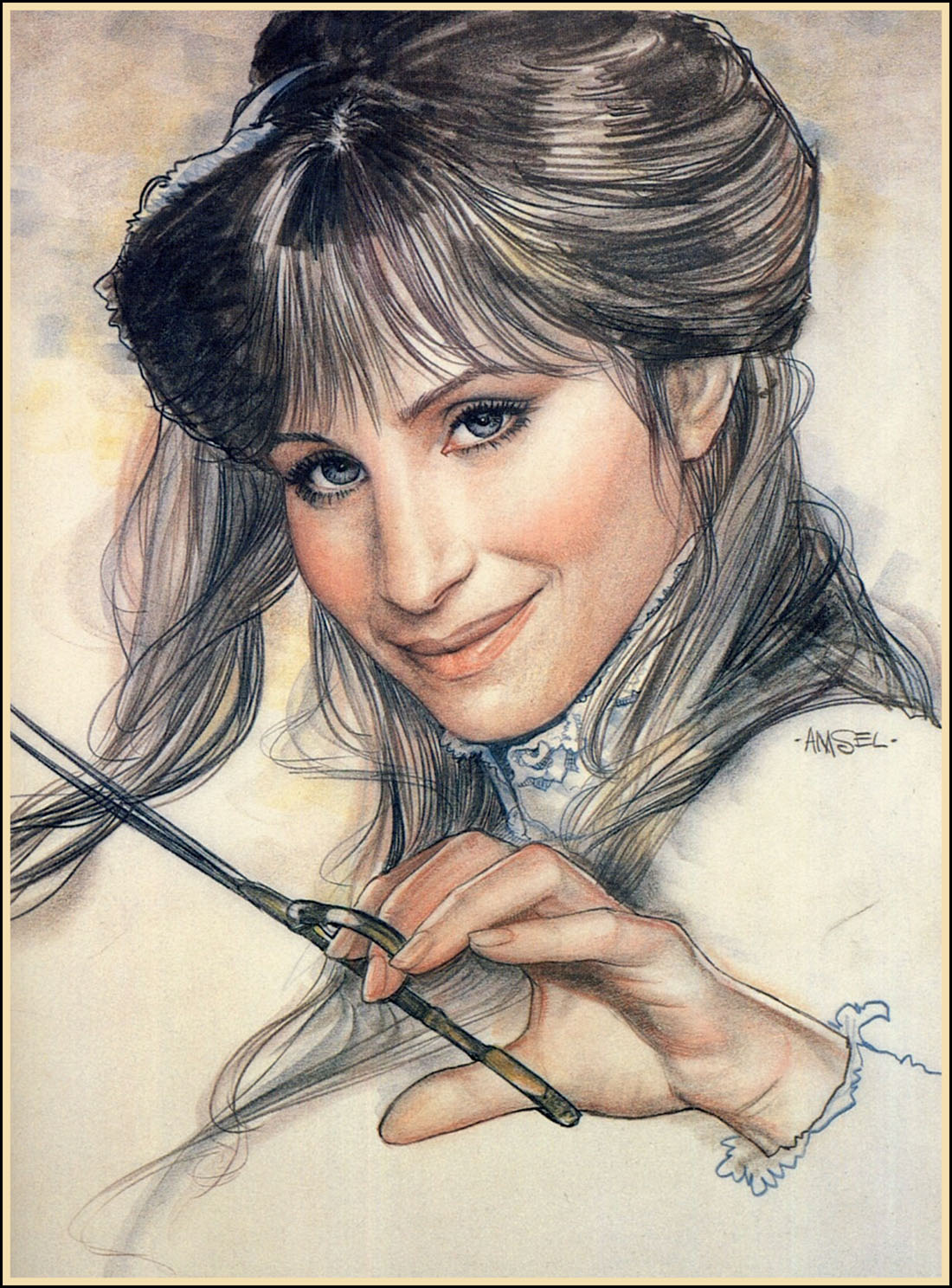
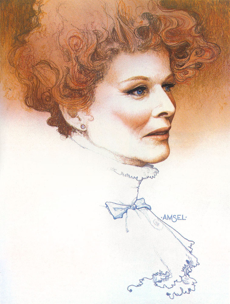
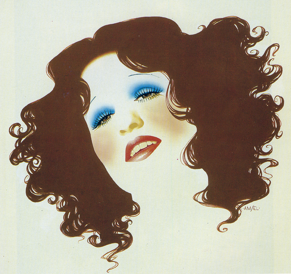

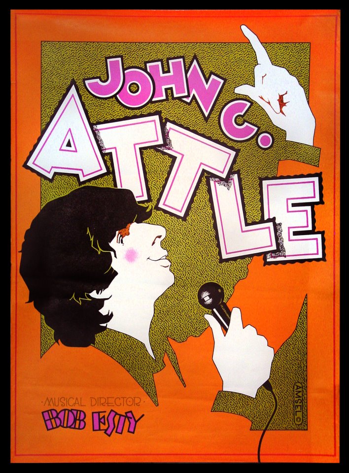
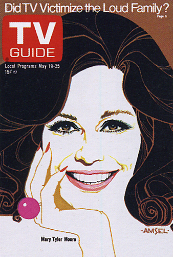
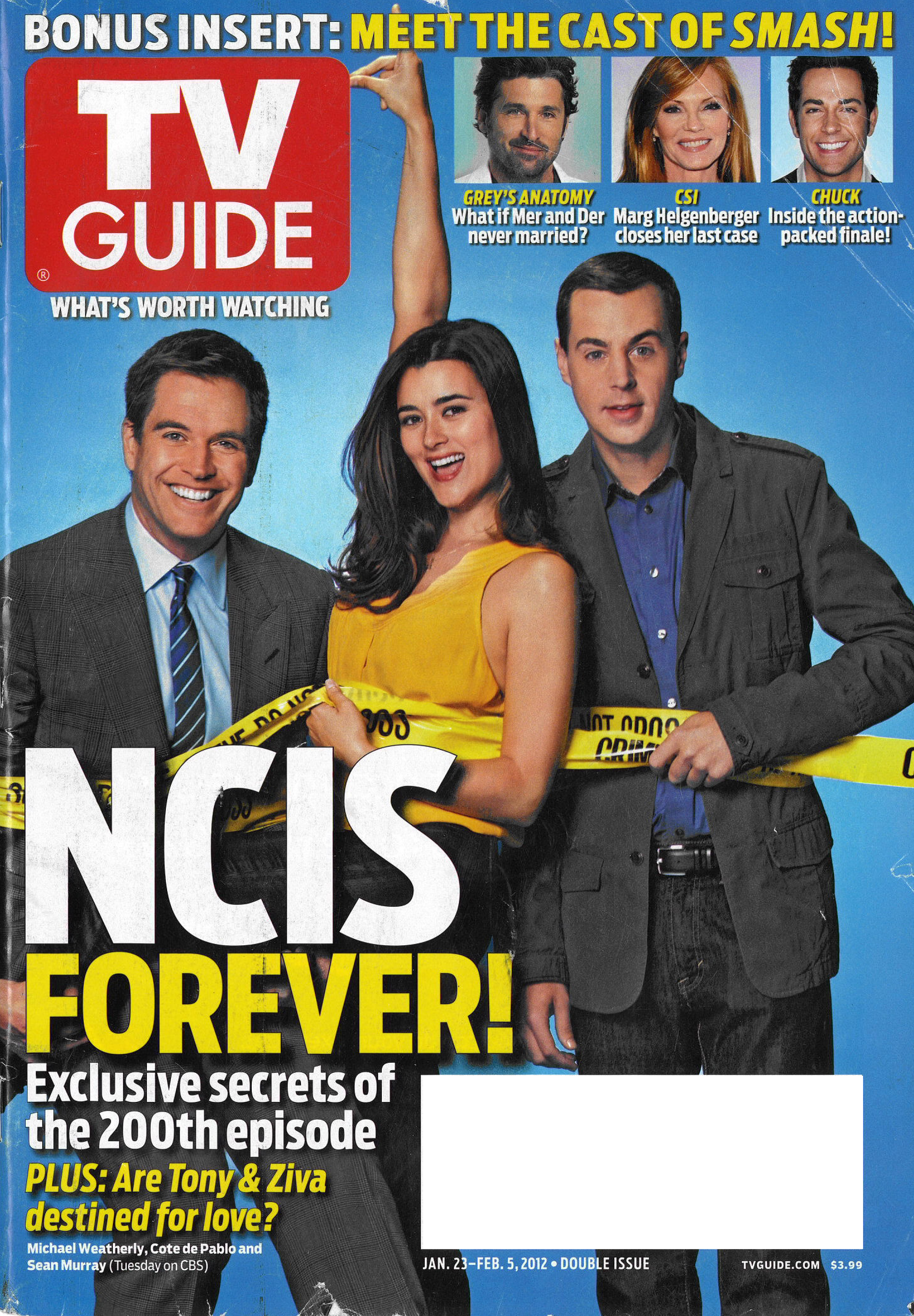

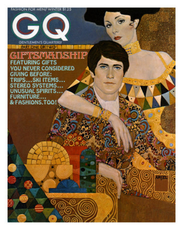

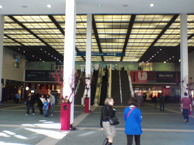
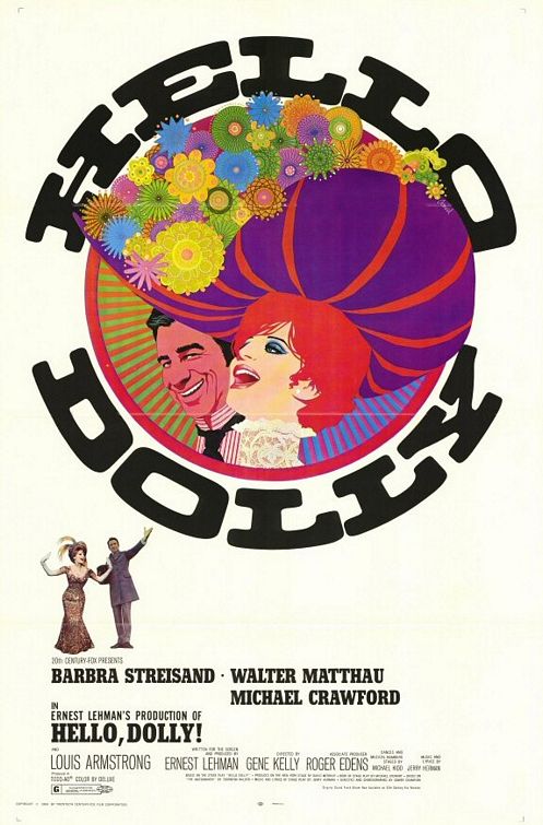
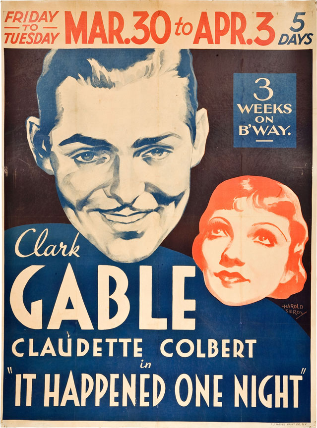
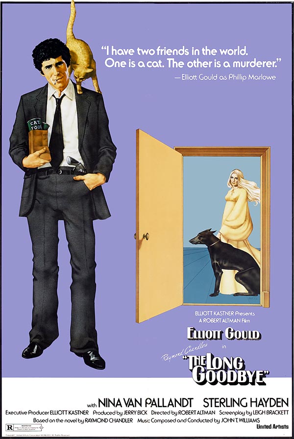
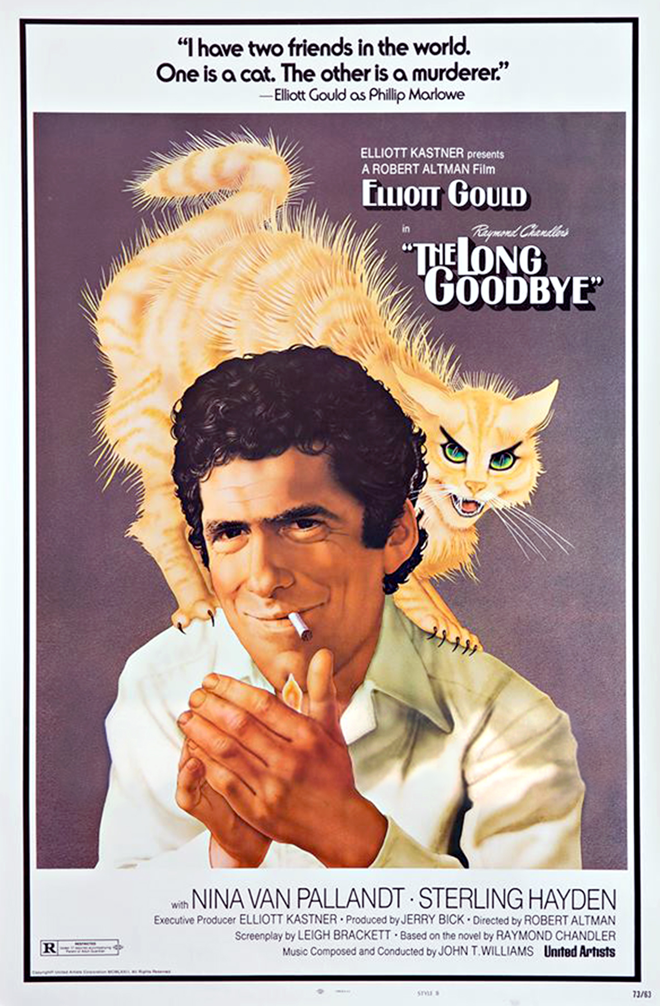
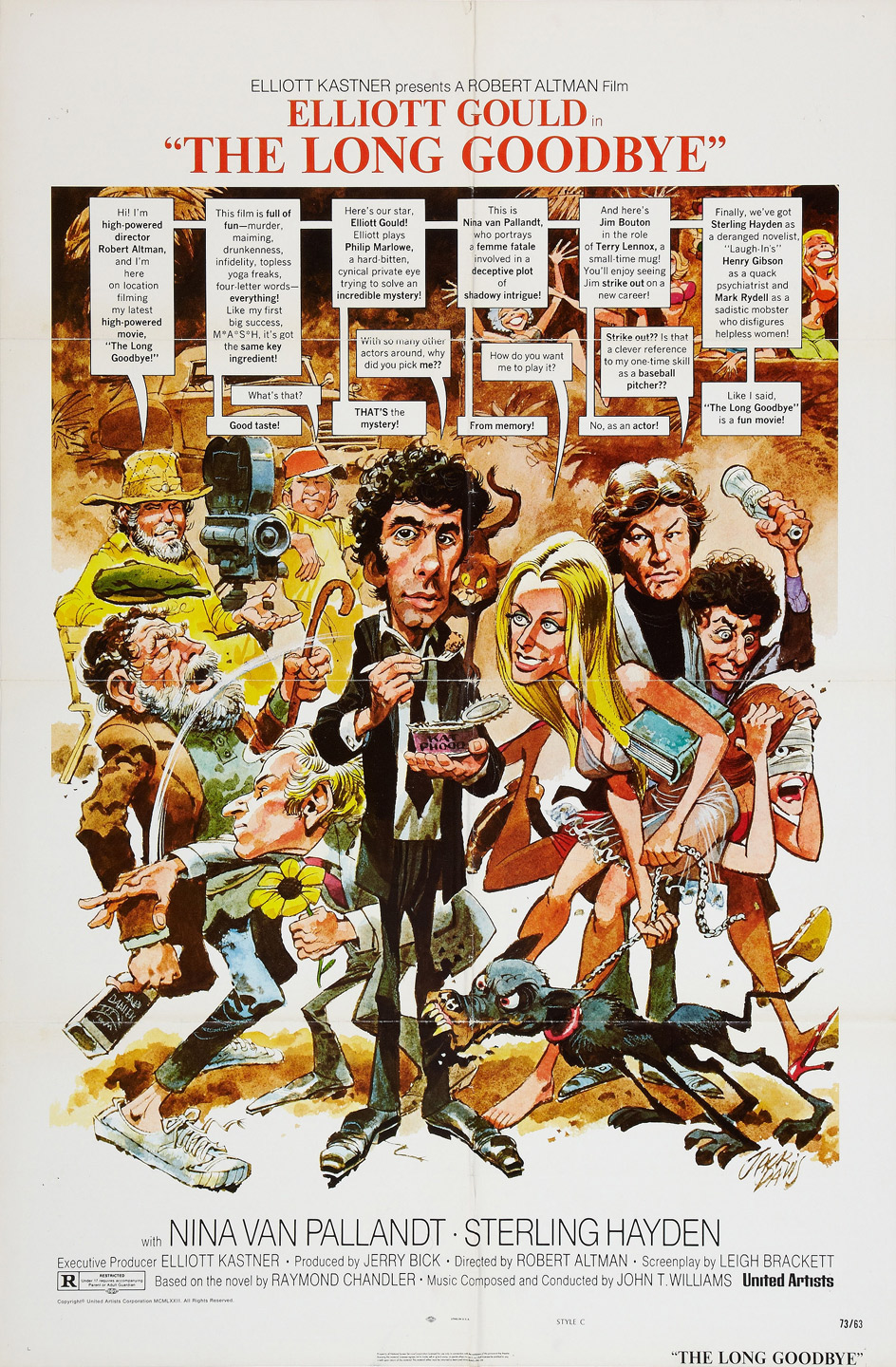
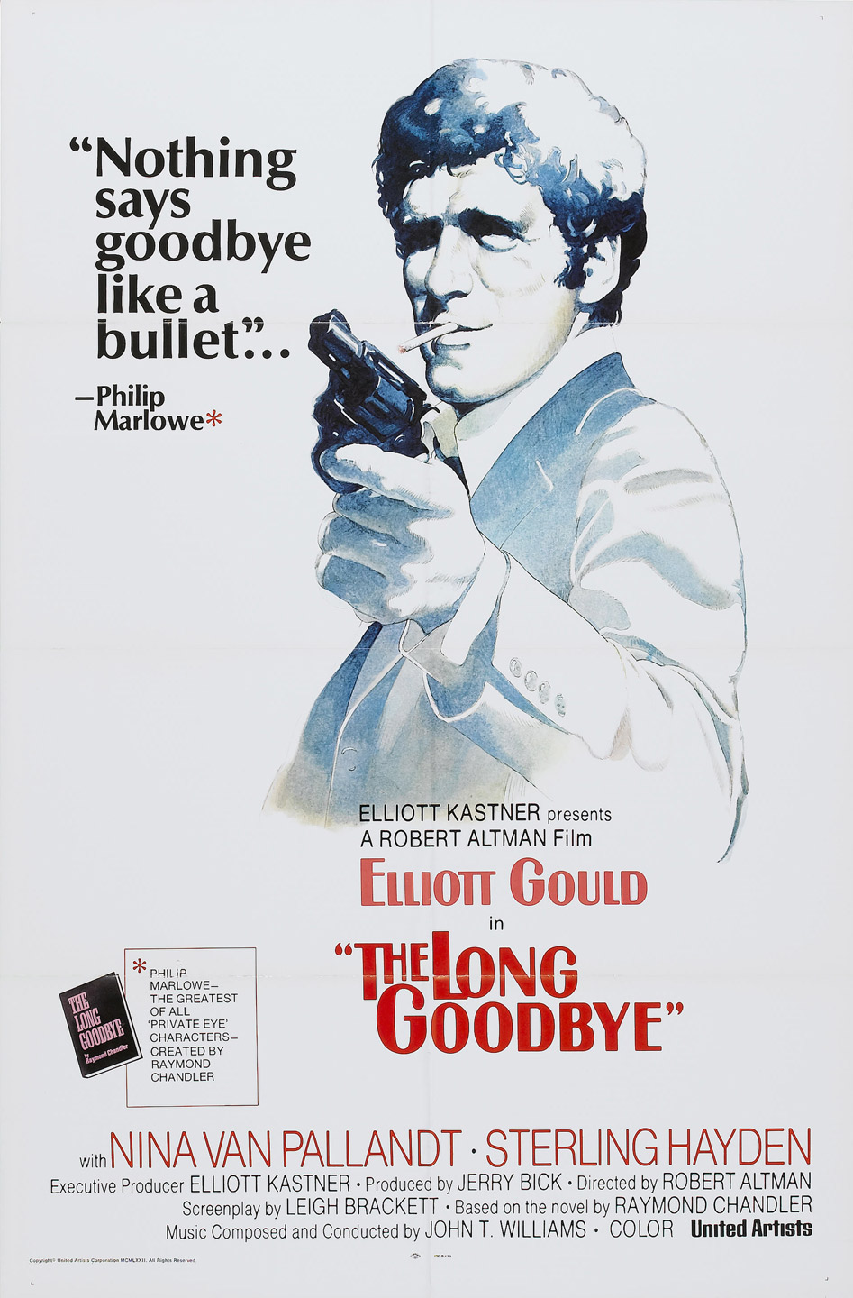
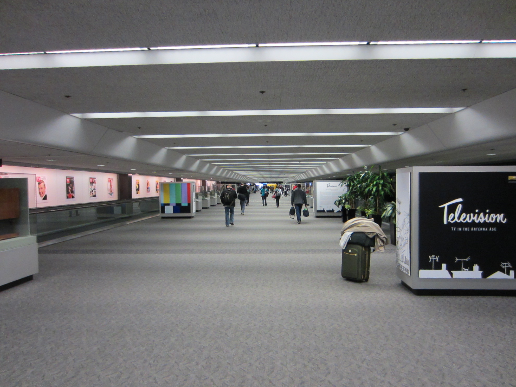
.jpg)
.jpg)

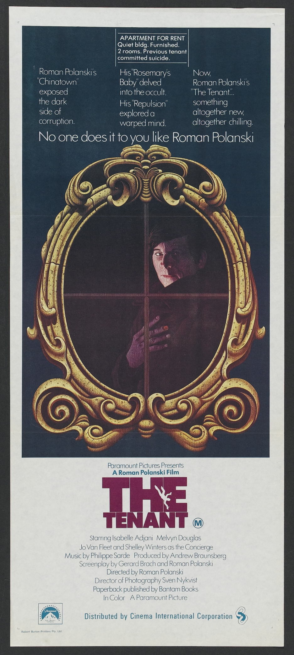

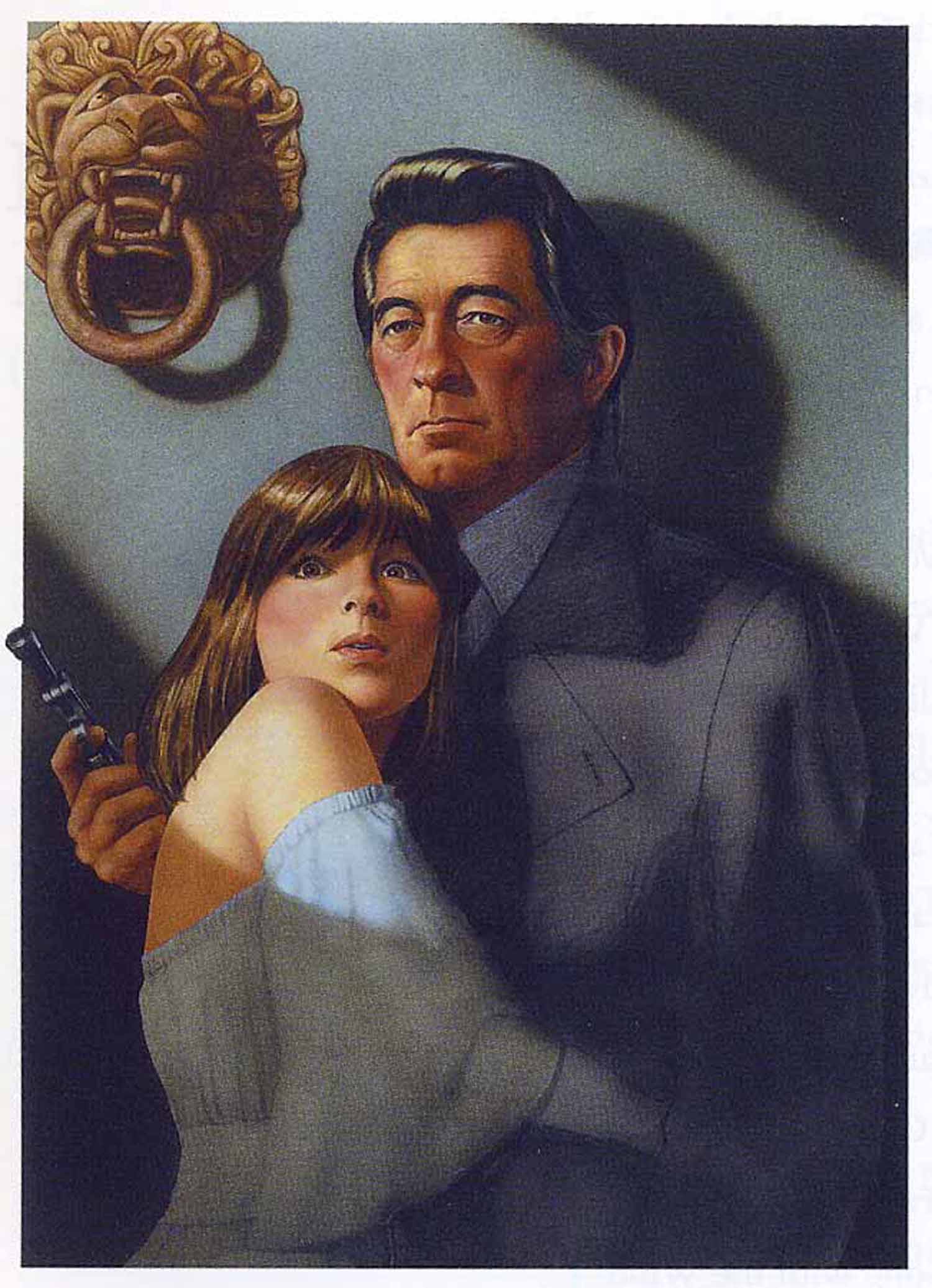
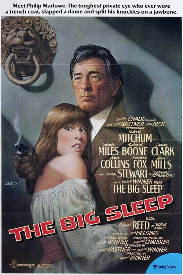


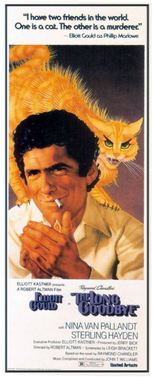
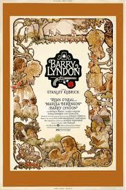
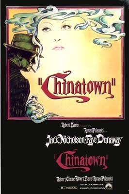


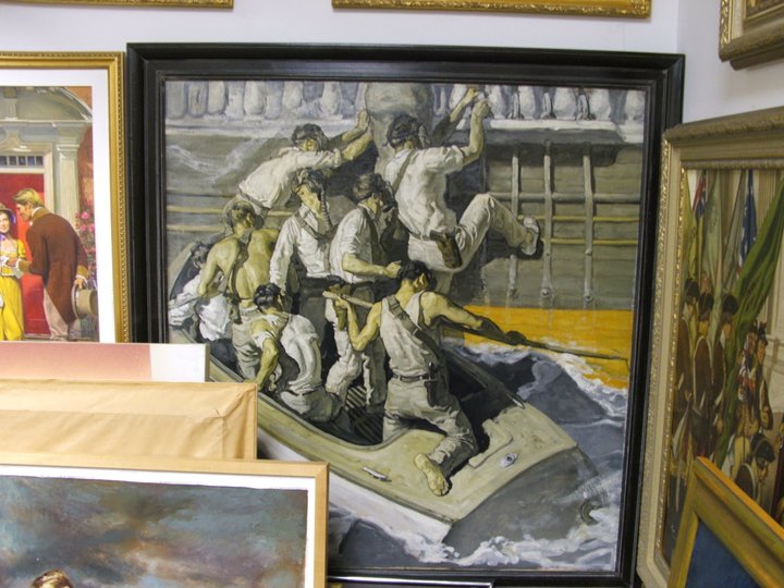
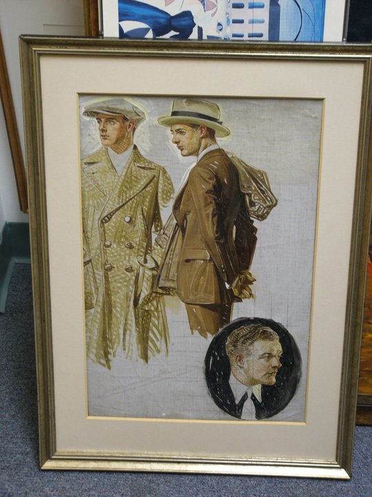
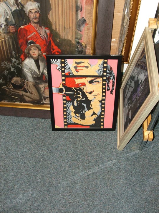
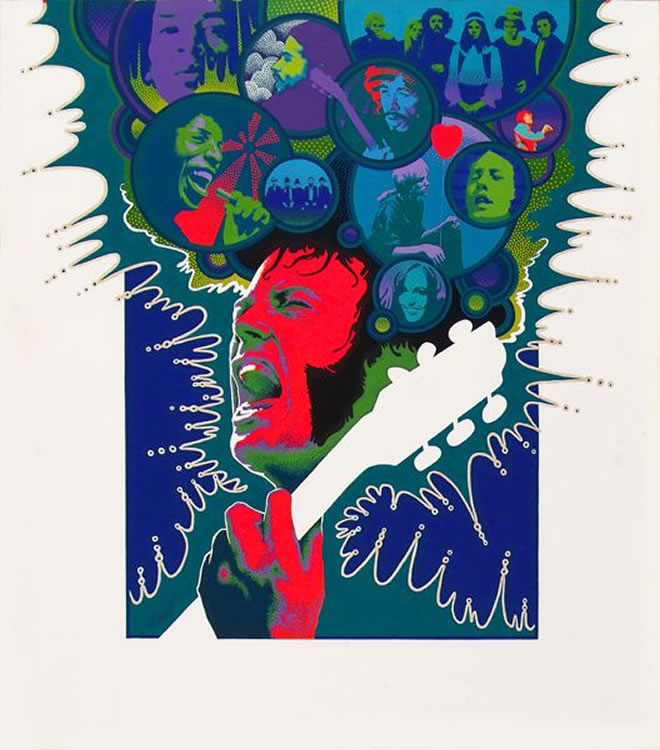
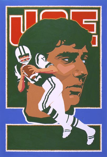
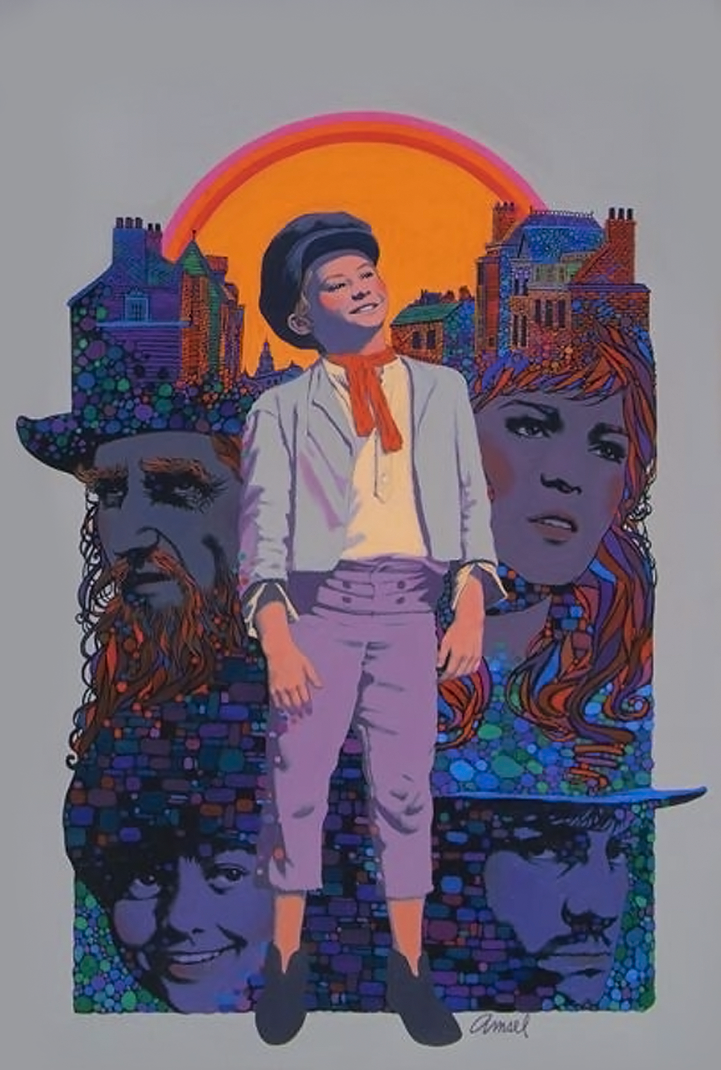

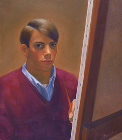
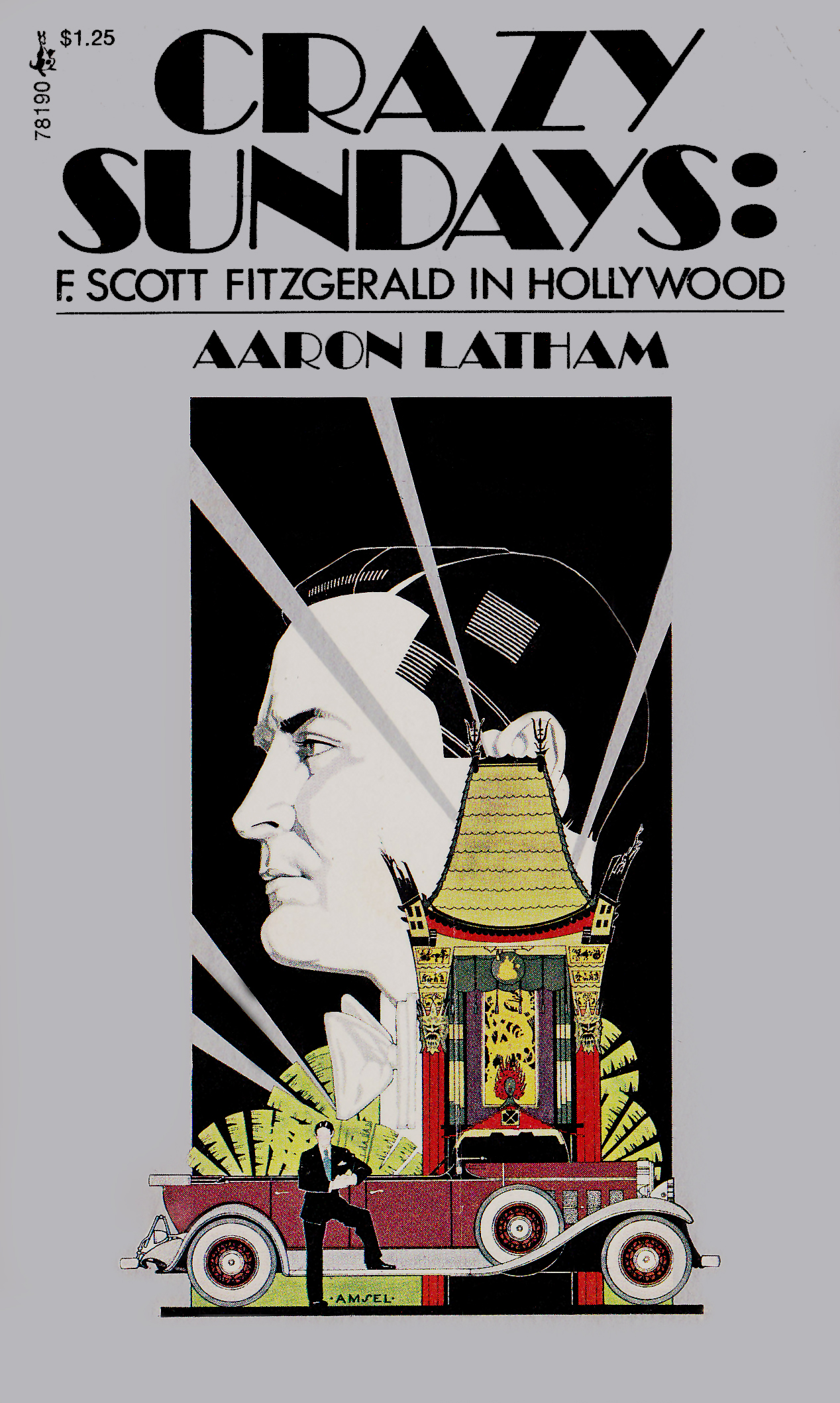

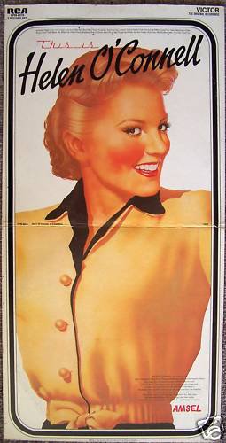
 This
seemingly innocuous tidbit is yet another reminder to me that
my tribute page is in dire need of an update -- including more
information on Richard's life and work (particularly his aspirations
to work in animation), as well as some corrections and clarifications
to what I had written back in early 2008.
I hope to get to this by the end of the summer.
This
seemingly innocuous tidbit is yet another reminder to me that
my tribute page is in dire need of an update -- including more
information on Richard's life and work (particularly his aspirations
to work in animation), as well as some corrections and clarifications
to what I had written back in early 2008.
I hope to get to this by the end of the summer.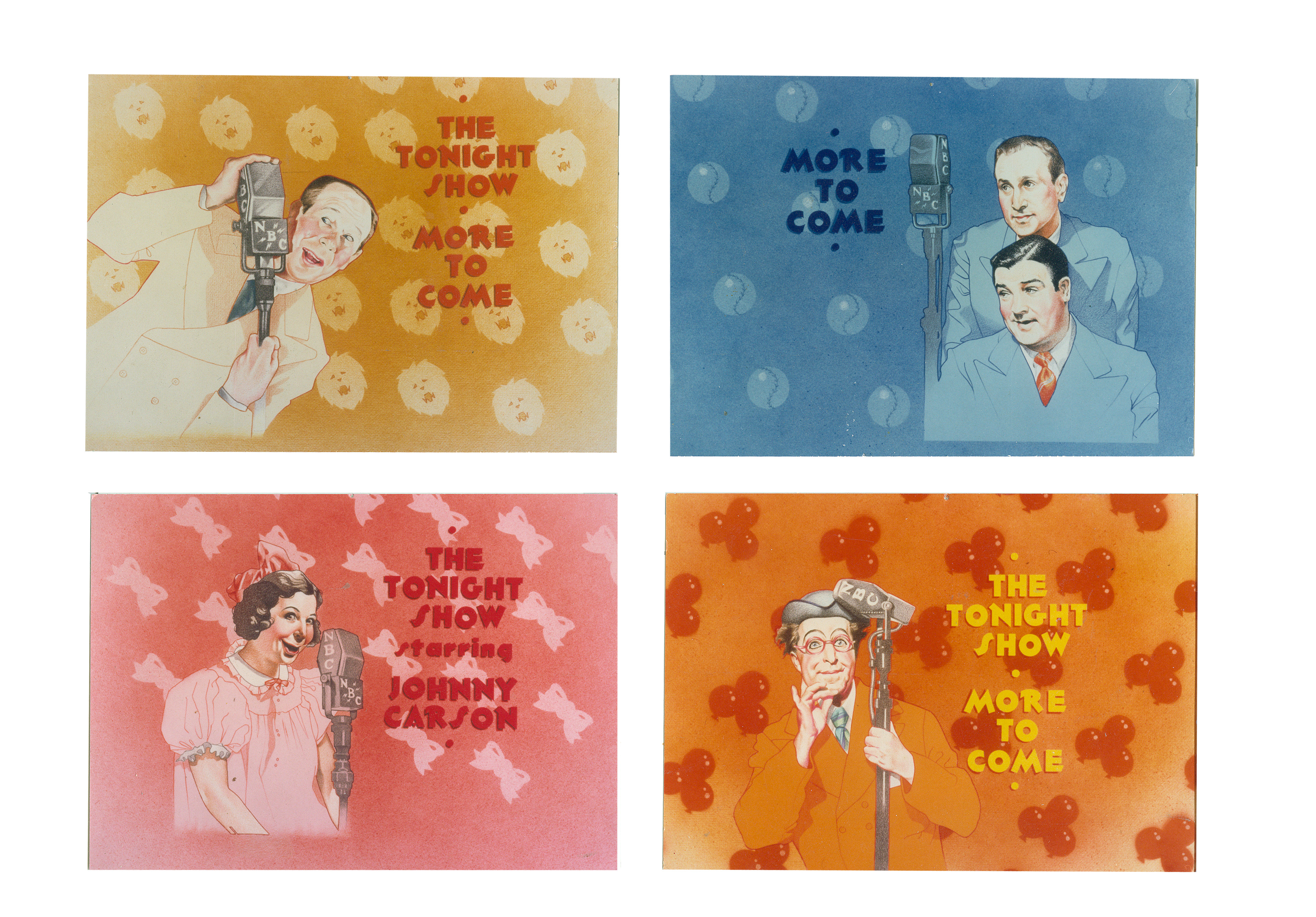
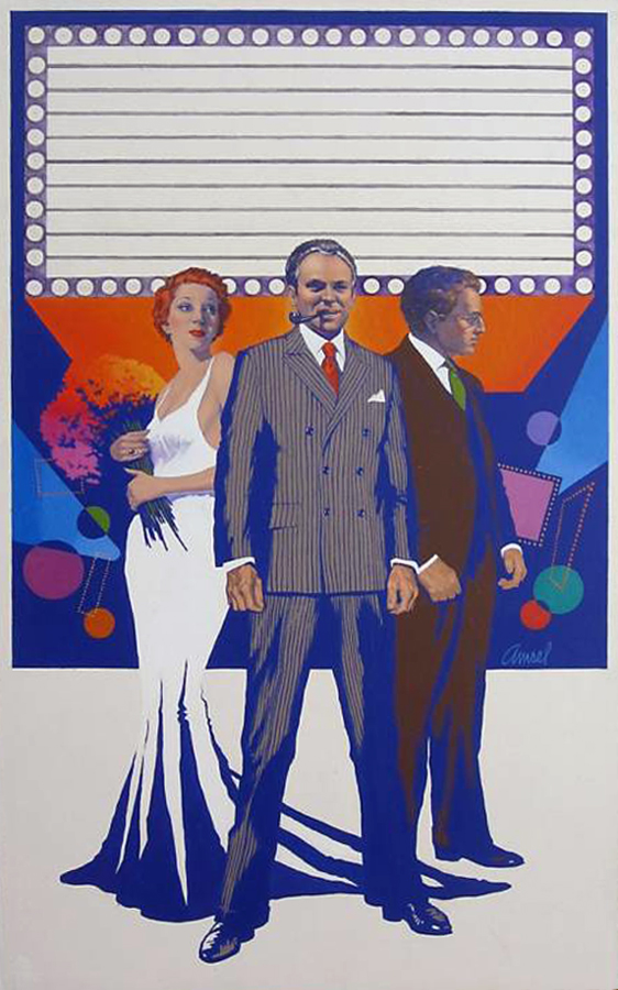
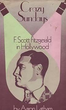

.jpg)
.jpg)
.jpg)
.jpg)
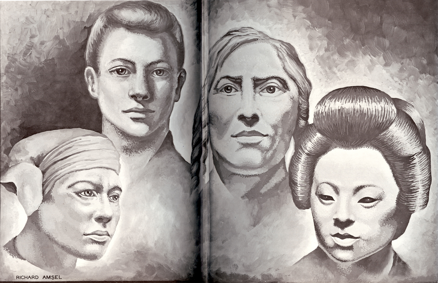

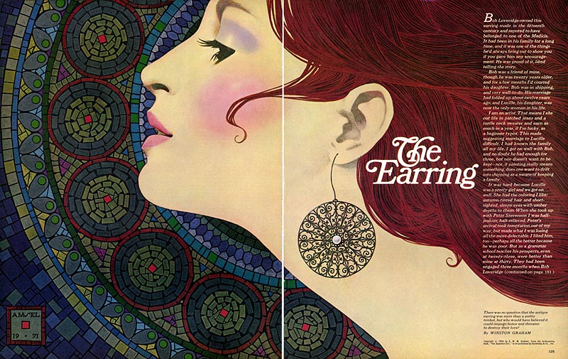
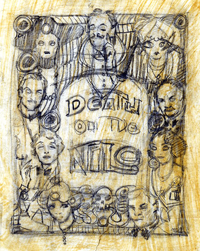
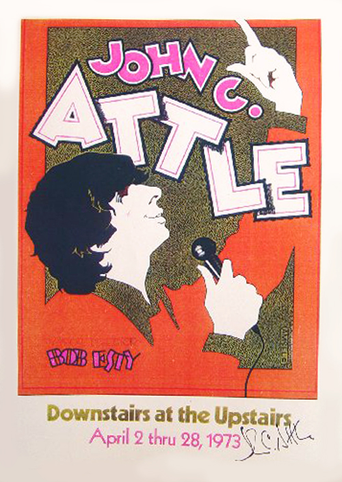

 The
logo -- whose typeface, like the film itself, has become so
commonly associated with action and adventure -- was the product
of
The
logo -- whose typeface, like the film itself, has become so
commonly associated with action and adventure -- was the product
of 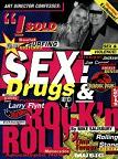
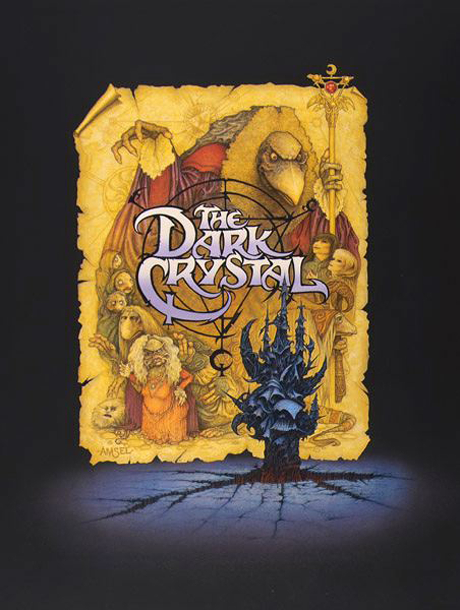
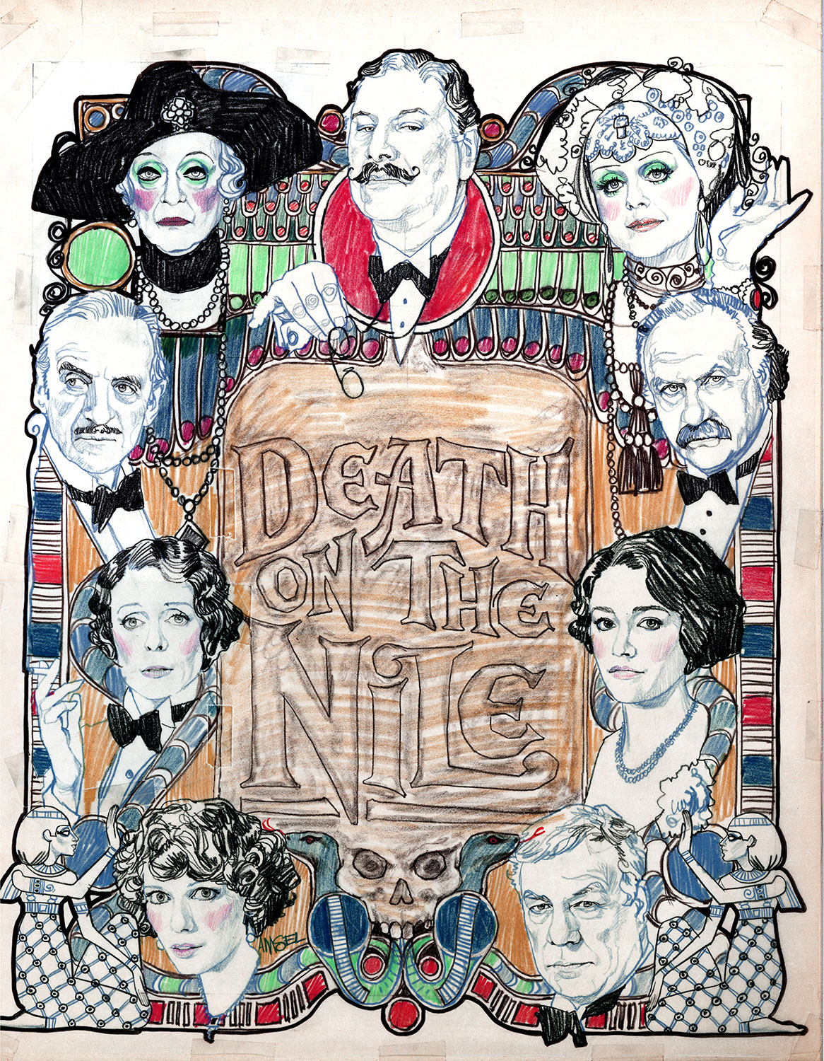
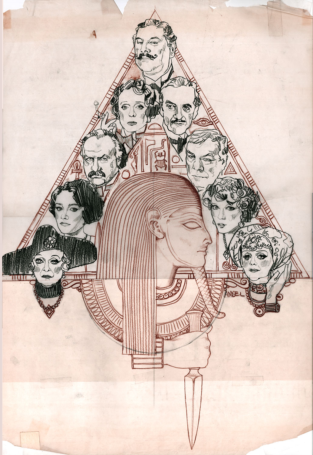
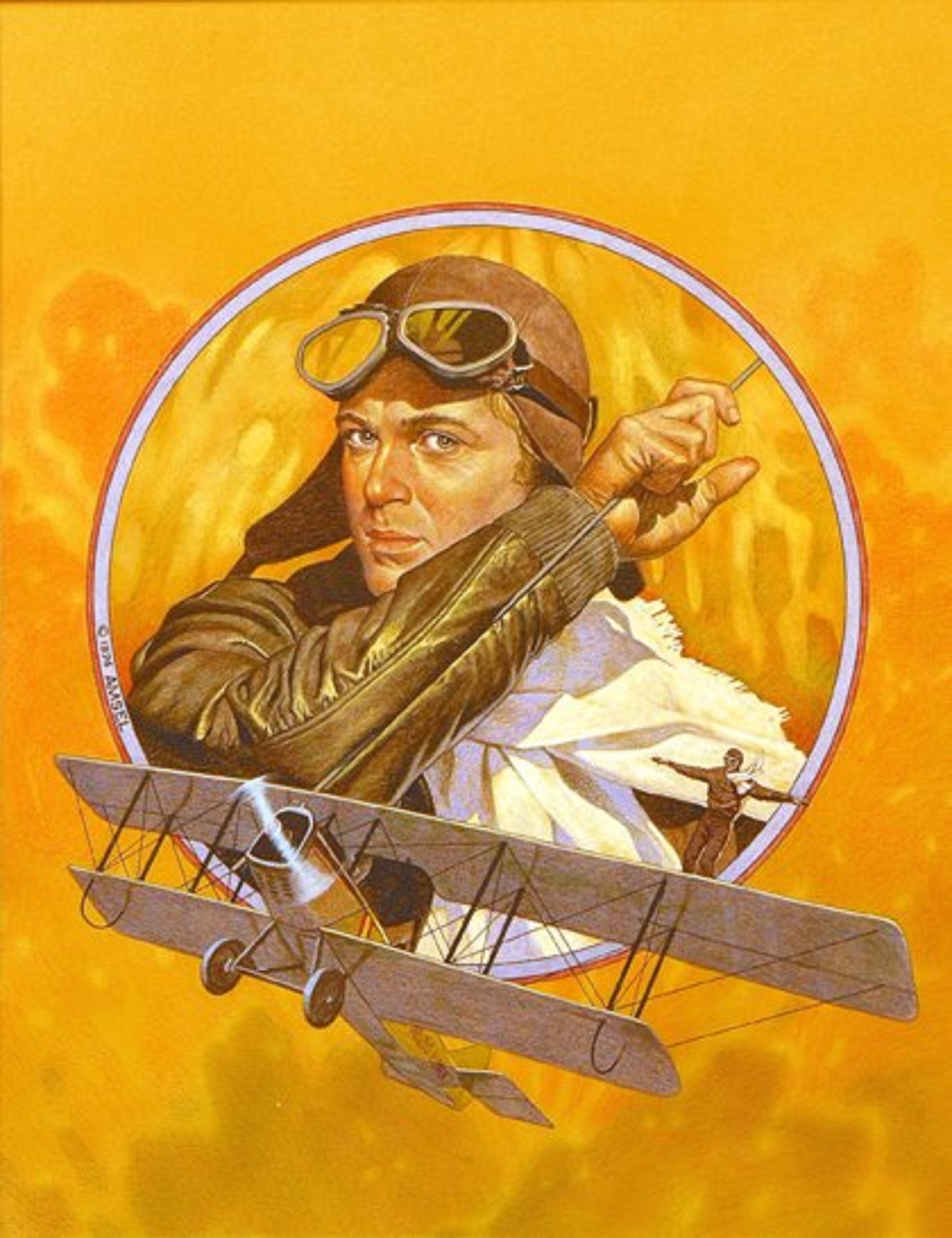
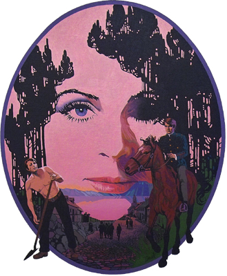
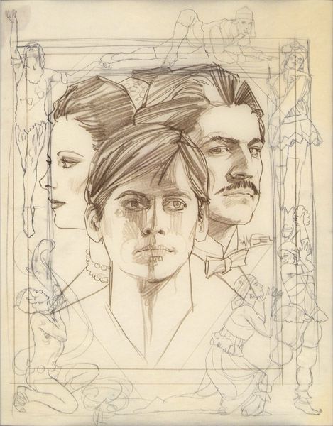
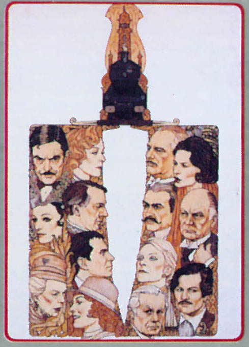

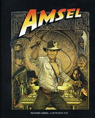
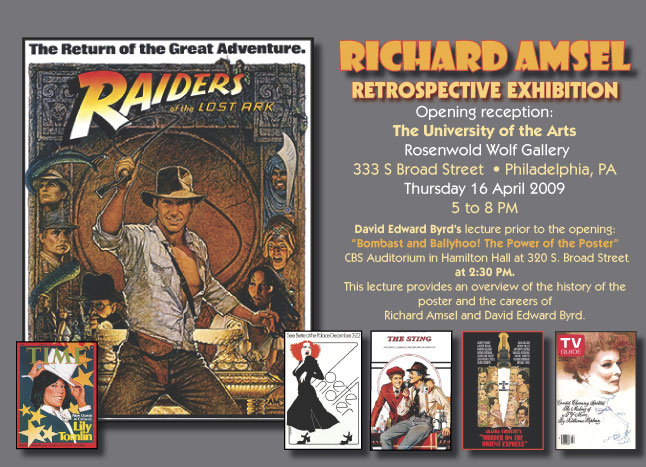
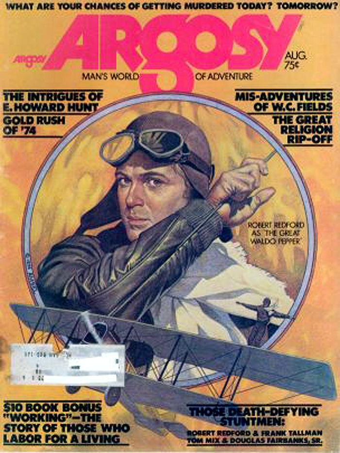
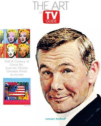
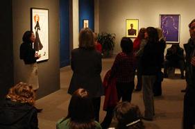 Maya
Foo, a researcher at the Smithsonian's National Portrait Gallery,
recently discussed Richard Amsel's
Maya
Foo, a researcher at the Smithsonian's National Portrait Gallery,
recently discussed Richard Amsel's 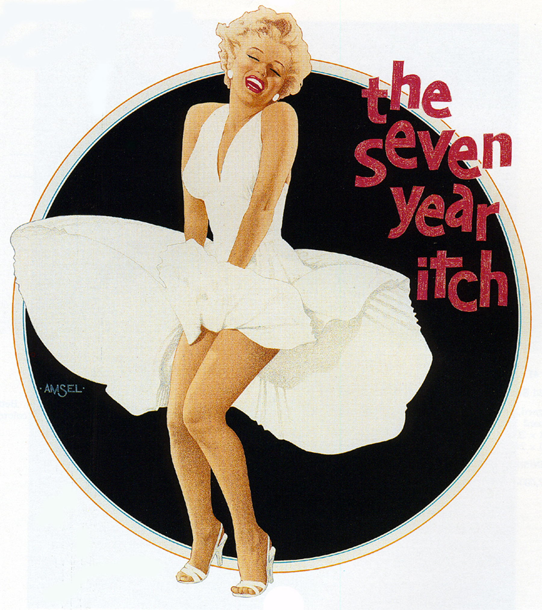
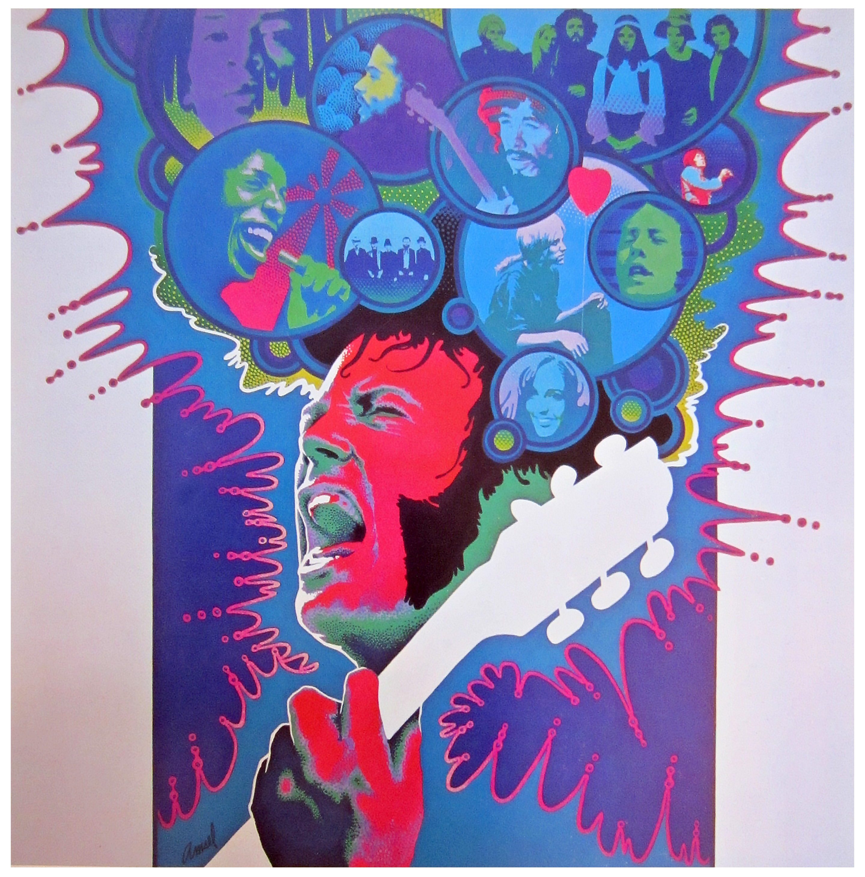
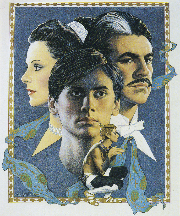
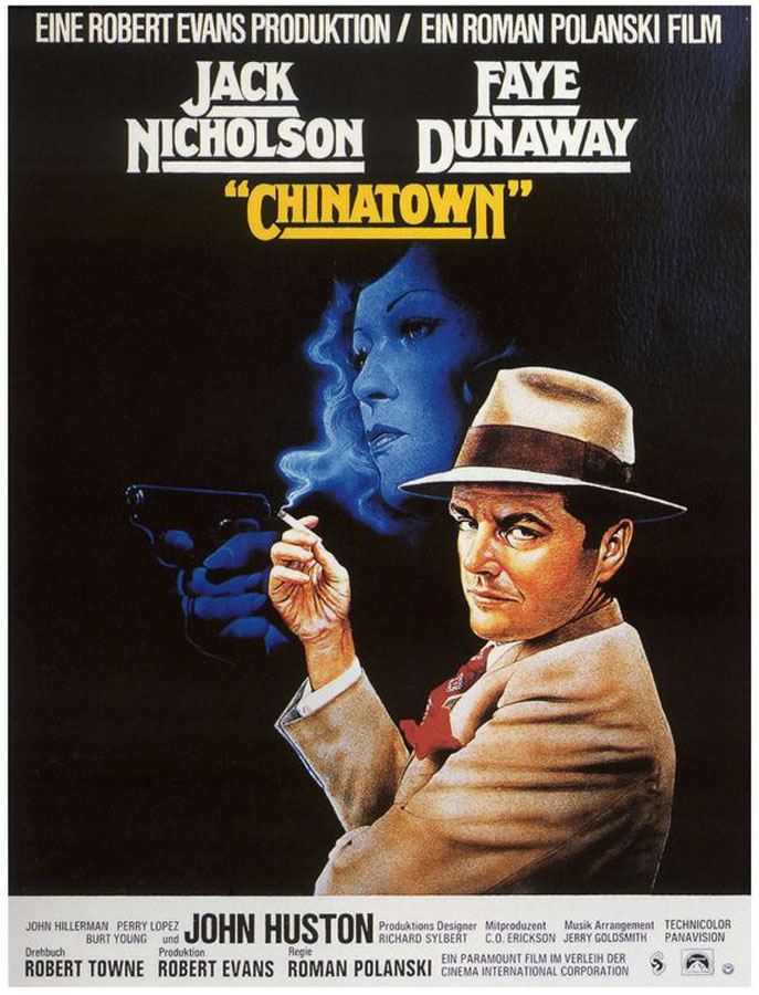
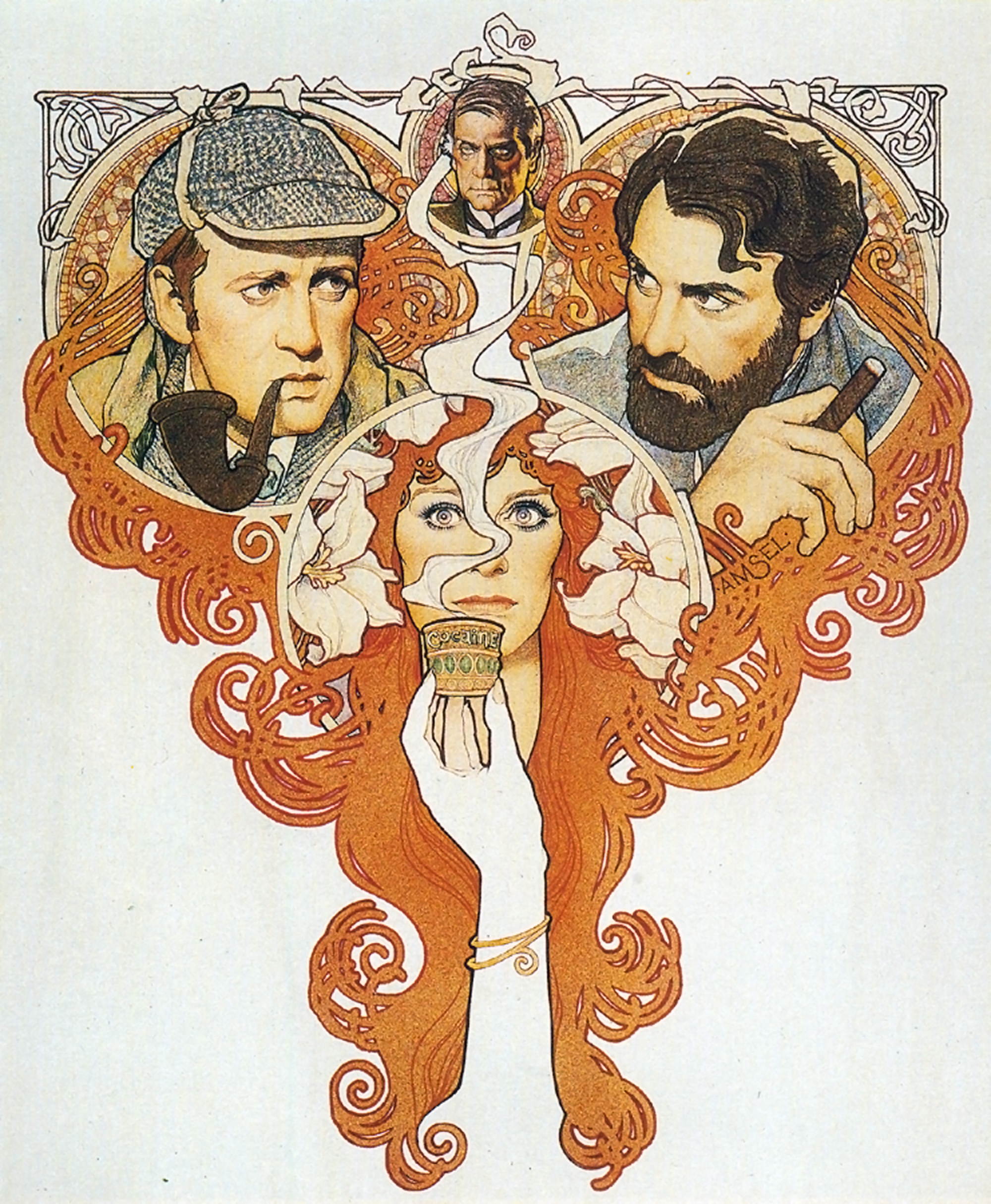
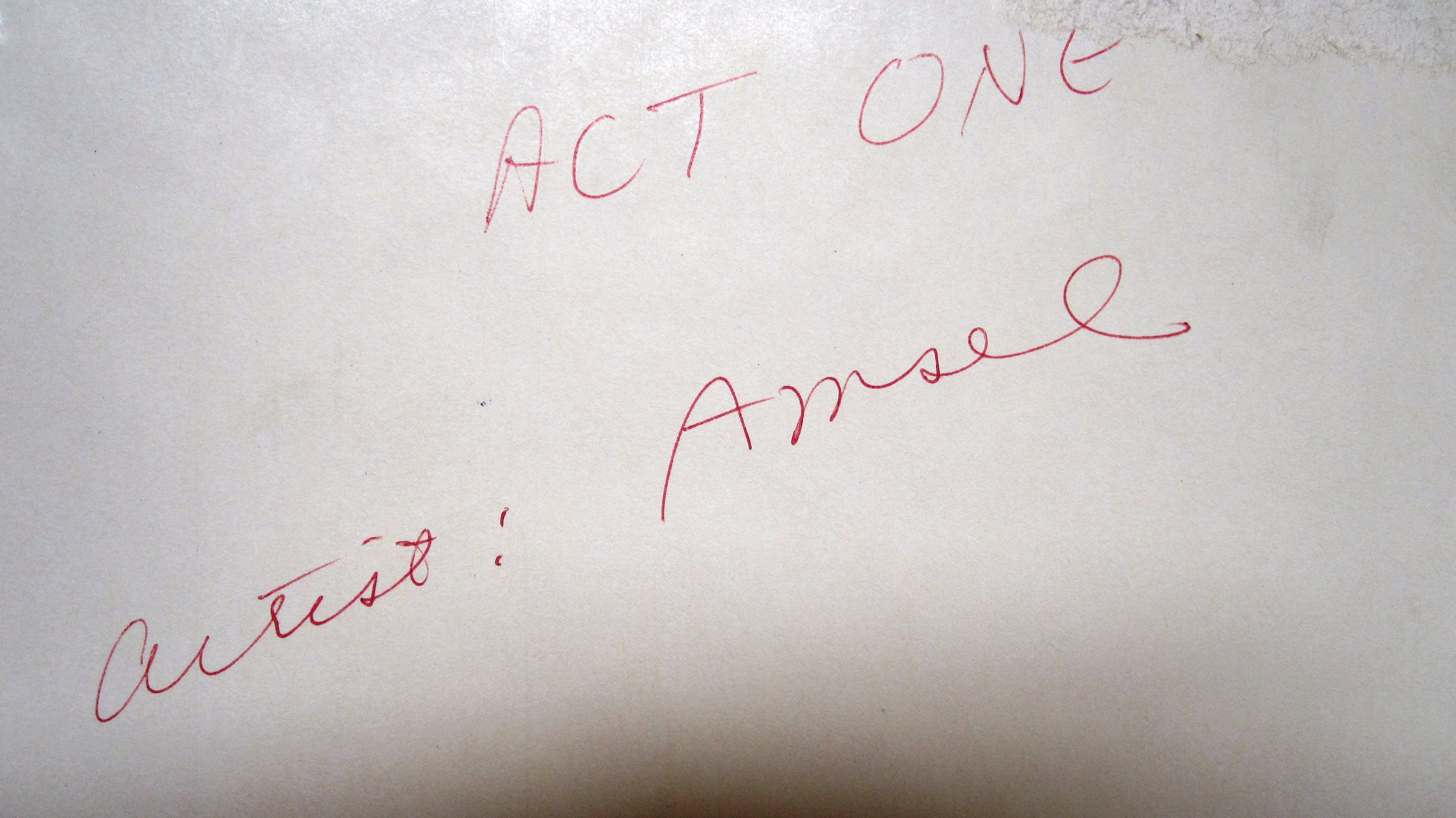
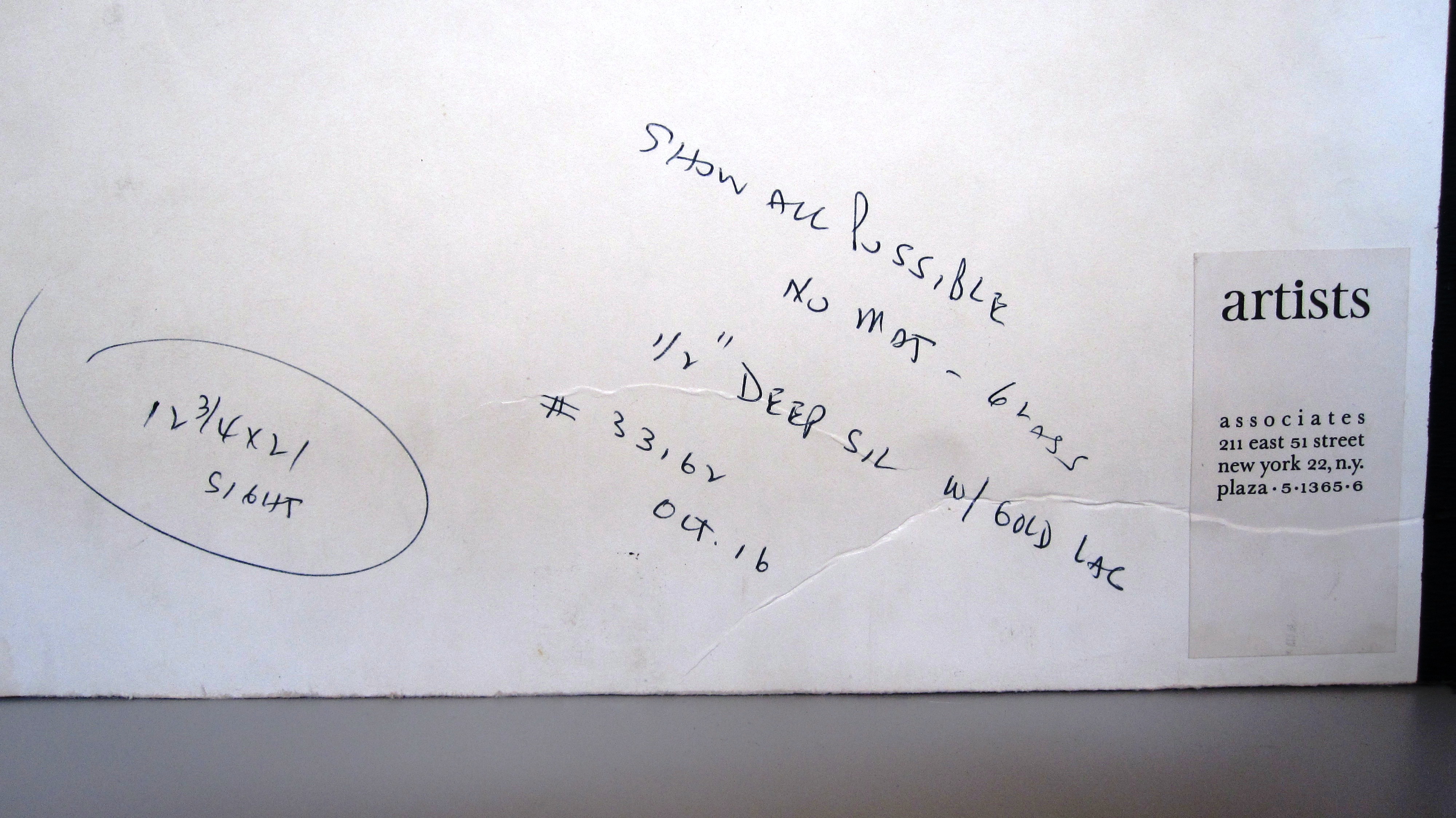
