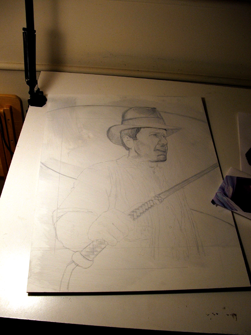
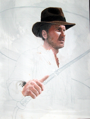
SOMETHING OLD, SOMETHING NEW

I guess I didn't have to paint Indiana Jones again, but...

This time I wanted to try something a little different, rather than making just another cheap Drew Struzan ripoff.

I decided to use oils, and rather than trying to make something 3 dimensional -- in essence, merely replicating a photograph -- I thought it'd be nice to paint something that had a more painterly, period look, like an old travel advertisement, and with a limited color palette similar to illustrations by N.C. Wyeth or J.C. Leyendecker.

The big problem I've had whenever painting the character was that most of the images artists (both professional and fans) rely on as references have become all too familiar. For this new painting I wanted a pose that hadn't been used before, so I had someone model for a few quick photographs at different angles until I found something I thought I'd like. (Thanks, Jody!)

As for the face, I found a still frame from RAIDERS OF THE LOST ARK that perfectly captured the expression I wanted Indy to have. Problem was, he wasn't donning his usual fedora and outfit...so I did my best guess in sketching how I thought they would look, using various photos with different poses, etc....

.

My drafting table, where piles of papers and occasional cat are found.

.

Here is the face in the painting's early stages. I wasn't too fond of my original sketch, but figured that once the painting was underway I'd be able to work out the problems. (I think I have better skills with paint and color than actual drafting.)
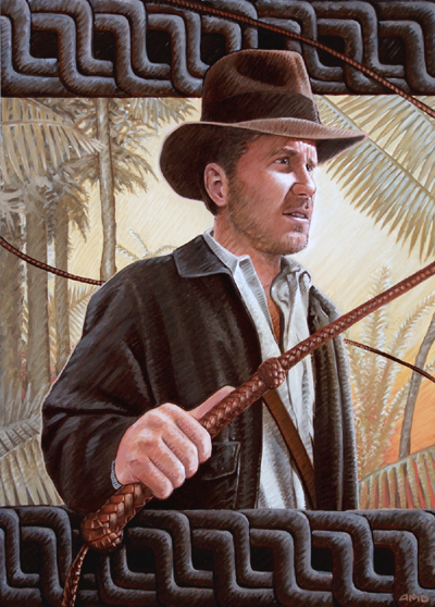
At this point, I have a vague idea about what I'll put in the background, but again, I want to give this a more painterly, 2 dimensional look. To make the most of the oil medium, I also thought it'd be fun to paint at a diagonal, putting more emphasis on stylized lines than the traditional method of blending colors.

In the end, I decided to use a jungle setting with "washed out" yellows and greens in the background. MY original intent was to have a world map (common to the INDY films), but it seemed a bit too flat, visually. (Insert bad Columbus joke here.)

The background used was inspired largely by an old TREASURE ISLAND illustration by N.C. Wyeth.

Using oils can be a slow process, but they blend wonderfully. I often smudge paint everywhere, from under my fingernails to all my laymen's clothes.

Ironically, hours before I was ready to put this on the web, Drew Struzan, God bless him, had his braveura INDY IV teaser poster released for all to see. I guess that's what I get for taking my time.
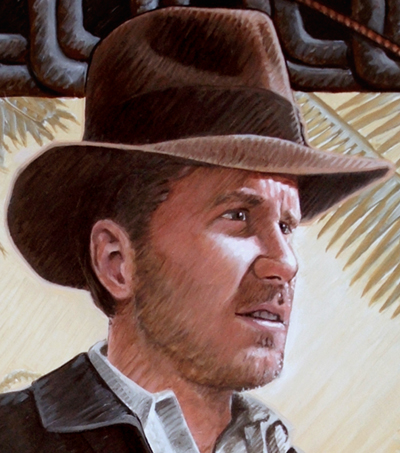
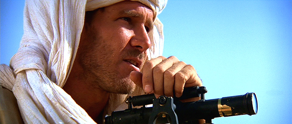
At right is a closeup detail of the face on the completed painting. Though I don't think the rest of the painting matches the quality of the portrait, I'm happy with the way Indy's face came out.
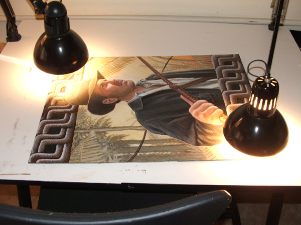
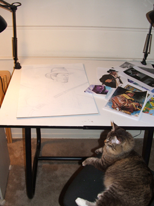
As I commonly do when using oils, I "bake" the painting under hot lights to speed the drying process.

The painting's almost finished...but something's missing. I decided to add some vines at the top and bottom to make the painting a little more dynamic, and also a few color adjustments here and there with thin washes of browns and yellows...

...but still SOMETHING isn't quite right. It's only after posting this artwork up for a month that I realize the head is just a tad bit too big in proportion to the body -- the result of trying to best match (or so I thought) the dimensions of Harrison Ford's head to the model I used. Not one to abandon a painting until I feel truly "done" with it, I play around for hours in Photoshop to correct the problem, shrinking Indy's head by about 5% and painting in the areas to mask where the hat's outline used to be. Look closely and you'll see the difference -- especially with the vines above Indy's head, and the branches to the right of his hat.


The finished painting. (You have to give me credit for being honest about my Photoshop adjustments!)